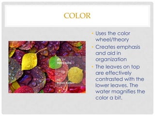
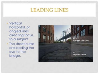
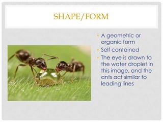
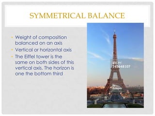
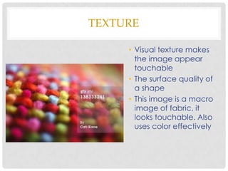
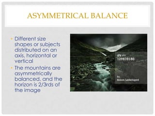
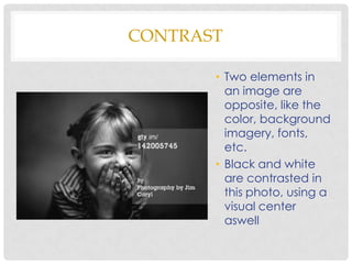
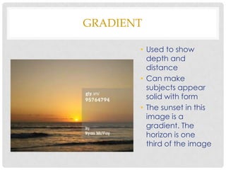
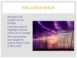
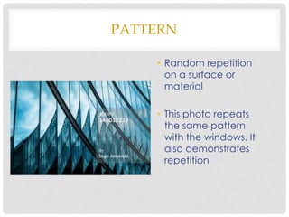
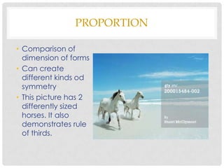
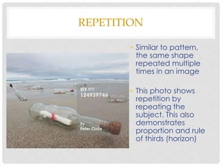
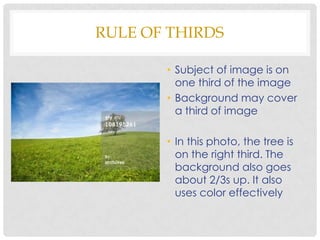
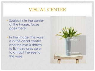
PRINCIPALS OF DESIGN
      GILLIAN SMITH
COLOR

        • Uses the color
          wheel/theory
        • Creates emphasis
          and aid in
          organization
        • The leaves on top
          are effectively
          contrasted with the
          lower leaves. The
          water magnifies the
          color a bit.
LEADING LINES

• Vertical,
  horizontal, or
  angled lines
  directing focus
  to a subject
• The street curbs
  are leading the
  eye to the
  bridge.
SHAPE/FORM

       • A geometric or
         organic form
       • Self contained
       • The eye is drawn to
         the water droplet in
         this image, and the
         ants act similar to
         leading lines
SYMMETRICAL BALANCE

• Weight of composition
  balanced on an axis
• Vertical or horizontal axis
• The Eiffel tower is the
  same on both sides of this
  vertical axis. The horizon is
  one the bottom third
TEXTURE

     • Visual texture makes
       the image appear
       touchable
     • The surface quality of
       a shape
     • This image is a macro
       image of fabric, it
       looks touchable. Also
       uses color effectively
ASYMMETRICAL BALANCE

• Different size
  shapes or subjects
  distributed on an
  axis, horizontal or
  vertical
• The mountains are
  asymmetrically
  balanced, and the
  horizon is 2/3rds of
  the image
CONTRAST

       • Two elements in
         an image are
         opposite, like the
         color, background
         imagery, fonts,
         etc.
       • Black and white
         are contrasted in
         this photo, using a
         visual center
         aswell
DOMINANCE

• Creates a focal
  point
• Without a
  dominant subject
  the eye wanders
  too much
• This photo has the
  cat being
  dominant, as well
  as being 1/3 of
  the picture
GRADIENT

       • Used to show
         depth and
         distance
       • Can make
         subjects appear
         solid with form
       • The sunset in this
         image is a
         gradient. The
         horizon is one
         third of the image
NEGATIVE SPACE

• Reveals true
  subject of an
  image
• Can be used to
  highlight certain
  areas of an image
• The power lines
  are negative
  space here. Color
  is also used
PATTERN

    • Random repetition
      on a surface or
      material

    • This photo repeats
      the same pattern
      with the windows. It
      also demonstrates
      repetition
PROPORTION

• Comparison of
  dimension of forms
• Can create
  different kinds od
  symmetry
• This picture has 2
  differently sized
  horses. It also
  demonstrates rule
  of thirds.
REPETITION

        • Similar to pattern,
          the same shape
          repeated multiple
          times in an image

        • This photo shows
          repetition by
          repeating the
          subject. This also
          demonstrates
          proportion and rule
          of thirds (horizon)
UNITY

• Subjects in an
  image are
  connected in
  some way

• The men in this
  photo
  demonstrate unity
  being connected
  in the same
  object. It also
  shows repetition.
RULE OF THIRDS

       • Subject of image is on
         one third of the image
       • Background may cover
         a third of image

       • In this photo, the tree is
         on the right third. The
         background also goes
         about 2/3s up. It also
         uses color effectively
VISUAL CENTER

• Subject is in the center
  of the image, focus
  goes there

• In the image, the vase
  is in the dead center
  and the eye is drawn
  to it. It also uses color
  to attract the eye to
  the vase.

Design principles

  • 1.
    PRINCIPALS OF DESIGN GILLIAN SMITH
  • 2.
    COLOR • Uses the color wheel/theory • Creates emphasis and aid in organization • The leaves on top are effectively contrasted with the lower leaves. The water magnifies the color a bit.
  • 3.
    LEADING LINES • Vertical, horizontal, or angled lines directing focus to a subject • The street curbs are leading the eye to the bridge.
  • 4.
    SHAPE/FORM • A geometric or organic form • Self contained • The eye is drawn to the water droplet in this image, and the ants act similar to leading lines
  • 5.
    SYMMETRICAL BALANCE • Weightof composition balanced on an axis • Vertical or horizontal axis • The Eiffel tower is the same on both sides of this vertical axis. The horizon is one the bottom third
  • 6.
    TEXTURE • Visual texture makes the image appear touchable • The surface quality of a shape • This image is a macro image of fabric, it looks touchable. Also uses color effectively
  • 7.
    ASYMMETRICAL BALANCE • Differentsize shapes or subjects distributed on an axis, horizontal or vertical • The mountains are asymmetrically balanced, and the horizon is 2/3rds of the image
  • 8.
    CONTRAST • Two elements in an image are opposite, like the color, background imagery, fonts, etc. • Black and white are contrasted in this photo, using a visual center aswell
  • 9.
    DOMINANCE • Creates afocal point • Without a dominant subject the eye wanders too much • This photo has the cat being dominant, as well as being 1/3 of the picture
  • 10.
    GRADIENT • Used to show depth and distance • Can make subjects appear solid with form • The sunset in this image is a gradient. The horizon is one third of the image
  • 11.
    NEGATIVE SPACE • Revealstrue subject of an image • Can be used to highlight certain areas of an image • The power lines are negative space here. Color is also used
  • 12.
    PATTERN • Random repetition on a surface or material • This photo repeats the same pattern with the windows. It also demonstrates repetition
  • 13.
    PROPORTION • Comparison of dimension of forms • Can create different kinds od symmetry • This picture has 2 differently sized horses. It also demonstrates rule of thirds.
  • 14.
    REPETITION • Similar to pattern, the same shape repeated multiple times in an image • This photo shows repetition by repeating the subject. This also demonstrates proportion and rule of thirds (horizon)
  • 15.
    UNITY • Subjects inan image are connected in some way • The men in this photo demonstrate unity being connected in the same object. It also shows repetition.
  • 16.
    RULE OF THIRDS • Subject of image is on one third of the image • Background may cover a third of image • In this photo, the tree is on the right third. The background also goes about 2/3s up. It also uses color effectively
  • 17.
    VISUAL CENTER • Subjectis in the center of the image, focus goes there • In the image, the vase is in the dead center and the eye is drawn to it. It also uses color to attract the eye to the vase.