This document analyzes the conventions used in real music magazines and how the student's mock magazine both follows and challenges conventions.
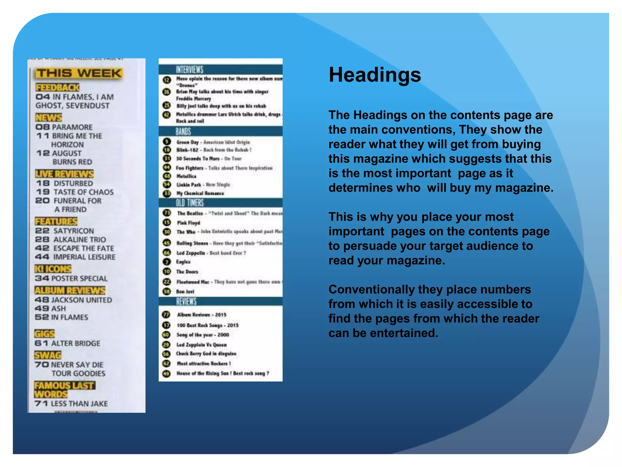
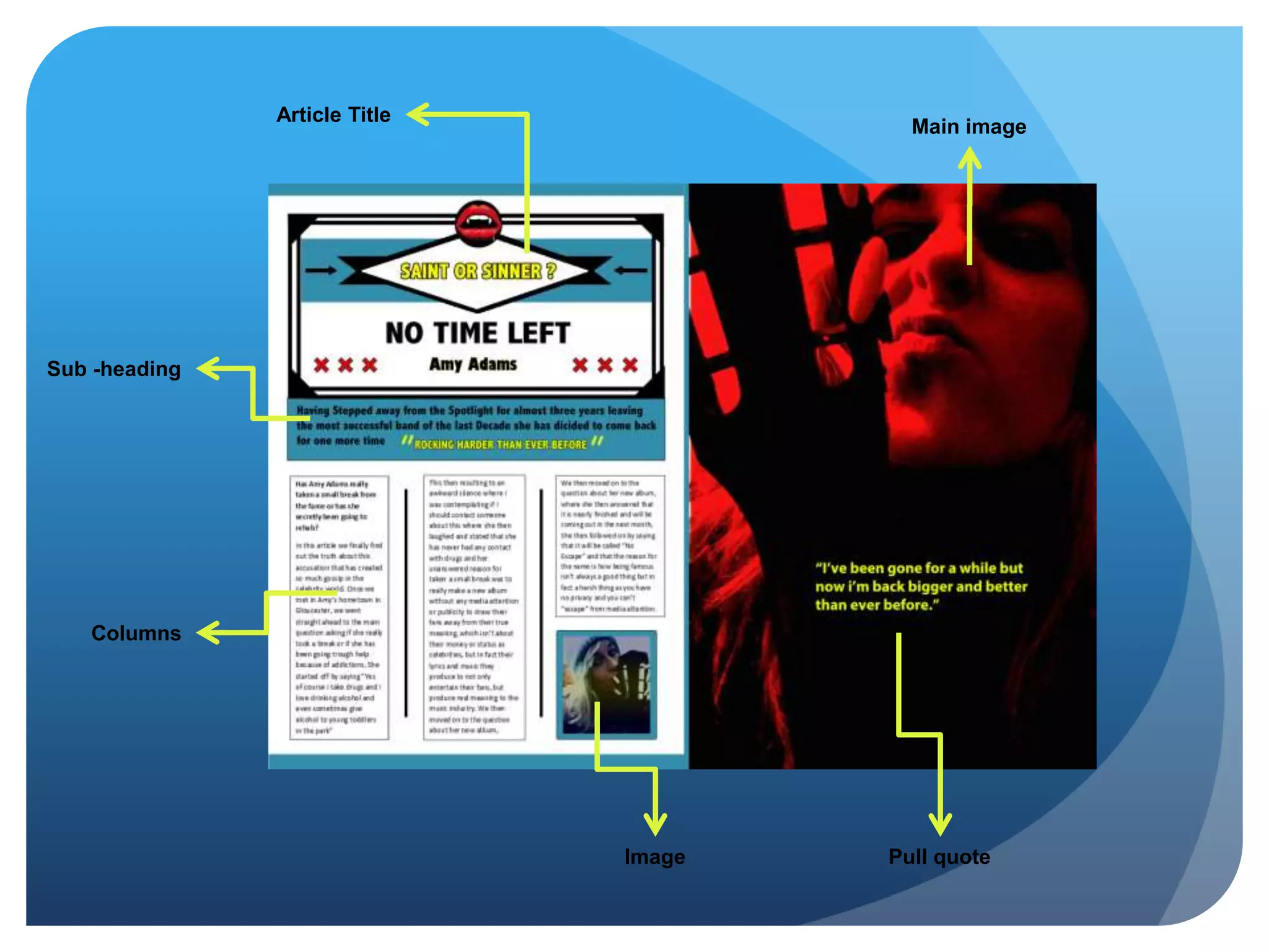
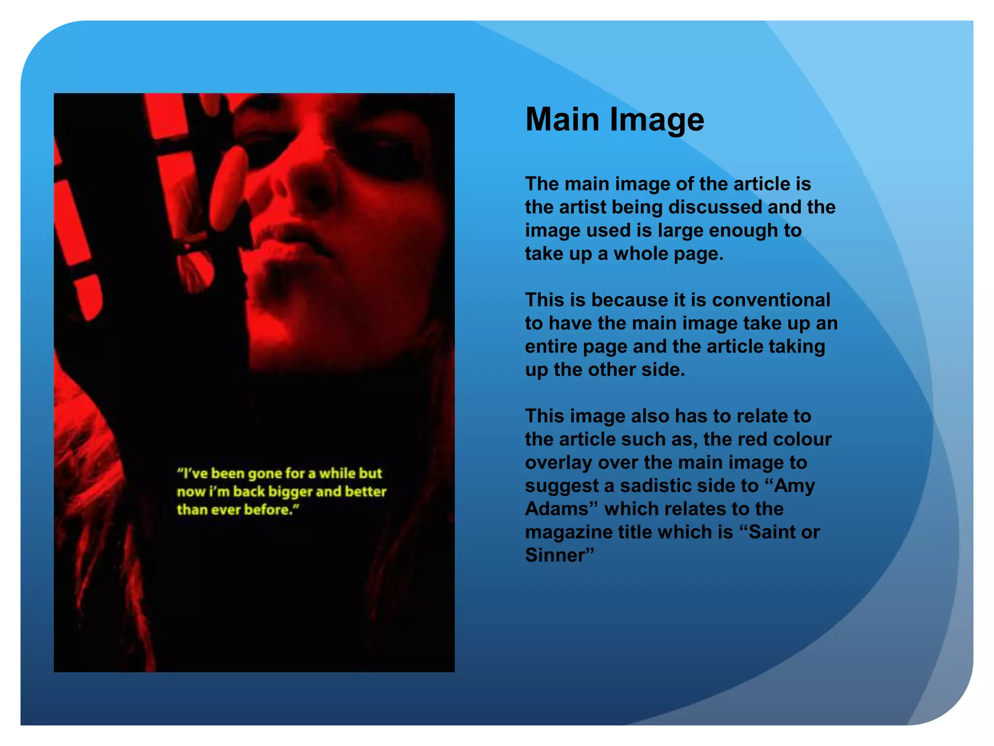
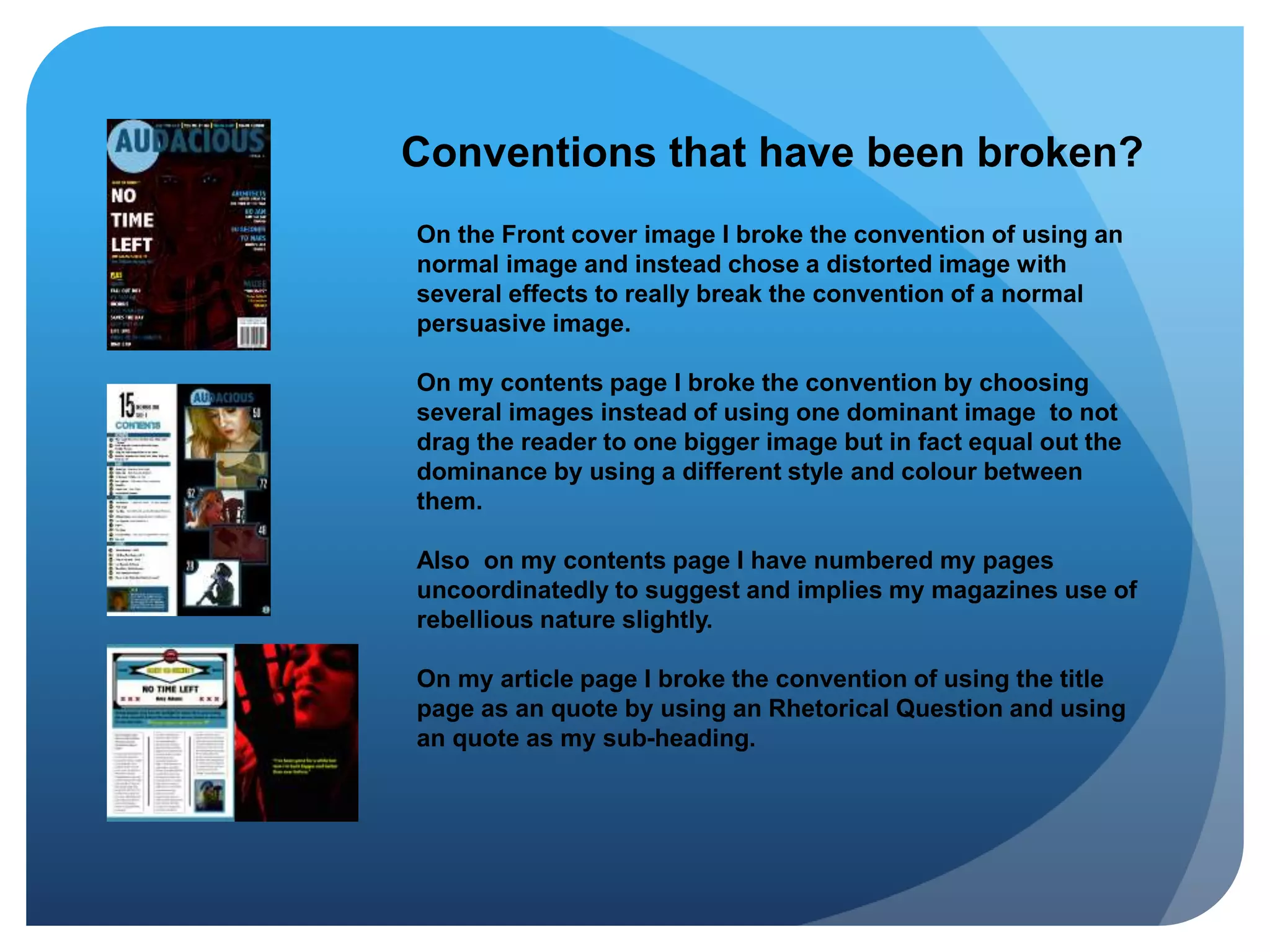
It discusses how the magazine follows conventions such as using a masthead, front cover image, pull quote, and multi-column article layout. However, it also breaks conventions by using a distorted front cover image, multiple equal images on the contents page, and unconventionally numbered pages. The article page challenges conventions by using a rhetorical question as the title and a quote as the sub-heading. In summary, the magazine aims to be unpredictable while still utilizing standard magazine design elements.