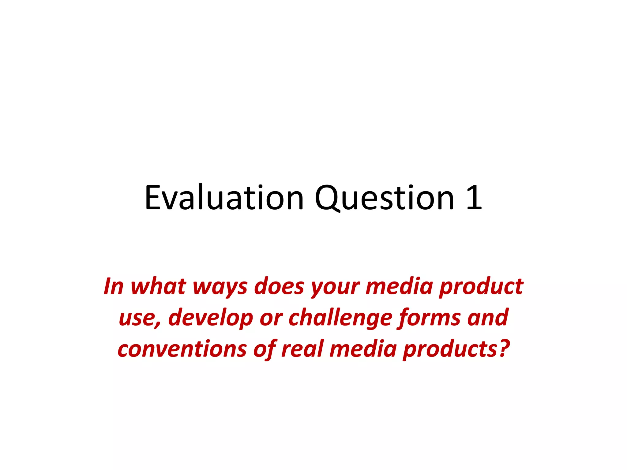
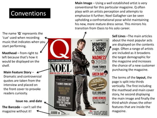
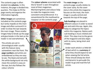
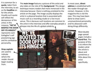
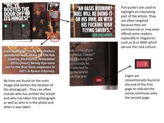
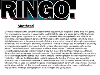
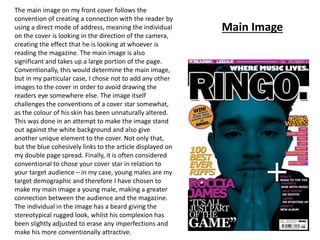
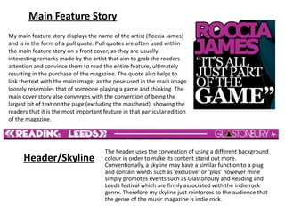
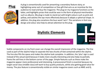
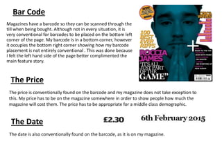
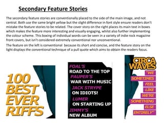
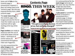
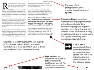
The document provides details on the conventions used in music magazines and how the student's media products challenge or develop those conventions. For the masthead, some conventions followed include placement in the top third and use of sans serif font, though a period is added for uniqueness. The main image convention of direct address is challenged through altering the subject's skin color. Pull quotes from interviews are used for the main feature story as is conventional. The header promotes music festivals to reinforce the indie genre. A plug is included to highlight competition prizes as an incentive to read, using bright colors and varied design elements to stand out.


![Music mag evaluation [recovered]](https://cdn.slidesharecdn.com/ss_thumbnails/musicmagevaluationrecovered-100421111014-phpapp01-thumbnail.jpg?width=640&height=640&fit=bounds)


