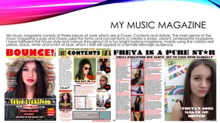
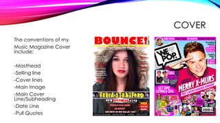
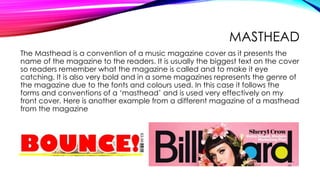
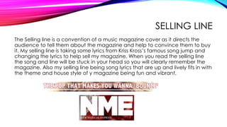
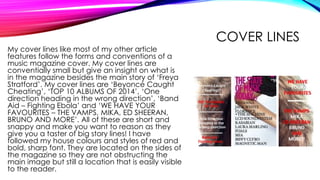
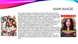
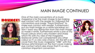
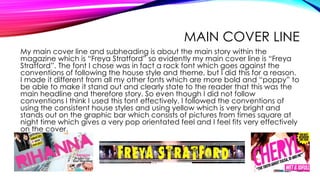
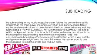
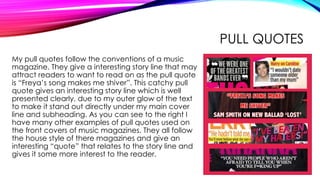
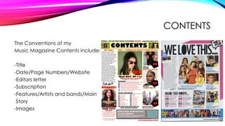
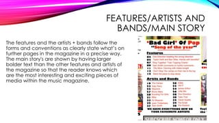
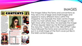
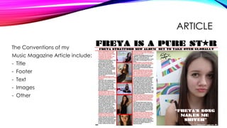
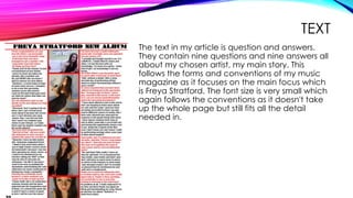
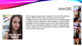
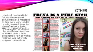
1. MEDIA – QUESTION 1
Q1. In what ways does your media product use, develop or challenge
forms and conventions of real media products?
2. MY MUSIC MAGAZINE
My music magazine consists of three pieces of work which are a Cover, Contents and Article. The main genre of the
music magazine is pop and I have used the forms and conventions to create a sharp, vibrant, professional magazine.
I have followed the house style and colours throughout of a fun bright looking magazine, mainly using the colours red,
yellow, black, white and a hint of blue, which I feel will appeal to a female teenage audience.
3. COVER
The conventions of my
Music Magazine Cover
include:
-Masthead
-Selling line
-Cover lines
-Main Image
-Main Cover
Line/Subheading
-Date Line
-Pull Quotes
4. MASTHEAD
The Masthead is a convention of a music magazine cover as it presents the
name of the magazine to the readers. It is usually the biggest text on the cover
so readers remember what the magazine is called and to make it eye
catching. It is also very bold and in a some magazines represents the genre of
the magazine due to the fonts and colours used. In this case it follows the
forms and conventions of a ‘masthead’ and is used very effectively on my
front cover. Here is another example from a different magazine of a masthead
from the magazine
5. SELLING LINE
The Selling line is a convention of a music magazine cover as it directs the
audience to tell them about the magazine and help to convince them to buy
it. My selling line is taking some lyrics from Kriss Kross’s famous song jump and
changing the lyrics to help sell my magazine. When you read the selling line
the song and line will be stuck in your head so you will clearly remember the
magazine. Also my selling line being song lyrics that are up and lively fits in with
the theme and house style of y magazine being fun and vibrant.
6. COVER LINES
My cover lines like most of my other article
features follow the forms and conventions of a
music magazine cover. My cover lines are
conventially small but give an insight on what is
in the magazine besides the main story of ‘Freya
Stratford’. My cover lines are ‘Beyoncé Caught
Cheating’, ‘TOP 10 ALBUMS OF 2014’, ‘One
direction heading in the wrong direction’, ‘Band
Aid – Fighting Ebola’ and ‘WE HAVE YOUR
FAVOURITES – THE VAMPS, MIKA, ED SHEERAN,
BRUNO AND MORE’. All of these are short and
snappy and make you want to reason as they
give you a taster of big story lines! I have
followed my house colours and styles of red and
bold, sharp font. They are located on the sides of
the magazine so they are not obstructing the
main image but still a location that is easily visible
to the reader.
7. MAIN IMAGE
My main Image was taken of the main focus of the
magazine which is “Freya Stratford”. I had the model
for my photo shoot wear a parka coat and bright red
lipstick with straightened hair. I made Freya wear the
parka coat as it is in trend with young style for
teenagers at the moment and knowing that pop is all
about “keeping in style” I focused my images round
what would be appropriate for this genre. I made
Freya wear red lipstick as it would match the
masthead and bring the image to life in a sense. Also
the colour red is very bright and popular which again
would appeal to my audience. Furthermore red is one
of my main house colours an keeping that style is very
important to the conventions and forms of a
magazine. I also made Freya straighten her hair as it
looks like many big artists such as Katy Perry, Jessie J
etc.
8. MAIN IMAGE CONTINUED
One of the main conventions of a music
magazine is for the main image to be making
eye contact with the reader so I followed the
conventions and made “Freya Stratford” to
make eye contact with reader. Furthermore I
put my main image on a white backdrop as I
don’t want any distraction from the main image
so made it white. Furthermore white is one of my
house colours and is very modern and sharp
which fits with my vibe of the magazine.
Moreover white can complement any other
colour so it’s a very wise choice. On the left is an
cover from the music magazine “VIBE” with the
famous artist Eminem on the front cover making
eye contact which also shows that it’s a very
common important convention.
9. MAIN COVER LINE
My main cover line and subheading is about the main story within the
magazine which is “Freya Stratford” so evidently my main cover line is “Freya
Stratford”. The font I chose was in fact a rock font which goes against the
conventions of following the house style and theme, but I did this for a reason.
I made it different from all my other fonts which are more bold and “poppy” to
be able to make it stand out and clearly state to the reader that this was the
main headline and therefore story. So even though I did not follow
conventions I think I used this font effectively. I followed the conventions of
using the consistent house styles and using yellow which is very bright and
stands out on the graphic bar which consists of pictures from times square at
night time which gives a very pop orientated feel and I feel fits very effectively
on the cover.
10. SUBHEADING
My subheading for my music magazine cover follows the conventions as it is
smaller than the main cover line and is very short and punchy, it also follows
my house style and colours so complements the front cover extremely well. My
subheading is “NEW UPCOMING STAR” with the lexis “UPCOMING” red and a
white background behind it to show that it’s all about a new next star artist. In
this example of a subheading from the music magazine “VIBE” the
conventional subheading of “comes clean” is alliteration which is very catchy
and gives a teaser insight onto the story. This makes the reader want to buy
the magazine to read the article and find out more.
11. PULL QUOTES
My pull quotes follow the conventions of a music
magazine. They give a interesting story line that may
attract readers to want to read on as the pull quote
is “Freya’s song makes me shiver”. This catchy pull
quote gives an interesting story line which is well
presented clearly, due to my outer glow of the text
to make it stand out directly under my main cover
line and subheading. As you can see to the right I
have many other examples of pull quotes used on
the front covers of music magazines. They all follow
the house style of there magazines and give an
interesting “quote” that relates to the story line and
gives it some more interest to the reader.
12. CONTENTS
The Conventions of my
Music Magazine Contents include:
-Title
-Date/Page Numbers/Website
-Editors letter
-Subscription
-Features/Artists and bands/Main
Story
-Images
13. TITLE
My title for the contents page obviously follows the conventions and forms of a
music magazine. The title “contents” is very bold and follows the house style
and colours which stands out so the readers know what this page is. The title
also has the same font as the title on the cover which continues the “pop”
themed style.
14. DATE/PAGE NUMBERS/WEBSITE/ ECT….
Page Number, Website
Date, Title, Selling Line
Issue Number
Title and selling line is used to constantly
remind the readers of the name of the
magazine and the selling line so that they
will remember it and want to buy further
issues of the magazine. It follows the forms
and conventions as it has the same house
style and constant use of the title and selling
line to influence the audience. I followed
the conventions and included the issue
number for if they are collecting they know
which episode this is. I followed the
conventions of any magazine and used
page numbers to signal what page you are
on in the magazine. I also put the website
on the bottom in the footer to expand my
magazines popularity to the internet.
15. EDITORS LETTER
The editors letters is used to give the reader a feel of the magazine
and give them a type of insight into the magazine, such as the story
lines, and the actual magazine gossip and updates. As you can see
it follows the forms and conventions of the music magazine as it has
smaller font sizes with a clear, sharp font. I used a hand written look
for the signature to give it more of a personal appeal to the
magazine.
16. SUBSCRIPTION
My subscription uses conventions and forms
very well to help sell my magazines and get
them to subscribe monthly. As you can see
my subscription has al the information you
would need to subscribe and follows the
forms and conventions of the subscription
from the music magazine NME below. It
also has a “free poster” to make the reader
want to subscribe to this magazine.
17. FEATURES/ARTISTS AND
BANDS/MAIN STORY
The features and the artists + bands follow the
forms and conventions as clearly state what’s on
further pages in the magazine in a precise way.
The main story's are shown by having larger
bolder text than the other features and artists of
the magazine so that the reader knows which
are the most interesting and exciting pieces of
media within the music magazine.
18. IMAGES
The images follow the forms and conventions as
they are a mix of large and small images and
appeal to many different story's within the
magazine. For example the main centre image
shows my main article story. The images on the
right show other story lines, for example the image
of Times Square taken by me first hand supports
the story line “Taylor Swift in the ‘BIG APPLE”.I also
have followed the forms and conventions and
put in a small image of the front cover just like in
the NME contents page.
20. TITLE
My title for the article obviously follows the conventions and forms of a music
magazine. The title “FREYA IS A PURE STAR” is very bold as it is black which
stands out so the readers clearly know what the article is about. I used a
image of a star within the lexis of a star to play on the word. The font is very
sharp and follows conventions of a pop theme.
21. FOOTER
The footer contains the website so the reader can find more about the
magazine and possibly subscribe on the website. It also has the page numbers
which sows what page it is which again follows the forms and conventions of
any magazine.
22. TEXT
The text in my article is question and answers.
They contain nine questions and nine answers all
about my chosen artist, my main story. This
follows the forms and conventions of my music
magazine as it focuses on the main focus which
is Freya Stratford. The font size is very small which
again follows the conventions as it doesn't take
up the whole page but still fits all the detail
needed in.
23. IMAGES
The images used were taken in my fourth photo-
shoot. They fit the conventions of my music
magazine as they have some of her making eye
contact which draws in the reader. I have other
images of her singing and on a sofa looking like
she is in an interview which is what’s happening
in the article as it is questions and answers taken
from a live interview.
24. OTHER
I used pull quotes which
follows the forms and
conventions of a magazine
as they draw in my reader
by using interesting quotes
such as “FREYA’S SONG
MAKES ME SHIVER”. I have
also used Freya’s signature
to make it have a more
personal feel to it, as well as
making it look extremely
sharp and professional.