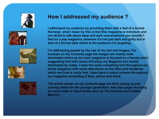
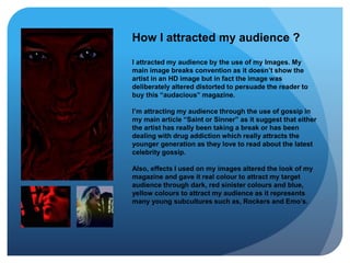
This document summarizes how the author addressed and attracted their target audience for their music magazine. They targeted a younger male audience interested in more mature topics by using a formal style similar to Kerrang! magazine. Images on the contents page featured mostly male artists but the cover story was on a female artist to appeal to both sexes. Fonts and a color scheme of blue, yellow, and black provided consistency. Artists featured included both up-and-coming young artists and older, established artists. The author attracted readers through a deliberately distorted cover image and gossip articles about artists' personal lives. Effects on images gave the magazine a dark, colorful look appealing to rock and emo subcultures.


