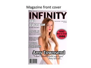
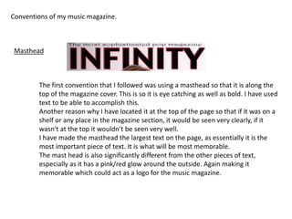
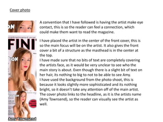
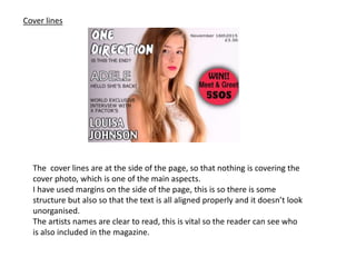
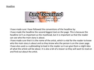
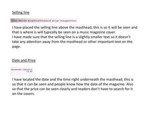
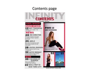
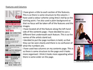
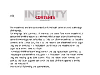
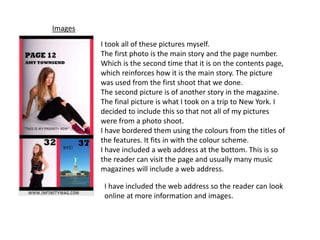
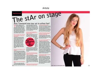
3. Conventions of my music magazine.
The first convention that I followed was using a masthead so that it is along the
top of the magazine cover. This is so it is eye catching as well as bold. I have used
text to be able to accomplish this.
Another reason why I have located it at the top of the page so that if it was on a
shelf or any place in the magazine section, it would be seen very clearly, if it
wasn't at the top it wouldn’t be seen very well.
I have made the masthead the largest text on the page, as essentially it is the
most important piece of text. It is what will be most memorable.
The mast head is also significantly different from the other pieces of text,
especially as it has a pink/red glow around the outside. Again making it
memorable which could act as a logo for the music magazine.
Masthead
4. Cover photo
A convention that I have followed is having the artist make eye
contact, this is so the reader can feel a connection, which
could make them want to read the magazine.
I have placed the artist in the center of the front cover, this is
so the main focus will be on the artist. It also gives the front
cover a bit of a structure as the masthead is in the center at
the top.
I have made sure that no bits of text are completely covering
the artists face, as it would be very unclear to see who the
main story is about. Even though there is a slight bit of text on
her hair, its nothing to big to not to be able to see Amy.
I have used the background from the photo shoot, this is
because it looks slightly more sophisticated and its nothing
bright, so it doesn’t take any attention off of the main artist.
The cover photo links to the headline, as it is the artists name
(Amy Townsend), so the reader can visually see the artist as
well.
5. Cover lines
The cover lines are at the side of the page, so that nothing is covering the
cover photo, which is one of the main aspects.
I have used margins on the side of the page, this is so there is some
structure but also so that the text is all aligned properly and it doesn’t look
unorganised.
The artists names are clear to read, this is vital so the reader can see who
is also included in the magazine.
6. Headline
I have made sure I have followed the conventions of the headline by:
I have made the headline the second biggest text on the page. This is because the
headline isn’t as important as the masthead, but it is important so that the reader
can see who the main story is about.
I have made sure that it is the name of the artist, which is vital for the reader to know
who the main story is about and so they know who the person is on the cover page.
I have also used a a subheading to lead in the reader so it can give them a slight idea
of what the article will be about. It is also a bit of a teaser so they will want to read on
and find out about the artist.
7. Selling line
I have placed the selling line above the masthead, this is so it will be seen and
that is where is will typically be seen on a music magazine cover.
I have made sure that the selling line is a slightly smaller text so it doesn’t
take any attention away from the masthead or other important text on the
page.
Date and Price
I have located the date and the time right underneath the masthead, this is
so that it can be seen and people know how the date of the magazine. Also
so that the price can be seen clearly and readers don’t have to search for it
on the covers.
9. Features and Columns
I have given a title to each section of the features.
This is so there is some structure to the column. I
have used a colour scheme using Amy’s red lip as the
starting point. I’ve also used a plain background so
that no focus will be taken off of the features and the
images.
I have located all of the feature along the left hand
side of the contents page. I have decided to use a
different font underneath each feature. This is so the
names of the artists stand out.
I decided to put the page numbers in bold, so that
they can be seen clearly and there is no confusion of
what the numbers are.
I have used two columns on my contents page. This is
so there is some structure to the page and it looks
more organised. I think it looks more appealing when
there is some order on the page.
10. Title
The masthead and the contents title have both been located at the top
of the page.
For my page title ‘contents’ I have used the same font as my masthead. I
decided to do this because as they match it doesn’t look like they have
been thrown together. I decided to fade out of my masthead so that the
contents title stands out, this is so the readers can clearly tell what page
they are on and also it is important to still have the masthead on the
page, as it almost acts as a logo.
I have located the date of magazine at the top right under contents, so
that people can see the date again. It is important that the reader knows
they are reading up to date stories. Also the reader wont have to turn
back to the cover page to see what the date of the magazine is and to
see the masthead.
These are all following the conventions.
11. Images
I took all of these pictures myself.
The first photo is the main story and the page number.
Which is the second time that it is on the contents page,
which reinforces how it is the main story. The picture
was used from the first shoot that we done.
The second picture is of another story in the magazine.
The final picture is what I took on a trip to New York. I
decided to include this so that not all of my pictures
were from a photo shoot.
I have bordered them using the colours from the titles of
the features. It fits in with the colour scheme.
I have included a web address at the bottom. This is so
the reader can visit the page and usually many music
magazines will include a web address.
I have included the web address so the reader can look
online at more information and images.
13. Main image
The main image is of the artist. This is a
convention as the reader needs to know who
the story is about. The image covers all of one
page, the other page is text.
I wanted the image to be of Amy as the main
story was about her and it is important for the
reader to know exactly who they are reading
about, also so they know what she looks like.
14. Pull quote
I added a pull quote so that the reader
can be enticed in to reading the article. It
is placed in the center of the text, placed
on a red background so that it stands out.
Index tab
I have placed an index tab on the top left
hand corner. This is so the reader can find
the main story fast by searching for
Amy’s. It also emphasises how important
the story is.
15. The article
The article has been spread on
just the one page. I have
separated the text in to three
columns. This is so the reader
isn’t just reading one large
chunk of text, as this can be very
off putting. It also makes it
easier to read.
Before the interview starts there
is a little bit of text that the
reader will read which will want
them want to read on as it is like
a small summary of what is
going to be said.
16. Headlines
The headline is located at the top of the first page of the double page
article. It is at a slight diagonal. I decided to do this as it will stand out that
it is an important thing to read. Also it is the biggest text on the page,
which makes it clearer to understand that it is the headline.
The subheading is a lead in so the reader will have an idea of what the
article will be about. Also it is located underneath the headline.
I have used black for the font as it fits in with the rest of the colour
scheme.
17. Forms
• The colour scheme of my magazine is red, grey, black and white. I felt that this was
sophisticated and it fits in with the fact that it is a pop magazine.
• I have used images which I took myself. I felt that it would be original to have my
own photos, also this is what I based my colour scheme on.
• I have used different fonts so that everything isn’t just the same and it is all pop
influenced.
• I used graphics to make shapes so that I could border my images and the top of my
article page. This is so the colour scheme can run throughout the magazine and so
it can still have the pop music feel.
18. Developing ideas
Cover
For my front cover I used ‘Q’
magazine layout as inspiration. I
liked the bold name for a
headline and the sub heading. I
changed the font so that I felt it
had a more of a pop feel. I
decided to change the font
underneath so that it was a little
more sophisticated as this is the
aim for the magazine. I also
decided to have all of my cover
lines on the left hand side just
like the Q magazine.
19. Challenging conventions
• I challenged the convention of having a smaller sized article on the contents page
as I felt that my contents page was pretty full, and I didn’t want to overcrowd the
area. Also I wanted to keep the contents page for the features and the images that
are going to be in the magazine.
• On the magazine article, I decided not to use a insert image in the text, this is was
because I felt like I had enough on the page and again I didn’t want to overcrowd
the page.