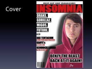
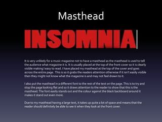
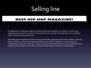
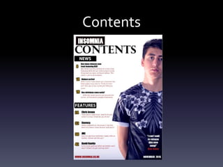
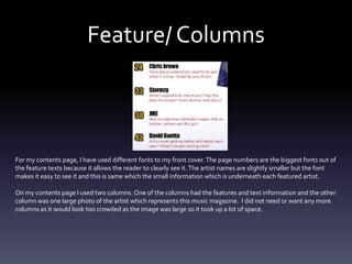
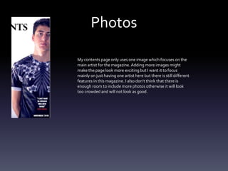
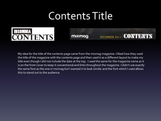
Evaluation
By Chris Akester
In what ways does your media
product use, develop or challenge
forms and conventions of real
media products?
Cover
Masthead
It is very unlikely for a music magazine not to have a masthead as the masthead is used to tell
the audience what magazine it is. It is usually placed at the top of the front cover so it is clearly
visible making I easy to read. I have placed my masthead at the top of the cover and goes
across the entire page. This is so it grabs the readers attention otherwise if it isn’t easily visible
then they might not know what the magazine is and may not feel drawn to it.
I also put the masthead in a different font to the rest of the text on the page.This is to try and
stop the page looking flat and so it draws attention to the reader to show that this is the
masthead.The font easily stands out and the colour against the black backboard around it
makes it stand out even more.
Due to my masthead having a large text, it takes up quite a lot of space and means that the
reader should definitely be able to see it when they look at the front cover.
Selling line
The selling line is used to persuade the audience to buy the magazine. It is common in most music
magazines today. and it is normal for it to be placed at the very top of the page above the masthead
which is what I have done with mine.
This selling line should be one of the first things read on the page even before the masthead. I have put
the text in black so that it is noticeable against the colour of the masthead. It is not as big as the
masthead but covers a lot of the top. t is also not as big as the masthead as it is only a small part of the
magazine which people tend to notice and will not draw attention away from the masthead.
Cover Photo
The person I used for the cover photo was to
represent an artist of a genre for the magazine
and because it was the main story of the
magazine. I wanted to make sure my model had
eye contact towards the magazine as it gives a
connection to the reader as it draws attention to
them.
The image is I the middle of the page and takes
up most of the page because it is the main
headline for the music magazine. I included the
name close to the photo so that the reader will
be able to recognise who it is about.
Cover lines
The text on the left and right side of the page are the cover lines for the magazine. I aligned them depending on which
side they are on so that the page looks neater and so that it does not interfere with the cover photo particularly where
the face is as that is essential that is it clear for the reader to see. All of my cover lines are situated on the left side of
the page as I did not want a lot of it to go over the cover photo.
The fonts for the cover lines are clear, I used impact which makes the text look bolder. I also used suitable colours.The
first four cover lines show features so I put the name in a black box to make it stand out. For the other I had put there
name, then a little pre cover story underneath inside a red box to make it stand out.The sizes are also quite big so that
the page doesn’t look empty.
Headlines
The headline features the artists name and a relevant title which is all placed on the cover photo but not
covering the face.
It is also one of the largest fonts on the page so that the reader knows it is the main headline.They can also
see this because it is placed with the cover photo.
The text underneath “Back at it again” is used as a small summary often under the name which most music
magazines have. This is relevant to the main headline and can attract the reader to read this specific headline.
I have used this one because it is supposed to symbolise how he is a new artist and discusses whether his
career will be successful or not.
Contents
Feature/ Columns
For my contents page, I have used different fonts to my front cover.The page numbers are the biggest fonts out of
the feature texts because it allows the reader to clearly see it.The artist names are slightly smaller but the font
makes it easy to see it and this is same which the small information which is underneath each featured artist.
On my contents page I used two columns. One of the columns had the features and text information and the other
column was one large photo of the artist which represents this music magazine. I did not need or want any more
columns as it would look too crowded as the image was large so it took up a lot of space.
Photos
My contents page only uses one image which focuses on the
main artist for the magazine. Adding more images might
make the page look more exciting but I want it to focus
mainly on just having one artist here but there is still different
features in this magazine. I also don’t think that there is
enough room to include more photos otherwise it will look
too crowded and will not look as good.
ContentsTitle
My idea for the title of the contents page came from the mixmag magazine. I liked how they used
the title of the magazine with the contents page and then used it as a different layout to make my
title even though I did not include the date at the top. I used the same for the magazine name as it
is on the front cover to keep it conventional and links throughout the magazine. I didn’t use exactly
the same font as the one in mixmag but I wanted it to look similar and the font which I used allows
this to stand out to the audience.
Article
Main Image
The main image is of Ben Jones because he has been the main headline throughout the magazine and I
wanted him to be on the article. If I had used someone else then it would not make as much sense to put Ben
on the front cover or as the main image on the contents page. I especially picked Ben because I have
represented him as a new artist and talking about whether he can make it or not. The audience need to know
what he looks like otherwise he might not be recognisable to the audience.The photo covers half of the page
so that he stands out and because it makes it look more professional.
Title
The colours used in the title of the article are the same as what I have used on the front
cover and contents page.The red colour is used as the title on the front cover and the black
is used as the second main colour in the magazine.The title of the article does not give
much information to the audience so it will make them want to read it so they can firstly
see who it is about and secondly find out what he does.
Main Article
The article which I have made is a interview type of article
which is to do with Ben Jones first song release. It is split
into two columns which fills up almost half of the page. It
doesn’t make the article look all over the place and is easy
to read even though the text is quite small it is readable.
Forms
All the images in my music magazine are all taken from me as this is my own magazine. All the images which I
took are suitable for the magazine and are linked to the headline and genre of the magazine.
The colours which I had mainly used in the magazine are Red,White, Black and someYellow.White was used
for the backgrounds and I wanted it to stay the same throughout the magazine. I used black colours for the
texts and some titles but mainly used Red as the title of my cover and some parts of the article. Each of these
colours compliment each other. I used similar fonts in my magazine. I used the same font for the name of my
magazine and smaller fonts that fit with lots of text.
Cover
For my front cover I didn’t really get my inspiration from a real music magazine but made it with my own ideas
of how I wanted it to look.The only things that I kept similar to real music magazines was keeping the main
image big and covering the majority of the page and to make sure that my title was big at the top so people
could easily see it. I did not get this from one particular magazine but most magazines do this and I wanted to
follow this idea.
Challenging Conventions
I don’t think I have challenged any conventions in my magazine. Some ways which I could have done is with
the photo by not giving eye contact or covering up the face so that it is not visible for the audience to clearly
see. Some real music magazines have challenged conventions where they have not included any cover lines
and just have the photo on the front cover but it works.

Question1 evaluation Chris

  • 1.
  • 2.
    In what waysdoes your media product use, develop or challenge forms and conventions of real media products?
  • 3.
  • 4.
    Masthead It is veryunlikely for a music magazine not to have a masthead as the masthead is used to tell the audience what magazine it is. It is usually placed at the top of the front cover so it is clearly visible making I easy to read. I have placed my masthead at the top of the cover and goes across the entire page. This is so it grabs the readers attention otherwise if it isn’t easily visible then they might not know what the magazine is and may not feel drawn to it. I also put the masthead in a different font to the rest of the text on the page.This is to try and stop the page looking flat and so it draws attention to the reader to show that this is the masthead.The font easily stands out and the colour against the black backboard around it makes it stand out even more. Due to my masthead having a large text, it takes up quite a lot of space and means that the reader should definitely be able to see it when they look at the front cover.
  • 5.
    Selling line The sellingline is used to persuade the audience to buy the magazine. It is common in most music magazines today. and it is normal for it to be placed at the very top of the page above the masthead which is what I have done with mine. This selling line should be one of the first things read on the page even before the masthead. I have put the text in black so that it is noticeable against the colour of the masthead. It is not as big as the masthead but covers a lot of the top. t is also not as big as the masthead as it is only a small part of the magazine which people tend to notice and will not draw attention away from the masthead.
  • 6.
    Cover Photo The personI used for the cover photo was to represent an artist of a genre for the magazine and because it was the main story of the magazine. I wanted to make sure my model had eye contact towards the magazine as it gives a connection to the reader as it draws attention to them. The image is I the middle of the page and takes up most of the page because it is the main headline for the music magazine. I included the name close to the photo so that the reader will be able to recognise who it is about.
  • 7.
    Cover lines The texton the left and right side of the page are the cover lines for the magazine. I aligned them depending on which side they are on so that the page looks neater and so that it does not interfere with the cover photo particularly where the face is as that is essential that is it clear for the reader to see. All of my cover lines are situated on the left side of the page as I did not want a lot of it to go over the cover photo. The fonts for the cover lines are clear, I used impact which makes the text look bolder. I also used suitable colours.The first four cover lines show features so I put the name in a black box to make it stand out. For the other I had put there name, then a little pre cover story underneath inside a red box to make it stand out.The sizes are also quite big so that the page doesn’t look empty.
  • 8.
    Headlines The headline featuresthe artists name and a relevant title which is all placed on the cover photo but not covering the face. It is also one of the largest fonts on the page so that the reader knows it is the main headline.They can also see this because it is placed with the cover photo. The text underneath “Back at it again” is used as a small summary often under the name which most music magazines have. This is relevant to the main headline and can attract the reader to read this specific headline. I have used this one because it is supposed to symbolise how he is a new artist and discusses whether his career will be successful or not.
  • 9.
  • 10.
    Feature/ Columns For mycontents page, I have used different fonts to my front cover.The page numbers are the biggest fonts out of the feature texts because it allows the reader to clearly see it.The artist names are slightly smaller but the font makes it easy to see it and this is same which the small information which is underneath each featured artist. On my contents page I used two columns. One of the columns had the features and text information and the other column was one large photo of the artist which represents this music magazine. I did not need or want any more columns as it would look too crowded as the image was large so it took up a lot of space.
  • 11.
    Photos My contents pageonly uses one image which focuses on the main artist for the magazine. Adding more images might make the page look more exciting but I want it to focus mainly on just having one artist here but there is still different features in this magazine. I also don’t think that there is enough room to include more photos otherwise it will look too crowded and will not look as good.
  • 12.
    ContentsTitle My idea forthe title of the contents page came from the mixmag magazine. I liked how they used the title of the magazine with the contents page and then used it as a different layout to make my title even though I did not include the date at the top. I used the same for the magazine name as it is on the front cover to keep it conventional and links throughout the magazine. I didn’t use exactly the same font as the one in mixmag but I wanted it to look similar and the font which I used allows this to stand out to the audience.
  • 13.
  • 14.
    Main Image The mainimage is of Ben Jones because he has been the main headline throughout the magazine and I wanted him to be on the article. If I had used someone else then it would not make as much sense to put Ben on the front cover or as the main image on the contents page. I especially picked Ben because I have represented him as a new artist and talking about whether he can make it or not. The audience need to know what he looks like otherwise he might not be recognisable to the audience.The photo covers half of the page so that he stands out and because it makes it look more professional.
  • 15.
    Title The colours usedin the title of the article are the same as what I have used on the front cover and contents page.The red colour is used as the title on the front cover and the black is used as the second main colour in the magazine.The title of the article does not give much information to the audience so it will make them want to read it so they can firstly see who it is about and secondly find out what he does.
  • 16.
    Main Article The articlewhich I have made is a interview type of article which is to do with Ben Jones first song release. It is split into two columns which fills up almost half of the page. It doesn’t make the article look all over the place and is easy to read even though the text is quite small it is readable.
  • 17.
    Forms All the imagesin my music magazine are all taken from me as this is my own magazine. All the images which I took are suitable for the magazine and are linked to the headline and genre of the magazine. The colours which I had mainly used in the magazine are Red,White, Black and someYellow.White was used for the backgrounds and I wanted it to stay the same throughout the magazine. I used black colours for the texts and some titles but mainly used Red as the title of my cover and some parts of the article. Each of these colours compliment each other. I used similar fonts in my magazine. I used the same font for the name of my magazine and smaller fonts that fit with lots of text.
  • 18.
    Cover For my frontcover I didn’t really get my inspiration from a real music magazine but made it with my own ideas of how I wanted it to look.The only things that I kept similar to real music magazines was keeping the main image big and covering the majority of the page and to make sure that my title was big at the top so people could easily see it. I did not get this from one particular magazine but most magazines do this and I wanted to follow this idea.
  • 19.
    Challenging Conventions I don’tthink I have challenged any conventions in my magazine. Some ways which I could have done is with the photo by not giving eye contact or covering up the face so that it is not visible for the audience to clearly see. Some real music magazines have challenged conventions where they have not included any cover lines and just have the photo on the front cover but it works.