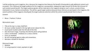
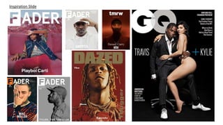
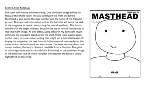
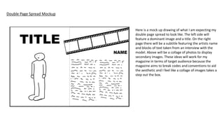
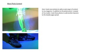
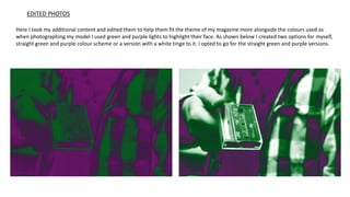
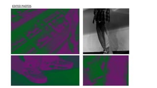
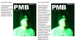
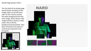
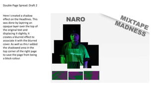
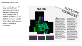
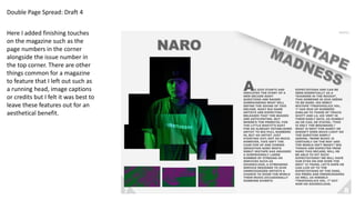
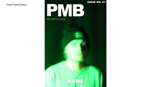
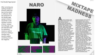
Minimalistic cover:
• Title at the top in a clean, bold font.
• An Issue number located in the top right corner above the title.
• A pull quote located under the left side of the title.
• One dominant image, if overlaps the title the photo will go behind.
• Colour coordinated - emphasis on a colour scheme
• Focus on aesthetic
• No sell lines going against codes and conventions.
• Barcode is located on the back.
Content:
• Music / Fashion / Culture
Dominant Image:
• Midshot
• Lit using projector in dark, example on right
I will be producing a print magazine, this is because the magazine then features the benefit of being able to add additional content such
as posters. This is because the target audience for this magazine is young adults, ranging from ages around 16-20 who the inclusion of
such content would benefit. The target audience gender will be male due to the magazine being on men’s culture; aimed at those
interested in music, fashion and aesthetic. This will be a good target audience because those interests are portrayed in the magazine, the
overall aesthetic of the magazine should grab the target audiences attention whilst the content would prompt them to buy it.
Inspiration Slide
The cover will feature minimal writing. One dominant image will be the
focus of the whole cover. The only writing on the front will be the
Masthead, a pull quote, the issue number and the name of the featured
person. All important information such as the barcode will be on the back
of the magazine to restrict obstructing the overall aesthetic. This format
will work for my target audience because the use of no sell-lines results in
less text more image. As well as this, using colour in my dominant image
will make the magazine stand out on the shelf. There is no wasted space
on the cover, no unnecessary writing that might put a potential reader off
buying the magazine, the text featured is the essential text needed on the
cover such as the masthead and artist name. The little amount of text that
is used is clean; the font is clear and readable from a distance. The genre
of this magazine is men’s culture (music & fashion) so the dominant image
of the artist and lack of text is fitting for this because the focus is clearly
highlighted on the artist.
Front Cover Mockup
Double Page Spread Mockup
Here is a mock up drawing of what I am expecting my
double page spread to look like. The left side will
feature a dominant image and a title. On the right
page there will be a subtitle featuring the artists name
and blocks of text taken from an interview with the
model. Above will be a collage of photos to display
secondary images. These ideas will work for my
magazine in terms of target audience because the
magazine aims to break codes and conventions to aid
the aesthetic and I feel like a collage of images takes a
step out the box.
Front Cover
For my front cover I decided to select these images. Out of taking 40 photos I picked these two with the intention of making one
the cover. I believe these photos break the conventions of a regular magazine cover as Most magazine covers have a distinct,
clear picture but to break away from this normality I have decided to use a blurry image. The image uses coloured light to match
the colour of the clothes being worn by the model.
Double Page Spread
For my double page I am planning to use a main image solely on the left page. For
this main image I took multiple pictures of the model using a small variation of lights
that would create an agreeable colour scheme as well as to highlight specific points
and convey a mood. This keeps up the aesthetical focus of the magazine. Examples
of these photos on the left. All the photos taken aren’t exactly polished, for example
many aren’t central. This is because that once the photos are cropped so there’s no
unneeded space in the photograph I will arrange them in the format of a photo
joiner. This will break conventions more as a typical magazine would just feature a
single solid main image. Also, this format will help put more of an emphasis on the
fashion element of the magazine, which is a main theme, rather than have the focus
on the artist personally. Examples of shots unfocused around the identity of the
model to the right.
Light and shadow is used in
these photos to eliminate
the unimportant parts of the
photograph, for example the
face out of these torso
focused shots on the right.
Double Page Spread Main Image
Using the photos taken I was able to pull together this photo
joiner. Rather than putting a separate collage on my double
page spread, I merged the secondary images into one photo
in a more unique way. An image like this will draw more
attention to it than a regular photo would, the aim of this is
so that it stands out on the page. The only thing wrong is a
lack of photos from the torso down, so using the same
lighting more pictures will have to be take to complete the
photo. This image is suitable for my magazine because the
magazine is intended to break codes and conventions to
stand out, so using a main image like this next to my article
does that.
More Photo Content
Here I took more photos to add more layers of content to
my magazine. Rather than the images be dominant by
portrait photographs I took more photos of different
things to add variation while also staying reflective on the
content originally intended for the magazine which was
Music / Fashion / Culture.
More Photo Content
Here I took more photos to add an extra layer of content
to my magazine. In addition to the photo-joiner I created
of my model, I took these photos to add another dynamic
to the double page spread.
Here I took my additional content and edited them to help them fit the theme of my magazine more alongside the colours used as
when photographing my model I used green and purple lights to highlight their face. As shown below I created two options for myself,
straight green and purple colour scheme or a version with a white tinge to it. I opted to go for the straight green and purple versions.
EDITED PHOTOS
EDITED PHOTOS
Front Cover: Draft 1
-Following previous
concepts the
barcode isnt located
on the cover as it
would disrupt the
aesthetic, it will be
located on the back
Front Cover: Draft 2
-After bringing the
masthead letters
closer together. I
believe I will use this
as my final front
cover as it has enough
content on the front
to grab the readers
attention whilst also
having an allure to
mystery with the
blurred photo
prompting them to be
more likely to buy the
magazine. The use of
a seraphic font for the
pull quote breaks
away from the blocky
text the rest of the
magazine features
adding a flare to it.
Double Page Spread: Draft 1
The first draft of my double page
spread shows the layout of the
images taken on the left hand
side. For this I had to remove
the white background from the
main image, shown below. If the
image had been saved as a PNG
rather than a JPG the
background would already have
been removed so this piece of
content was exported as the
wrong file.
Double Page Spread: Draft 2
Here I created a shadow
effect on the Headlines. This
was done by layering an
opaque layer over the top of
the original text and
displacing it slightly, it
creates a blurred effect to
associate it with the blurred
cover. As well as this I added
the shadowed area in the
top corner of the right page
to save the page from being
a block colour.
Double Page Spread: Draft 3
Here I added my article. The
article features quotes,
references popular culture
relevant to the magazine
whilst staying on topic to
discuss artist featured on the
left page. All text on the page
follows a grey colour scheme
which helps it contrast against
the much lighter grey
background.
Double Page Spread: Draft 4
Here I added finishing touches
on the magazine such as the
page numbers in the corner
alongside the issue number in
the top corner. There are other
things common for a magazine
to feature that I left out such as
a running head, image captions
or credits but I felt it was best to
leave these features out for an
aesthetical benefit.
Final Front Cover:
Final Double Page Spread:
After correcting any
spelling mistakes in
previous drafts this
was my final draft.
In reflection after
the production of
this double page
spread in future I
would like to add
variation in terms
of fonts. I believe
that although I used
the bold block text
for aesthetical
reasons as well as
clarity for reading, a
variation here
would’ve added
something more to
the magazine.

Magazine

  • 1.
    Minimalistic cover: • Titleat the top in a clean, bold font. • An Issue number located in the top right corner above the title. • A pull quote located under the left side of the title. • One dominant image, if overlaps the title the photo will go behind. • Colour coordinated - emphasis on a colour scheme • Focus on aesthetic • No sell lines going against codes and conventions. • Barcode is located on the back. Content: • Music / Fashion / Culture Dominant Image: • Midshot • Lit using projector in dark, example on right I will be producing a print magazine, this is because the magazine then features the benefit of being able to add additional content such as posters. This is because the target audience for this magazine is young adults, ranging from ages around 16-20 who the inclusion of such content would benefit. The target audience gender will be male due to the magazine being on men’s culture; aimed at those interested in music, fashion and aesthetic. This will be a good target audience because those interests are portrayed in the magazine, the overall aesthetic of the magazine should grab the target audiences attention whilst the content would prompt them to buy it.
  • 2.
  • 3.
    The cover willfeature minimal writing. One dominant image will be the focus of the whole cover. The only writing on the front will be the Masthead, a pull quote, the issue number and the name of the featured person. All important information such as the barcode will be on the back of the magazine to restrict obstructing the overall aesthetic. This format will work for my target audience because the use of no sell-lines results in less text more image. As well as this, using colour in my dominant image will make the magazine stand out on the shelf. There is no wasted space on the cover, no unnecessary writing that might put a potential reader off buying the magazine, the text featured is the essential text needed on the cover such as the masthead and artist name. The little amount of text that is used is clean; the font is clear and readable from a distance. The genre of this magazine is men’s culture (music & fashion) so the dominant image of the artist and lack of text is fitting for this because the focus is clearly highlighted on the artist. Front Cover Mockup
  • 4.
    Double Page SpreadMockup Here is a mock up drawing of what I am expecting my double page spread to look like. The left side will feature a dominant image and a title. On the right page there will be a subtitle featuring the artists name and blocks of text taken from an interview with the model. Above will be a collage of photos to display secondary images. These ideas will work for my magazine in terms of target audience because the magazine aims to break codes and conventions to aid the aesthetic and I feel like a collage of images takes a step out the box.
  • 5.
    Front Cover For myfront cover I decided to select these images. Out of taking 40 photos I picked these two with the intention of making one the cover. I believe these photos break the conventions of a regular magazine cover as Most magazine covers have a distinct, clear picture but to break away from this normality I have decided to use a blurry image. The image uses coloured light to match the colour of the clothes being worn by the model.
  • 6.
    Double Page Spread Formy double page I am planning to use a main image solely on the left page. For this main image I took multiple pictures of the model using a small variation of lights that would create an agreeable colour scheme as well as to highlight specific points and convey a mood. This keeps up the aesthetical focus of the magazine. Examples of these photos on the left. All the photos taken aren’t exactly polished, for example many aren’t central. This is because that once the photos are cropped so there’s no unneeded space in the photograph I will arrange them in the format of a photo joiner. This will break conventions more as a typical magazine would just feature a single solid main image. Also, this format will help put more of an emphasis on the fashion element of the magazine, which is a main theme, rather than have the focus on the artist personally. Examples of shots unfocused around the identity of the model to the right. Light and shadow is used in these photos to eliminate the unimportant parts of the photograph, for example the face out of these torso focused shots on the right.
  • 7.
    Double Page SpreadMain Image Using the photos taken I was able to pull together this photo joiner. Rather than putting a separate collage on my double page spread, I merged the secondary images into one photo in a more unique way. An image like this will draw more attention to it than a regular photo would, the aim of this is so that it stands out on the page. The only thing wrong is a lack of photos from the torso down, so using the same lighting more pictures will have to be take to complete the photo. This image is suitable for my magazine because the magazine is intended to break codes and conventions to stand out, so using a main image like this next to my article does that.
  • 8.
    More Photo Content HereI took more photos to add more layers of content to my magazine. Rather than the images be dominant by portrait photographs I took more photos of different things to add variation while also staying reflective on the content originally intended for the magazine which was Music / Fashion / Culture.
  • 9.
    More Photo Content HereI took more photos to add an extra layer of content to my magazine. In addition to the photo-joiner I created of my model, I took these photos to add another dynamic to the double page spread.
  • 10.
    Here I tookmy additional content and edited them to help them fit the theme of my magazine more alongside the colours used as when photographing my model I used green and purple lights to highlight their face. As shown below I created two options for myself, straight green and purple colour scheme or a version with a white tinge to it. I opted to go for the straight green and purple versions. EDITED PHOTOS
  • 11.
  • 12.
    Front Cover: Draft1 -Following previous concepts the barcode isnt located on the cover as it would disrupt the aesthetic, it will be located on the back Front Cover: Draft 2 -After bringing the masthead letters closer together. I believe I will use this as my final front cover as it has enough content on the front to grab the readers attention whilst also having an allure to mystery with the blurred photo prompting them to be more likely to buy the magazine. The use of a seraphic font for the pull quote breaks away from the blocky text the rest of the magazine features adding a flare to it.
  • 13.
    Double Page Spread:Draft 1 The first draft of my double page spread shows the layout of the images taken on the left hand side. For this I had to remove the white background from the main image, shown below. If the image had been saved as a PNG rather than a JPG the background would already have been removed so this piece of content was exported as the wrong file.
  • 14.
    Double Page Spread:Draft 2 Here I created a shadow effect on the Headlines. This was done by layering an opaque layer over the top of the original text and displacing it slightly, it creates a blurred effect to associate it with the blurred cover. As well as this I added the shadowed area in the top corner of the right page to save the page from being a block colour.
  • 15.
    Double Page Spread:Draft 3 Here I added my article. The article features quotes, references popular culture relevant to the magazine whilst staying on topic to discuss artist featured on the left page. All text on the page follows a grey colour scheme which helps it contrast against the much lighter grey background.
  • 16.
    Double Page Spread:Draft 4 Here I added finishing touches on the magazine such as the page numbers in the corner alongside the issue number in the top corner. There are other things common for a magazine to feature that I left out such as a running head, image captions or credits but I felt it was best to leave these features out for an aesthetical benefit.
  • 17.
  • 18.
    Final Double PageSpread: After correcting any spelling mistakes in previous drafts this was my final draft. In reflection after the production of this double page spread in future I would like to add variation in terms of fonts. I believe that although I used the bold block text for aesthetical reasons as well as clarity for reading, a variation here would’ve added something more to the magazine.