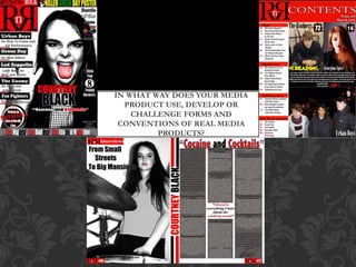
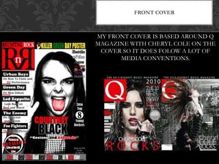
IN WHAT WAY DOES YOUR MEDIA
PRODUCT USE, DEVELOP OR
CHALLENGE FORMS AND
CONVENTIONS OF REAL MEDIA
PRODUCTS?
FRONT COVER
MY FRONT COVER IS BASED AROUND Q
MAGAZINE WITH CHERYL COLE ON THE
COVER SO IT DOES FOLOW A LOT OF
MEDIA CONVENTIONS.
HEADLINE
I have followed
conventions by having the
masthead as the largest
text on the page. This is a
common occurrence in
magazine as it catches
your eye and is the first
thing the reader reads.
Another
convention I have
followed is having
the masthead in
the centre bottom
of the page.
I have followed
conventions by having
the masthead in a
contrasting colour to the
background, this makes
it stand out from the
rest showing it
importance.
I have followed
conventions of music
magazines by having a
quotation from the main
artist featured on the
cover underneath the
headline.
I have complied to
the forms of music
magazines by
having an appealing
and interesting
possibly
controversial quote
getting the
audiences attention
MAIN IMAGE
I have followed
conventions by having the
main image placed in the
centre of the page. This
shows the importance of the
artist. This is usually in
music magazine because it
catches the eye of the reader
and may encourage people to
buy the magazine if they see
a famous artist they
recognize.
I have followed
conventions by
having the artist
looking into the
lense of the
camera giving
the effect of eye
contact and a
more personal
feel.
I have followed
conventions by having the
main logo in the top right
corner. This is often used
as the reader will read this
first. Showing its
importance.
MAGAZINE LOGO
By having the logo
stand out with bright
dominant colours.
These colours are
often reserved for
the most important
text on the page.
I have followed conventions by
using contrasting colours with
the text and graphics.
This is often used as it makes the
reader want to buy there magazine
which is why it is a common
convention of music magazines. I
have also followed the convention
of having a positive strap line
instead of a negative one. By having
“best” it makes people want to read
the magazine producing more
buyers.
STRAP LINE
I have followed conventions by
having the strapline on the bottom
of the page in a solid colour filling
the width of the page. This gives
the page a solid foundation.
I have included splash that stands out from the rest of the
magazine advertising why you should buy the magazine with a
chance to win something get something inside this is commonly
done throughout the industry but seems to be a common
occurrence in magazines such as Q Kerrang and NME.
Kerrang and most other rock magazines tend to advertise what
posters they have inside I have done the same on my cover.
SPLASH
CONTENTS
I have put the title on the top this is a convention
of music magazine.
I have used the same colour scheme as my cover
in my contents. This is use in a lot of magazine
such as Q.
I have also followed convention by placing my
magazine logo and name next to the headline
“contents”. Like Q has also done.
HEADLINE
I have followed conventions by putting the text on the left hand
side of the page.
I have followed conventions by have black text on a white
background this makes it easy to read.
I have also put the numbers in a different colour to the rest of
the text.
Put the heading in a larger font and in bold to make it clear to
the reader which is an article and what kind of article it is going
to be.
TEXT
I have put the main articles as pictures with the page numbers
in a bigger font to the others. This makes it easy to see which
articles are more significant, it may also encourage more
buyers as if they see a face they like on the contents page they
will want to read that article so buy the magazine.
I have also included an editors letter which is often done in
rock magazines particularly Kerrang.
I have included the issue number and date in the contents
page as it made the cover far to chaotic and crowded this is
commonly done by every magazine including the placement
on the page shown here.
FORMS
ARTICLE
The image takes up the whole the page
showing the importance of her, and as Alice
Burns is already a huge well known artist
artist. Many others do the same thing such
as Q magazine.
The image shows a part of the artists
lifestyle many other magazines do this as it
gives an insight into the artist life and what
they're about.
Image spanning into text but in background.
I have included props which point towards
the genre the artist is under.
MAIN IMAGE
I have done the same sort of thing in my article as my cover so this is both carrying on my
previous work on this page and is why I included this image:
My have followed many of the conventions that NME have
used in there article here.
I have put a blurb in giving information of what the article
is about and who she is. The reader will decide on this
weather not they want to read on. NME also do this.
I have followed conventions by placing a pull quote in the
middle of the rest of the articles text the majority of
magazines do this as it encourages readers to red the article
as it usually has something hooking and intriguing.
I have followed magazine conventions by having the whole
of the article in the same font and size this makes it easy to
read.
TEXT
I have broken conventions and forms by having logos dotted around the
magazine. This looked very cool and I have not seen this been done else were
BROKEN CONVENTIONS
I have also broken
conventions by not having the
barcode on the front cover
where it usually is found. I
planned to have this on the
back of my magazine this is
also commonly done but is
still a conventions and form I
have broken.
I have broken forms and
conventions by having one of my
featured pages on the cover in the
form of a vs battle this is very
rarely done but I want this to be a
common feature if this magazine
was too continue.

Question 1111111

  • 1.
    IN WHAT WAYDOES YOUR MEDIA PRODUCT USE, DEVELOP OR CHALLENGE FORMS AND CONVENTIONS OF REAL MEDIA PRODUCTS?
  • 2.
    FRONT COVER MY FRONTCOVER IS BASED AROUND Q MAGAZINE WITH CHERYL COLE ON THE COVER SO IT DOES FOLOW A LOT OF MEDIA CONVENTIONS.
  • 3.
    HEADLINE I have followed conventionsby having the masthead as the largest text on the page. This is a common occurrence in magazine as it catches your eye and is the first thing the reader reads. Another convention I have followed is having the masthead in the centre bottom of the page. I have followed conventions by having the masthead in a contrasting colour to the background, this makes it stand out from the rest showing it importance. I have followed conventions of music magazines by having a quotation from the main artist featured on the cover underneath the headline. I have complied to the forms of music magazines by having an appealing and interesting possibly controversial quote getting the audiences attention
  • 4.
    MAIN IMAGE I havefollowed conventions by having the main image placed in the centre of the page. This shows the importance of the artist. This is usually in music magazine because it catches the eye of the reader and may encourage people to buy the magazine if they see a famous artist they recognize. I have followed conventions by having the artist looking into the lense of the camera giving the effect of eye contact and a more personal feel.
  • 5.
    I have followed conventionsby having the main logo in the top right corner. This is often used as the reader will read this first. Showing its importance. MAGAZINE LOGO By having the logo stand out with bright dominant colours. These colours are often reserved for the most important text on the page. I have followed conventions by using contrasting colours with the text and graphics.
  • 6.
    This is oftenused as it makes the reader want to buy there magazine which is why it is a common convention of music magazines. I have also followed the convention of having a positive strap line instead of a negative one. By having “best” it makes people want to read the magazine producing more buyers. STRAP LINE I have followed conventions by having the strapline on the bottom of the page in a solid colour filling the width of the page. This gives the page a solid foundation.
  • 7.
    I have includedsplash that stands out from the rest of the magazine advertising why you should buy the magazine with a chance to win something get something inside this is commonly done throughout the industry but seems to be a common occurrence in magazines such as Q Kerrang and NME. Kerrang and most other rock magazines tend to advertise what posters they have inside I have done the same on my cover. SPLASH
  • 8.
  • 9.
    I have putthe title on the top this is a convention of music magazine. I have used the same colour scheme as my cover in my contents. This is use in a lot of magazine such as Q. I have also followed convention by placing my magazine logo and name next to the headline “contents”. Like Q has also done. HEADLINE
  • 10.
    I have followedconventions by putting the text on the left hand side of the page. I have followed conventions by have black text on a white background this makes it easy to read. I have also put the numbers in a different colour to the rest of the text. Put the heading in a larger font and in bold to make it clear to the reader which is an article and what kind of article it is going to be. TEXT
  • 11.
    I have putthe main articles as pictures with the page numbers in a bigger font to the others. This makes it easy to see which articles are more significant, it may also encourage more buyers as if they see a face they like on the contents page they will want to read that article so buy the magazine. I have also included an editors letter which is often done in rock magazines particularly Kerrang. I have included the issue number and date in the contents page as it made the cover far to chaotic and crowded this is commonly done by every magazine including the placement on the page shown here. FORMS
  • 12.
  • 13.
    The image takesup the whole the page showing the importance of her, and as Alice Burns is already a huge well known artist artist. Many others do the same thing such as Q magazine. The image shows a part of the artists lifestyle many other magazines do this as it gives an insight into the artist life and what they're about. Image spanning into text but in background. I have included props which point towards the genre the artist is under. MAIN IMAGE I have done the same sort of thing in my article as my cover so this is both carrying on my previous work on this page and is why I included this image:
  • 14.
    My have followedmany of the conventions that NME have used in there article here. I have put a blurb in giving information of what the article is about and who she is. The reader will decide on this weather not they want to read on. NME also do this. I have followed conventions by placing a pull quote in the middle of the rest of the articles text the majority of magazines do this as it encourages readers to red the article as it usually has something hooking and intriguing. I have followed magazine conventions by having the whole of the article in the same font and size this makes it easy to read. TEXT
  • 15.
    I have brokenconventions and forms by having logos dotted around the magazine. This looked very cool and I have not seen this been done else were BROKEN CONVENTIONS I have also broken conventions by not having the barcode on the front cover where it usually is found. I planned to have this on the back of my magazine this is also commonly done but is still a conventions and form I have broken. I have broken forms and conventions by having one of my featured pages on the cover in the form of a vs battle this is very rarely done but I want this to be a common feature if this magazine was too continue.