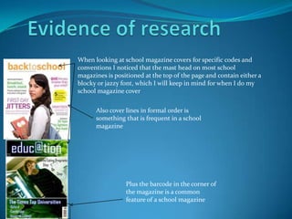
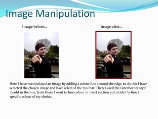
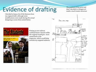
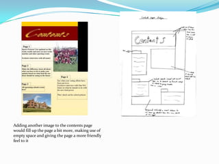
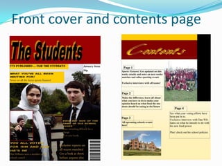
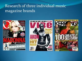
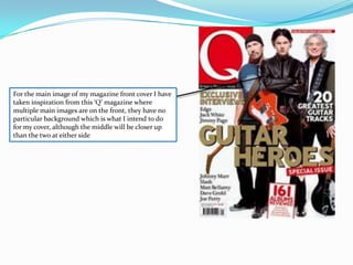
Tim Noyce set out to create a school magazine cover to learn the skills and conventions of magazine design. His research found that school magazine covers typically have the masthead at the top in a blocky or jazzy font. He practiced manipulating images by adding borders. Noyce made modifications to his draft based on what looked better. His questionnaire found that his target audience preferred rock, hip-hop and drum and bass music and wanted exclusive interviews and free items. He was influenced to include multiple main images on his cover like those seen on 'Q' magazine covers.