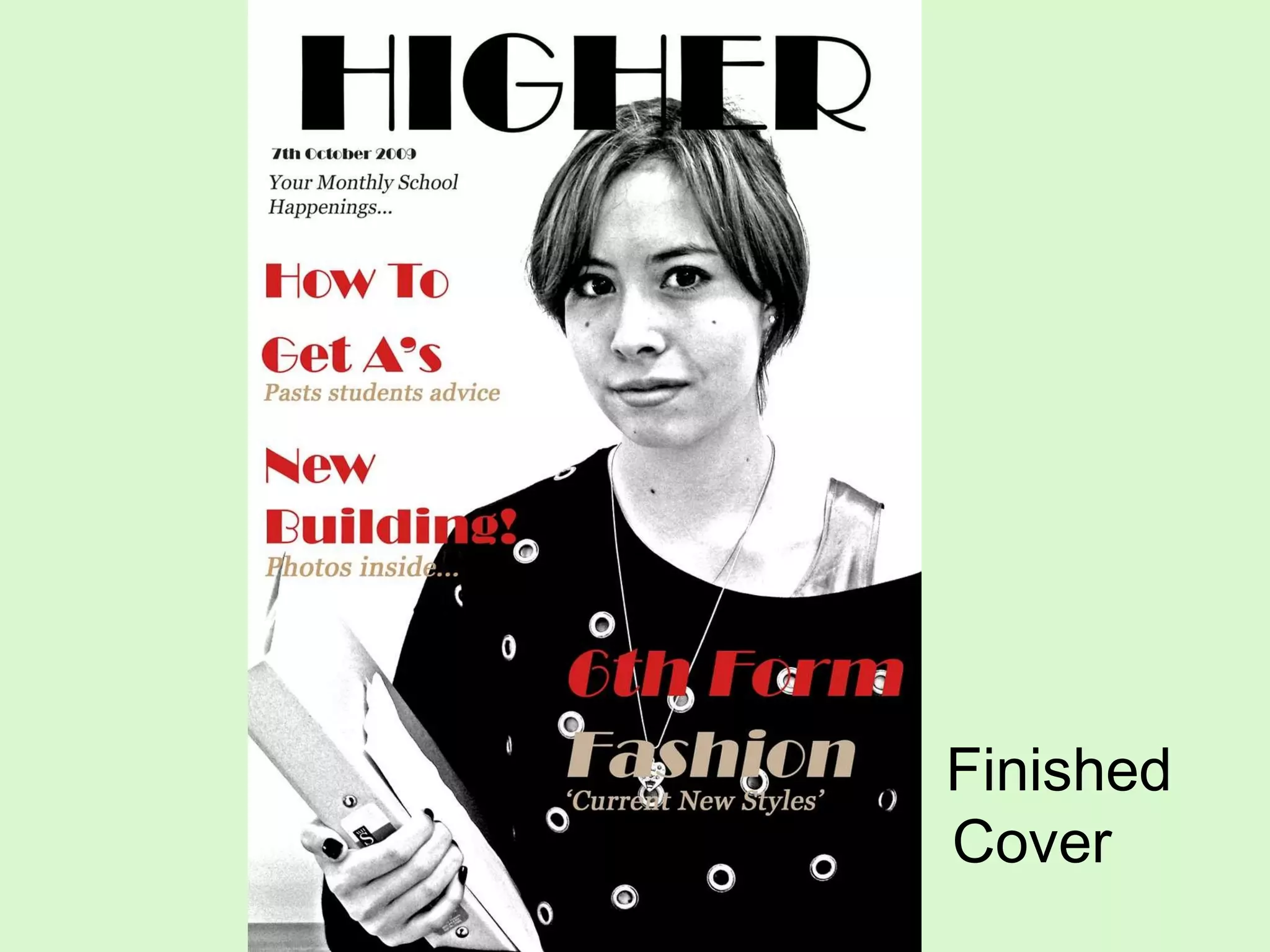
Finished Cover
Evaluation 1. In what ways does your media product use, develop or challenge the forms & conventions of real media products?  My magazine does follow the usual conventions of a magazine, for example the masthead is at the top of the cover which the cover lines then follow along the side, but for a school magazine it may be slightly different as it is more stylized and enhanced. Which consequently may seem like it isn’t a school magazine as it hasn’t kept to the usual conventions.  My cover is also kept minimal and isn’t bombarded by six different cover lines spewed across the pages so the reader can clearly see each cover line without any fuss or confusion. I decided not to add a barcode onto my front cover as it is for a school which in this circumstance, the magazines are usually free so they are not needed.  2. How does your media product represent particular social groups?  As the main topics in my magazine are fashion, music and current affairs it may apply to more performing arts based subjects, but as it is a school magazine it is not necessarily targeted at a certain group but for all young people in general, but just some of the content in the magazine may apply more to others.
Evaluation… 3. What kind of media institution might distribute your media product and why? As this is a school magazine for sixth form and college students, both boys and girls, it will only be distributed to these places, but as St Marylebone is a Performing Arts School it may just be circulated to these sorts of schools as the students can relate to the content of the magazine more.  4. Who is the audience for your media product? (the target market)?  My target market are young people currently in sixth form and college whom are interested in reading about current affairs, fashion and music.
Evaluation… 5. How did you attract/address your audience?  For a start my magazine is quite different to any other usual school magazine, so immediately my readers may be attracted to it as it not following the usual conventions of a school magazine. Also by having a black and white colour scheme followed by splashes of red for the cover lines it stands out a lot more, successfully attracting my potential readers.  The cover is also simple and kept clear, making it easy for them to read, which then the reader will get the idea that the layout of the magazine is kept simple throughout.  6.In the process of constructing this product, what have you learnt about the technologies employed?  Through the process of constructing this product I have learnt many new sort of editing techniques which I did not know before, for example moving the image and resizing it so it is positioned slightly to the right and also editing away any blemishes from the face and being able to change eye and hair colours.  I’ve also learnt that adding layers when doing something new is very important, as if something needs correcting you can simply just go back to that layer.  After then finishing my Photoshop work if I then put this on a PowerPoint document I can just go to slideshare.net and put my entire document on there instead of print screening, which is a lot more convenient and looks more professional.
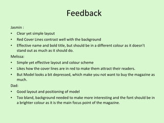
Feedback Jasmin : Clear yet simple layout Red Cover Lines contrast well with the background Effective name and bold title, but should be in a different colour as it doesn’t stand out as much as it should do. Melissa: Simple yet effective layout and colour scheme Likes how the cover lines are in red to make them attract their readers. But Model looks a bit depressed, which make you not want to buy the magazine as much. Dad: Good layout and positioning of model Too bland, background needed to make more interesting and the font should be in a brighter colour as it is the main focus point of the magazine.

Final

  • 1.
  • 2.
    Evaluation 1. Inwhat ways does your media product use, develop or challenge the forms & conventions of real media products? My magazine does follow the usual conventions of a magazine, for example the masthead is at the top of the cover which the cover lines then follow along the side, but for a school magazine it may be slightly different as it is more stylized and enhanced. Which consequently may seem like it isn’t a school magazine as it hasn’t kept to the usual conventions. My cover is also kept minimal and isn’t bombarded by six different cover lines spewed across the pages so the reader can clearly see each cover line without any fuss or confusion. I decided not to add a barcode onto my front cover as it is for a school which in this circumstance, the magazines are usually free so they are not needed. 2. How does your media product represent particular social groups? As the main topics in my magazine are fashion, music and current affairs it may apply to more performing arts based subjects, but as it is a school magazine it is not necessarily targeted at a certain group but for all young people in general, but just some of the content in the magazine may apply more to others.
  • 3.
    Evaluation… 3. Whatkind of media institution might distribute your media product and why? As this is a school magazine for sixth form and college students, both boys and girls, it will only be distributed to these places, but as St Marylebone is a Performing Arts School it may just be circulated to these sorts of schools as the students can relate to the content of the magazine more. 4. Who is the audience for your media product? (the target market)? My target market are young people currently in sixth form and college whom are interested in reading about current affairs, fashion and music.
  • 4.
    Evaluation… 5. Howdid you attract/address your audience? For a start my magazine is quite different to any other usual school magazine, so immediately my readers may be attracted to it as it not following the usual conventions of a school magazine. Also by having a black and white colour scheme followed by splashes of red for the cover lines it stands out a lot more, successfully attracting my potential readers. The cover is also simple and kept clear, making it easy for them to read, which then the reader will get the idea that the layout of the magazine is kept simple throughout. 6.In the process of constructing this product, what have you learnt about the technologies employed? Through the process of constructing this product I have learnt many new sort of editing techniques which I did not know before, for example moving the image and resizing it so it is positioned slightly to the right and also editing away any blemishes from the face and being able to change eye and hair colours. I’ve also learnt that adding layers when doing something new is very important, as if something needs correcting you can simply just go back to that layer. After then finishing my Photoshop work if I then put this on a PowerPoint document I can just go to slideshare.net and put my entire document on there instead of print screening, which is a lot more convenient and looks more professional.
  • 5.
    Feedback Jasmin :Clear yet simple layout Red Cover Lines contrast well with the background Effective name and bold title, but should be in a different colour as it doesn’t stand out as much as it should do. Melissa: Simple yet effective layout and colour scheme Likes how the cover lines are in red to make them attract their readers. But Model looks a bit depressed, which make you not want to buy the magazine as much. Dad: Good layout and positioning of model Too bland, background needed to make more interesting and the font should be in a brighter colour as it is the main focus point of the magazine.