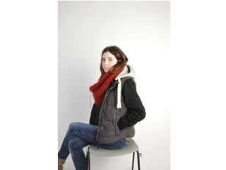
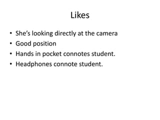
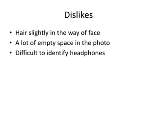
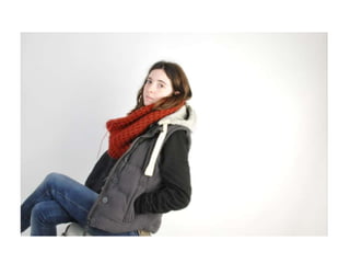
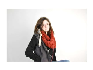
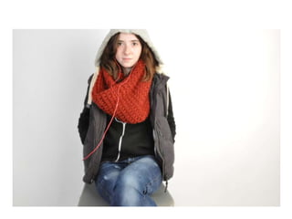
Cover Production
Photo Selection
• I have narrowed down the photo’s I have taken to
  these four images:
Likes
•   She’s looking directly at the camera
•   Good position
•   Hands in pocket connotes student.
•   Headphones connote student.
Dislikes
• Hair slightly in the way of face
• A lot of empty space in the photo
• Difficult to identify headphones
Likes
• More space around the face
• Keeps hands in pockets and Headphone
  connotations
• Less empty space.
Dislikes
• The image is rotated diagonally.
• Headphones aren’t clear
Like
•   Less empty space
•   Same connotations
•   Good position
•   Headphones easily Identifiable
•   Good eye contanct
Dislike
• Red scarf shows up a bit too much
Like
• She’s staring directly into the audience and
  directly facing them.
• Same connotations.
• Headphones Identifiable
• Good facial expression.
Dislike
• A lot of empty space
• Part of Hoody cropped out.
Choosing
• I have decided to use the third photo because
  it matches all the features of a magazine front
  cover and I personally believe it would be the
  image that sold the best.
• The red scarf fault can be dimmed down in
  editing so it doesn’t stand out as much.

Cover production

  • 1.
  • 2.
    Photo Selection • Ihave narrowed down the photo’s I have taken to these four images:
  • 4.
    Likes • She’s looking directly at the camera • Good position • Hands in pocket connotes student. • Headphones connote student.
  • 5.
    Dislikes • Hair slightlyin the way of face • A lot of empty space in the photo • Difficult to identify headphones
  • 7.
    Likes • More spacearound the face • Keeps hands in pockets and Headphone connotations • Less empty space.
  • 8.
    Dislikes • The imageis rotated diagonally. • Headphones aren’t clear
  • 10.
    Like • Less empty space • Same connotations • Good position • Headphones easily Identifiable • Good eye contanct
  • 11.
    Dislike • Red scarfshows up a bit too much
  • 13.
    Like • She’s staringdirectly into the audience and directly facing them. • Same connotations. • Headphones Identifiable • Good facial expression.
  • 14.
    Dislike • A lotof empty space • Part of Hoody cropped out.
  • 15.
    Choosing • I havedecided to use the third photo because it matches all the features of a magazine front cover and I personally believe it would be the image that sold the best. • The red scarf fault can be dimmed down in editing so it doesn’t stand out as much.