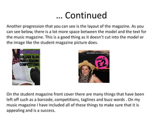
SlideShare a Scribd company logo
1 of 10
Student Magazine and Student Magazine
Preliminary Exercise
This was a task we did before we started making our music magazines. It allowed us to try
out ideas we had for our magazine and see what went well and what didn’t. As well as this,
it meant that we could experiment and get used to different types of software that may be
useful when constructing our music magazines.

I thought that this task was a very useful thing to do as it gave me new ideas and I was able
to look back at this piece of work when constructing my music magazine and maybe take
ideas that I had forgotten about and introduce it with my other pieces of work.

However, at some points it was hard not to just copy this piece of work or elements with in
it as for me if I have a piece of work in front of me I find like even if I am not realising it, the
work I produce comes out looking a lot like the other piece of work.

Overall I am proud of the student magazine that I produced, even though there were quite
a few things wrong with it as I looked back after producing my music magazine. As you will
be able to see in the next few slides, there are many improvements that I could have made
to make it better.
Front cover- Student magazine
•   I both like and dislike the picture on this front
    cover. I like how the girls look like the are
    engaging and they look like they are students
    and this fits in with the genre of the magazine.
    However, I think it would have been more
    affective if you could actually see their faces
    more and with direct mode of address to include
    the audience more. And also think it would have
    been better if it was a closer image.
•   The heading on the magazine doesn’t look
    professional and I don’t believe it is large enough
    that I catches your eye. If you compare it to the
    rest of the font on the page it doesn’t really look
    any different and it is meant to be the biggest
    thing on the front cover.
•   The font looks quite childish in a way. It doesn’t
    look very professional. Also, the fact that some
    of the text is outlined in blue doesn’t look very
    professional in my opinion, although it does
    make them stand out more, but it takes away
    from the heading.
… Continued
•   The page looks quite bare, it has large gapes
    where there is not writing or anything. A reason
    for this is that it would go into the image which
    wouldn’t be very good. It just doesn’t look very
    evenly spread out.
•   “Different theme everyday” goes onto the
    models hair a bit to much I think, as well as “Get
    involved..”. This goes into the model on the right
    to much and the text book.
•   Not all of the writing is capitalized which I think
    looks a little odd looking back at it.
•   I like the colours used though. It has a contrast
    between the different colours, like it has a light
    green and then a darker colour of purple. I also
    believe the black works well as it makes the text
    seem more important and stand out.
•   You also can’t tell what the main story is. It
    doesn’t stand out and it should be clear and
    large.
Contents page- Student magazine
•   It doesn’t actually say contents on the page
    which is a convention of a contents page. It
    doesn’t clearly seem like a contents page in my
    opinion.
•   Heading isn’t big enough.
•   I like how the writing is set out on the page and
    how there is a large heading for each section
    making it clear and east to see.
•   I don’t think that the title of each feature is easy
    to distinguish from the rest of the information. It
    should be more bolded and easier to see as it
    just looks the same.
•   Part of the ‘plus’ at the bottom of the page is cut
    off and this shouldn’t happen as it may lead to
    less legible text.
•   I think that the two top imagines (shown by the
    boxes) should be the same size and split down
    the middles as it looks a little odd and off
    balance.
Hardest things to overcome
• When producing the magazines I found it quite
  annoying as I didn’t have all of the software I needed at
  home. For example, I didn’t have Photoshop so I wasn’t
  able to edit the pictures for the magazine at home. This
  meant that I had to put off doing some of it meaning
  that I didn’t completely stick to the time I had planned
  as it took longer.
• Trying to find fonts and colours that didn’t make the
  magazine look childish was an issue I had to overcome.
How I progressed
When looking at both of the magazines, I think that I did the font and heading
better in my student magazines. As you can see below, the country pop one
looks a lot more professional and suited to it’s genre than enterprise note
does. The spacing on enterprise note is less accurate and some letter are
higher or lower than others. Both the colour and the font goes well together
for country pop and it looks less childish and more like one you would find on
a real published music magazine.
… Continued
My photography definitely improved from the student magazine. As you can see
below, they backgrounds are very different. The picture of the student magazine has a
less relevant and attractive background with just a grey fence and is very plain. But if
you look at the music magazine one it is much more appealing. I didn’t do much
editing on the student magazine picture at all, but for the music magazine picture I
changed the contrast and colour and made the models stand out more from the
background and used more of my skills to make it more attractive and different. As
well as this, the use of direct mode of address with the models looking at you for the
music magazine makes the audience more engaged instead of just looking at the
models engaging like it is for the student magazine.
… Continued
Another progression that you can see is the layout of the magazine. As you
can see below, there is a lot more space between the model and the text for
the music magazine. This is a good thing as it doesn’t cut into the model or
the image like the student magazine picture does.


On the student magazine front cover there are many things that have been
left off such as a barcode, competitions, taglines and buzz words . On my
music magazine I have included all of these things to make sure that it is
appealing and is a success.
What I have learnt from the
                   coursework
• From carrying out this coursework I have developed my skills with
  using technical programs and software. Before I started, I couldn’t
  use Photoshop and I have developed my skills and I can now use
  many of the tools confidently. I had also never used audacity to
  edit voice clips and I have improved my skills when using simple
  software such as paint, word and PowerPoint.
• I have also developed my photography skills and different types of
  shots.
• I have learnt many different codes and conventions from this
  coursework. I have learnt how to set up a music magazine and can
  apply all of these code and conventions to magazines. I am able to
  spot these codes and conventions when looking at other
  magazines and can explain them in detail.

More Related Content

What's hot

Media Preliminary presentation
Media Preliminary presentationMedia Preliminary presentation
Media Preliminary presentation10BeatBe
 
Magazine design evaluation
Magazine design evaluationMagazine design evaluation
Magazine design evaluationWanderingHalle
 
Magazine design evaluation
Magazine design evaluationMagazine design evaluation
Magazine design evaluationWanderingHalle
 
Prelim to Music Magazine
Prelim to Music MagazinePrelim to Music Magazine
Prelim to Music MagazineSuzyQuinn13
 
Evaluation 7
Evaluation 7Evaluation 7
Evaluation 7zelrii
 
Preliminary task
Preliminary taskPreliminary task
Preliminary task10bertal
 
Masthead and Font Decisions
Masthead and Font DecisionsMasthead and Font Decisions
Masthead and Font DecisionsHollyRosa98
 
Evaluation 7
Evaluation 7Evaluation 7
Evaluation 7chlojeann
 
As reflection
As reflectionAs reflection
As reflectionJosh Webb
 
Planning and research Isaac McKenzie
Planning and research Isaac McKenziePlanning and research Isaac McKenzie
Planning and research Isaac McKenzieIsaac Mckenzie
 
evaluation Question 7
evaluation Question 7 evaluation Question 7
evaluation Question 7 044007
 
7. evaluation(2) powerpoint
7. evaluation(2) powerpoint7. evaluation(2) powerpoint
7. evaluation(2) powerpointthomasmoore143
 
Feedback and Evaluation
Feedback and EvaluationFeedback and Evaluation
Feedback and Evaluationguestbe5729b
 

What's hot (20)

Media Preliminary presentation
Media Preliminary presentationMedia Preliminary presentation
Media Preliminary presentation
 
Magazine design evaluation
Magazine design evaluationMagazine design evaluation
Magazine design evaluation
 
Magazine design evaluation
Magazine design evaluationMagazine design evaluation
Magazine design evaluation
 
7. Evaluation
7. Evaluation7. Evaluation
7. Evaluation
 
Prelim to Music Magazine
Prelim to Music MagazinePrelim to Music Magazine
Prelim to Music Magazine
 
Evaluation 7
Evaluation 7Evaluation 7
Evaluation 7
 
Preliminary task
Preliminary taskPreliminary task
Preliminary task
 
Masthead and Font Decisions
Masthead and Font DecisionsMasthead and Font Decisions
Masthead and Font Decisions
 
Evaluation 7
Evaluation 7Evaluation 7
Evaluation 7
 
As reflection
As reflectionAs reflection
As reflection
 
Evaluation
Evaluation Evaluation
Evaluation
 
Evaluation 6
Evaluation 6Evaluation 6
Evaluation 6
 
Planning and research Isaac McKenzie
Planning and research Isaac McKenziePlanning and research Isaac McKenzie
Planning and research Isaac McKenzie
 
evaluation Question 7
evaluation Question 7 evaluation Question 7
evaluation Question 7
 
7. evaluation(2) powerpoint
7. evaluation(2) powerpoint7. evaluation(2) powerpoint
7. evaluation(2) powerpoint
 
7. evaluation
7. evaluation7. evaluation
7. evaluation
 
Question 7
Question 7Question 7
Question 7
 
Question 7
Question 7Question 7
Question 7
 
Question 7
Question 7Question 7
Question 7
 
Feedback and Evaluation
Feedback and EvaluationFeedback and Evaluation
Feedback and Evaluation
 

Viewers also liked

Individual focus
Individual focusIndividual focus
Individual focusKIngJoshIII
 
Dejar de fumar por el movil. Presentación de Cesar Minue en la IV jornada CNP...
Dejar de fumar por el movil. Presentación de Cesar Minue en la IV jornada CNP...Dejar de fumar por el movil. Presentación de Cesar Minue en la IV jornada CNP...
Dejar de fumar por el movil. Presentación de Cesar Minue en la IV jornada CNP...fcamarelles
 
96 Grant Court Charles Town WV 25414
96 Grant Court Charles Town WV 2541496 Grant Court Charles Town WV 25414
96 Grant Court Charles Town WV 25414Heather Harley
 
Intro a la epidemio clase 4
Intro a la epidemio clase 4Intro a la epidemio clase 4
Intro a la epidemio clase 4Ariel Aranda
 
Hospital carrea-odontopediatria
Hospital carrea-odontopediatriaHospital carrea-odontopediatria
Hospital carrea-odontopediatriaMeluZambrano
 
Gráficos microsoft excel 2010
Gráficos microsoft excel 2010Gráficos microsoft excel 2010
Gráficos microsoft excel 2010Yochi Cun
 
Authentic Reality-How to Guide
Authentic Reality-How to GuideAuthentic Reality-How to Guide
Authentic Reality-How to GuideTony Jeton Selimi
 
Photo requirements for U.S. Visa
Photo requirements for U.S. VisaPhoto requirements for U.S. Visa
Photo requirements for U.S. VisaIVAMCONGEN
 
Requirimientos para la foto de la Visa Americana
Requirimientos para la foto de la Visa AmericanaRequirimientos para la foto de la Visa Americana
Requirimientos para la foto de la Visa AmericanaIVAMCONGEN
 
The problems and prosperity of publishing industry of bangladesh
The problems and prosperity of publishing industry of bangladeshThe problems and prosperity of publishing industry of bangladesh
The problems and prosperity of publishing industry of bangladeshUniversity of Dhaka
 
Archaeological, historical and cultural protection (2)
Archaeological, historical and cultural protection (2)Archaeological, historical and cultural protection (2)
Archaeological, historical and cultural protection (2)Mehmet Tuncer
 
La planificación de una campaña online. Lineamientos e ideas para mejorar los...
La planificación de una campaña online. Lineamientos e ideas para mejorar los...La planificación de una campaña online. Lineamientos e ideas para mejorar los...
La planificación de una campaña online. Lineamientos e ideas para mejorar los...Gustavo Ripoll
 
Alfredo bullard
Alfredo bullardAlfredo bullard
Alfredo bullardsageta12
 
Exercises for KG1
Exercises for KG1Exercises for KG1
Exercises for KG1Engy Samir
 

Viewers also liked (20)

Individual focus
Individual focusIndividual focus
Individual focus
 
Dejar de fumar por el movil. Presentación de Cesar Minue en la IV jornada CNP...
Dejar de fumar por el movil. Presentación de Cesar Minue en la IV jornada CNP...Dejar de fumar por el movil. Presentación de Cesar Minue en la IV jornada CNP...
Dejar de fumar por el movil. Presentación de Cesar Minue en la IV jornada CNP...
 
96 Grant Court Charles Town WV 25414
96 Grant Court Charles Town WV 2541496 Grant Court Charles Town WV 25414
96 Grant Court Charles Town WV 25414
 
English 2
English 2English 2
English 2
 
Intro a la epidemio clase 4
Intro a la epidemio clase 4Intro a la epidemio clase 4
Intro a la epidemio clase 4
 
Hospital carrea-odontopediatria
Hospital carrea-odontopediatriaHospital carrea-odontopediatria
Hospital carrea-odontopediatria
 
Gráficos microsoft excel 2010
Gráficos microsoft excel 2010Gráficos microsoft excel 2010
Gráficos microsoft excel 2010
 
οικουμενικο πατριαρχειο
οικουμενικο πατριαρχειοοικουμενικο πατριαρχειο
οικουμενικο πατριαρχειο
 
Making wip
Making   wipMaking   wip
Making wip
 
Authentic Reality-How to Guide
Authentic Reality-How to GuideAuthentic Reality-How to Guide
Authentic Reality-How to Guide
 
Buquemargaritas
BuquemargaritasBuquemargaritas
Buquemargaritas
 
Photo requirements for U.S. Visa
Photo requirements for U.S. VisaPhoto requirements for U.S. Visa
Photo requirements for U.S. Visa
 
Requirimientos para la foto de la Visa Americana
Requirimientos para la foto de la Visa AmericanaRequirimientos para la foto de la Visa Americana
Requirimientos para la foto de la Visa Americana
 
The problems and prosperity of publishing industry of bangladesh
The problems and prosperity of publishing industry of bangladeshThe problems and prosperity of publishing industry of bangladesh
The problems and prosperity of publishing industry of bangladesh
 
Trabalho de Semiótica
Trabalho de SemióticaTrabalho de Semiótica
Trabalho de Semiótica
 
Archaeological, historical and cultural protection (2)
Archaeological, historical and cultural protection (2)Archaeological, historical and cultural protection (2)
Archaeological, historical and cultural protection (2)
 
La planificación de una campaña online. Lineamientos e ideas para mejorar los...
La planificación de una campaña online. Lineamientos e ideas para mejorar los...La planificación de una campaña online. Lineamientos e ideas para mejorar los...
La planificación de una campaña online. Lineamientos e ideas para mejorar los...
 
Alfredo bullard
Alfredo bullardAlfredo bullard
Alfredo bullard
 
Escoria fabricacao
Escoria fabricacaoEscoria fabricacao
Escoria fabricacao
 
Exercises for KG1
Exercises for KG1Exercises for KG1
Exercises for KG1
 

Similar to Student Magazine Design Skills

Similar to Student Magazine Design Skills (20)

Evaluation Question 7
Evaluation Question 7Evaluation Question 7
Evaluation Question 7
 
Question 7
Question 7Question 7
Question 7
 
Final Evaluation 7 power point
Final Evaluation 7 power pointFinal Evaluation 7 power point
Final Evaluation 7 power point
 
7. evaluation(1)
7. evaluation(1)7. evaluation(1)
7. evaluation(1)
 
Question 7- Evaluation
Question 7- EvaluationQuestion 7- Evaluation
Question 7- Evaluation
 
Annalysing my college magazine
Annalysing my college magazineAnnalysing my college magazine
Annalysing my college magazine
 
Evaluation question 5
Evaluation question 5Evaluation question 5
Evaluation question 5
 
Evaluation Question 7
Evaluation Question 7Evaluation Question 7
Evaluation Question 7
 
Evaluation media 4 7
Evaluation media 4 7Evaluation media 4 7
Evaluation media 4 7
 
Evaluation 7
Evaluation 7Evaluation 7
Evaluation 7
 
Evaluation 7
Evaluation 7Evaluation 7
Evaluation 7
 
Evaluation question 7
Evaluation question 7Evaluation question 7
Evaluation question 7
 
Evaluation question 7
Evaluation question 7Evaluation question 7
Evaluation question 7
 
7. evaluation(3) magazine final
7. evaluation(3) magazine final7. evaluation(3) magazine final
7. evaluation(3) magazine final
 
7. evaluation(3)
7. evaluation(3)7. evaluation(3)
7. evaluation(3)
 
Question 7 eval
Question 7 evalQuestion 7 eval
Question 7 eval
 
Question 7 - final evaluation
Question 7 - final evaluationQuestion 7 - final evaluation
Question 7 - final evaluation
 
Question 7 - Evalutation
Question 7 - EvalutationQuestion 7 - Evalutation
Question 7 - Evalutation
 
Evaluation Question 7
Evaluation Question 7Evaluation Question 7
Evaluation Question 7
 
Question 7 Evaluation
Question 7 EvaluationQuestion 7 Evaluation
Question 7 Evaluation
 

Student Magazine Design Skills

  • 1. Student Magazine and Student Magazine
  • 2. Preliminary Exercise This was a task we did before we started making our music magazines. It allowed us to try out ideas we had for our magazine and see what went well and what didn’t. As well as this, it meant that we could experiment and get used to different types of software that may be useful when constructing our music magazines. I thought that this task was a very useful thing to do as it gave me new ideas and I was able to look back at this piece of work when constructing my music magazine and maybe take ideas that I had forgotten about and introduce it with my other pieces of work. However, at some points it was hard not to just copy this piece of work or elements with in it as for me if I have a piece of work in front of me I find like even if I am not realising it, the work I produce comes out looking a lot like the other piece of work. Overall I am proud of the student magazine that I produced, even though there were quite a few things wrong with it as I looked back after producing my music magazine. As you will be able to see in the next few slides, there are many improvements that I could have made to make it better.
  • 3. Front cover- Student magazine • I both like and dislike the picture on this front cover. I like how the girls look like the are engaging and they look like they are students and this fits in with the genre of the magazine. However, I think it would have been more affective if you could actually see their faces more and with direct mode of address to include the audience more. And also think it would have been better if it was a closer image. • The heading on the magazine doesn’t look professional and I don’t believe it is large enough that I catches your eye. If you compare it to the rest of the font on the page it doesn’t really look any different and it is meant to be the biggest thing on the front cover. • The font looks quite childish in a way. It doesn’t look very professional. Also, the fact that some of the text is outlined in blue doesn’t look very professional in my opinion, although it does make them stand out more, but it takes away from the heading.
  • 4. … Continued • The page looks quite bare, it has large gapes where there is not writing or anything. A reason for this is that it would go into the image which wouldn’t be very good. It just doesn’t look very evenly spread out. • “Different theme everyday” goes onto the models hair a bit to much I think, as well as “Get involved..”. This goes into the model on the right to much and the text book. • Not all of the writing is capitalized which I think looks a little odd looking back at it. • I like the colours used though. It has a contrast between the different colours, like it has a light green and then a darker colour of purple. I also believe the black works well as it makes the text seem more important and stand out. • You also can’t tell what the main story is. It doesn’t stand out and it should be clear and large.
  • 5. Contents page- Student magazine • It doesn’t actually say contents on the page which is a convention of a contents page. It doesn’t clearly seem like a contents page in my opinion. • Heading isn’t big enough. • I like how the writing is set out on the page and how there is a large heading for each section making it clear and east to see. • I don’t think that the title of each feature is easy to distinguish from the rest of the information. It should be more bolded and easier to see as it just looks the same. • Part of the ‘plus’ at the bottom of the page is cut off and this shouldn’t happen as it may lead to less legible text. • I think that the two top imagines (shown by the boxes) should be the same size and split down the middles as it looks a little odd and off balance.
  • 6. Hardest things to overcome • When producing the magazines I found it quite annoying as I didn’t have all of the software I needed at home. For example, I didn’t have Photoshop so I wasn’t able to edit the pictures for the magazine at home. This meant that I had to put off doing some of it meaning that I didn’t completely stick to the time I had planned as it took longer. • Trying to find fonts and colours that didn’t make the magazine look childish was an issue I had to overcome.
  • 7. How I progressed When looking at both of the magazines, I think that I did the font and heading better in my student magazines. As you can see below, the country pop one looks a lot more professional and suited to it’s genre than enterprise note does. The spacing on enterprise note is less accurate and some letter are higher or lower than others. Both the colour and the font goes well together for country pop and it looks less childish and more like one you would find on a real published music magazine.
  • 8. … Continued My photography definitely improved from the student magazine. As you can see below, they backgrounds are very different. The picture of the student magazine has a less relevant and attractive background with just a grey fence and is very plain. But if you look at the music magazine one it is much more appealing. I didn’t do much editing on the student magazine picture at all, but for the music magazine picture I changed the contrast and colour and made the models stand out more from the background and used more of my skills to make it more attractive and different. As well as this, the use of direct mode of address with the models looking at you for the music magazine makes the audience more engaged instead of just looking at the models engaging like it is for the student magazine.
  • 9. … Continued Another progression that you can see is the layout of the magazine. As you can see below, there is a lot more space between the model and the text for the music magazine. This is a good thing as it doesn’t cut into the model or the image like the student magazine picture does. On the student magazine front cover there are many things that have been left off such as a barcode, competitions, taglines and buzz words . On my music magazine I have included all of these things to make sure that it is appealing and is a success.
  • 10. What I have learnt from the coursework • From carrying out this coursework I have developed my skills with using technical programs and software. Before I started, I couldn’t use Photoshop and I have developed my skills and I can now use many of the tools confidently. I had also never used audacity to edit voice clips and I have improved my skills when using simple software such as paint, word and PowerPoint. • I have also developed my photography skills and different types of shots. • I have learnt many different codes and conventions from this coursework. I have learnt how to set up a music magazine and can apply all of these code and conventions to magazines. I am able to spot these codes and conventions when looking at other magazines and can explain them in detail.