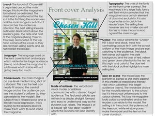
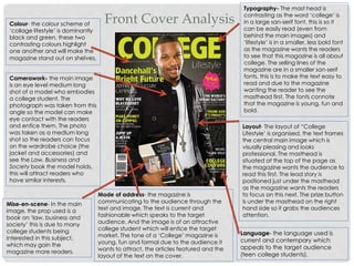
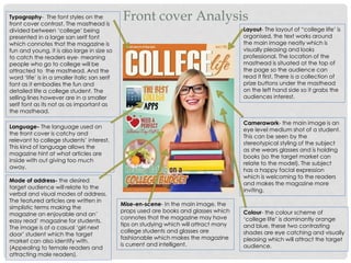
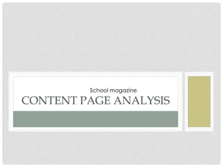
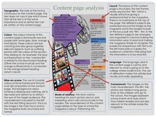
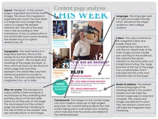
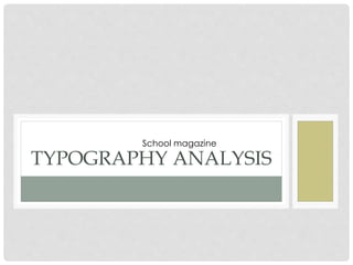
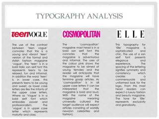
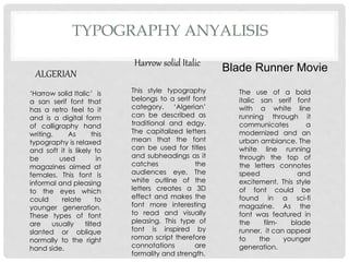
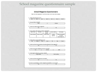
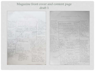
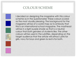
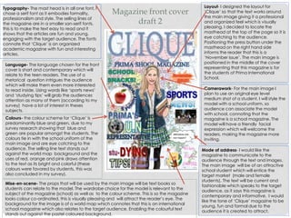
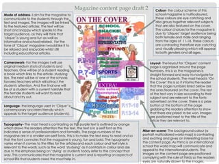
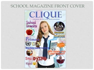
SlideShare a Scribd company logo
1 of 30
PRELIMINARY TASK
School magazine
INTRODUCTION
For my AS level media studies course work, my first task was to
produce a draft front cover and content page of a school/collage
magazine, featuring a medium close up shot of a student with an
appropriately laid out text and masthead. Through this I have
completed research that has developed the necessary skills
needed to make a foundation portfolio. This will demonstrate my
grasp of the DTP program. I have analysed 3 front covers of school
magazines and 2 content pages, in theses I have identified the
terminology and analysed the use of: typography, layout,
language, colour, camerawork, mise-en-scene and mode of
address. From this research I have been able to plan my school
magazine by doing a hand drawn draft layout, sample of font
styles and sample colour schemes, in order to make my magazine
the most professional and accurate it can be.
FRONT COVER ANALYSIS
School magazine
Front cover Analysis
Typography- The style of the fonts
on the front cover contrast. The
masthead is in a large italic fancy
serif font which connotes that the
magazine has a certain element
of class and exclusivity. It is also
large in size so to catch the
reader’s eye. The selling lines
however are in a smaller san serif
font as to make it easy to read
against the main image.
Layout- The layout of ‘Chosen Hill’
is organized around the main
image, this shows the magazine is
formal and co-ordinated. The
masthead is positioned at the top
so it is the first thing the reader sees
and the main image is central so it
also catches the audiences
attention. The best selling lines are
outlined in black which draws the
reader’s gaze. The date and cost
of the magazine (being ‘Free’ in
this case) are located at the top
hand corners of the cover as they
are not main selling points, and do
not interest the reader.
Language- The language used on
the front cover is short and snappy
which relates to the target audience
(teens) and allows the magazine to
subtly revel what's inside with out
giving away too much.
Colour- the colour scheme for ‘Chosen
Hill’ is blue and black, these two
contrasting colours tie in with the school
uniform of the main image and are eye
catching to the audience. The black
text stands out against the pale
background and the uses of red, yellow
and green draw attention to the text as
it is bright and colorful. The blue text
with the black outline highlights a main
selling line.
Camerawork- the main image is
an eye level medium long shot of
a student. This is so the text can
neatly fit around the central
image and so the audience can
see the student’s uniform (so they
can relate to the model). The
subject has a relaxed pose and a
friendly facial expression. This is
inviting to the readers and will
make them want to read inside
the magazine.
Mise-en-scene- the model uses the
banister as a prop as she leans against
it, this creates a relaxed and friendly
vibe which will attract the target
audience (teens). The wardrobe choice
for the model is relevant to the school
(as it is the school uniform) and to the
colour scheme. This is so the magazine
looks colour co-ordinated and so the
readers can relate to the model. The
setting is in the school, the paleness of
the trees and white window panes
make the model and the text on the
cover stand out.
Mode of address- the verbal and
visual modes of address
communicate with a desired target
audience. The featured articles are
written in a simple, straight forward
and easy to understand way so the
students can relate. The image is of
a casual ‘girl next door’ student
which the readers can also identify
with.
Front Cover Analysis
Typography- The mast head is
contrasting as the word ‘college’ is
in a large san-serif font, this is so it
can be easily read (even from
behind the main images) and
‘lifestyle’ is in a smaller, less bold font
as the magazine wants the readers
to see that this magazine is all about
college. The selling lines of the
magazine are in a smaller san-serif
fonts, this is to make the text easy to
read and due to the magazine
wanting the reader to see the
masthead first. The fonts connote
that the magazine is young, fun and
bold.
Layout- The layout of “College
Lifestyle’ is organised, the text frames
the central main image which is
visually pleasing and looks
professional. The masthead is
situated at the top of the page as
the magazine wants the audience to
read this first. The lead story is
positioned just under the masthead
as the magazine wants the readers
to focus on this next. The prize button
is under the masthead on the right
hand side so it grabs the audiences
attention.
Language- the language used is
current and contempary which
appeals to the target audience
(teen college students).
Colour- the colour scheme of
‘collage lifestyle’ is dominantly
black and green, these two
contrasting colours highlight
one another and will make the
magazine stand out on shelves.
Camerawork- the main image
is an eye level medium long
shot of a model who embodies
a college student. The
photograph was taken from this
angle so the model can make
eye contact with the readers
and entice them. The photo
was taken as a medium long
shot so the readers can focus
on the wardrobe choice (the
jacket and accessories) and
see the Law, Business and
Society book the model holds,
this will attract readers who
have similar interests.
Mise-en-scene- In the main
image, the prop used is a
book on ‘law, business and
society’ this is due to many
college students being
interested in this subject,
which may gain the
magazine more readers.
Mode of address- the magazine is
communicating to the audience through the
text and image. The text is current and
fashionable which speaks to the target
audience. And the image is of an attractive
college student which will entice the target
market. The tone of a ‘College’ magazine is
young, fun and formal due to the audience it
wants to attract, the articles featured and the
layout of the text on the cover.
Front cover AnalysisTypography- The font styles on the
front cover contrast. The masthead is
divided between ‘college’ being
presented in a large san serif font
which connotes that the magazine is
fun and young, it is also large in size so
to catch the readers eye- meaning
people who go to college will be
attracted to the masthead. And the
word ‘life’ is in a smaller italic san serif
font as it embodies the fun and
detailed life a college student. The
selling lines however are in a smaller
serif font as its not as as important as
the masthead.
Layout- The layout of “college life’ is
organised, the text works around
the main image neatly which is
visually pleasing and looks
professional. The location of the
masthead is situated at the top of
the page so the audience can
read it first. There is a collection of
prize buttons under the masthead
on the left hand side so it grabs the
audiences interest.
Language- The language used on
the front cover is catchy and
relevant to college students’ interest.
This kind of language allows the
magazine hint at what articles are
inside with out giving too much
away.
Colour- the colour scheme of
‘college life’ is dominantly orange
and blue, these two contrasting
shades are eye catching and visually
pleasing which will attract the target
audience.
Camerawork- the main image is an
eye level medium shot of a student.
This can be seen by the
stereotypical styling of the subject
as she wears glasses and is holding
books (so the target market can
relate to the model). The subject
has a happy facial expression
which is welcoming to the readers
and makes the magazine more
inviting.
Mise-en-scene- In the main image, the
props used are books and glasses which
connotes that the magazine may have
tips on studying which will attract many
college students and glasses are
fashionable which makes the magazine
is current and intelligent.
Mode of address- the desired
target audience will relate to the
verbal and visual modes of address.
The featured articles are written in
simplistic terms making the
magazine an enjoyable and an’
easy read’ magazine for students.
The image is of a casual ‘girl next
door’ student which the target
market can also identify with.
(Appealing to female readers and
attracting male readers).
CONTENT PAGE ANALYSIS
School magazine
Content page analysis
Layout- The layout of this content
page is structured, the text frames
neatly around the ‘film’ which is
visually attractive giving a
professional feel to the magazine.
There is no masthead at the top of
the page. The different subjects are
positioned around the image as the
magazine wants the readers to look
at the focus pull- the ‘film’, first. In the
text different subjects are arranged
and organised in columns making the
information easy to read and making
the magazine simple to navigate. The
purple star shaped box with text is on
the left hand side so it grabs the
audience’s attention indicating that
this information is to be read first.
Language- The language used in
the content page is catchy and
relevant to what is going on in the
college where students live. The use
of alliteration makes the articles look
visually and orally appealing.
Typography- The style of the fonts is
continuous on the content page. The
text does not vary in size which shows
that all the text is of the same
importance and so all the text can
be written on the content page.
Colour- the colour scheme of this
content page is dominantly red and
purple (with some grey, blue, orange
and black), these colours are eye
catching and also group together
relevant aspects. Such as outlining
photos with the colour of the section
they belong to, for example; the blue
out lined photo on the ‘camera film’
is related to the blue boxed heading-
(Oliver the school musical) and the
orange outlined photo is connected
to the orange boxed heading-
(what’s new?)
Mode of address- the short catchy
headings for each section are fun and
interesting which will communicate to the
readers. The visual element of the content
page relates to the type of school the
magazine is about- Preforming Arts.
Camerawork- The images on the
main visual element- the film, the
photos are medium long group
shots of the children who go to
the school. The images represent
school events and clubs which
may interest readers and are also
relevant to the articles inside the
magazine.
Mise-en-scene- The use of a pastel
colour scheme frames and formats
over all composition of the content
page. The background colour
scheme is relaxing and calming, yet is
also bold and vibrant so to attract
the eye of the target audience. The
visual element is located to the left
with the text fitting around it, this is so
the image is the main focus and so
the magazine looks structured and
formal.
Layout- The layout of this content
page is organized around the main
images. This shows the magazine is
organised and visual. The mast head
is in large font and a bright blue
colour so it grabs the readers’
attention first. The rest of the texts
vary in size according to their
importance. It has a a prize button in
the bottom left hand corner drawing
the readers focus to a great
deal/money off.
Content page analysis
Typography- The mast head is in a
large blue serif font, this is so the
reader knows that all the articles are
new and current . The numbers and
headings of the pages are large to
show which pictures can be found on
which page and what they
represent. The article titles vary from;
rhetorical questions to quotes to
rhymes . The fonts connote that the
magazine is fun, up to date.
Language- the language used
is in style and student friendly
which will attract the target
audience -teen college
students.
Colour- the colour scheme for
this magazine is blue and
purple. These two
complimentary colours tie in
with the fun vibrant style of the
main image and are visually
eye catching to the audience.
The colourful text draws
attention to the information as it
is bright and inviting. The large
blue text at the top of the page
has a small shadow which
indicates that this is the most
important text on the page.
Mise-en-scene- The background
colour (white) is fresh and gives a
neutral base so the contrasting and
exciting colours of the text really
stand out as they pop on the page.
The visual aspects on the content
page are positioned complying to
the rule of thirds so the readers’ eyes
are naturally drawn to the images.
Camerawork- The images on the content page
vary from medium close ups to high angled
long shots, the content being students from the
school taking part in work shops and studying,
which indicates that the photos are related to
the articles featured.
Mode of address- The relaxed
informal language of the
headings relate to the student
readers and will make the
content page easy to read and
navigate. The colours and
images are relevant to what
they are doing in school and
will make the magazine more
interesting.
TYPOGRAPHY ANALYSIS
School magazine
TYPOGRAPHY ANALYSIS
The use of the contrast
between ‘teen vogue’
connotes that this is a
young and vibrant ‘teen’
version of the formal and
stylish fashion magazine
‘vogue’. The ‘teen’ is in a
bold italic san serif font this
represents teens to be
relaxed, fun and informal.
In addition the word ‘teen’
is in lower case, this
presents teens to be young
and sweet, as lower case
letters are like the infants of
the upper case letters.
Where as ‘Vogue’ is in a
bold serif font which
embodies power and
professionalism. The
‘vogue’ is in upper case
letter which represents
maturity and class.
The ‘cosmopolitan’
magazine mast head is in a
bold san serif font this
connotes that the
magazine is adventurous
and informal. The uses of
the colour pink shows the
magazine to be aimed at
young females and the
reader will anticipate that
the magazine will have
feminine gossip articles. As
‘cosmopolitan’ is in all
upper case letters it can be
interpreted that the
magazine is bold and loud.
With the name of the
magazine meaning
universally cultured the
target audience will expect
articles consisting of worldly
news(on celebrities and
fashion).
This typography for
‘Elle’ magazine is
sophisticated and
chic. The use of a san
serif font presents
elegance and
experience. The
spacing of the lettering
signifies symmetry and
consistency which
creates a
commensurate and
uniformed look for the
logo. From this mast
head readers can
expect a luxury fashion
and beauty magazine.
The tone for ‘Elle’
represents exclusivity
and grandiosity.
ALGERIAN
Harrow solid Italic Blade Runner Movie
This style typography
belongs to a serif font
category. ‘Algerian’
can be described as
traditional and edgy.
The capitalized letters
mean that the font
can be used for titles
and subheadings as it
catches the
audiences eye. The
white outline of the
letters creates a 3D
effect and makes the
font more interesting
to read and visually
pleasing. This type of
font is inspired by
roman script therefore
connotations are
formality and strength.
‘Harrow solid Italic’ is
a san serif font that
has a retro feel to it
and is a digital form
of calligraphy hand
writing. As this
typography is relaxed
and soft it is likely to
be used in
magazines aimed at
females. This font is
informal and pleasing
to the eyes which
could relate to
younger generation.
These types of font
are usually tilted
slanted or oblique
normally to the right
hand side.
The use of a bold
italic san serif font
with a white line
running through it
communicates a
modernized and an
urban ambiance. The
white line running
through the top of
the letters connotes
speed and
excitement. This style
of font could be
found in a sci-fi
magazine. As the
font was featured in
the film- blade
runner, it can appeal
to the younger
generation.
TYPOGRAPHY ANYALISIS
QUESTIONNAIRE SAMPLE
School magazine
School magazine questionnaire sample
QUESTIONNAIRE RESULTS
School magazine
School Magazine Questionnaire Results
Q1 lower secondary=6 upper secondary=4
Q2 Male=3 Female=7
Q3 Yes=9 No=1
Q4 Sports news=8 Food tips=4
Studying advice= 10 Career options=10
Horoscopes= 7 School fashion=7
School events=9 School clubs=4
Student opinions=8 Recommendation=2
Q5 Red=3 Orange=1 Yellow=2
Green=2 Pink=6 Blue=5
Purple=1
Q6 Yes= 8 No=2
Q7 Fun=4 Formal= 0 Both=6
Q8 Long articles=1 Short articles=9
Q9 Yes=7 No=3
Q10 Yes=8 No=2
60%
40%
Year Groups
lower secondary upper secondary
30%
70%
Genders of Students
Male Female
90%
10%
Students who would read
the school magazine
yes no
12%
6%
14%
14%
10%
10%
13%
6%
12%
3%
What students want to read about
Sports New
Food Tips
Studinging Advice
Career Options
Horoscopes
School Fashion
School Events
School Clubs
Student Opinion
Recommendations
80%
20%
Students who would like
puzzels and quizzes in the
magazine
yes no
15% 5%
10%
10%
30%
25%
5%
What colours Students find eye
catching
Red Orange Yellow Green Pink Blue Purple
40%
0%
60%
What type of magazine would
students like the school
magazine to be
fun formal both
10%
90%
What length articles would
students like to read
Long Articles Short Articles
70%
30%
Would students like to be
included in articles in the
school magazine
Yes No
80%
20%
Whether students would participate in
school magazine competitions
Yes No
FRONT COVER AND CONTENT PAGE
ROUGH DRAFT
School magazine
Magazine front cover and content page
draft 1
COLOUR SCHEME
School magazine
COLOUR SCHEME
I decided on designing the magazine with this colour
scheme as in the questionaries' these colours scored
as the most visually pleasing. The background for the
magazine will be of a world map as to embody that
this is an international school magazine. The masthead
will be in a light purple shade as that is a neutral
colour that both genders of students like. The other
colours will be used in the subtitles, depending on the
target audience that the article will attract; pink for
girls, navy for boys and green & red is for both.
FRONT COVER AND CONTENT PAGE
INITIAL DESIGNS
School magazine
Magazine front cover
draft 2
Layout- I designed the layout for
‘Clique’ so that the text works around
the main image giving it a professional
and organized feel which is visually
pleasing. I decided to locate the
masthead at the top of the page so it is
eye catching to the audience.
Positioning the press button under the
masthead on the right hand side
informs the reader that this is a
‘November issue’. The main image is
positioned in the middle of the cover
representing that this magazine is for
the students of Prima International
School.
Typography- The mast head is in all one font, I
chose a serif font as it embodies formality,
professionalism and style. The selling lines of
the magazine are in a smaller san-serif fonts,
this is to make the text easy to read and it
shows that the articles are fun and young,
engaging with the target audience. The fonts
connate that ‘Clique’ is an organized
academic magazine with fun and interesting
articles.
Language- The language chosen for the front
cover is short and contemporary which will
relate to the teen readers. The use of a
rhetorical question intrigues the audience
which will make them even more interested
to read inside. Using words like ‘sports news’
and ‘studying tips’ will grab the audiences
attention as many of them (according to my
survey) have a lot of interest in theses
subjects.
Camerawork- For the main image I
plan to use an original eye level
medium shot of a student. I will style the
model with a school uniform, so
audience can associate the model
with school, connoting that the
magazine is a school magazine. The
model will have a friendly facial
expression which will welcome the
readers, making the magazine more
inviting.
Mode of address- I would like the
magazine to communicate to the
audience through the text and images.
The main image will be of an attractive
school student which will entice the
target market (male and female
students). The text will be current and
fashionable which speaks to the target
audience, as it says this magazine is
contemporary and informative. I would
like the tone of ‘Clique’ magazine to be
young, fun and formal due to the
audience it is created to attract.
Colours- the colour scheme for ‘Clique’ is
predominantly blue and green, due to my
survey research showing that blue and
green are popular amongst the students. The
colours tie in with the school uniform of the
main image and are eye catching to the
audience. The selling line text stands out
against the world map background and the
uses of red, orange and pink draws attention
to the text as its bright and colorful (these
colours were favored by students, this was
also concluded in my survey).
Mise-en-scene- The props that will be used by the main image will be text books so
students can relate to the model. The wardrobe choice for the model is relevant to the
subject of the magazine (school) as well as to the colour scheme. This is so the magazine
looks colour co-ordinated, this is visually pleasing and will attract the reader’s eye. The
background for the image is of a world map which connotes that this is an international
school magazine which also relates to the target audience. Enabling the colourful text
stands out against the pastel coloured background.
Magazine content page draft 2
Layout- The layout for ‘Cliques’ content
page is organized around the page
numbers, this is so the magazines is
straight forward and easy to navigate for
the school students. The mast head is ‘On
the Cover’ this is so it informs the reader
that the page numbers listed below are
the ones featured on the cover. The rest
of the text vary in size according to their
subject and are relevant to the fonts
advertised on the cover. There is a prize
button at the bottom of the page
grabbing the readers attention to show
that there are prized to be won. Images
are positioned next to the title of the
article they are relevant to.
Language- the language used in ‘Clique’ is
contemporary and teen friendly which
appeals to the target audience (students).
Colour- the colour scheme of this
school magazine is multicoloured,
these colours are eye catching and
also group together relevant subjects
that are also featured on the cover.
The colour choices for the magazine is
due to ‘cliques’ target audience being
both female and male and ranging
from the ages of 11-18. These colours
are contrasting therefore eye catching
and visually pleasing which will appeal
to both genders and all ages.
Camerawork- For the images I will use
original medium shots of students and
teachers. One will be of a student reading
a book which links to the article- studying
tips. The next will be of one of the schools
favored teachers which will attract the
students attention. And the final one will
be of a student with a current hairstyle that
the female students will want to read
about and try out.
Mode of address- I aim for the magazine to
communicate to the students through the
text and images. The images will be linked
to the featured articles. The text will be
short and snappy which speaks to the
target audience, as they will think that
‘clique’ is young and fun as well as
informative and school related. For the
tone of ‘Clique’ magazine I would like it to
be relaxed and enjoyable whilst still
including educational articles.
Typography- The mast head is contrasting as the purple text is outlined by orange
which draws the readers attention the the text, the text is in a serif font as this
indicates a sense of professionalism and formality. The page numbers of the
magazine are in a smaller san-serif fonts, this is to make the text easy to read and so
that the font connotes that the magazine is young, fun and bold. The typography
varies when it comes to the titles for the articles and each colour and text style is
relevant to the words, such as the word ‘studying’ as it contrasts in colour and size
due to the emphasis being on ‘dying’ as students today refer to the concept that
way. This communicates that the magazine is current and is reporting on aspects of
school life that students need the most help in.
Mise-en-scene- The background colour (a
portrait multicolored world map) is contrasting
and exciting and gives an interesting base for
the content page. As Prima is an international
school the world map will communicate and
appeal to the international students. The
images on the content page are positioned
complying with the rule of thirds so the readers
eyes are naturally drawn to the images.
FRONT COVER AND CONTENT PAGE
FINAL DESIGNS
School magazine
SCHOOL MAGAZINE FRONT COVER
NOVEMBER
ISSUE!
SCHOOL MAGAZINE CONTENT PAGE
EVALUATION
School magazine
EVALUATION
My preliminary task was to create a school magazine front cover and content page.
Firstly, I have used media conventions in this task, such as, for the layout of the magazine, I have based it on the
conventional school magazine, giving my design a professional and organised feel to it. The font use on the magazine
front cover is relevant to what is currently stylish as well as being easy to read, which is what students look for in a
magazine. The images featured in the magazine are all original and comply to the medium close up shot which is
requested. The content is relevant to school life and includes enjoyable and educational articles.
I have used media language in my product. Creating the intended effect for the use of shot types/angles is so the target
audience can connect with the image, making them want to read the magazine. The mise-en-scene being the subject
holding books and a back pack means the reader can relate to the subject as they have the same. The tie and shirt of
the image creates a professional feel to the magazine and will make the target audience aspire to the image. The layout
is organised around the main image which is visually pleasing which will attract the desired readers. The font use is
contemporary and relevant to the meaning of the words making the magazine more interesting and alluring. The colour
scheme is a mixture of many colours in order to attract both genders and to catch the audience’s eye.
The magazine has communicated to the audience through various modes of address, the image is formal as to inspire
young international students. However the language is informal due to the way teenagers communicate today which will
attract the target audience and it is easy to understand and relate to them. The articles are about student interests,
focused around their surroundings and school life making the magazine desirable. As well as having educational articles
such as ‘studying tips’ I have included enjoyable magazine activities like debates and pop quizzes. The magazine also
includes ‘sports news’ and ‘school snack’ which encourages healthy eating and participation in sports activities.
I have developed many skills through out this task, such as, I have learned how to analyse magazine front covers in more
depth and by using AS level terminology. As well as advancing my research ability I have also expanded my capability of
planning, as I have had to be orgainsed both in collecting data and arranging information which has benefited my
development in these areas. Having a deadline for this task has increased my productivity and has helped me with the
transition from GCSE to AS level through encouraging my level of work to be in more depth and produced at a higher
rate. In conclusion I have some criticisms of my work and given the task again I would have done some aspects
differently, but over all I am satisfied with my front cover and content page design and I enjoyed completing this
preliminary task.

More Related Content

What's hot

What are pugs and puffs on magazines
What are pugs and puffs on magazinesWhat are pugs and puffs on magazines
What are pugs and puffs on magazinessophcanning
 
School magazine proposal form
School magazine proposal formSchool magazine proposal form
School magazine proposal formJordan Julien
 
Codes and conventions of a newspaper
Codes and conventions of a newspaperCodes and conventions of a newspaper
Codes and conventions of a newspaperAmna Qaiser
 
Codes and conventions of a magazine website
Codes and conventions of a magazine websiteCodes and conventions of a magazine website
Codes and conventions of a magazine websiteCharlie512
 
Newspaper annotations New
Newspaper annotations NewNewspaper annotations New
Newspaper annotations Newghancorn
 
media studies Magazine cover analysis
media studies Magazine cover analysis media studies Magazine cover analysis
media studies Magazine cover analysis shrutiramnath1
 
Elle Magazine Cover Analysis
Elle Magazine Cover Analysis Elle Magazine Cover Analysis
Elle Magazine Cover Analysis millyollis
 
Magazine Analysis (Front Cover)
Magazine Analysis (Front Cover)Magazine Analysis (Front Cover)
Magazine Analysis (Front Cover)RyaaanWard
 
Magazine Cover Analysis
Magazine Cover AnalysisMagazine Cover Analysis
Magazine Cover AnalysisAnna Salman
 
Magazine cover graphic elements analysis
Magazine cover graphic elements analysisMagazine cover graphic elements analysis
Magazine cover graphic elements analysisRafaelPerezOlivan
 
Elements of newspaper
Elements of newspaperElements of newspaper
Elements of newspaperJIMS
 
Magazine proposal
Magazine proposalMagazine proposal
Magazine proposalramsz001
 
Magazine treatment
Magazine treatmentMagazine treatment
Magazine treatmenttom_martin
 
Conventions of newspapers
Conventions of newspapersConventions of newspapers
Conventions of newspapershaverstockmedia
 
Masthead with analysis
Masthead with analysisMasthead with analysis
Masthead with analysismeenaislam
 
Magazine cover analysis of similar texts
Magazine cover analysis of similar texts Magazine cover analysis of similar texts
Magazine cover analysis of similar texts bobonthedrums
 
GCSE Media Studies Coursework - Magazine research and planning
GCSE Media Studies Coursework - Magazine research and planningGCSE Media Studies Coursework - Magazine research and planning
GCSE Media Studies Coursework - Magazine research and planningNeill Ford
 
Module 2 learning activity 1 personal letter
Module 2 learning activity 1 personal letterModule 2 learning activity 1 personal letter
Module 2 learning activity 1 personal letterAnselmusSudirman1
 

What's hot (20)

What are pugs and puffs on magazines
What are pugs and puffs on magazinesWhat are pugs and puffs on magazines
What are pugs and puffs on magazines
 
Photo Essay Assignment
Photo Essay AssignmentPhoto Essay Assignment
Photo Essay Assignment
 
School magazine proposal form
School magazine proposal formSchool magazine proposal form
School magazine proposal form
 
Codes and conventions of a newspaper
Codes and conventions of a newspaperCodes and conventions of a newspaper
Codes and conventions of a newspaper
 
Codes and conventions of a magazine website
Codes and conventions of a magazine websiteCodes and conventions of a magazine website
Codes and conventions of a magazine website
 
Feature Article Analysis
Feature Article AnalysisFeature Article Analysis
Feature Article Analysis
 
Newspaper annotations New
Newspaper annotations NewNewspaper annotations New
Newspaper annotations New
 
media studies Magazine cover analysis
media studies Magazine cover analysis media studies Magazine cover analysis
media studies Magazine cover analysis
 
Elle Magazine Cover Analysis
Elle Magazine Cover Analysis Elle Magazine Cover Analysis
Elle Magazine Cover Analysis
 
Magazine Analysis (Front Cover)
Magazine Analysis (Front Cover)Magazine Analysis (Front Cover)
Magazine Analysis (Front Cover)
 
Magazine Cover Analysis
Magazine Cover AnalysisMagazine Cover Analysis
Magazine Cover Analysis
 
Magazine cover graphic elements analysis
Magazine cover graphic elements analysisMagazine cover graphic elements analysis
Magazine cover graphic elements analysis
 
Elements of newspaper
Elements of newspaperElements of newspaper
Elements of newspaper
 
Magazine proposal
Magazine proposalMagazine proposal
Magazine proposal
 
Magazine treatment
Magazine treatmentMagazine treatment
Magazine treatment
 
Conventions of newspapers
Conventions of newspapersConventions of newspapers
Conventions of newspapers
 
Masthead with analysis
Masthead with analysisMasthead with analysis
Masthead with analysis
 
Magazine cover analysis of similar texts
Magazine cover analysis of similar texts Magazine cover analysis of similar texts
Magazine cover analysis of similar texts
 
GCSE Media Studies Coursework - Magazine research and planning
GCSE Media Studies Coursework - Magazine research and planningGCSE Media Studies Coursework - Magazine research and planning
GCSE Media Studies Coursework - Magazine research and planning
 
Module 2 learning activity 1 personal letter
Module 2 learning activity 1 personal letterModule 2 learning activity 1 personal letter
Module 2 learning activity 1 personal letter
 

Viewers also liked

Film magazine cover analysis
Film magazine cover analysisFilm magazine cover analysis
Film magazine cover analysisMalloryfurness
 
Benetton Group Marketing Analysis/ تحلیل بازاریابی گروه بنتون
Benetton Group Marketing Analysis/ تحلیل بازاریابی گروه بنتونBenetton Group Marketing Analysis/ تحلیل بازاریابی گروه بنتون
Benetton Group Marketing Analysis/ تحلیل بازاریابی گروه بنتونEhsan Zeraatparvar
 
Preliminary task evaluation grid
Preliminary task evaluation gridPreliminary task evaluation grid
Preliminary task evaluation gridchloeread
 
Material Testing Equipments - Gemarc Enterprises
Material Testing Equipments - Gemarc EnterprisesMaterial Testing Equipments - Gemarc Enterprises
Material Testing Equipments - Gemarc EnterprisesLance Libot
 
Using powerpoint at exhibitions presentation
Using powerpoint at exhibitions presentationUsing powerpoint at exhibitions presentation
Using powerpoint at exhibitions presentationLorna Rose
 
CitySprintHealthcarebrochure
CitySprintHealthcarebrochureCitySprintHealthcarebrochure
CitySprintHealthcarebrochureMartin Slater
 
Bg primary production workshop 4.06.2014
Bg primary production workshop 4.06.2014Bg primary production workshop 4.06.2014
Bg primary production workshop 4.06.2014marcusbiogro
 
บทที่ 6 การสร้างตาราง
บทที่ 6  การสร้างตารางบทที่ 6  การสร้างตาราง
บทที่ 6 การสร้างตารางWassana27
 

Viewers also liked (16)

Film magazine cover analysis
Film magazine cover analysisFilm magazine cover analysis
Film magazine cover analysis
 
APPRAISAL AND ANALOGY OF MODIFIED DE-NOISING AND LOCAL ADAPTIVE WAVELET IMAGE...
APPRAISAL AND ANALOGY OF MODIFIED DE-NOISING AND LOCAL ADAPTIVE WAVELET IMAGE...APPRAISAL AND ANALOGY OF MODIFIED DE-NOISING AND LOCAL ADAPTIVE WAVELET IMAGE...
APPRAISAL AND ANALOGY OF MODIFIED DE-NOISING AND LOCAL ADAPTIVE WAVELET IMAGE...
 
REAL TIME DATA TRANSFER VIA VIDEO USING REVERSIBLE DATA HIDING TECHNIQUE
REAL TIME DATA TRANSFER VIA VIDEO USING REVERSIBLE DATA HIDING TECHNIQUEREAL TIME DATA TRANSFER VIA VIDEO USING REVERSIBLE DATA HIDING TECHNIQUE
REAL TIME DATA TRANSFER VIA VIDEO USING REVERSIBLE DATA HIDING TECHNIQUE
 
Benetton Group Marketing Analysis/ تحلیل بازاریابی گروه بنتون
Benetton Group Marketing Analysis/ تحلیل بازاریابی گروه بنتونBenetton Group Marketing Analysis/ تحلیل بازاریابی گروه بنتون
Benetton Group Marketing Analysis/ تحلیل بازاریابی گروه بنتون
 
PRODUCTION OF HARD SHEETS FROM MUNICIPAL SOLID WASTE
PRODUCTION OF HARD SHEETS FROM MUNICIPAL SOLID WASTEPRODUCTION OF HARD SHEETS FROM MUNICIPAL SOLID WASTE
PRODUCTION OF HARD SHEETS FROM MUNICIPAL SOLID WASTE
 
FERRITIC AS A POTENT MARKER OF BREST CANCER
FERRITIC AS A POTENT MARKER OF BREST CANCERFERRITIC AS A POTENT MARKER OF BREST CANCER
FERRITIC AS A POTENT MARKER OF BREST CANCER
 
ACTUAL_TR_
ACTUAL_TR_ACTUAL_TR_
ACTUAL_TR_
 
Ijtra141124
Ijtra141124Ijtra141124
Ijtra141124
 
Preliminary task evaluation grid
Preliminary task evaluation gridPreliminary task evaluation grid
Preliminary task evaluation grid
 
Material Testing Equipments - Gemarc Enterprises
Material Testing Equipments - Gemarc EnterprisesMaterial Testing Equipments - Gemarc Enterprises
Material Testing Equipments - Gemarc Enterprises
 
Using powerpoint at exhibitions presentation
Using powerpoint at exhibitions presentationUsing powerpoint at exhibitions presentation
Using powerpoint at exhibitions presentation
 
CitySprintHealthcarebrochure
CitySprintHealthcarebrochureCitySprintHealthcarebrochure
CitySprintHealthcarebrochure
 
Why MyParkScotland?
Why MyParkScotland?Why MyParkScotland?
Why MyParkScotland?
 
AMIGOS
AMIGOSAMIGOS
AMIGOS
 
Bg primary production workshop 4.06.2014
Bg primary production workshop 4.06.2014Bg primary production workshop 4.06.2014
Bg primary production workshop 4.06.2014
 
บทที่ 6 การสร้างตาราง
บทที่ 6  การสร้างตารางบทที่ 6  การสร้างตาราง
บทที่ 6 การสร้างตาราง
 

Similar to College Magazine Front Cover Analysis

Cover and contents page
Cover and contents pageCover and contents page
Cover and contents pageTomAshby
 
Research of My School Magazine
Research of My School MagazineResearch of My School Magazine
Research of My School MagazineSundasBostan
 
School Magazine - Research
School Magazine - ResearchSchool Magazine - Research
School Magazine - ResearchSundasBostan
 
As media studies preliminary task 1
As media studies preliminary task 1As media studies preliminary task 1
As media studies preliminary task 1rosstclrichardson
 
As media studies preliminary task 1
As media studies preliminary task 1As media studies preliminary task 1
As media studies preliminary task 1rosstclrichardson
 
As Media Studies Foundation Portfolio Preliminary Task
As Media Studies Foundation Portfolio Preliminary TaskAs Media Studies Foundation Portfolio Preliminary Task
As Media Studies Foundation Portfolio Preliminary TaskPetramediastudies
 
anastasija preliminary task.pptx
anastasija preliminary task.pptxanastasija preliminary task.pptx
anastasija preliminary task.pptxAnastasia141913
 
Preliminary task vanessa szymanska
Preliminary task   vanessa szymanskaPreliminary task   vanessa szymanska
Preliminary task vanessa szymanskaVanessa S
 
Research Into Existing College Magazines
Research Into Existing College MagazinesResearch Into Existing College Magazines
Research Into Existing College MagazinesAmy Harriss
 
Myschoolmagazineanalysisforproject
MyschoolmagazineanalysisforprojectMyschoolmagazineanalysisforproject
Myschoolmagazineanalysisforprojectkayleywx
 
AS media Studies School Magazine preliminary task.pptx
AS media Studies School Magazine preliminary task.pptxAS media Studies School Magazine preliminary task.pptx
AS media Studies School Magazine preliminary task.pptxlaraartkaric
 
AS Media Studies School Magazine Preliminary Task
AS Media Studies School Magazine Preliminary TaskAS Media Studies School Magazine Preliminary Task
AS Media Studies School Magazine Preliminary Taskpopovicanastasia011
 
(Done) preliminary task
(Done) preliminary task(Done) preliminary task
(Done) preliminary taskvren88
 
School magazine analysis
School magazine analysisSchool magazine analysis
School magazine analysisKlarasa098
 
School Magazine - Prelimary Task
School Magazine - Prelimary TaskSchool Magazine - Prelimary Task
School Magazine - Prelimary TaskEliza09ec
 

Similar to College Magazine Front Cover Analysis (20)

Cover and contents page
Cover and contents pageCover and contents page
Cover and contents page
 
Research of My School Magazine
Research of My School MagazineResearch of My School Magazine
Research of My School Magazine
 
School Magazine - Research
School Magazine - ResearchSchool Magazine - Research
School Magazine - Research
 
As media studies preliminary task 1
As media studies preliminary task 1As media studies preliminary task 1
As media studies preliminary task 1
 
As media studies preliminary task 1
As media studies preliminary task 1As media studies preliminary task 1
As media studies preliminary task 1
 
As Media Studies Foundation Portfolio Preliminary Task
As Media Studies Foundation Portfolio Preliminary TaskAs Media Studies Foundation Portfolio Preliminary Task
As Media Studies Foundation Portfolio Preliminary Task
 
anastasija preliminary task.pptx
anastasija preliminary task.pptxanastasija preliminary task.pptx
anastasija preliminary task.pptx
 
As Media Studies
As Media StudiesAs Media Studies
As Media Studies
 
As Media Studies
As Media StudiesAs Media Studies
As Media Studies
 
Preliminary task vanessa szymanska
Preliminary task   vanessa szymanskaPreliminary task   vanessa szymanska
Preliminary task vanessa szymanska
 
Research Into Existing College Magazines
Research Into Existing College MagazinesResearch Into Existing College Magazines
Research Into Existing College Magazines
 
Myschoolmagazineanalysisforproject
MyschoolmagazineanalysisforprojectMyschoolmagazineanalysisforproject
Myschoolmagazineanalysisforproject
 
AS media Studies School Magazine preliminary task.pptx
AS media Studies School Magazine preliminary task.pptxAS media Studies School Magazine preliminary task.pptx
AS media Studies School Magazine preliminary task.pptx
 
AS Media Studies School Magazine Preliminary Task
AS Media Studies School Magazine Preliminary TaskAS Media Studies School Magazine Preliminary Task
AS Media Studies School Magazine Preliminary Task
 
22
2222
22
 
(Done) preliminary task
(Done) preliminary task(Done) preliminary task
(Done) preliminary task
 
School magazine analysis
School magazine analysisSchool magazine analysis
School magazine analysis
 
School Magazine - Prelimary Task
School Magazine - Prelimary TaskSchool Magazine - Prelimary Task
School Magazine - Prelimary Task
 
Preliminary task
Preliminary taskPreliminary task
Preliminary task
 
Preliminary task
Preliminary taskPreliminary task
Preliminary task
 

Recently uploaded

The Most Excellent Way | 1 Corinthians 13
The Most Excellent Way | 1 Corinthians 13The Most Excellent Way | 1 Corinthians 13
The Most Excellent Way | 1 Corinthians 13Steve Thomason
 
Crayon Activity Handout For the Crayon A
Crayon Activity Handout For the Crayon ACrayon Activity Handout For the Crayon A
Crayon Activity Handout For the Crayon AUnboundStockton
 
SOCIAL AND HISTORICAL CONTEXT - LFTVD.pptx
SOCIAL AND HISTORICAL CONTEXT - LFTVD.pptxSOCIAL AND HISTORICAL CONTEXT - LFTVD.pptx
SOCIAL AND HISTORICAL CONTEXT - LFTVD.pptxiammrhaywood
 
PSYCHIATRIC History collection FORMAT.pptx
PSYCHIATRIC   History collection FORMAT.pptxPSYCHIATRIC   History collection FORMAT.pptx
PSYCHIATRIC History collection FORMAT.pptxPoojaSen20
 
_Math 4-Q4 Week 5.pptx Steps in Collecting Data
_Math 4-Q4 Week 5.pptx Steps in Collecting Data_Math 4-Q4 Week 5.pptx Steps in Collecting Data
_Math 4-Q4 Week 5.pptx Steps in Collecting DataJhengPantaleon
 
Introduction to AI in Higher Education_draft.pptx
Introduction to AI in Higher Education_draft.pptxIntroduction to AI in Higher Education_draft.pptx
Introduction to AI in Higher Education_draft.pptxpboyjonauth
 
Mastering the Unannounced Regulatory Inspection
Mastering the Unannounced Regulatory InspectionMastering the Unannounced Regulatory Inspection
Mastering the Unannounced Regulatory InspectionSafetyChain Software
 
Separation of Lanthanides/ Lanthanides and Actinides
Separation of Lanthanides/ Lanthanides and ActinidesSeparation of Lanthanides/ Lanthanides and Actinides
Separation of Lanthanides/ Lanthanides and ActinidesFatimaKhan178732
 
Micromeritics - Fundamental and Derived Properties of Powders
Micromeritics - Fundamental and Derived Properties of PowdersMicromeritics - Fundamental and Derived Properties of Powders
Micromeritics - Fundamental and Derived Properties of PowdersChitralekhaTherkar
 
Employee wellbeing at the workplace.pptx
Employee wellbeing at the workplace.pptxEmployee wellbeing at the workplace.pptx
Employee wellbeing at the workplace.pptxNirmalaLoungPoorunde1
 
Hybridoma Technology ( Production , Purification , and Application )
Hybridoma Technology  ( Production , Purification , and Application  ) Hybridoma Technology  ( Production , Purification , and Application  )
Hybridoma Technology ( Production , Purification , and Application ) Sakshi Ghasle
 
Concept of Vouching. B.Com(Hons) /B.Compdf
Concept of Vouching. B.Com(Hons) /B.CompdfConcept of Vouching. B.Com(Hons) /B.Compdf
Concept of Vouching. B.Com(Hons) /B.CompdfUmakantAnnand
 
18-04-UA_REPORT_MEDIALITERAСY_INDEX-DM_23-1-final-eng.pdf
18-04-UA_REPORT_MEDIALITERAСY_INDEX-DM_23-1-final-eng.pdf18-04-UA_REPORT_MEDIALITERAСY_INDEX-DM_23-1-final-eng.pdf
18-04-UA_REPORT_MEDIALITERAСY_INDEX-DM_23-1-final-eng.pdfssuser54595a
 
Alper Gobel In Media Res Media Component
Alper Gobel In Media Res Media ComponentAlper Gobel In Media Res Media Component
Alper Gobel In Media Res Media ComponentInMediaRes1
 
Accessible design: Minimum effort, maximum impact
Accessible design: Minimum effort, maximum impactAccessible design: Minimum effort, maximum impact
Accessible design: Minimum effort, maximum impactdawncurless
 
Contemporary philippine arts from the regions_PPT_Module_12 [Autosaved] (1).pptx
Contemporary philippine arts from the regions_PPT_Module_12 [Autosaved] (1).pptxContemporary philippine arts from the regions_PPT_Module_12 [Autosaved] (1).pptx
Contemporary philippine arts from the regions_PPT_Module_12 [Autosaved] (1).pptxRoyAbrique
 
Presiding Officer Training module 2024 lok sabha elections
Presiding Officer Training module 2024 lok sabha electionsPresiding Officer Training module 2024 lok sabha elections
Presiding Officer Training module 2024 lok sabha electionsanshu789521
 
Solving Puzzles Benefits Everyone (English).pptx
Solving Puzzles Benefits Everyone (English).pptxSolving Puzzles Benefits Everyone (English).pptx
Solving Puzzles Benefits Everyone (English).pptxOH TEIK BIN
 
microwave assisted reaction. General introduction
microwave assisted reaction. General introductionmicrowave assisted reaction. General introduction
microwave assisted reaction. General introductionMaksud Ahmed
 

Recently uploaded (20)

The Most Excellent Way | 1 Corinthians 13
The Most Excellent Way | 1 Corinthians 13The Most Excellent Way | 1 Corinthians 13
The Most Excellent Way | 1 Corinthians 13
 
Crayon Activity Handout For the Crayon A
Crayon Activity Handout For the Crayon ACrayon Activity Handout For the Crayon A
Crayon Activity Handout For the Crayon A
 
SOCIAL AND HISTORICAL CONTEXT - LFTVD.pptx
SOCIAL AND HISTORICAL CONTEXT - LFTVD.pptxSOCIAL AND HISTORICAL CONTEXT - LFTVD.pptx
SOCIAL AND HISTORICAL CONTEXT - LFTVD.pptx
 
PSYCHIATRIC History collection FORMAT.pptx
PSYCHIATRIC   History collection FORMAT.pptxPSYCHIATRIC   History collection FORMAT.pptx
PSYCHIATRIC History collection FORMAT.pptx
 
_Math 4-Q4 Week 5.pptx Steps in Collecting Data
_Math 4-Q4 Week 5.pptx Steps in Collecting Data_Math 4-Q4 Week 5.pptx Steps in Collecting Data
_Math 4-Q4 Week 5.pptx Steps in Collecting Data
 
Introduction to AI in Higher Education_draft.pptx
Introduction to AI in Higher Education_draft.pptxIntroduction to AI in Higher Education_draft.pptx
Introduction to AI in Higher Education_draft.pptx
 
Mastering the Unannounced Regulatory Inspection
Mastering the Unannounced Regulatory InspectionMastering the Unannounced Regulatory Inspection
Mastering the Unannounced Regulatory Inspection
 
Separation of Lanthanides/ Lanthanides and Actinides
Separation of Lanthanides/ Lanthanides and ActinidesSeparation of Lanthanides/ Lanthanides and Actinides
Separation of Lanthanides/ Lanthanides and Actinides
 
Micromeritics - Fundamental and Derived Properties of Powders
Micromeritics - Fundamental and Derived Properties of PowdersMicromeritics - Fundamental and Derived Properties of Powders
Micromeritics - Fundamental and Derived Properties of Powders
 
Employee wellbeing at the workplace.pptx
Employee wellbeing at the workplace.pptxEmployee wellbeing at the workplace.pptx
Employee wellbeing at the workplace.pptx
 
Hybridoma Technology ( Production , Purification , and Application )
Hybridoma Technology  ( Production , Purification , and Application  ) Hybridoma Technology  ( Production , Purification , and Application  )
Hybridoma Technology ( Production , Purification , and Application )
 
Concept of Vouching. B.Com(Hons) /B.Compdf
Concept of Vouching. B.Com(Hons) /B.CompdfConcept of Vouching. B.Com(Hons) /B.Compdf
Concept of Vouching. B.Com(Hons) /B.Compdf
 
18-04-UA_REPORT_MEDIALITERAСY_INDEX-DM_23-1-final-eng.pdf
18-04-UA_REPORT_MEDIALITERAСY_INDEX-DM_23-1-final-eng.pdf18-04-UA_REPORT_MEDIALITERAСY_INDEX-DM_23-1-final-eng.pdf
18-04-UA_REPORT_MEDIALITERAСY_INDEX-DM_23-1-final-eng.pdf
 
Alper Gobel In Media Res Media Component
Alper Gobel In Media Res Media ComponentAlper Gobel In Media Res Media Component
Alper Gobel In Media Res Media Component
 
Código Creativo y Arte de Software | Unidad 1
Código Creativo y Arte de Software | Unidad 1Código Creativo y Arte de Software | Unidad 1
Código Creativo y Arte de Software | Unidad 1
 
Accessible design: Minimum effort, maximum impact
Accessible design: Minimum effort, maximum impactAccessible design: Minimum effort, maximum impact
Accessible design: Minimum effort, maximum impact
 
Contemporary philippine arts from the regions_PPT_Module_12 [Autosaved] (1).pptx
Contemporary philippine arts from the regions_PPT_Module_12 [Autosaved] (1).pptxContemporary philippine arts from the regions_PPT_Module_12 [Autosaved] (1).pptx
Contemporary philippine arts from the regions_PPT_Module_12 [Autosaved] (1).pptx
 
Presiding Officer Training module 2024 lok sabha elections
Presiding Officer Training module 2024 lok sabha electionsPresiding Officer Training module 2024 lok sabha elections
Presiding Officer Training module 2024 lok sabha elections
 
Solving Puzzles Benefits Everyone (English).pptx
Solving Puzzles Benefits Everyone (English).pptxSolving Puzzles Benefits Everyone (English).pptx
Solving Puzzles Benefits Everyone (English).pptx
 
microwave assisted reaction. General introduction
microwave assisted reaction. General introductionmicrowave assisted reaction. General introduction
microwave assisted reaction. General introduction
 

College Magazine Front Cover Analysis

  • 2. INTRODUCTION For my AS level media studies course work, my first task was to produce a draft front cover and content page of a school/collage magazine, featuring a medium close up shot of a student with an appropriately laid out text and masthead. Through this I have completed research that has developed the necessary skills needed to make a foundation portfolio. This will demonstrate my grasp of the DTP program. I have analysed 3 front covers of school magazines and 2 content pages, in theses I have identified the terminology and analysed the use of: typography, layout, language, colour, camerawork, mise-en-scene and mode of address. From this research I have been able to plan my school magazine by doing a hand drawn draft layout, sample of font styles and sample colour schemes, in order to make my magazine the most professional and accurate it can be.
  • 4. Front cover Analysis Typography- The style of the fonts on the front cover contrast. The masthead is in a large italic fancy serif font which connotes that the magazine has a certain element of class and exclusivity. It is also large in size so to catch the reader’s eye. The selling lines however are in a smaller san serif font as to make it easy to read against the main image. Layout- The layout of ‘Chosen Hill’ is organized around the main image, this shows the magazine is formal and co-ordinated. The masthead is positioned at the top so it is the first thing the reader sees and the main image is central so it also catches the audiences attention. The best selling lines are outlined in black which draws the reader’s gaze. The date and cost of the magazine (being ‘Free’ in this case) are located at the top hand corners of the cover as they are not main selling points, and do not interest the reader. Language- The language used on the front cover is short and snappy which relates to the target audience (teens) and allows the magazine to subtly revel what's inside with out giving away too much. Colour- the colour scheme for ‘Chosen Hill’ is blue and black, these two contrasting colours tie in with the school uniform of the main image and are eye catching to the audience. The black text stands out against the pale background and the uses of red, yellow and green draw attention to the text as it is bright and colorful. The blue text with the black outline highlights a main selling line. Camerawork- the main image is an eye level medium long shot of a student. This is so the text can neatly fit around the central image and so the audience can see the student’s uniform (so they can relate to the model). The subject has a relaxed pose and a friendly facial expression. This is inviting to the readers and will make them want to read inside the magazine. Mise-en-scene- the model uses the banister as a prop as she leans against it, this creates a relaxed and friendly vibe which will attract the target audience (teens). The wardrobe choice for the model is relevant to the school (as it is the school uniform) and to the colour scheme. This is so the magazine looks colour co-ordinated and so the readers can relate to the model. The setting is in the school, the paleness of the trees and white window panes make the model and the text on the cover stand out. Mode of address- the verbal and visual modes of address communicate with a desired target audience. The featured articles are written in a simple, straight forward and easy to understand way so the students can relate. The image is of a casual ‘girl next door’ student which the readers can also identify with.
  • 5. Front Cover Analysis Typography- The mast head is contrasting as the word ‘college’ is in a large san-serif font, this is so it can be easily read (even from behind the main images) and ‘lifestyle’ is in a smaller, less bold font as the magazine wants the readers to see that this magazine is all about college. The selling lines of the magazine are in a smaller san-serif fonts, this is to make the text easy to read and due to the magazine wanting the reader to see the masthead first. The fonts connote that the magazine is young, fun and bold. Layout- The layout of “College Lifestyle’ is organised, the text frames the central main image which is visually pleasing and looks professional. The masthead is situated at the top of the page as the magazine wants the audience to read this first. The lead story is positioned just under the masthead as the magazine wants the readers to focus on this next. The prize button is under the masthead on the right hand side so it grabs the audiences attention. Language- the language used is current and contempary which appeals to the target audience (teen college students). Colour- the colour scheme of ‘collage lifestyle’ is dominantly black and green, these two contrasting colours highlight one another and will make the magazine stand out on shelves. Camerawork- the main image is an eye level medium long shot of a model who embodies a college student. The photograph was taken from this angle so the model can make eye contact with the readers and entice them. The photo was taken as a medium long shot so the readers can focus on the wardrobe choice (the jacket and accessories) and see the Law, Business and Society book the model holds, this will attract readers who have similar interests. Mise-en-scene- In the main image, the prop used is a book on ‘law, business and society’ this is due to many college students being interested in this subject, which may gain the magazine more readers. Mode of address- the magazine is communicating to the audience through the text and image. The text is current and fashionable which speaks to the target audience. And the image is of an attractive college student which will entice the target market. The tone of a ‘College’ magazine is young, fun and formal due to the audience it wants to attract, the articles featured and the layout of the text on the cover.
  • 6. Front cover AnalysisTypography- The font styles on the front cover contrast. The masthead is divided between ‘college’ being presented in a large san serif font which connotes that the magazine is fun and young, it is also large in size so to catch the readers eye- meaning people who go to college will be attracted to the masthead. And the word ‘life’ is in a smaller italic san serif font as it embodies the fun and detailed life a college student. The selling lines however are in a smaller serif font as its not as as important as the masthead. Layout- The layout of “college life’ is organised, the text works around the main image neatly which is visually pleasing and looks professional. The location of the masthead is situated at the top of the page so the audience can read it first. There is a collection of prize buttons under the masthead on the left hand side so it grabs the audiences interest. Language- The language used on the front cover is catchy and relevant to college students’ interest. This kind of language allows the magazine hint at what articles are inside with out giving too much away. Colour- the colour scheme of ‘college life’ is dominantly orange and blue, these two contrasting shades are eye catching and visually pleasing which will attract the target audience. Camerawork- the main image is an eye level medium shot of a student. This can be seen by the stereotypical styling of the subject as she wears glasses and is holding books (so the target market can relate to the model). The subject has a happy facial expression which is welcoming to the readers and makes the magazine more inviting. Mise-en-scene- In the main image, the props used are books and glasses which connotes that the magazine may have tips on studying which will attract many college students and glasses are fashionable which makes the magazine is current and intelligent. Mode of address- the desired target audience will relate to the verbal and visual modes of address. The featured articles are written in simplistic terms making the magazine an enjoyable and an’ easy read’ magazine for students. The image is of a casual ‘girl next door’ student which the target market can also identify with. (Appealing to female readers and attracting male readers).
  • 8. Content page analysis Layout- The layout of this content page is structured, the text frames neatly around the ‘film’ which is visually attractive giving a professional feel to the magazine. There is no masthead at the top of the page. The different subjects are positioned around the image as the magazine wants the readers to look at the focus pull- the ‘film’, first. In the text different subjects are arranged and organised in columns making the information easy to read and making the magazine simple to navigate. The purple star shaped box with text is on the left hand side so it grabs the audience’s attention indicating that this information is to be read first. Language- The language used in the content page is catchy and relevant to what is going on in the college where students live. The use of alliteration makes the articles look visually and orally appealing. Typography- The style of the fonts is continuous on the content page. The text does not vary in size which shows that all the text is of the same importance and so all the text can be written on the content page. Colour- the colour scheme of this content page is dominantly red and purple (with some grey, blue, orange and black), these colours are eye catching and also group together relevant aspects. Such as outlining photos with the colour of the section they belong to, for example; the blue out lined photo on the ‘camera film’ is related to the blue boxed heading- (Oliver the school musical) and the orange outlined photo is connected to the orange boxed heading- (what’s new?) Mode of address- the short catchy headings for each section are fun and interesting which will communicate to the readers. The visual element of the content page relates to the type of school the magazine is about- Preforming Arts. Camerawork- The images on the main visual element- the film, the photos are medium long group shots of the children who go to the school. The images represent school events and clubs which may interest readers and are also relevant to the articles inside the magazine. Mise-en-scene- The use of a pastel colour scheme frames and formats over all composition of the content page. The background colour scheme is relaxing and calming, yet is also bold and vibrant so to attract the eye of the target audience. The visual element is located to the left with the text fitting around it, this is so the image is the main focus and so the magazine looks structured and formal.
  • 9. Layout- The layout of this content page is organized around the main images. This shows the magazine is organised and visual. The mast head is in large font and a bright blue colour so it grabs the readers’ attention first. The rest of the texts vary in size according to their importance. It has a a prize button in the bottom left hand corner drawing the readers focus to a great deal/money off. Content page analysis Typography- The mast head is in a large blue serif font, this is so the reader knows that all the articles are new and current . The numbers and headings of the pages are large to show which pictures can be found on which page and what they represent. The article titles vary from; rhetorical questions to quotes to rhymes . The fonts connote that the magazine is fun, up to date. Language- the language used is in style and student friendly which will attract the target audience -teen college students. Colour- the colour scheme for this magazine is blue and purple. These two complimentary colours tie in with the fun vibrant style of the main image and are visually eye catching to the audience. The colourful text draws attention to the information as it is bright and inviting. The large blue text at the top of the page has a small shadow which indicates that this is the most important text on the page. Mise-en-scene- The background colour (white) is fresh and gives a neutral base so the contrasting and exciting colours of the text really stand out as they pop on the page. The visual aspects on the content page are positioned complying to the rule of thirds so the readers’ eyes are naturally drawn to the images. Camerawork- The images on the content page vary from medium close ups to high angled long shots, the content being students from the school taking part in work shops and studying, which indicates that the photos are related to the articles featured. Mode of address- The relaxed informal language of the headings relate to the student readers and will make the content page easy to read and navigate. The colours and images are relevant to what they are doing in school and will make the magazine more interesting.
  • 11. TYPOGRAPHY ANALYSIS The use of the contrast between ‘teen vogue’ connotes that this is a young and vibrant ‘teen’ version of the formal and stylish fashion magazine ‘vogue’. The ‘teen’ is in a bold italic san serif font this represents teens to be relaxed, fun and informal. In addition the word ‘teen’ is in lower case, this presents teens to be young and sweet, as lower case letters are like the infants of the upper case letters. Where as ‘Vogue’ is in a bold serif font which embodies power and professionalism. The ‘vogue’ is in upper case letter which represents maturity and class. The ‘cosmopolitan’ magazine mast head is in a bold san serif font this connotes that the magazine is adventurous and informal. The uses of the colour pink shows the magazine to be aimed at young females and the reader will anticipate that the magazine will have feminine gossip articles. As ‘cosmopolitan’ is in all upper case letters it can be interpreted that the magazine is bold and loud. With the name of the magazine meaning universally cultured the target audience will expect articles consisting of worldly news(on celebrities and fashion). This typography for ‘Elle’ magazine is sophisticated and chic. The use of a san serif font presents elegance and experience. The spacing of the lettering signifies symmetry and consistency which creates a commensurate and uniformed look for the logo. From this mast head readers can expect a luxury fashion and beauty magazine. The tone for ‘Elle’ represents exclusivity and grandiosity.
  • 12. ALGERIAN Harrow solid Italic Blade Runner Movie This style typography belongs to a serif font category. ‘Algerian’ can be described as traditional and edgy. The capitalized letters mean that the font can be used for titles and subheadings as it catches the audiences eye. The white outline of the letters creates a 3D effect and makes the font more interesting to read and visually pleasing. This type of font is inspired by roman script therefore connotations are formality and strength. ‘Harrow solid Italic’ is a san serif font that has a retro feel to it and is a digital form of calligraphy hand writing. As this typography is relaxed and soft it is likely to be used in magazines aimed at females. This font is informal and pleasing to the eyes which could relate to younger generation. These types of font are usually tilted slanted or oblique normally to the right hand side. The use of a bold italic san serif font with a white line running through it communicates a modernized and an urban ambiance. The white line running through the top of the letters connotes speed and excitement. This style of font could be found in a sci-fi magazine. As the font was featured in the film- blade runner, it can appeal to the younger generation. TYPOGRAPHY ANYALISIS
  • 16. School Magazine Questionnaire Results Q1 lower secondary=6 upper secondary=4 Q2 Male=3 Female=7 Q3 Yes=9 No=1 Q4 Sports news=8 Food tips=4 Studying advice= 10 Career options=10 Horoscopes= 7 School fashion=7 School events=9 School clubs=4 Student opinions=8 Recommendation=2 Q5 Red=3 Orange=1 Yellow=2 Green=2 Pink=6 Blue=5 Purple=1 Q6 Yes= 8 No=2 Q7 Fun=4 Formal= 0 Both=6 Q8 Long articles=1 Short articles=9 Q9 Yes=7 No=3 Q10 Yes=8 No=2 60% 40% Year Groups lower secondary upper secondary 30% 70% Genders of Students Male Female 90% 10% Students who would read the school magazine yes no
  • 17. 12% 6% 14% 14% 10% 10% 13% 6% 12% 3% What students want to read about Sports New Food Tips Studinging Advice Career Options Horoscopes School Fashion School Events School Clubs Student Opinion Recommendations 80% 20% Students who would like puzzels and quizzes in the magazine yes no 15% 5% 10% 10% 30% 25% 5% What colours Students find eye catching Red Orange Yellow Green Pink Blue Purple 40% 0% 60% What type of magazine would students like the school magazine to be fun formal both
  • 18. 10% 90% What length articles would students like to read Long Articles Short Articles 70% 30% Would students like to be included in articles in the school magazine Yes No 80% 20% Whether students would participate in school magazine competitions Yes No
  • 19. FRONT COVER AND CONTENT PAGE ROUGH DRAFT School magazine
  • 20. Magazine front cover and content page draft 1
  • 22. COLOUR SCHEME I decided on designing the magazine with this colour scheme as in the questionaries' these colours scored as the most visually pleasing. The background for the magazine will be of a world map as to embody that this is an international school magazine. The masthead will be in a light purple shade as that is a neutral colour that both genders of students like. The other colours will be used in the subtitles, depending on the target audience that the article will attract; pink for girls, navy for boys and green & red is for both.
  • 23. FRONT COVER AND CONTENT PAGE INITIAL DESIGNS School magazine
  • 24. Magazine front cover draft 2 Layout- I designed the layout for ‘Clique’ so that the text works around the main image giving it a professional and organized feel which is visually pleasing. I decided to locate the masthead at the top of the page so it is eye catching to the audience. Positioning the press button under the masthead on the right hand side informs the reader that this is a ‘November issue’. The main image is positioned in the middle of the cover representing that this magazine is for the students of Prima International School. Typography- The mast head is in all one font, I chose a serif font as it embodies formality, professionalism and style. The selling lines of the magazine are in a smaller san-serif fonts, this is to make the text easy to read and it shows that the articles are fun and young, engaging with the target audience. The fonts connate that ‘Clique’ is an organized academic magazine with fun and interesting articles. Language- The language chosen for the front cover is short and contemporary which will relate to the teen readers. The use of a rhetorical question intrigues the audience which will make them even more interested to read inside. Using words like ‘sports news’ and ‘studying tips’ will grab the audiences attention as many of them (according to my survey) have a lot of interest in theses subjects. Camerawork- For the main image I plan to use an original eye level medium shot of a student. I will style the model with a school uniform, so audience can associate the model with school, connoting that the magazine is a school magazine. The model will have a friendly facial expression which will welcome the readers, making the magazine more inviting. Mode of address- I would like the magazine to communicate to the audience through the text and images. The main image will be of an attractive school student which will entice the target market (male and female students). The text will be current and fashionable which speaks to the target audience, as it says this magazine is contemporary and informative. I would like the tone of ‘Clique’ magazine to be young, fun and formal due to the audience it is created to attract. Colours- the colour scheme for ‘Clique’ is predominantly blue and green, due to my survey research showing that blue and green are popular amongst the students. The colours tie in with the school uniform of the main image and are eye catching to the audience. The selling line text stands out against the world map background and the uses of red, orange and pink draws attention to the text as its bright and colorful (these colours were favored by students, this was also concluded in my survey). Mise-en-scene- The props that will be used by the main image will be text books so students can relate to the model. The wardrobe choice for the model is relevant to the subject of the magazine (school) as well as to the colour scheme. This is so the magazine looks colour co-ordinated, this is visually pleasing and will attract the reader’s eye. The background for the image is of a world map which connotes that this is an international school magazine which also relates to the target audience. Enabling the colourful text stands out against the pastel coloured background.
  • 25. Magazine content page draft 2 Layout- The layout for ‘Cliques’ content page is organized around the page numbers, this is so the magazines is straight forward and easy to navigate for the school students. The mast head is ‘On the Cover’ this is so it informs the reader that the page numbers listed below are the ones featured on the cover. The rest of the text vary in size according to their subject and are relevant to the fonts advertised on the cover. There is a prize button at the bottom of the page grabbing the readers attention to show that there are prized to be won. Images are positioned next to the title of the article they are relevant to. Language- the language used in ‘Clique’ is contemporary and teen friendly which appeals to the target audience (students). Colour- the colour scheme of this school magazine is multicoloured, these colours are eye catching and also group together relevant subjects that are also featured on the cover. The colour choices for the magazine is due to ‘cliques’ target audience being both female and male and ranging from the ages of 11-18. These colours are contrasting therefore eye catching and visually pleasing which will appeal to both genders and all ages. Camerawork- For the images I will use original medium shots of students and teachers. One will be of a student reading a book which links to the article- studying tips. The next will be of one of the schools favored teachers which will attract the students attention. And the final one will be of a student with a current hairstyle that the female students will want to read about and try out. Mode of address- I aim for the magazine to communicate to the students through the text and images. The images will be linked to the featured articles. The text will be short and snappy which speaks to the target audience, as they will think that ‘clique’ is young and fun as well as informative and school related. For the tone of ‘Clique’ magazine I would like it to be relaxed and enjoyable whilst still including educational articles. Typography- The mast head is contrasting as the purple text is outlined by orange which draws the readers attention the the text, the text is in a serif font as this indicates a sense of professionalism and formality. The page numbers of the magazine are in a smaller san-serif fonts, this is to make the text easy to read and so that the font connotes that the magazine is young, fun and bold. The typography varies when it comes to the titles for the articles and each colour and text style is relevant to the words, such as the word ‘studying’ as it contrasts in colour and size due to the emphasis being on ‘dying’ as students today refer to the concept that way. This communicates that the magazine is current and is reporting on aspects of school life that students need the most help in. Mise-en-scene- The background colour (a portrait multicolored world map) is contrasting and exciting and gives an interesting base for the content page. As Prima is an international school the world map will communicate and appeal to the international students. The images on the content page are positioned complying with the rule of thirds so the readers eyes are naturally drawn to the images.
  • 26. FRONT COVER AND CONTENT PAGE FINAL DESIGNS School magazine
  • 27. SCHOOL MAGAZINE FRONT COVER NOVEMBER ISSUE!
  • 30. EVALUATION My preliminary task was to create a school magazine front cover and content page. Firstly, I have used media conventions in this task, such as, for the layout of the magazine, I have based it on the conventional school magazine, giving my design a professional and organised feel to it. The font use on the magazine front cover is relevant to what is currently stylish as well as being easy to read, which is what students look for in a magazine. The images featured in the magazine are all original and comply to the medium close up shot which is requested. The content is relevant to school life and includes enjoyable and educational articles. I have used media language in my product. Creating the intended effect for the use of shot types/angles is so the target audience can connect with the image, making them want to read the magazine. The mise-en-scene being the subject holding books and a back pack means the reader can relate to the subject as they have the same. The tie and shirt of the image creates a professional feel to the magazine and will make the target audience aspire to the image. The layout is organised around the main image which is visually pleasing which will attract the desired readers. The font use is contemporary and relevant to the meaning of the words making the magazine more interesting and alluring. The colour scheme is a mixture of many colours in order to attract both genders and to catch the audience’s eye. The magazine has communicated to the audience through various modes of address, the image is formal as to inspire young international students. However the language is informal due to the way teenagers communicate today which will attract the target audience and it is easy to understand and relate to them. The articles are about student interests, focused around their surroundings and school life making the magazine desirable. As well as having educational articles such as ‘studying tips’ I have included enjoyable magazine activities like debates and pop quizzes. The magazine also includes ‘sports news’ and ‘school snack’ which encourages healthy eating and participation in sports activities. I have developed many skills through out this task, such as, I have learned how to analyse magazine front covers in more depth and by using AS level terminology. As well as advancing my research ability I have also expanded my capability of planning, as I have had to be orgainsed both in collecting data and arranging information which has benefited my development in these areas. Having a deadline for this task has increased my productivity and has helped me with the transition from GCSE to AS level through encouraging my level of work to be in more depth and produced at a higher rate. In conclusion I have some criticisms of my work and given the task again I would have done some aspects differently, but over all I am satisfied with my front cover and content page design and I enjoyed completing this preliminary task.