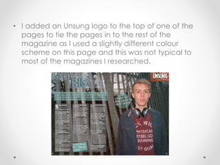
Evaluation
Question 1
How does your media product use,
develop and challenge forms and
conventions of real media products?
Front Cover
• My magazine was created in a way that is similar to
NME. There were many forms and conventions
which I tried to follow and develop. I used a larger
masthead, in which the font I used (fiesta) was only
used within the masthead, and was the largest font
used on the page. I also used a font that was
smaller than the masthead but still larger than the
other cover lines for my main cover line. I did this so
the main cover line stood out against the rest of the
cover lines. I used a female cover star who is looking
directly at the camera, which is known as direct
mode of address. This is a common convention that
is used in magazines as it invites the reader in.
• I also added a bar code, issue number and date,
website and price as these are all common
conventions used on real media products and
something I felt that I needed to add to my media
product.
Contents Page
• On my contents page I used a number of
different forms and conventions. I, again,
used my masthead to tie the page in with
the front cover. I listed my regular and
feature articles in a way that was similar to
the Q magazine contents page that I
used for inspiration. I also added images
that related to the articles and page
numbers next to the articles to make them
easy to find within the magazine. I added
a letter from the editor which I found was
common within magazines and gave it a
more personal feel.
Double Page Spread
• On my double page spread I used a number of
different conventions that I found to be common in
the magazines that I researched. I used a title which
I made using a range of different fonts so it stood
out and drew the reader in. I also added a kicker
that gave a brief description of the article. I used a
large image of the person that the article was
about, and included pull quotes, again to draw the
reader in. My article was set out in three columns,
which was typical to most magazines I researched. I
also added page numbers, issue details and a
website in small font at the bottom of my pages.
• I added an Unsung logo to the top of one of the
pages to tie the pages in to the rest of the
magazine as I used a slightly different colour
scheme on this page and this was not typical to
most of the magazines I researched.

Evaluation Question 1

  • 1.
    Evaluation Question 1 How doesyour media product use, develop and challenge forms and conventions of real media products?
  • 2.
    Front Cover • Mymagazine was created in a way that is similar to NME. There were many forms and conventions which I tried to follow and develop. I used a larger masthead, in which the font I used (fiesta) was only used within the masthead, and was the largest font used on the page. I also used a font that was smaller than the masthead but still larger than the other cover lines for my main cover line. I did this so the main cover line stood out against the rest of the cover lines. I used a female cover star who is looking directly at the camera, which is known as direct mode of address. This is a common convention that is used in magazines as it invites the reader in.
  • 3.
    • I alsoadded a bar code, issue number and date, website and price as these are all common conventions used on real media products and something I felt that I needed to add to my media product.
  • 4.
    Contents Page • Onmy contents page I used a number of different forms and conventions. I, again, used my masthead to tie the page in with the front cover. I listed my regular and feature articles in a way that was similar to the Q magazine contents page that I used for inspiration. I also added images that related to the articles and page numbers next to the articles to make them easy to find within the magazine. I added a letter from the editor which I found was common within magazines and gave it a more personal feel.
  • 5.
    Double Page Spread •On my double page spread I used a number of different conventions that I found to be common in the magazines that I researched. I used a title which I made using a range of different fonts so it stood out and drew the reader in. I also added a kicker that gave a brief description of the article. I used a large image of the person that the article was about, and included pull quotes, again to draw the reader in. My article was set out in three columns, which was typical to most magazines I researched. I also added page numbers, issue details and a website in small font at the bottom of my pages.
  • 6.
    • I addedan Unsung logo to the top of one of the pages to tie the pages in to the rest of the magazine as I used a slightly different colour scheme on this page and this was not typical to most of the magazines I researched.