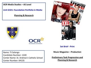
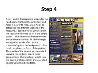
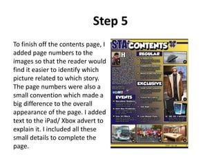
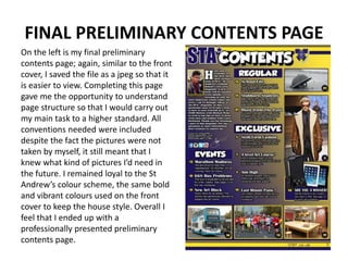
This document provides details and progression of a student's preliminary tasks for their AS Level Media Studies portfolio. It includes:
1) Details of the step-by-step process for creating a music magazine front cover and contents page, including conventions used and design choices.
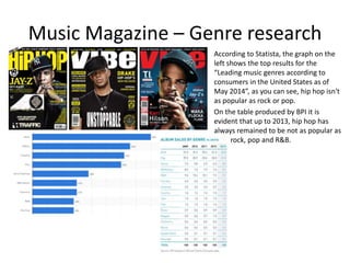
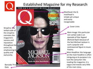
2) Research on the music magazine genre, established magazines, target audiences, and common conventions. Research of Q Magazine and NME is provided.
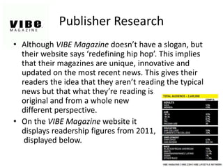
3) Research on the publisher of Vibe Magazine, including target readership statistics.