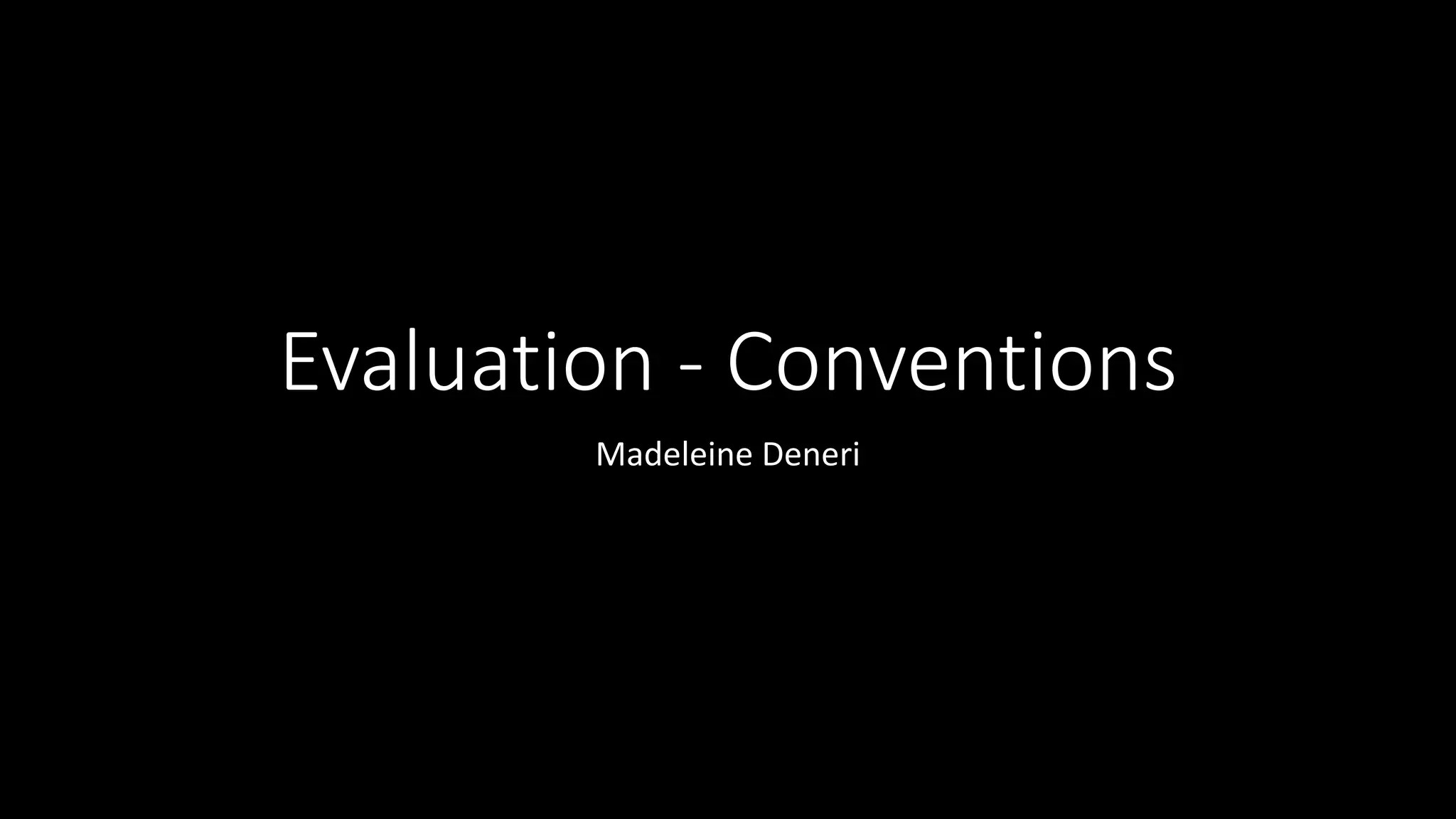
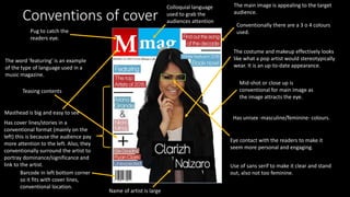
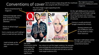
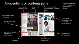
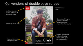
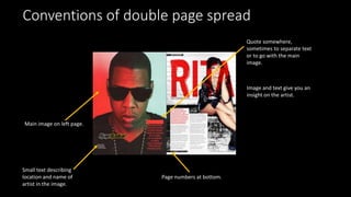
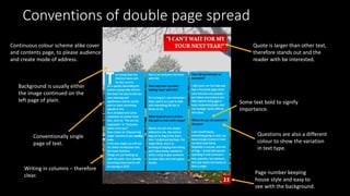
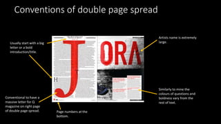
This document discusses conventions used in magazine design. It notes that cover lines are conventionally placed on the left to draw more attention. Artists are typically surrounded on covers to portray their significance. Mastheads are big and easy to see. Contents pages usually repeat the title in bold and use page numbers, subheadings for navigation, and a consistent color scheme. Double page spreads commonly feature a large main image on the left page with small descriptive text, with quotes, continuous color schemes, and variations in bolding and font colors to emphasize different text types.