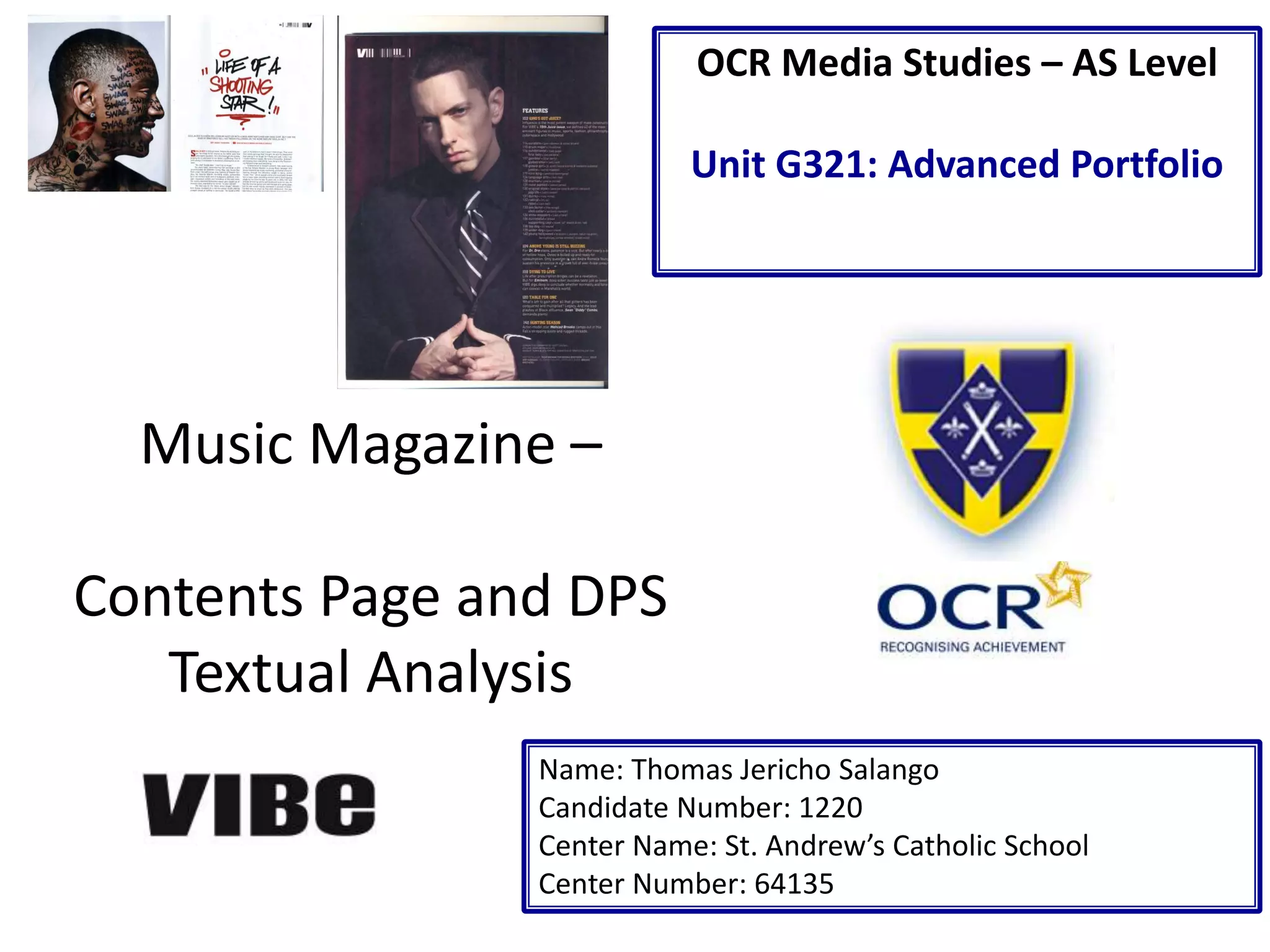
Music Magazine –
Contents Page and DPS
Textual Analysis
Name: Thomas Jericho Salango
Candidate Number: 1220
Center Name: St. Andrew’s Catholic School
Center Number: 64135
OCR Media Studies – AS Level
Unit G321: Advanced Portfolio
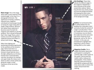
Subline: As mentioned earlier,
the subline follows the sub-
heading; this is basically a short
summary of what the content of
a page is actually about. These
are usually very concise, around
2-3 sentences, so as to inform
the reader but at the same time
tries not to reveal too much.
Buzzwords, such as ‘Dr. Dre’ or
‘Eminem’, in this case, are
emboldened to highlight their
importance, and to create a
striking effect on the reader.
Main Image: This is the image
which takes up the majority of the
contents page. In this case it is a
photograph of Eminem. The
significance of having a celebrity
represent your magazine
contributes to financial gain thanks
to having the rapper being able to
target a large audience. Because
fans idolize these celebrities it
becomes easier for both the
magazine and celebrity to sell their
products. This is all part of Richard
Dyer’s Star Image Theory, which
evolves around the thought that
celebrities possess the power to
attract more money.
Often times lighting and
positioning contribute significantly
to the aesthetics of the contents
page. Notice how there is a
shadow covering a minority of
Eminem’s head, with the rest in
the light, adding focus on his face.
Eminem here is pictured with a
mid shot, focusing on his clothing
and upper body; this shows more
detail on what is shown whilst also
giving the reader a small
impression of the rest of the
model.
Magazine Credits: This is
simply information about who
participated in creating this
contents page. Credit is given to
the author, and at times the
model’s stylist, makeup and
photographer. If the model is
wearing a particular brand of
clothing the company will often
times want credit, to inform the
reader and promote their
clothing.
Sub-Headings: These titles
indicate the different pages in
the magazine, followed by a
short summary of the actual
content (the subline). Notice
how the font very clearly stands
out from the background whilst
still keeping the same colour
scheme and matching the colour
of the background image.
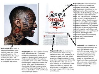
Pull Quote: often times this is taken
from the interview, quoted by the
interviewee. Notice how it is styled
particularly to suit the celebrity on the
left; the character of the celebrity is
reflected on the font of the pull quote; it
is slim, sleek and has an urban youth
feeling to it. The colours are strategically
chosen to match the whole theme of
the page, the red and black tattoos and
writing very well suit the colours of the
quote and contrast strongly against the
bright white background. The pull quote
is highly likely to be short yet intriguing,
it doesn't reveal too much of the article
but gives the reader a very brief taste of
the content. ‘Shooting Star’ has
connotations of success, individuality
and fame, which could influence
viewers to read on.
Main Image: Again, same as
the previous slide but in this
case this image uses a close
up shot, focusing on the
model’s features. The colours
of brown, red, black and
white fit cleverly with the rest
of the double page spread.
Stand First: The stand first is, in
essence, a short summary of the
topics touched upon in the
article. The language used in this
case is very concise, it asks the
reader a question, persuading
them to read on to find the
answer for themselves. The
stand first is often restricted to 1
to 2 sentences so as to keep the
reader in suspense of the actual
focus of the magazine.
Magazine Credits: As mentioned in
the previous slide, this is basically
information about who did what job in
creating the page. In this case there is
an author and a photographer. In some
cases there may be a model stylist and a
fashion director, but as seen above
there seems to be no example of either
those. The credits are coloured red
which breaks the boring black pattern
and keeps in style with the main image
and pull quote.
Drop Capital: The drop capital is essential
to any magazine article, it is typical to
include this convention in all sorts of
magazines. Notice how it is coloured red;
this draws attention from the reader to
focus on the article whilst at the same time
maintaining the same colour scheme with
the rest of the page. The drop capital is
also considerably large compared to the
rest of the article,this adds significance to
the name ‘Soulja Boy’, which can influence
interested fans to read on.
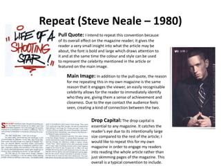
Repeat (Steve Neale – 1980)
Pull Quote: I intend to repeat this convention because
of its overall effect on the magazine reader; it gives the
reader a very small insight into what the article may be
about, the font is bold and large which draws attention to
it and at the same time the colour and style can be used
to represent the celebrity mentioned in the article or
featured on the main image.
Main Image: In addition to the pull quote, the reason
for me repeating this in my own magazine is the same
reason that it engages the viewer, an easily recognisable
celebrity allows for the reader to immediately identify
who they are, giving them a sense of achievement and
closeness. Due to the eye contact the audience feels
seen, creating a kind of connection between the two.
Drop Capital: The drop capital is
essential to any magazine. It catches the
reader’s eye due to its intentionally large
size compared to the rest of the article; I
would like to repeat this for my own
magazine in order to engage my readers
into reading the whole article rather than
just skimming pages of the magazine. This
overall is a typical convention to include.

Contents Page and DPS Analysis

  • 1.
    Music Magazine – ContentsPage and DPS Textual Analysis Name: Thomas Jericho Salango Candidate Number: 1220 Center Name: St. Andrew’s Catholic School Center Number: 64135 OCR Media Studies – AS Level Unit G321: Advanced Portfolio
  • 2.
    Subline: As mentionedearlier, the subline follows the sub- heading; this is basically a short summary of what the content of a page is actually about. These are usually very concise, around 2-3 sentences, so as to inform the reader but at the same time tries not to reveal too much. Buzzwords, such as ‘Dr. Dre’ or ‘Eminem’, in this case, are emboldened to highlight their importance, and to create a striking effect on the reader. Main Image: This is the image which takes up the majority of the contents page. In this case it is a photograph of Eminem. The significance of having a celebrity represent your magazine contributes to financial gain thanks to having the rapper being able to target a large audience. Because fans idolize these celebrities it becomes easier for both the magazine and celebrity to sell their products. This is all part of Richard Dyer’s Star Image Theory, which evolves around the thought that celebrities possess the power to attract more money. Often times lighting and positioning contribute significantly to the aesthetics of the contents page. Notice how there is a shadow covering a minority of Eminem’s head, with the rest in the light, adding focus on his face. Eminem here is pictured with a mid shot, focusing on his clothing and upper body; this shows more detail on what is shown whilst also giving the reader a small impression of the rest of the model. Magazine Credits: This is simply information about who participated in creating this contents page. Credit is given to the author, and at times the model’s stylist, makeup and photographer. If the model is wearing a particular brand of clothing the company will often times want credit, to inform the reader and promote their clothing. Sub-Headings: These titles indicate the different pages in the magazine, followed by a short summary of the actual content (the subline). Notice how the font very clearly stands out from the background whilst still keeping the same colour scheme and matching the colour of the background image.
  • 3.
    Pull Quote: oftentimes this is taken from the interview, quoted by the interviewee. Notice how it is styled particularly to suit the celebrity on the left; the character of the celebrity is reflected on the font of the pull quote; it is slim, sleek and has an urban youth feeling to it. The colours are strategically chosen to match the whole theme of the page, the red and black tattoos and writing very well suit the colours of the quote and contrast strongly against the bright white background. The pull quote is highly likely to be short yet intriguing, it doesn't reveal too much of the article but gives the reader a very brief taste of the content. ‘Shooting Star’ has connotations of success, individuality and fame, which could influence viewers to read on. Main Image: Again, same as the previous slide but in this case this image uses a close up shot, focusing on the model’s features. The colours of brown, red, black and white fit cleverly with the rest of the double page spread. Stand First: The stand first is, in essence, a short summary of the topics touched upon in the article. The language used in this case is very concise, it asks the reader a question, persuading them to read on to find the answer for themselves. The stand first is often restricted to 1 to 2 sentences so as to keep the reader in suspense of the actual focus of the magazine. Magazine Credits: As mentioned in the previous slide, this is basically information about who did what job in creating the page. In this case there is an author and a photographer. In some cases there may be a model stylist and a fashion director, but as seen above there seems to be no example of either those. The credits are coloured red which breaks the boring black pattern and keeps in style with the main image and pull quote. Drop Capital: The drop capital is essential to any magazine article, it is typical to include this convention in all sorts of magazines. Notice how it is coloured red; this draws attention from the reader to focus on the article whilst at the same time maintaining the same colour scheme with the rest of the page. The drop capital is also considerably large compared to the rest of the article,this adds significance to the name ‘Soulja Boy’, which can influence interested fans to read on.
  • 4.
    Repeat (Steve Neale– 1980) Pull Quote: I intend to repeat this convention because of its overall effect on the magazine reader; it gives the reader a very small insight into what the article may be about, the font is bold and large which draws attention to it and at the same time the colour and style can be used to represent the celebrity mentioned in the article or featured on the main image. Main Image: In addition to the pull quote, the reason for me repeating this in my own magazine is the same reason that it engages the viewer, an easily recognisable celebrity allows for the reader to immediately identify who they are, giving them a sense of achievement and closeness. Due to the eye contact the audience feels seen, creating a kind of connection between the two. Drop Capital: The drop capital is essential to any magazine. It catches the reader’s eye due to its intentionally large size compared to the rest of the article; I would like to repeat this for my own magazine in order to engage my readers into reading the whole article rather than just skimming pages of the magazine. This overall is a typical convention to include.