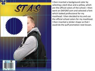
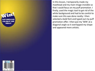
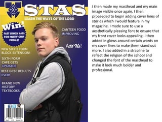
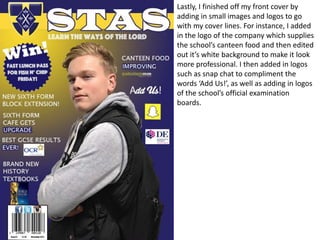
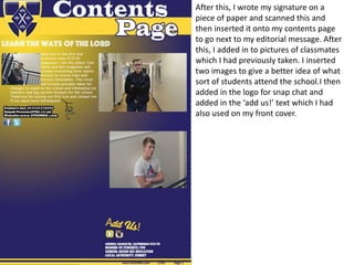
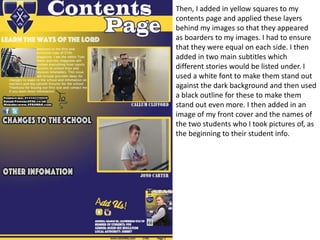
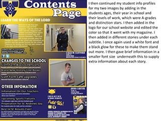
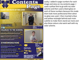
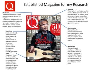
OCR Media Studies – AS Level
Unit G321: Foundation Portfolio in Media
Planning & Research
Name: Tom Owen
Candidate Number: 3103
Center Name: St. Andrew’s Catholic School
Center Number: 64135
Set Brief - Print
Music Magazine – Production
Preliminary Task Progression and
Planning & Research
Section 1) –
Preliminary Task
Preliminary Task Progression–Front
Cover
I started my front cover by taking sample
social media barcodes and social media
logos. I created a white shape and
arranged them neatly. I named all of the
separate layers and then typed in the
issue, the price of the magazine and the
date of the release. I used ruler lines to
line the social media logos up equally
and to make sure they were the same
distance away from each other.
I then created a colours banner and took
Our schools logo from the official site. I
removed any background from the logo
of the site. I then inserted my main image
and lined it up, using the ruler tool. I
made sure to carefully edit the picture to
make sure that there was absolutely no
background colours. I then sharpened my
image twice, so that my models features
were made much more prominent.
I then inserted a background color by
selecting a dark blue and a yellow, which
are the official colors of the school. I then
went on DAFONT.com and selected a font
which looked professional for my
masthead. I then decided to try and use
the official school colors for my masthead.
I then inserted a sticker shape so that I
could do the puff promotion next lesson.
In this lesson, I temporarily made my
masthead and my main image invisible so
that I could focus on my puff promotion. I
firstly, used the magic tool to get rid of the
white background and had to be careful to
make sure this was done neatly. I then
selected a bold font and typed out my puff
promotion offer. I then put my ‘WIN’ at a
diagonal angle so it overlapped my shape
and appeared more artistic.
I then made my masthead and my main
image visible once again. I then
proceeded to begin adding cover lines of
stories which I would feature in my
magazine. I made sure to use a
aesthetically pleasing font to ensure that
my front cover looks appealing. I then
added in glows around certain words on
my cover lines to make them stand out
more. I also added in a strapline to
reflect the religion of the school and
changed the font of the masthead to
make it look much bolder and
professional.
Lastly, I finished off my front cover by
adding in small images and logos to go
with my cover lines. For instance, I added
in the logo of the company which supplies
the school’s canteen food and then edited
out it’s white background to make it look
more professional. I then added in logos
such as snap chat to compliment the
words ‘Add Us!’, as well as adding in logos
of the school’s official examination
boards.
Preliminary Task Progression–
Evidence
Contents Page Step-by-step
For my contents page, I started by
inserting the same background that I
had used for my front cover to create a
clear similarity between the two. I then
added in the same St. Andrews logo and
then used the same sized and styled
font to create my ‘Contents page’
masthead. After this, I added in an
editors picture which I had one of my
classmates take a few days previously. I
then began to add in contact details
beneath this which was going to go
beneath my editorial message.
Then, I added in my editorial message to
introduce people to the magazine and I
used the pen tool to make this message
wrap around my editors image.
Furthermore, I added in a yellow shape to
go beneath my cover line to make the
bottom half of it stand out more.
Furthermore, I added in social media logos
such as twitter and Facebook. I then
added in the address and contact details
of the school itself.
After this, I wrote my signature on a
piece of paper and scanned this and
then inserted it onto my contents page
to go next to my editorial message. After
this, I added in to pictures of classmates
which I had previously taken. I inserted
two images to give a better idea of what
sort of students attend the school.I then
added in the logo for snap chat and
added in the ‘add us!’ text which I had
also used on my front cover.
Then, I added in yellow squares to my
contents page and applied these layers
behind my images so that they appeared
as boarders to my images. I had to ensure
that they were equal on each side. I then
added in two main subtitles which
different stories would be listed under. I
used a white font to make them stand out
against the dark background and then used
a black outline for these to make them
stand out even more. I then added in an
image of my front cover and the names of
the two students who I took pictures of, as
the beginning to their student info.
I then continued my student info profiles
for my two images by adding in the
students ages, their year in school and
their levels of work, which were A-grades
and distinction stars. I then added in the
logo for our school website and edited the
color so that it went with my magazine. I
then added in different stories under each
subtitle. I once again used a white font and
a black glow for these to make them stand
out more. I then gave brief information in a
smaller font size underneath this to supply
extra information about each story.
Lastly, I added in page numbers for each
image and story on my contents page. I
used a yellow font to go with my color
scheme and then used a black glow on
each of these numbers because this made
them look more professional then when
no glow was used. I then inserted a blue
and yellow rectangle behind each main
subtitle to make them stand out more and
also these colours also went well with my
color scheme.
Section 2) – Log Book
Music Magazine – Genre research
Q magazine is released every month and is specifically published by Bauer Media
group. Its first issue was released for purchase in October 1986 and from July 2015-
December 2015, over 44 thousand copies were sold.
Young adults are the target audience of Q magazine and they are enticed to buy the
new issue every month by the large range of genres that the magazine covers, E.g pop,
classic etc. This also explains the magazines popularity, as many surveys have proved
Pop and Rock to be the most popular genres of music.
http://3.bp.blogspot.com/_K8rZpPr_8oY/TPKAVeovIyI/AAAAAAAAACE/ztvtS5nwACw/s
1600/chart.jpg
Established Magazine for my Research
Main headline
The main headline
provides information on
what the main story of the
magazine is. The main
story is usually the most
interesting to attract more
buyers.
Main image
The main image is
usually of a well known
star, which is important
because it means that it
will create ‘Star Appeal’
and will not only attract
the frequent buyers of
the magazine, but also
fans of the star on the
cover.
Barcode/price/date
/issue
The price is shown
for the benefit for
potential buyers and
the issue informs
whether there are
more issues of the
magazine out, which
the reader can buy
if he/she enjoys it.
Coverlines
(secondary stories)
These cover lines
attract readers, as
they offer
alternate items of
news and different
stories and
furthermore
informs of what
the magazine
contains.
Masthead
The masthead denotes Q which
depicts clearly the name of the
magazine.
Furthermore, the Red colour font
and sophisticated font makes the
cover stand out and makes it
clear that the content inside is
going to be just as professional.
Strapline
The strapline is used to convey the
essence of a brand and it should be
short and catchy, so that it is easily
remembered by the reader. This
will help them to associate a slogan
with a certain magazine and
therefore encourage them to but it
again in the future.
Target Audience
According Hartley the target audience is young adults. This is clear as the magazine mainly covers
news on artists that young adults are fans of and not artists that children or the elderly would
enjoy listening to. This therefore makes the magazine appealing to only young adults. Also, the
target audience will be both men and women, but mainly men. According to Katz, the aim is to
inform about the latest news in different genres of music. Furthermore, according to the Socio-
economic needs, this magazine is targeted towards classes D-A, as it contains a lot of information
on a wide range of genres. The magazine will also educate the reader in stories and information
about music producers and about how the biggest stars can come from anywhere. Lastly,
Maslow’s hierarchy of needs connotes that the audience will mostly be Survivors, as the
magazine contains information on some of the problems that these celebrities are facing.
What is the USP of this magazine?
This magazine is made to be unique as it sometimes gives out free items. For
instance, when Q magazine reached its 30 year anniversary, the anniversary
edition contained a free CD containing 15 tracks. This is something that not all
magazines do, which therefore makes it unique for buyers. Furthermore,
sometimes magazines such as Q give out albums that are mixes of all of the
top hits from 2015 for example.
Publisher research
http://magazines.bauermediaadvertising.com/magazines/detail/Q
http://www.bauermedia.co.uk/brands/q
Bauer Media Groups slogan, "We think popular” is very important, as it connotes that the
magazine only covers important stories and information about successful musicians, who
people want to hear the latest news about. The circulation of Q magazine is 64,596 every
month, probably due to the fact that it is available to buy in multiple retail outlets. For
instance, it is sold in WH Smith, Tesco's and Sainsbury's, as well as many other Superstores
and Companies across the UK. This means that it is more available to the public and the
extra availability helps make more business and make more money. Bauer media is
extremely popular, as it meets over 22 million UK adults with every release. Bauer media
also organizes cultural creative agencies, training for business owners, music and film award
shows and entertainment hubs.
Mix-Mag
Masthead: The masthead is in a bright
White against the dark background,
which makes it stand out. Furthermore, it
uses a professional and sophisticated
font to make the magazine look more
professional. This makes it more
appealing to potential buyers.
Main heading: This is usually
related to the genre that the
magazine is based on. It is
usually made with an artistic or
interesting font to make it look
professional and engaging for
the reader.
Main image: The main image is
important because it often contains
a celebrity. This is important as it
creates Star Appeal and this
therefore helps to attract more
customers to buy and read the
magazine. The star on the front f
the magazine is usually related to
the genre that the magazine covers.
Issue: the issue is important, as it informs
the reader how many other releases of the
magazine there has been. This will make
them aware if there are more magazines
that are available for them to buy.
Cover-lines: The cover-lines
of this magazine contain
news and alternate stories
about other famous stars I
the music business, such as
“Calvin Harris”. This is
important as it makes it
easier to attract people to
read the different stories
that the magazine has to
offer.
Colour: The magazine
uses bright colours, such
as yellows and Whites
to reflect the typical
bright colours that are
associated with festivals
and the theme of
Electronic music.
Logo: the logo is a bright
yellow colour, which
coordinates with the other
colours and also makes it
stand out against the dark
background.
Target Audience –
The target audience for this magazine is young adults who are interested in Electronic music. This
is because the magazine contains lots of news on Electronic music, dj’s and also on live events
and festivals, such as Tomorrowland in Germany. According to Hartley, the magazine’s target
audience is young adults, as the magazine will be advertising electronic music in clubs. This is
important because this music is inappropriate for children and may be offensive to the elderly, as
it contains explicit words. According to Katz, the aim is to inform about the latest news in
different genres of music. Furthermore, according to the Socio-economic needs, this magazine is
targeted towards classes D-A, as it contains a lot of information on music that the upper class
wont be interested in. Lastly, according to Maslow’s hierarchy of needs connotes that the
audience will mostly be Survivors, as the magazine contains information on some of the problems
that these celebrities are facing in their everyday lives.
What is the USP of this magazine?
This magazine is made unique due to the fact that once subscribing to receive copies of the
magazine, three magazines can be delivered to your house for just below five pounds, when
usually one copy costs roughly five pounds anyway. This is therefore appealing for a customer, as
most magazines don’t offer this and it saves money. Furthermore, magazines such as this offer
prizes and giveaways if you fill out a survey online for them etc.
Publisher research
Publisher-Pam
Price-4.99
Issues-22 released
First issue-22 months ago
-Subscription is started online and deliveries are available. However, it is also available
to read on PDF after payment has been completed.
-The company was incorporated in 2001 and is based in London, the United Kingdom.
In 2001, the magazine teamed up with Virgin Records to release a double album titled
B!g Tunes.
In 2012, the Guardian collaborated with Mixmag on a survey of British drug taking
habits
It has a circulation of up to 70,000
Bought by Development Hell, the company that also owned The Word music
magazine, in 2005

Preliminary task and planning & research

  • 1.
    OCR Media Studies– AS Level Unit G321: Foundation Portfolio in Media Planning & Research Name: Tom Owen Candidate Number: 3103 Center Name: St. Andrew’s Catholic School Center Number: 64135 Set Brief - Print Music Magazine – Production Preliminary Task Progression and Planning & Research
  • 2.
  • 3.
  • 4.
    I started myfront cover by taking sample social media barcodes and social media logos. I created a white shape and arranged them neatly. I named all of the separate layers and then typed in the issue, the price of the magazine and the date of the release. I used ruler lines to line the social media logos up equally and to make sure they were the same distance away from each other.
  • 5.
    I then createda colours banner and took Our schools logo from the official site. I removed any background from the logo of the site. I then inserted my main image and lined it up, using the ruler tool. I made sure to carefully edit the picture to make sure that there was absolutely no background colours. I then sharpened my image twice, so that my models features were made much more prominent.
  • 6.
    I then inserteda background color by selecting a dark blue and a yellow, which are the official colors of the school. I then went on DAFONT.com and selected a font which looked professional for my masthead. I then decided to try and use the official school colors for my masthead. I then inserted a sticker shape so that I could do the puff promotion next lesson.
  • 7.
    In this lesson,I temporarily made my masthead and my main image invisible so that I could focus on my puff promotion. I firstly, used the magic tool to get rid of the white background and had to be careful to make sure this was done neatly. I then selected a bold font and typed out my puff promotion offer. I then put my ‘WIN’ at a diagonal angle so it overlapped my shape and appeared more artistic.
  • 8.
    I then mademy masthead and my main image visible once again. I then proceeded to begin adding cover lines of stories which I would feature in my magazine. I made sure to use a aesthetically pleasing font to ensure that my front cover looks appealing. I then added in glows around certain words on my cover lines to make them stand out more. I also added in a strapline to reflect the religion of the school and changed the font of the masthead to make it look much bolder and professional.
  • 9.
    Lastly, I finishedoff my front cover by adding in small images and logos to go with my cover lines. For instance, I added in the logo of the company which supplies the school’s canteen food and then edited out it’s white background to make it look more professional. I then added in logos such as snap chat to compliment the words ‘Add Us!’, as well as adding in logos of the school’s official examination boards.
  • 10.
  • 11.
    For my contentspage, I started by inserting the same background that I had used for my front cover to create a clear similarity between the two. I then added in the same St. Andrews logo and then used the same sized and styled font to create my ‘Contents page’ masthead. After this, I added in an editors picture which I had one of my classmates take a few days previously. I then began to add in contact details beneath this which was going to go beneath my editorial message.
  • 12.
    Then, I addedin my editorial message to introduce people to the magazine and I used the pen tool to make this message wrap around my editors image. Furthermore, I added in a yellow shape to go beneath my cover line to make the bottom half of it stand out more. Furthermore, I added in social media logos such as twitter and Facebook. I then added in the address and contact details of the school itself.
  • 13.
    After this, Iwrote my signature on a piece of paper and scanned this and then inserted it onto my contents page to go next to my editorial message. After this, I added in to pictures of classmates which I had previously taken. I inserted two images to give a better idea of what sort of students attend the school.I then added in the logo for snap chat and added in the ‘add us!’ text which I had also used on my front cover.
  • 14.
    Then, I addedin yellow squares to my contents page and applied these layers behind my images so that they appeared as boarders to my images. I had to ensure that they were equal on each side. I then added in two main subtitles which different stories would be listed under. I used a white font to make them stand out against the dark background and then used a black outline for these to make them stand out even more. I then added in an image of my front cover and the names of the two students who I took pictures of, as the beginning to their student info.
  • 15.
    I then continuedmy student info profiles for my two images by adding in the students ages, their year in school and their levels of work, which were A-grades and distinction stars. I then added in the logo for our school website and edited the color so that it went with my magazine. I then added in different stories under each subtitle. I once again used a white font and a black glow for these to make them stand out more. I then gave brief information in a smaller font size underneath this to supply extra information about each story.
  • 16.
    Lastly, I addedin page numbers for each image and story on my contents page. I used a yellow font to go with my color scheme and then used a black glow on each of these numbers because this made them look more professional then when no glow was used. I then inserted a blue and yellow rectangle behind each main subtitle to make them stand out more and also these colours also went well with my color scheme.
  • 17.
  • 18.
    Music Magazine –Genre research Q magazine is released every month and is specifically published by Bauer Media group. Its first issue was released for purchase in October 1986 and from July 2015- December 2015, over 44 thousand copies were sold. Young adults are the target audience of Q magazine and they are enticed to buy the new issue every month by the large range of genres that the magazine covers, E.g pop, classic etc. This also explains the magazines popularity, as many surveys have proved Pop and Rock to be the most popular genres of music. http://3.bp.blogspot.com/_K8rZpPr_8oY/TPKAVeovIyI/AAAAAAAAACE/ztvtS5nwACw/s 1600/chart.jpg
  • 19.
    Established Magazine formy Research Main headline The main headline provides information on what the main story of the magazine is. The main story is usually the most interesting to attract more buyers. Main image The main image is usually of a well known star, which is important because it means that it will create ‘Star Appeal’ and will not only attract the frequent buyers of the magazine, but also fans of the star on the cover. Barcode/price/date /issue The price is shown for the benefit for potential buyers and the issue informs whether there are more issues of the magazine out, which the reader can buy if he/she enjoys it. Coverlines (secondary stories) These cover lines attract readers, as they offer alternate items of news and different stories and furthermore informs of what the magazine contains. Masthead The masthead denotes Q which depicts clearly the name of the magazine. Furthermore, the Red colour font and sophisticated font makes the cover stand out and makes it clear that the content inside is going to be just as professional. Strapline The strapline is used to convey the essence of a brand and it should be short and catchy, so that it is easily remembered by the reader. This will help them to associate a slogan with a certain magazine and therefore encourage them to but it again in the future.
  • 20.
    Target Audience According Hartleythe target audience is young adults. This is clear as the magazine mainly covers news on artists that young adults are fans of and not artists that children or the elderly would enjoy listening to. This therefore makes the magazine appealing to only young adults. Also, the target audience will be both men and women, but mainly men. According to Katz, the aim is to inform about the latest news in different genres of music. Furthermore, according to the Socio- economic needs, this magazine is targeted towards classes D-A, as it contains a lot of information on a wide range of genres. The magazine will also educate the reader in stories and information about music producers and about how the biggest stars can come from anywhere. Lastly, Maslow’s hierarchy of needs connotes that the audience will mostly be Survivors, as the magazine contains information on some of the problems that these celebrities are facing. What is the USP of this magazine? This magazine is made to be unique as it sometimes gives out free items. For instance, when Q magazine reached its 30 year anniversary, the anniversary edition contained a free CD containing 15 tracks. This is something that not all magazines do, which therefore makes it unique for buyers. Furthermore, sometimes magazines such as Q give out albums that are mixes of all of the top hits from 2015 for example.
  • 21.
    Publisher research http://magazines.bauermediaadvertising.com/magazines/detail/Q http://www.bauermedia.co.uk/brands/q Bauer MediaGroups slogan, "We think popular” is very important, as it connotes that the magazine only covers important stories and information about successful musicians, who people want to hear the latest news about. The circulation of Q magazine is 64,596 every month, probably due to the fact that it is available to buy in multiple retail outlets. For instance, it is sold in WH Smith, Tesco's and Sainsbury's, as well as many other Superstores and Companies across the UK. This means that it is more available to the public and the extra availability helps make more business and make more money. Bauer media is extremely popular, as it meets over 22 million UK adults with every release. Bauer media also organizes cultural creative agencies, training for business owners, music and film award shows and entertainment hubs.
  • 22.
    Mix-Mag Masthead: The mastheadis in a bright White against the dark background, which makes it stand out. Furthermore, it uses a professional and sophisticated font to make the magazine look more professional. This makes it more appealing to potential buyers. Main heading: This is usually related to the genre that the magazine is based on. It is usually made with an artistic or interesting font to make it look professional and engaging for the reader. Main image: The main image is important because it often contains a celebrity. This is important as it creates Star Appeal and this therefore helps to attract more customers to buy and read the magazine. The star on the front f the magazine is usually related to the genre that the magazine covers. Issue: the issue is important, as it informs the reader how many other releases of the magazine there has been. This will make them aware if there are more magazines that are available for them to buy. Cover-lines: The cover-lines of this magazine contain news and alternate stories about other famous stars I the music business, such as “Calvin Harris”. This is important as it makes it easier to attract people to read the different stories that the magazine has to offer. Colour: The magazine uses bright colours, such as yellows and Whites to reflect the typical bright colours that are associated with festivals and the theme of Electronic music. Logo: the logo is a bright yellow colour, which coordinates with the other colours and also makes it stand out against the dark background.
  • 23.
    Target Audience – Thetarget audience for this magazine is young adults who are interested in Electronic music. This is because the magazine contains lots of news on Electronic music, dj’s and also on live events and festivals, such as Tomorrowland in Germany. According to Hartley, the magazine’s target audience is young adults, as the magazine will be advertising electronic music in clubs. This is important because this music is inappropriate for children and may be offensive to the elderly, as it contains explicit words. According to Katz, the aim is to inform about the latest news in different genres of music. Furthermore, according to the Socio-economic needs, this magazine is targeted towards classes D-A, as it contains a lot of information on music that the upper class wont be interested in. Lastly, according to Maslow’s hierarchy of needs connotes that the audience will mostly be Survivors, as the magazine contains information on some of the problems that these celebrities are facing in their everyday lives. What is the USP of this magazine? This magazine is made unique due to the fact that once subscribing to receive copies of the magazine, three magazines can be delivered to your house for just below five pounds, when usually one copy costs roughly five pounds anyway. This is therefore appealing for a customer, as most magazines don’t offer this and it saves money. Furthermore, magazines such as this offer prizes and giveaways if you fill out a survey online for them etc.
  • 24.
    Publisher research Publisher-Pam Price-4.99 Issues-22 released Firstissue-22 months ago -Subscription is started online and deliveries are available. However, it is also available to read on PDF after payment has been completed. -The company was incorporated in 2001 and is based in London, the United Kingdom. In 2001, the magazine teamed up with Virgin Records to release a double album titled B!g Tunes. In 2012, the Guardian collaborated with Mixmag on a survey of British drug taking habits It has a circulation of up to 70,000 Bought by Development Hell, the company that also owned The Word music magazine, in 2005

Editor's Notes

  • #19 Research into ALL music genres – find graphs to highlight what the most popular genre is in the music industry Q eclectic – all different types of genres.