Question 7:
Looking back at your
preliminary task, what do you
feel you have learnt in the
progression from it to the full
product?
Skills Development
The main thing that I have learnt in the progression from my preliminary task to my
music magazine was improving my general skills and knowledge of softwares such as
Photoshop and InDesign. This allowed me to create and design in a more accurate and
professional manner.
When making my college magazine for preliminary task I held no previous experiance
with such professional softwares and therefore got the chance to experiment with
both pieces in order to develop a basic set of skills that I could work on. The college
magazine I have created is therefore very simple and safe standing with no hard
technology involved.
Experimenting allowed me to create a music magazine which was much more
accurate and professional looking, it helped me realise for myself which parts were
aesthetically pleasing for a magazine and which I needed to work on in order for it to
look good. For example, in my college magazine I have used too much blank space and
there was no real imagination to the piece.
Design
After researching into various music magazines of various genres it became clear to me
that magazines use specific links between the design, layout, genre and audience. They
do this in order to make a music magazine stay markable, through different codes and
conventions. Learning about this allowed me to focus on making my magazine look
more professional and realistic.
However, magazines conveying different genres sometimes challenge these codes and
conventions in order to create meaning or stand out. I was not aware of that when
designing my college magazine, which shows because the magazine is very plain.
Research and planning
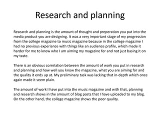
Research and planning is the amount of thought and preperation you put into the
media product you are designing. It was a very important stage of my progression
from the college magazine to music magazine because in the college magazine I
had no previous experiance with things like an audience profile, which made it
harder for me to know who I am aiming my magazine for and not just basing it on
my taste.
There is an obvious correlation between the amount of work you put in research
and planning and how well you know the magazine, what you are aiming for and
the quality it ends up at. My preliminary task was lacking that in-depth which once
again made it seem plain.
The amount of work I have put into the music magazine and with that, planning
and research shows in the amount of blog posts that I have uploaded to my blog.
On the other hand, the college magazine shows the poor quality.
Comparison
I will show a comparison between my college preliminary task and my music
magazine project. In that I will detect elements that I feel I have improved on and so
has the magazine.
Under the blog post ‘evaluation of front cover’ in my preliminary task I have picked
out things that I was pleased with. Although, at the time that must of been a very
big achievement I think I have improved a lot since.
College Magazine Front Cover Music Magazine Front Cover
The cover lines that I have used on this
front cover are very plain and limited.
Cover lines like ‘college essentials’ are
not the most enticing for the reader,
especially a college student. The
language used is very simple and
therefore not overly intriguing.
I have conventionally, placed all of the
cover lines on the left hand side
however in this example, I think they
should of been placed on both sides.
Some magazines deliberately keep
their cover lines minimalistic however
for the genre and audience that this is,
I think the page should of been filled
out more proprtionally.
Cover lines
Yet again, I have decided to keep the
cover lines simple. This is because this
way the magazine looks less cluttered
and more sophisticated. I think this
would appeal to my target audience
because it’s appealing to the eye through
it’s simplicity. However the language
used is much more interesting, I have
even included a pull quote in order to
further entice the reader.
I have deliberately not included cover
lines on the right hand side because that
would interfere with the model because
of the way she is standing. I have used
the rule of thirds when constructing in
order to keep the page organised.
Cover lines
It’s clear that this front cover is missing
a main cover line. This is a very rare
occasion and it is definitely
unconventional, someone could
mistaken this front cover for a normal
photograph with writing on. I think the
lack of a main cover line makes the
picture look rather dull .
This shows lack of research and
planning, if I had researched into other
magazines before hand I would of
realised the typical conventions for any
magazine on the market.
Main Cover Line
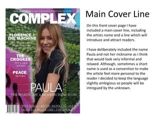
On this front cover page I have
included a main cover line, including
the artists name and a line which will
introduce and attract readers.
I have deliberately included the name
Paula and not her nickname as I think
that would look very informal and
relaxed. Although, sometimes a short
name is used as a convention to make
the article feel more personal to the
reader I decided to keep the language
slightly ambigious so people will be
intregued by the unknown.
Main Cover Line
Although, plain fonts are a typical
convention for magazine front covers I
think the fonts displayed on this page
are very monotonous, with no variation.
The sans-serif font is often used to
convey simplicity and minimality
however I think it works better balanced
with a more modern serif font . Many
magazines I have analysed use two or
more fonts to add variation and
fulfilment to the page, breaking each
section up more.
I think the size of cover lines on this
page are relatively small and at the
same time very hard to read over the
girls body.
Fonts
Fonts
On this front cover I have used a
variation of 3 main fonts to add balance
to the writing and to make it look
interesting. I have used Minion Pro,
Nirmala Ui and Franklin Gothic, the mix
between serif and sans-serif typeface is
a very commonly used feature because
it appeals to a wider audience and look
organised and structred at the same.
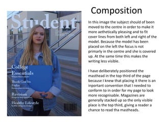
In this image the subject should of been
moved to the centre in order to make it
more aethetically pleasing and to fit
cover lines from both left and right of the
model. Because the model has been
placed on the left the focus is not
primarly in the centre and she is covered
up. At the same time this makes the
writing less visible.
I have deliberately positioned the
masthead in the top third of the page
because I knew that placing it there is an
inportant convention that I needed to
conform to in order for my page to look
more recognisable. Magazines are
generally stacked up so the only visible
place is the top third, giving a reader a
chance to read tha mastheads.
Composition
Composition
This photo is a lot more composed with
the model placed near enough the
middle with no cover lines placed over
her except the main cover line which is
unavoidable, when making the cover
line visible and big enough to grab
attention. I have deliberately used a
skinnier font for the name Paula and not
the same one as masthead or coverlines
to leave more white space around it, to
make sure the image isn’t obstructed
from.
I have used the rule of thirds when I first
started constructing my front page to
make the page appear more neat,
however I have learnt from my mistakes
from the college magazine not to squish
everything into one corner.
College Magazine Contents Page Music Magazine Contents Page
Composition
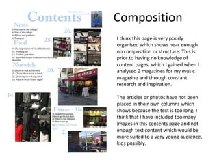
I think this page is very poorly
organised which shows near enough
no composition or structure. This is
prior to having no knowledge of
content pages, which I gained when I
analysed 2 magazines for my music
magazine and through constant
research and inspiration.
The articles or photos have not been
placed in their own columns which
shows because the text is too long. I
think that I have included too many
images in this contents page and not
enough text content which would be
more suited to a very young audience,
kids possibly.
Composition
The composition of this contents
page compared to the college
magazine is very different.
Firstly, here I have used the rule of
thirds, margins and professional
structure in order to make the page
look neat and tidy. Each heading has
it’s own row or designated space to
further perfect the overall design.
The text is composed in a very clear
way with enough space around it to
not be touching other images or text
like it was in the college contents
page.

Q7

  • 1.
    Question 7: Looking backat your preliminary task, what do you feel you have learnt in the progression from it to the full product?
  • 2.
    Skills Development The mainthing that I have learnt in the progression from my preliminary task to my music magazine was improving my general skills and knowledge of softwares such as Photoshop and InDesign. This allowed me to create and design in a more accurate and professional manner. When making my college magazine for preliminary task I held no previous experiance with such professional softwares and therefore got the chance to experiment with both pieces in order to develop a basic set of skills that I could work on. The college magazine I have created is therefore very simple and safe standing with no hard technology involved. Experimenting allowed me to create a music magazine which was much more accurate and professional looking, it helped me realise for myself which parts were aesthetically pleasing for a magazine and which I needed to work on in order for it to look good. For example, in my college magazine I have used too much blank space and there was no real imagination to the piece.
  • 3.
    Design After researching intovarious music magazines of various genres it became clear to me that magazines use specific links between the design, layout, genre and audience. They do this in order to make a music magazine stay markable, through different codes and conventions. Learning about this allowed me to focus on making my magazine look more professional and realistic. However, magazines conveying different genres sometimes challenge these codes and conventions in order to create meaning or stand out. I was not aware of that when designing my college magazine, which shows because the magazine is very plain.
  • 4.
    Research and planning Researchand planning is the amount of thought and preperation you put into the media product you are designing. It was a very important stage of my progression from the college magazine to music magazine because in the college magazine I had no previous experiance with things like an audience profile, which made it harder for me to know who I am aiming my magazine for and not just basing it on my taste. There is an obvious correlation between the amount of work you put in research and planning and how well you know the magazine, what you are aiming for and the quality it ends up at. My preliminary task was lacking that in-depth which once again made it seem plain. The amount of work I have put into the music magazine and with that, planning and research shows in the amount of blog posts that I have uploaded to my blog. On the other hand, the college magazine shows the poor quality.
  • 5.
    Comparison I will showa comparison between my college preliminary task and my music magazine project. In that I will detect elements that I feel I have improved on and so has the magazine. Under the blog post ‘evaluation of front cover’ in my preliminary task I have picked out things that I was pleased with. Although, at the time that must of been a very big achievement I think I have improved a lot since.
  • 6.
    College Magazine FrontCover Music Magazine Front Cover
  • 7.
    The cover linesthat I have used on this front cover are very plain and limited. Cover lines like ‘college essentials’ are not the most enticing for the reader, especially a college student. The language used is very simple and therefore not overly intriguing. I have conventionally, placed all of the cover lines on the left hand side however in this example, I think they should of been placed on both sides. Some magazines deliberately keep their cover lines minimalistic however for the genre and audience that this is, I think the page should of been filled out more proprtionally. Cover lines
  • 8.
    Yet again, Ihave decided to keep the cover lines simple. This is because this way the magazine looks less cluttered and more sophisticated. I think this would appeal to my target audience because it’s appealing to the eye through it’s simplicity. However the language used is much more interesting, I have even included a pull quote in order to further entice the reader. I have deliberately not included cover lines on the right hand side because that would interfere with the model because of the way she is standing. I have used the rule of thirds when constructing in order to keep the page organised. Cover lines
  • 9.
    It’s clear thatthis front cover is missing a main cover line. This is a very rare occasion and it is definitely unconventional, someone could mistaken this front cover for a normal photograph with writing on. I think the lack of a main cover line makes the picture look rather dull . This shows lack of research and planning, if I had researched into other magazines before hand I would of realised the typical conventions for any magazine on the market. Main Cover Line
  • 10.
    On this frontcover page I have included a main cover line, including the artists name and a line which will introduce and attract readers. I have deliberately included the name Paula and not her nickname as I think that would look very informal and relaxed. Although, sometimes a short name is used as a convention to make the article feel more personal to the reader I decided to keep the language slightly ambigious so people will be intregued by the unknown. Main Cover Line
  • 11.
    Although, plain fontsare a typical convention for magazine front covers I think the fonts displayed on this page are very monotonous, with no variation. The sans-serif font is often used to convey simplicity and minimality however I think it works better balanced with a more modern serif font . Many magazines I have analysed use two or more fonts to add variation and fulfilment to the page, breaking each section up more. I think the size of cover lines on this page are relatively small and at the same time very hard to read over the girls body. Fonts
  • 12.
    Fonts On this frontcover I have used a variation of 3 main fonts to add balance to the writing and to make it look interesting. I have used Minion Pro, Nirmala Ui and Franklin Gothic, the mix between serif and sans-serif typeface is a very commonly used feature because it appeals to a wider audience and look organised and structred at the same.
  • 13.
    In this imagethe subject should of been moved to the centre in order to make it more aethetically pleasing and to fit cover lines from both left and right of the model. Because the model has been placed on the left the focus is not primarly in the centre and she is covered up. At the same time this makes the writing less visible. I have deliberately positioned the masthead in the top third of the page because I knew that placing it there is an inportant convention that I needed to conform to in order for my page to look more recognisable. Magazines are generally stacked up so the only visible place is the top third, giving a reader a chance to read tha mastheads. Composition
  • 14.
    Composition This photo isa lot more composed with the model placed near enough the middle with no cover lines placed over her except the main cover line which is unavoidable, when making the cover line visible and big enough to grab attention. I have deliberately used a skinnier font for the name Paula and not the same one as masthead or coverlines to leave more white space around it, to make sure the image isn’t obstructed from. I have used the rule of thirds when I first started constructing my front page to make the page appear more neat, however I have learnt from my mistakes from the college magazine not to squish everything into one corner.
  • 15.
    College Magazine ContentsPage Music Magazine Contents Page
  • 16.
    Composition I think thispage is very poorly organised which shows near enough no composition or structure. This is prior to having no knowledge of content pages, which I gained when I analysed 2 magazines for my music magazine and through constant research and inspiration. The articles or photos have not been placed in their own columns which shows because the text is too long. I think that I have included too many images in this contents page and not enough text content which would be more suited to a very young audience, kids possibly.
  • 17.
    Composition The composition ofthis contents page compared to the college magazine is very different. Firstly, here I have used the rule of thirds, margins and professional structure in order to make the page look neat and tidy. Each heading has it’s own row or designated space to further perfect the overall design. The text is composed in a very clear way with enough space around it to not be touching other images or text like it was in the college contents page.