Download to read offline


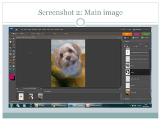

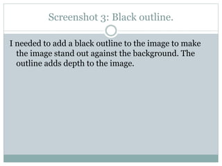
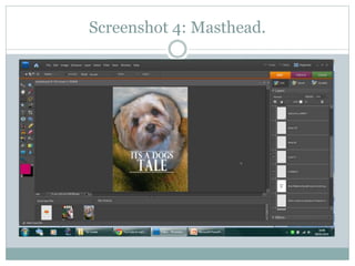
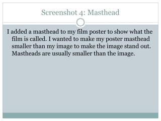
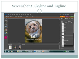
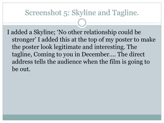
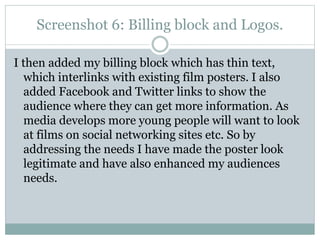
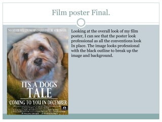

The document describes the process of creating a film poster. It includes 6 screenshots showing: 1) The countryside background image chosen to suit the family film genre. 2) The main image of a dog, which is the main character, with a blurred edge to blend into the background. 3) Adding a black outline to the main image to make it stand out against the background. 4) Adding a smaller masthead to identify the film title and allow the main image to stand out. 5) Including a skyline and tagline at the top to make the poster look legitimate and interesting. 6) Finally, adding billing information and social media links at the bottom to provide more


