
More Related Content
What's hot
What's hot (20)
Viewers also liked
Viewers also liked (20)
Similar to Skyfall poster analysis
Similar to Skyfall poster analysis (20)
Skyfall poster analysis
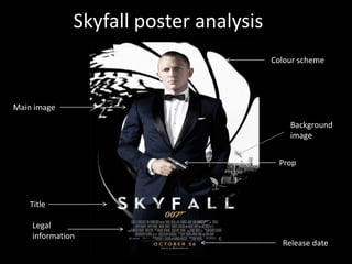
- 1. Skyfall poster analysis Colour scheme Main image Background image Prop Title Legal information Release date
- 2. Title – the title is written in white to contrast again the dark coloured background. It uses capital letters and a simple font to make it easy to read and clear to people who are only quickly viewing it. It is slightly edited to look like its worn out however it is still kept simple and plain. Main image – the main image used on the poster is of the main character and very well known actor Daniel Craig. As the bond films are well known this image will instantly attract attention. By seeing it, it will make people aware of a new bond film and encourage them to learn more about it and remember the release date to see it when it comes out. He is wearing a smart suit and looks very professional suggesting business and importance and the black contrast against the white in the background making him seem even more superior.
- 3. Colour scheme – the colours used on this poster are kept simple and classy using just black and white. It looks very smart and sophisticated and not tacky in any way. It doesn’t have anything cheery or bubbly about it suggesting it focuses on more serious matters and makes it clear the film is not a comedy. By using this colour scheme it also matches the characters suit and is all kept very simple and easy to view. Background image - the image in the background shows London in black and white and the union jack is the only thing in colour to make it really stand out. This informs the audience of the main setting in the film and suggests it could be very British as the flag has been made to really stand out.
- 4. Props – the use of the gun as a prop for the main character makes it easy for the audience to establish the genre of the film. With a gun involved it would suggest action/thriller. Viewers can then instantly decide if they like this genre or not and if they do it will encourage them to want to see the film . Release date – this is very important as it’s the thing people will look for if they are interested in the campaign, by putting it in a bold orange against the black background it is hard to miss and stands out. By including this date, people may start to see if they can pre-book tickets or wait to see it the minute it comes out.
- 5. Legal information – this doesn’t really have any impact on the amount of people wanting to see the film or on advertising therefore it is kept small and discrete but it is there if people did want to read it.