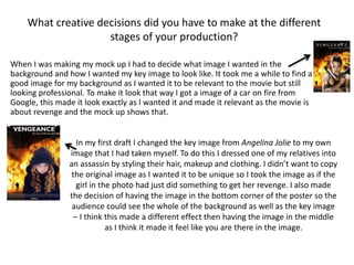
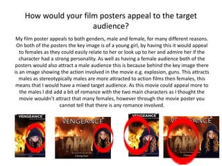
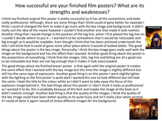
Evaluation
How effective was your research into similar film
posters and the Action/Adventure film genre. What
did you learn from your research?
By doing my research of other film posters helped me a lot as it made me understand the
convections of a movie poster and the correct way of producing one so it would look like the
actual thing. The research was really effective as it showed how to make the poster and also
make it look action/adventure for example, in all posters behind the key image there was action
happening whether it was an explosion or guns shooting – I added this to my original poster.
There was also other things to consider like colour and text, this was actually what I found hard
to decide was what text font to use as I wanted it to represent the movie but also go with the
genre. By having all the different posters gave me ideas about how I wanted my key image to look
like e.g. clothing, expression and posture, this was a really important part of making the poster
look professional as this adds to the genre and the overall feeling of the film. The research
helped me come up with an idea for my film, this was because by knowing what happened in
each film that was part of my research gave me some ideas about what to involve in my own one
and what not to add for example there has to be a good storyline as well as the action to make it
more remember able.
What creative decisions did you have to make at the different
stages of your production?
When I was making my mock up I had to decide what image I wanted in the
background and how I wanted my key image to look like. It took me a while to find a
good image for my background as I wanted it to be relevant to the movie but still
looking professional. To make it look that way I got a image of a car on fire from
Google, this made it look exactly as I wanted it and made it relevant as the movie is
about revenge and the mock up shows that.
In my first draft I changed the key image from Angelina Jolie to my own
image that I had taken myself. To do this I dressed one of my relatives into
an assassin by styling their hair, makeup and clothing. I didn’t want to copy
the original image as I wanted it to be unique so I took the image as if the
girl in the photo had just did something to get her revenge. I also made
the decision of having the image in the bottom corner of the poster so the
audience could see the whole of the background as well as the key image
– I think this made a different effect then having the image in the middle
as I think it made it feel like you are there in the image.
How closely does your film poster follow the forms
and conventions of existing film posters?
My film poster follows the basic convections of the making of a film poster. The poster
has a key image that is placed on the right side as I did want it as a main focus but I
also wanted the background to be noticeable as well so I thought that would be the
best choice of making it work. I also had the title at the top, making sure that the font
went well with the genre of the film and didn’t look out of place. The tag line was
placed right underneath it so it would be easily seen by the audience and made the
film more popular by a memorable tag line – this would also get a larger audience. I
also placed fake billing on the bottom as this made it look more realistic and
professional as without it, it would not look like a film poster. I also did it as on
professional film posters that have to legally have the billing somewhere on it as it
shows the audience the cast, producers, directors, editors etc. To make it look better I
added the date on the bottom underneath the billing to make it not look like a teaser
poster, this would also tell the audience when to expect the film.
How would your film posters appeal to the target
audience?
My film poster appeals to both genders, male and female, for many different reasons.
On both of the posters the key image is of a young girl, by having this it would appeal
to females as they could easily relate to her or look up to her and admire her if the
character had a strong personality. As well as having a female audience both of the
posters would also attract a male audience this is because behind the key image there
is an image showing the action involved in the movie e.g. explosion, guns. This attracts
males as stereotypically males are more attracted to action films then females, this
means that I would have a mixed target audience. As this movie could appeal more to
the males I did add a bit of romance with the two main characters as I thought the
movie wouldn’t attract that many females, however through the movie poster you
cannot tell that there is any romance involved.
How successful are your finished film posters? What are its
strengths and weaknesses?
I think my finished original film poster is pretty successful as it has all the convections and looks
really professional. Although, there are some things that I think could of gone better for example I
think I could of changed the font to make it go more with the key image and background. It didn’t
really suit the idea of the movie however I couldn’t find another one that made it look realistic.
Another thing that I would change is the position of the tag line, when I first placed the tag line on
I couldn’t decide where to put it – I wanted it to be somewhere that it would be noticeable and
big enough so it would be readable. Even though I think that has been achieved underneath the
title I still think that it could of gone some other place where it would of looked better. The good
things about the poster is the key image. Personally, I think the key image goes really well with the
image on the background and has the effect that I wanted. Another good thing about the poster is
the proportions of everything, I think that the images, title, tag line and billing are all a good size
to be noticeable but then are not big enough that it makes it look overcrowded.
The good things about my finished teaser poster is that again with the original poster it creates
the same effect that I wanted with the key image but this time the image is slightly different but
still has the same type of expression. Another good thing is on this poster I went slightly lighter
with the lighting as the first poster is quite dark I wanted this one to look different but still look
the same. I kept the title to the colour white as I didn’t want to take away the focus of the
explosion image behind it. The bad things about this poster is I don’t think it looks as professional
as I wanted it to be, this is probably because of the font and maybe the image at the back as it
didn’t realistic enough. Another bad thing is that the quality of the images, I think the quality of
the key image could have been better quality as its quite fuzzy and isn’t really clear when printed.
If I could of done it again I would of chose different images for the background.

Evaluation

  • 1.
  • 2.
    How effective wasyour research into similar film posters and the Action/Adventure film genre. What did you learn from your research? By doing my research of other film posters helped me a lot as it made me understand the convections of a movie poster and the correct way of producing one so it would look like the actual thing. The research was really effective as it showed how to make the poster and also make it look action/adventure for example, in all posters behind the key image there was action happening whether it was an explosion or guns shooting – I added this to my original poster. There was also other things to consider like colour and text, this was actually what I found hard to decide was what text font to use as I wanted it to represent the movie but also go with the genre. By having all the different posters gave me ideas about how I wanted my key image to look like e.g. clothing, expression and posture, this was a really important part of making the poster look professional as this adds to the genre and the overall feeling of the film. The research helped me come up with an idea for my film, this was because by knowing what happened in each film that was part of my research gave me some ideas about what to involve in my own one and what not to add for example there has to be a good storyline as well as the action to make it more remember able.
  • 3.
    What creative decisionsdid you have to make at the different stages of your production? When I was making my mock up I had to decide what image I wanted in the background and how I wanted my key image to look like. It took me a while to find a good image for my background as I wanted it to be relevant to the movie but still looking professional. To make it look that way I got a image of a car on fire from Google, this made it look exactly as I wanted it and made it relevant as the movie is about revenge and the mock up shows that. In my first draft I changed the key image from Angelina Jolie to my own image that I had taken myself. To do this I dressed one of my relatives into an assassin by styling their hair, makeup and clothing. I didn’t want to copy the original image as I wanted it to be unique so I took the image as if the girl in the photo had just did something to get her revenge. I also made the decision of having the image in the bottom corner of the poster so the audience could see the whole of the background as well as the key image – I think this made a different effect then having the image in the middle as I think it made it feel like you are there in the image.
  • 4.
    How closely doesyour film poster follow the forms and conventions of existing film posters? My film poster follows the basic convections of the making of a film poster. The poster has a key image that is placed on the right side as I did want it as a main focus but I also wanted the background to be noticeable as well so I thought that would be the best choice of making it work. I also had the title at the top, making sure that the font went well with the genre of the film and didn’t look out of place. The tag line was placed right underneath it so it would be easily seen by the audience and made the film more popular by a memorable tag line – this would also get a larger audience. I also placed fake billing on the bottom as this made it look more realistic and professional as without it, it would not look like a film poster. I also did it as on professional film posters that have to legally have the billing somewhere on it as it shows the audience the cast, producers, directors, editors etc. To make it look better I added the date on the bottom underneath the billing to make it not look like a teaser poster, this would also tell the audience when to expect the film.
  • 5.
    How would yourfilm posters appeal to the target audience? My film poster appeals to both genders, male and female, for many different reasons. On both of the posters the key image is of a young girl, by having this it would appeal to females as they could easily relate to her or look up to her and admire her if the character had a strong personality. As well as having a female audience both of the posters would also attract a male audience this is because behind the key image there is an image showing the action involved in the movie e.g. explosion, guns. This attracts males as stereotypically males are more attracted to action films then females, this means that I would have a mixed target audience. As this movie could appeal more to the males I did add a bit of romance with the two main characters as I thought the movie wouldn’t attract that many females, however through the movie poster you cannot tell that there is any romance involved.
  • 6.
    How successful areyour finished film posters? What are its strengths and weaknesses? I think my finished original film poster is pretty successful as it has all the convections and looks really professional. Although, there are some things that I think could of gone better for example I think I could of changed the font to make it go more with the key image and background. It didn’t really suit the idea of the movie however I couldn’t find another one that made it look realistic. Another thing that I would change is the position of the tag line, when I first placed the tag line on I couldn’t decide where to put it – I wanted it to be somewhere that it would be noticeable and big enough so it would be readable. Even though I think that has been achieved underneath the title I still think that it could of gone some other place where it would of looked better. The good things about the poster is the key image. Personally, I think the key image goes really well with the image on the background and has the effect that I wanted. Another good thing about the poster is the proportions of everything, I think that the images, title, tag line and billing are all a good size to be noticeable but then are not big enough that it makes it look overcrowded. The good things about my finished teaser poster is that again with the original poster it creates the same effect that I wanted with the key image but this time the image is slightly different but still has the same type of expression. Another good thing is on this poster I went slightly lighter with the lighting as the first poster is quite dark I wanted this one to look different but still look the same. I kept the title to the colour white as I didn’t want to take away the focus of the explosion image behind it. The bad things about this poster is I don’t think it looks as professional as I wanted it to be, this is probably because of the font and maybe the image at the back as it didn’t realistic enough. Another bad thing is that the quality of the images, I think the quality of the key image could have been better quality as its quite fuzzy and isn’t really clear when printed. If I could of done it again I would of chose different images for the background.