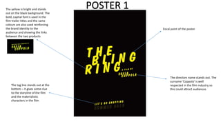
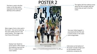
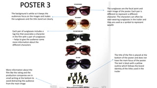
The Bling Ring Poster Analysis
The yellow is bright and stands
out on the black background. The
bold, capital font is used in the
film trailer titles and the same
colours are also used reinforcing
the brand identity to the
audience and showing the links
between the two products

The tag line stands out at the
bottom – it gives some clue
to the storyline of the film
and the materialistic
characters in the film

POSTER 1
Focal point of the poster

The directors name stands out. The
surname ‘Coppola’ is well
respected in the film industry so
this could attract audiences
This font is used in the film
trailer on the titles which
represents the films brand
identity to the audience

POSTER 2

The tagline tells the audience more
about the film and goes with the
events that are seen in the film
trailer

Main image is from a shot used in
the trailer – the cast are wearing
the same outfits and are in the
same location. The image is the
main focus of the poster

The name ‘Sofia Coppola’ is
associated with the film and
is clearly shown in the trailer
to be recognisable

Saying it was ‘based on
actual events’ often entices
the audience to go see the
film as it makes it seem
more realistic

Information at the bottom of
the poster includes things such
as cast members names,
production companies etc
POSTER 3
The background is white so it keeps the
audiences focus on the images and makes
the sunglasses and the title stand out clearly

The sunglasses are the focal point and
main image of the poster. Each pair is
different to represent a different
character. The characters can often be
seen wearing sunglasses in the trailer and
they are used as a symbol to represent
wealth

Each pair of sunglasses includes a
tag line that associates a character
in the film with a pair of sunglasses
– helps to give the audience some
more information about the
different characters

More information about the
film like the rating and the
production companies are in
small writing at the bottom to
avoid distracting the audience
from the main image

The title of the film is placed at the
bottom of the poster and does not
have the main focus of the poster.
The text is black with a yellow
outline which follows the brand
identity of the titles used in the
trailer

The Bling Ring Poster Analysis

  • 1.
    The Bling RingPoster Analysis
  • 2.
    The yellow isbright and stands out on the black background. The bold, capital font is used in the film trailer titles and the same colours are also used reinforcing the brand identity to the audience and showing the links between the two products The tag line stands out at the bottom – it gives some clue to the storyline of the film and the materialistic characters in the film POSTER 1 Focal point of the poster The directors name stands out. The surname ‘Coppola’ is well respected in the film industry so this could attract audiences
  • 3.
    This font isused in the film trailer on the titles which represents the films brand identity to the audience POSTER 2 The tagline tells the audience more about the film and goes with the events that are seen in the film trailer Main image is from a shot used in the trailer – the cast are wearing the same outfits and are in the same location. The image is the main focus of the poster The name ‘Sofia Coppola’ is associated with the film and is clearly shown in the trailer to be recognisable Saying it was ‘based on actual events’ often entices the audience to go see the film as it makes it seem more realistic Information at the bottom of the poster includes things such as cast members names, production companies etc
  • 4.
    POSTER 3 The backgroundis white so it keeps the audiences focus on the images and makes the sunglasses and the title stand out clearly The sunglasses are the focal point and main image of the poster. Each pair is different to represent a different character. The characters can often be seen wearing sunglasses in the trailer and they are used as a symbol to represent wealth Each pair of sunglasses includes a tag line that associates a character in the film with a pair of sunglasses – helps to give the audience some more information about the different characters More information about the film like the rating and the production companies are in small writing at the bottom to avoid distracting the audience from the main image The title of the film is placed at the bottom of the poster and does not have the main focus of the poster. The text is black with a yellow outline which follows the brand identity of the titles used in the trailer