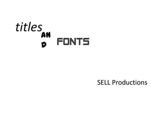
1) SELL Productions chose the font for their feature film title first since it would be shown live in the opening rather than added in post-production.
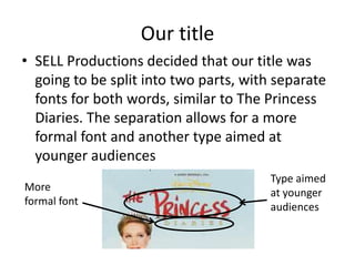
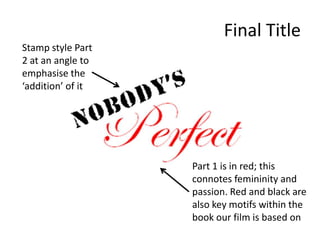
2) The title is split into two parts with separate fonts to have a formal font for one part and a more youth-oriented font for the other part, similar to "The Princess Diaries".
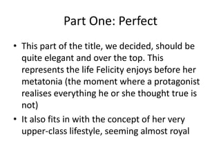
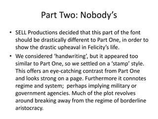
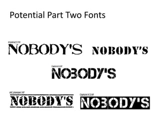
3) The film's title was decided as "Nobody's Perfect" which is a common phrase that fits the film better than the original consideration of just "Perfect". The "Nobody's" part would be layered on top of "Perfect" as if added angrily.