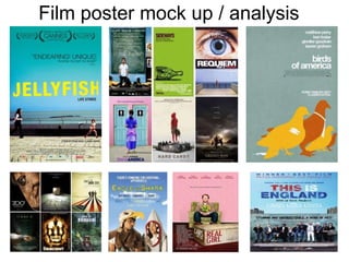
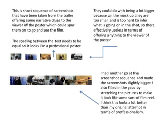
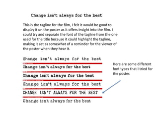
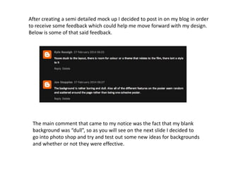
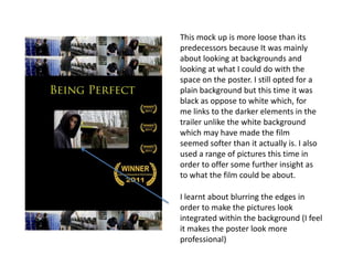
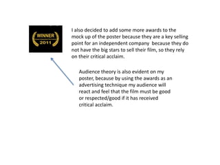
Film poster mock up / analysis
I downloaded this font from an
external source because the
standard fonts on photo shop did
not offer the look I going for.
This font was chosen because I
felt it was loosely perfect which
links to the film itself because
the protagonist doesn't’t
understand he can be perfect
just the way he is.
The font is Large and black because I
have a white background and the two
colors work well with each other.
I like the font, it is different from
the one that is used in the trailer
but I feel it looks good with this
idea (mock up).
This photo of the protagonist was taken
against a blank background, so I could
edit it easier on a blank background and
refine the edges.
I think it needs to be cropped
and made smaller by perhaps
getting rid of the shoulders and
changing the photo to just his
face.
It also looks slightly out of
place on the poster so it may
be better if I integrate it better
onto the background.
I could also try some
different facial expressions
which would give the
viewer a different
impression about the film.
This is short sequence of screenshots
that have been taken from the trailer
offering some narrative clues to the
viewer of the poster which could spur
them on to go and see the film.
They could do with being a lot bigger
because on the mock up they are
too small and is too hard to infer
what is going on in the shot, so there
effectively useless in terms of
offering anything to the viewer of
the poster.The spacing between the text needs to be
equal so it looks like a professional poster.
I had another go at the
screenshot sequence and made
the screenshots slightly bigger. I
also filled in the gaps by
stretching the pictures to make
it look like some sort of film reel,
I think this looks a lot better
than my original attempt in
terms of proffessionalism.
This is the tagline for the film, I felt it would be good to
display it on the poster as it offers insight into the film. I
could try and separate the font of the tagline from the one
used for the title because it could highlight the tagline,
making it act as somewhat of a reminder for the viewer of
the poster when they hear it.
Here are some different
font types that I tried for
the poster.
After creating a semi detailed mock up I decided to post in on my blog in order
to receive some feedback which could help me move forward with my design.
Below is some of that said feedback.
The main comment that came to my notice was the fact that my blank
background was “dull”, so as you will see on the next slide I decided to
go into photo shop and try and test out some new ideas for backgrounds
and whether or not they were effective.
This mock up is more loose than its
predecessors because It was mainly
about looking at backgrounds and
looking at what I could do with the
space on the poster. I still opted for a
plain background but this time it was
black as oppose to white which, for
me links to the darker elements in the
trailer unlike the white background
which may have made the film
seemed softer than it actually is. I also
used a range of pictures this time in
order to offer some further insight as
to what the film could be about.
I learnt about blurring the edges in
order to make the pictures look
integrated within the background (I feel
it makes the poster look more
professional)
I also decided to add some more awards to the
mock up of the poster because they are a key selling
point for an independent company because they do
not have the big stars to sell their film, so they rely
on their critical acclaim.
Audience theory is also evident on my
poster, because by using the awards as an
advertising technique my audience will
react and feel that the film must be good
or respected/good if it has received
critical acclaim.

Film poster mock up analysis

  • 1.
    Film poster mockup / analysis
  • 2.
    I downloaded thisfont from an external source because the standard fonts on photo shop did not offer the look I going for. This font was chosen because I felt it was loosely perfect which links to the film itself because the protagonist doesn't’t understand he can be perfect just the way he is. The font is Large and black because I have a white background and the two colors work well with each other. I like the font, it is different from the one that is used in the trailer but I feel it looks good with this idea (mock up).
  • 3.
    This photo ofthe protagonist was taken against a blank background, so I could edit it easier on a blank background and refine the edges. I think it needs to be cropped and made smaller by perhaps getting rid of the shoulders and changing the photo to just his face. It also looks slightly out of place on the poster so it may be better if I integrate it better onto the background. I could also try some different facial expressions which would give the viewer a different impression about the film.
  • 4.
    This is shortsequence of screenshots that have been taken from the trailer offering some narrative clues to the viewer of the poster which could spur them on to go and see the film. They could do with being a lot bigger because on the mock up they are too small and is too hard to infer what is going on in the shot, so there effectively useless in terms of offering anything to the viewer of the poster.The spacing between the text needs to be equal so it looks like a professional poster. I had another go at the screenshot sequence and made the screenshots slightly bigger. I also filled in the gaps by stretching the pictures to make it look like some sort of film reel, I think this looks a lot better than my original attempt in terms of proffessionalism.
  • 5.
    This is thetagline for the film, I felt it would be good to display it on the poster as it offers insight into the film. I could try and separate the font of the tagline from the one used for the title because it could highlight the tagline, making it act as somewhat of a reminder for the viewer of the poster when they hear it. Here are some different font types that I tried for the poster.
  • 6.
    After creating asemi detailed mock up I decided to post in on my blog in order to receive some feedback which could help me move forward with my design. Below is some of that said feedback. The main comment that came to my notice was the fact that my blank background was “dull”, so as you will see on the next slide I decided to go into photo shop and try and test out some new ideas for backgrounds and whether or not they were effective.
  • 7.
    This mock upis more loose than its predecessors because It was mainly about looking at backgrounds and looking at what I could do with the space on the poster. I still opted for a plain background but this time it was black as oppose to white which, for me links to the darker elements in the trailer unlike the white background which may have made the film seemed softer than it actually is. I also used a range of pictures this time in order to offer some further insight as to what the film could be about. I learnt about blurring the edges in order to make the pictures look integrated within the background (I feel it makes the poster look more professional)
  • 8.
    I also decidedto add some more awards to the mock up of the poster because they are a key selling point for an independent company because they do not have the big stars to sell their film, so they rely on their critical acclaim. Audience theory is also evident on my poster, because by using the awards as an advertising technique my audience will react and feel that the film must be good or respected/good if it has received critical acclaim.