This document analyzes and summarizes key elements of three movie posters:
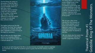
1) Godzilla: King of the Monsters poster uses a blue color scheme and features Godzilla amid military vehicles, implying his power.
2) Star Wars: The Force Awakens character poster focuses on the villain Kylo Ren in red, black and silver, suggesting his role.
3) The Dark Knight teaser poster features a smeared bat symbol in black, red and grey, foreshadowing the Joker and a dark, gritty superhero film.