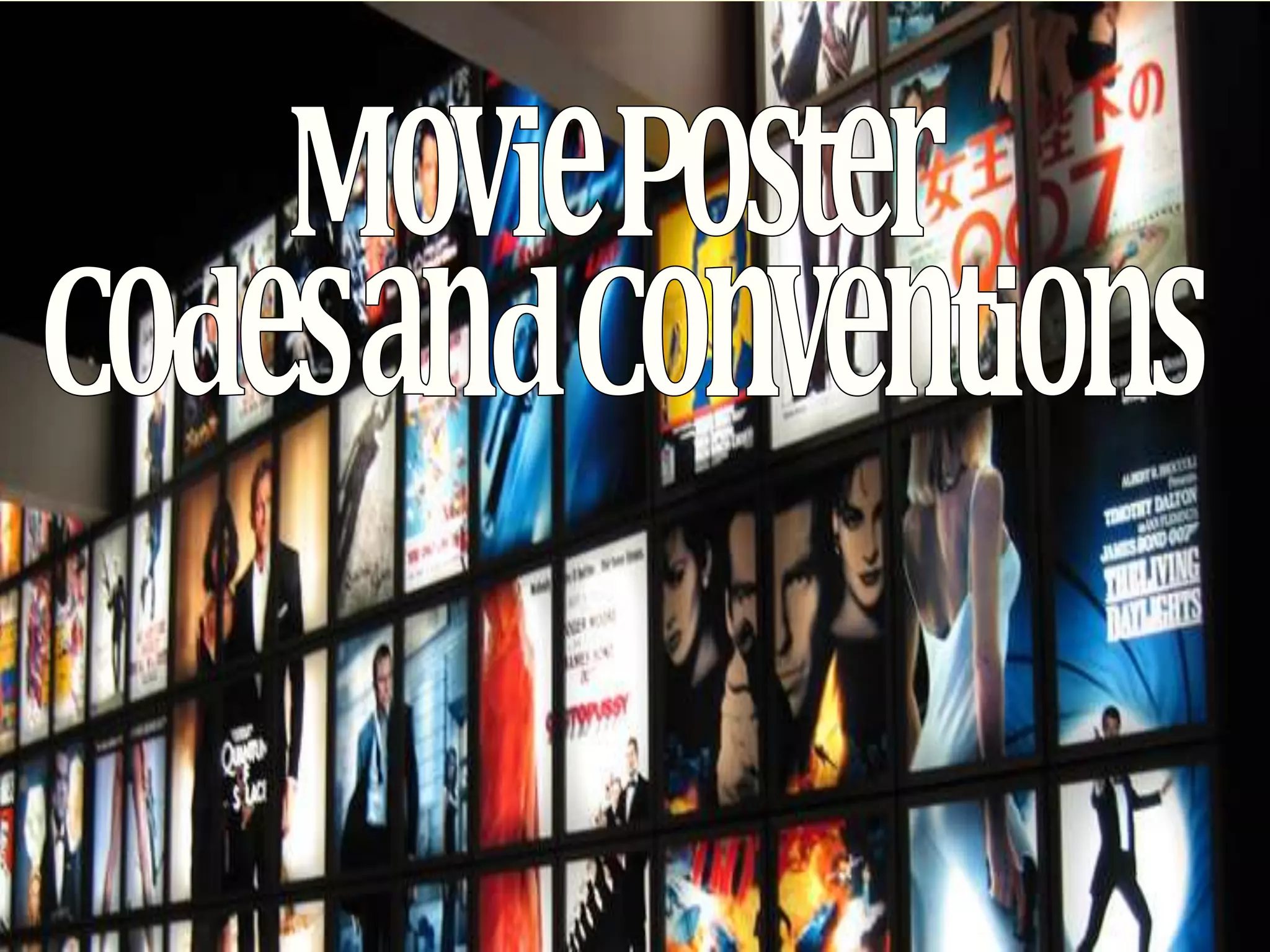
The document discusses several key elements that are commonly found in film posters across different genres. Most film posters include a billing block that provides information about the producers, directors, and other crew. The colors used are typically genre-specific to help viewers quickly identify the type of film. The title of the film is always prominently displayed in the top, middle, or bottom third of the poster. A tagline is also usually present to summarize the film in a memorable phrase. The main image typically takes up most of the poster and features the main character(s). These elements are designed to attract audience attention and intrigue them about the film.
Model Attribute Check Company Auto PropertyCeline George
In Odoo, the multi-company feature allows you to manage multiple companies within a single Odoo database instance. Each company can have its own configurations while still sharing common resources such as products, customers, and suppliers.
Synthetic Fiber Construction in lab .pptxPavel ( NSTU)
Synthetic fiber production is a fascinating and complex field that blends chemistry, engineering, and environmental science. By understanding these aspects, students can gain a comprehensive view of synthetic fiber production, its impact on society and the environment, and the potential for future innovations. Synthetic fibers play a crucial role in modern society, impacting various aspects of daily life, industry, and the environment. ynthetic fibers are integral to modern life, offering a range of benefits from cost-effectiveness and versatility to innovative applications and performance characteristics. While they pose environmental challenges, ongoing research and development aim to create more sustainable and eco-friendly alternatives. Understanding the importance of synthetic fibers helps in appreciating their role in the economy, industry, and daily life, while also emphasizing the need for sustainable practices and innovation.
How to Make a Field invisible in Odoo 17Celine George
It is possible to hide or invisible some fields in odoo. Commonly using “invisible” attribute in the field definition to invisible the fields. This slide will show how to make a field invisible in odoo 17.
The Roman Empire A Historical Colossus.pdfkaushalkr1407
The Roman Empire, a vast and enduring power, stands as one of history's most remarkable civilizations, leaving an indelible imprint on the world. It emerged from the Roman Republic, transitioning into an imperial powerhouse under the leadership of Augustus Caesar in 27 BCE. This transformation marked the beginning of an era defined by unprecedented territorial expansion, architectural marvels, and profound cultural influence.
The empire's roots lie in the city of Rome, founded, according to legend, by Romulus in 753 BCE. Over centuries, Rome evolved from a small settlement to a formidable republic, characterized by a complex political system with elected officials and checks on power. However, internal strife, class conflicts, and military ambitions paved the way for the end of the Republic. Julius Caesar’s dictatorship and subsequent assassination in 44 BCE created a power vacuum, leading to a civil war. Octavian, later Augustus, emerged victorious, heralding the Roman Empire’s birth.
Under Augustus, the empire experienced the Pax Romana, a 200-year period of relative peace and stability. Augustus reformed the military, established efficient administrative systems, and initiated grand construction projects. The empire's borders expanded, encompassing territories from Britain to Egypt and from Spain to the Euphrates. Roman legions, renowned for their discipline and engineering prowess, secured and maintained these vast territories, building roads, fortifications, and cities that facilitated control and integration.
The Roman Empire’s society was hierarchical, with a rigid class system. At the top were the patricians, wealthy elites who held significant political power. Below them were the plebeians, free citizens with limited political influence, and the vast numbers of slaves who formed the backbone of the economy. The family unit was central, governed by the paterfamilias, the male head who held absolute authority.
Culturally, the Romans were eclectic, absorbing and adapting elements from the civilizations they encountered, particularly the Greeks. Roman art, literature, and philosophy reflected this synthesis, creating a rich cultural tapestry. Latin, the Roman language, became the lingua franca of the Western world, influencing numerous modern languages.
Roman architecture and engineering achievements were monumental. They perfected the arch, vault, and dome, constructing enduring structures like the Colosseum, Pantheon, and aqueducts. These engineering marvels not only showcased Roman ingenuity but also served practical purposes, from public entertainment to water supply.
This is a presentation by Dada Robert in a Your Skill Boost masterclass organised by the Excellence Foundation for South Sudan (EFSS) on Saturday, the 25th and Sunday, the 26th of May 2024.
He discussed the concept of quality improvement, emphasizing its applicability to various aspects of life, including personal, project, and program improvements. He defined quality as doing the right thing at the right time in the right way to achieve the best possible results and discussed the concept of the "gap" between what we know and what we do, and how this gap represents the areas we need to improve. He explained the scientific approach to quality improvement, which involves systematic performance analysis, testing and learning, and implementing change ideas. He also highlighted the importance of client focus and a team approach to quality improvement.
We all have good and bad thoughts from time to time and situation to situation. We are bombarded daily with spiraling thoughts(both negative and positive) creating all-consuming feel , making us difficult to manage with associated suffering. Good thoughts are like our Mob Signal (Positive thought) amidst noise(negative thought) in the atmosphere. Negative thoughts like noise outweigh positive thoughts. These thoughts often create unwanted confusion, trouble, stress and frustration in our mind as well as chaos in our physical world. Negative thoughts are also known as “distorted thinking”.
Palestine last event orientationfvgnh .pptxRaedMohamed3
An EFL lesson about the current events in Palestine. It is intended to be for intermediate students who wish to increase their listening skills through a short lesson in power point.
The Indian economy is classified into different sectors to simplify the analysis and understanding of economic activities. For Class 10, it's essential to grasp the sectors of the Indian economy, understand their characteristics, and recognize their importance. This guide will provide detailed notes on the Sectors of the Indian Economy Class 10, using specific long-tail keywords to enhance comprehension.
For more information, visit-www.vavaclasses.com
Sectors of the Indian Economy - Class 10 Study Notes pdf
Movie Poster Codes and Conventions
1.
2. • A film poster is a poster used to advertise a film. The most common
conventiosn used for posters for films of all genres, featuring the
mast head, a main image – usually of the main actor(s), a tagline, the name of the director/actors and a billing block at the
bottom of the poster highlighting the key companies and crew
members in smaller writing, also the release date and the name of
the film in the largest writing on the page.
• Whilst some people see them as a work of art for people to look
at, they are more of an advertisement for the film and act as an eye
catcher and draw interest to the film more.
• Movie posters should let the consumers grasp the genre of the
movie through looking at the poster, through the colour
scheme, main image, camera angles and the choice of fonts.
• Movie posters are a key element in the marketing campaign and can
be seen outside cinemas, on billboards, on transport and also in the
newspaper to increase the potential audience and make the
audience a lot more aware of when it is being released.
• There are various types of movie posters, including official cinema
release posters, DVD release posters and also teaser trailer posters.
3.
4. The title makes an impact again
using a simple text which
catches your eye against the
background.
There is a tagline on the
poster, ‘twenty years, two
people, which enhances the
vintage theme of the film’s
image.
Underneath the title of the
film, the two main characters
names are clear, simple and
allows the viewer to quickly
know that they are in the film
and correspond them with
other films making them want
to go see the film more.
From the main characters, it
is clear that the genre is
romantic due to the pose the
characters are portraying.
The posters use of vintage
filter over the image allows
the reader to again identify
that it is a romantic genre
film.
The image again is very
intimate which is a perfect type
of image relating to the
romantic genre.
The billing block at the
bottom of the poster is a
typical convention of a film
poster
5.
6. A catchy tag line is placed at the top
of the poster and is the first thing the
audience member sees. It is a direct
question to the audience making
them feel like the poster is directly
targeting them.
The colour scheme follows the
traditional horror poster
conventions, using the contrasts
between black and white and
parts of red. The black, simple
background suggests that the
film will be a dark, scary film.
The black can also suggest the
‘unknown’ which creates a type
of mystery within the film for
the audience.
The main image is at the centre of
the poster meaning it is the main
focus point for the audience when
they first see the poster. At first
glance the image looks distorted
following the codes and
conventions of a traditional
horror film.
This image can be initially
scare for an audience member
but it can also suggest a lot
about the films narrative. The
eyes of the face are made up of
screaming mouths alone with a
smile. This could suggest that
the film could consist of
frightening sequences and also
characters that inflict this
terror. This face created does
not look like a human but an
alien/ghost suggesting this
film is also about spirits and
the underworld.
The title of the film is in the
lower third of the poster and
stands out to the audience. A
passing audience can identify the
film’s title and genre. The
position of the film title follows a
traditional poster layout with the
billing block at the bottom.
7.
8. The slogan attracts attention and
suggests where the film is
set, Vegas. The slogan also adds to
the humour of the poster as the
actors don’t look like they did
handle Vegas well at all.
Important information is included
about the director, producers and
music composers which may draw
in a wider audience to see the film
in the billing block which is a
traditional code and convention.
The Film title is in bright white
text underneath the main image
in upper casing. This provides
the audience with an answer as
to why the actors look so worn.
The text looks like a Las Vegas
show sign which would collate
with the theme of the film.
The inclusion of “from the directors
of” attracts the audience’s attention
as they may be fans of the other film
and will therefore want to go and
enjoy this film.
The main colours are yellow, red and
brown which are very male
orientated colours with blue
incorporated in the babies’ clothes
suggesting how this is a “boy’s film”
and also corresponds with the theme
of comedy and laughter.
The main image of the actors suggests
this is a comedy film through the
expressions on the actor’s faces, the
missing teeth, scrapes and the baby
strapped to one of the men which will
make the audience want to go see how
they ended up this way and what will
happen next.
The background of the image of the
lights is in-keeping with the Vegas
theme but is also a glamorous
appearance which contradicts the
image of the worn out actors which
adds to the humour of the poster.
9.
10. The background
image is white so that
it is simple, not
distracting the
audience’s attention
away from the main
characters.
The main image is in the
middle third of the poster
which makes it stand out to
the audience and it is very eye
catching. The main image
concentrates on the main
characters who are universally
known. The colourful
characters are more well
known due to it being more
eye-catching for children.
The use of the ‘from the
creators of…’ allows the
audience to know if the
film will be at a standard
that they will want to see
due to previous films
created by the producers
and production company.
The elements of fantasy are
obvious to attract the
younger and also older
audience, yet foreknowledge
lets the audience know that
this film is also for adults.
In the billing block, which
is much smaller than usual
due to the fact that a child
will not want to know who
the producers are.
11.
12. The main image of this poster takes
up most of it this shown in the top
third, of two of the main characters
faces in a mid-shot/ close up were
both characters are looking to their
right. This image appears to
be amongst the clouds and sky
staying in the colour theme of the
poster creating a “sun setting”
image. Below this the poster also
shows another image this of a screen
shot from the movie of the same two
characters walking on a beach with
their arms around each other, this
showing that it is a romantic and
dramatic movie. Again this blends in
with the colour theme keeping them
all quiet dull this perhaps
suggesting that the film does not
only consist of “romance” but
maybe “drama”.
We can see in the top third the
unique selling point which this
has been connected with being
“The notebook” and “A walk to
remember”.
The title of this film “The Last
Song” is in the middle third of
this poster, this is written in
white font allowing it to stand
out from the rest of the poster.
The characters names are then
written above this so that those
that are fans of these actors /
actresses can easily see that they
are in this film. Above the title
there also is a blurb on what the
film is about letting the audience
know that this is a romantic
drama.
The use of the lighting between
the two main characters
highlights to the audience the
two images merged into one but
also draws attention to the poster
and two main characters.
13.
14. • After researching several different film posters from different genres, I
found that most, if not all of the posters included a ‘billing block’ which
allows the reader to find out more about the producers, directors and
other people involved in the making which may intrigue the audience
to research them and entice them in more. The colours used in most
were specific to the genre, for my chosen genre of horror/mystery I
found that red black white and duller colours were used to entice the
audience in and allow them to quickly recognise what genre it is. All of
the posters, no mater what genre included the title of the film, which
was placed either in the middle third, top third or bottom third of the
poster which attracts the audience straight away. A tagline was also
used to create a memorable phrase that sums up the film easily making
the audience connect the two together. Lastly, the main image, which
usually covers the full of the poster and usually centre of the page is of
the main character (s).