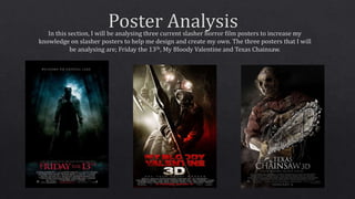
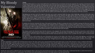
The poster below promotes ‘My Bloody Valentine’, a horror film that is based in the slasher sub-genre as it has elements of slasher films with certain conventions
that place it in this genre. I chose to analysis this poster in particular because it is one of the few horror posters that appears 3D and I thought this was a good
effect and would work on enticing audiences to watch the film in 3D rather than regular 2D.
Poster Conventions
This poster follows the general conventions
of a film post just like ‘Friday the 13th’ such
as the title of the film is at the bottom of the
page but above the institutional information
and the text of the title is the largest on the
page so that the audience can read and
know what the film is called.
Furthermore it is designed well to attract its
target audience by using the convention
colours that are within the slasher genre;
black, red and white. Additionally, the
antagonist is holding his weapon of choice
which is a common feature in slasher movie
posters.
However the tagline is below the film title
and not at the top of the poster like the
other posters I have analysed, but still
conforms to the common convention that
the tagline is the second largest text on the
poster.
The poster also has logo’s of company’s that
help fund the movie at the bottom of the
poster and the date of the movies release is
in a conventional place on the poster and
also stands out with the colour used so that
the audience can read it.
Colour
The main colour scheme is red, white and black which conforms to the conventions of horror, being
that red represents blood and the text is red. This is to inform the audience that there is most likely
going to be a lot of gruesome deaths, which is what they desire. This will encourage audiences to go
and watch the film. Colour has also been used in order to show that this movie is 3D, the antagonist
is shown three times in the same poster, however the use of lighter colours shows that this is the
same killer which suggest that he is a serial killer due to the lighter shade of himself which
represents that he has killed more than once. But also further encourages the idea to the audience
that this movie is in 3D. This will heighten audiences interest because at this time (2009) there
wasn’t many horror movies with a three dimensional effect and this will make audience’s feel more
aware of the danger within the movie, which will then make their fears grow and make them more
enticed to watch the film. The use of white lighting is used to represent death, in the way that
supposedly, when you die you see you see a bright white light. So therefore this white light
signifies death is going to occur in this movie and the 3D aspect represents that not even the
audience is safe. Furthermore the darker colours used towards the bottom of the poster represent
that the cave/mine that the antagonist is in, is hell. We all represent that hell is below us and the
colours red and black are often linked with hell, and everybody is afraid of going to hell.
The colours that most appear are grey, black and red. The connotations of grey and black are death,
loneliness and suggest fear which could be related to both how the antagonist and victims and
therefore represents and links to the narrative of the film, being that the sub-genre’s narrative is
conventionally about fear and the fear of being alone in the dark. Black is generally suggests death
and fear which relates to the victims being in the dark within the mineshafts deep below the earths
surface, audiences fear being alone and isolated and these colours represent this is exactly what
will happen to the victims, but also could mean that the narrative is a lot deeper inn the fact that
the antagonist could just be lonely and fears anyone knowing his existence.
Tagline
The tagline is in a conventional place on the poster and is the second largest text on the page. It also
features direct address ‘Get YOUR heart broken’ which draws the audience in and allows them to
connect with the movie. But the movie is not saying in terms of getting your heart broken by love
but literally getting your heart broken and dying a gruesome death from the antagonists pickaxe.
The tagline represents that the heart will be broken and links with the name of the film, My Bloody
Valentine, which tells the audience that the day that is meant to be the most loving will lead to the
most heart breaking experience. This includes death and love being lost between the characters
losing their closest friends.
Other Texts
Other texts that feature within this poster are the institutional information and the release date of
the film. The institutional information is at the bottom if the page which is conventional in all
posters and this goes the same with the release date of the film. They are both don’t take any
attention away from the main image and texts on the page.
Image
The setting of this poster is in a cave or mine shaft and we can tell this by the use of costume worn by the antagonist. He is wearing a conventional costume
of what a miner would wear typically, by having props such as his gas mask and head torch to further this stereotype. This setting is used to create a
symbiotic link between the poster and trailer due to the use of the rocky wall in the background of the image and the costume used is going to be the same
for the antagonist in the film. The setting featured can also suggest that where the film is set is in hell, as everyone believes that hell is below the earth and
is usually represented by hellish fires and colours such as red and black, like such colours used in the poster. Basically the setting suggest that you are
going to hell when you go down to this mineshaft that the antagonists goes by. This is a typical convention for horror movies, by using hell subconsciously
within the setting will heighten the scare factor within the audience and will allow the audience do create expectations of the film’s narrative.
Side lighting has also been used in the image for the poster and is used to represent death. By using a white, bright light, audiences will be able to get a
feeling of death as it is thought that you see a white bright light before you die. However this light could be used to show escape and safety, the only
problem is the audience will have to get passed the antagonist first, which is unlikely as this is a slasher film. Furthermore the dark lighting out-weighs the
brighter lighting which suggests that the victims in this horror film are not going to survive. This will create fear within the audience as they will feel as if
they are there in the same situation as the victims, especially due to the fact that this poster is forcing the audience to understand that this film is in 3D so
there is no escape.
In addition, the character dominates the frame of the poster by having a 3D effect to promote the movie in 3D which could gain the film more audience.
The audience is presented with a medium longshot of the antagonist and he is holding his chose of weapon which seems to come out of the poster to get
the audience, once again focusing on the film being in 3D to create more fear and interest for the audience. We can tell that the poster is focusing on the 3D
aspect of the film as ‘3D’ is actually the largest text on the poster, furthermore the pickaxe overlaps the title of the film so that the audience can realise that
it would appear that the antagonist could almost look like he can kill them because of the 3D aspect.
The costume used for the character shows that this character is the antagonist. We can know this because this character is covered by a mask to hide his
identity but also to represent that the character is a mine or a former one. The mask also looks as if the killer has no eyes which is used to create more fear
for the audience. Also by the audience not knowing what the killer looks like allows the narrative to have a possible twist and creates a conventional killer
with no identity.
Key light is used here which produces the most illumination and contrast on the subject. Like Friday the 13ths poster, back lighting is used behind the
antagonist to represent that the victim that is confronted by the antagonist has to defeat him to survive and go towards the light. This is another main
convention and I may use in the poster that my group create. Fill light is placed to the side of the subject to fill out shadows and balance the key light.
Title
The title’s typography is a standard and convention layout and text. The colour used is red to represent blood and has dusty black stains on some of the characters to show a symbiotic link between
the title and the image. It also has a play on words because of the name of the title is ‘My Bloody Valentine’ plays with the tagline with the fact that is states that you will have a broken heart, but as
the title uses ‘Bloody’ suggests that the victims heart is going to be broken in a psychical way and through a painful death. Furthermore, the title is a conventions place on the poster and is also the
largest text on the poster so that after the audience has seen the main image, can read the title of the film so that they can remember what the film is called to go and watch the trailer so they can
become more enticed in the movie. In addition to this, audiences do not represents valentine with death, but with love, the fact that this film is called ‘My Bloody Valentine’ suggests the movie is
about death and love.
Overall, this movie poster is effective by the use of conventional colours, mise-en-scene and promotes the movie well as audiences will be able to understand that this is a movie from the horror
genre, they could even get that it is a slasher genre. This will help create understanding and attraction of the right audience to go and watch this film.

21.Poster Analysis 2

  • 2.
    The poster belowpromotes ‘My Bloody Valentine’, a horror film that is based in the slasher sub-genre as it has elements of slasher films with certain conventions that place it in this genre. I chose to analysis this poster in particular because it is one of the few horror posters that appears 3D and I thought this was a good effect and would work on enticing audiences to watch the film in 3D rather than regular 2D. Poster Conventions This poster follows the general conventions of a film post just like ‘Friday the 13th’ such as the title of the film is at the bottom of the page but above the institutional information and the text of the title is the largest on the page so that the audience can read and know what the film is called. Furthermore it is designed well to attract its target audience by using the convention colours that are within the slasher genre; black, red and white. Additionally, the antagonist is holding his weapon of choice which is a common feature in slasher movie posters. However the tagline is below the film title and not at the top of the poster like the other posters I have analysed, but still conforms to the common convention that the tagline is the second largest text on the poster. The poster also has logo’s of company’s that help fund the movie at the bottom of the poster and the date of the movies release is in a conventional place on the poster and also stands out with the colour used so that the audience can read it. Colour The main colour scheme is red, white and black which conforms to the conventions of horror, being that red represents blood and the text is red. This is to inform the audience that there is most likely going to be a lot of gruesome deaths, which is what they desire. This will encourage audiences to go and watch the film. Colour has also been used in order to show that this movie is 3D, the antagonist is shown three times in the same poster, however the use of lighter colours shows that this is the same killer which suggest that he is a serial killer due to the lighter shade of himself which represents that he has killed more than once. But also further encourages the idea to the audience that this movie is in 3D. This will heighten audiences interest because at this time (2009) there wasn’t many horror movies with a three dimensional effect and this will make audience’s feel more aware of the danger within the movie, which will then make their fears grow and make them more enticed to watch the film. The use of white lighting is used to represent death, in the way that supposedly, when you die you see you see a bright white light. So therefore this white light signifies death is going to occur in this movie and the 3D aspect represents that not even the audience is safe. Furthermore the darker colours used towards the bottom of the poster represent that the cave/mine that the antagonist is in, is hell. We all represent that hell is below us and the colours red and black are often linked with hell, and everybody is afraid of going to hell. The colours that most appear are grey, black and red. The connotations of grey and black are death, loneliness and suggest fear which could be related to both how the antagonist and victims and therefore represents and links to the narrative of the film, being that the sub-genre’s narrative is conventionally about fear and the fear of being alone in the dark. Black is generally suggests death and fear which relates to the victims being in the dark within the mineshafts deep below the earths surface, audiences fear being alone and isolated and these colours represent this is exactly what will happen to the victims, but also could mean that the narrative is a lot deeper inn the fact that the antagonist could just be lonely and fears anyone knowing his existence. Tagline The tagline is in a conventional place on the poster and is the second largest text on the page. It also features direct address ‘Get YOUR heart broken’ which draws the audience in and allows them to connect with the movie. But the movie is not saying in terms of getting your heart broken by love but literally getting your heart broken and dying a gruesome death from the antagonists pickaxe. The tagline represents that the heart will be broken and links with the name of the film, My Bloody Valentine, which tells the audience that the day that is meant to be the most loving will lead to the most heart breaking experience. This includes death and love being lost between the characters losing their closest friends. Other Texts Other texts that feature within this poster are the institutional information and the release date of the film. The institutional information is at the bottom if the page which is conventional in all posters and this goes the same with the release date of the film. They are both don’t take any attention away from the main image and texts on the page.
  • 3.
    Image The setting ofthis poster is in a cave or mine shaft and we can tell this by the use of costume worn by the antagonist. He is wearing a conventional costume of what a miner would wear typically, by having props such as his gas mask and head torch to further this stereotype. This setting is used to create a symbiotic link between the poster and trailer due to the use of the rocky wall in the background of the image and the costume used is going to be the same for the antagonist in the film. The setting featured can also suggest that where the film is set is in hell, as everyone believes that hell is below the earth and is usually represented by hellish fires and colours such as red and black, like such colours used in the poster. Basically the setting suggest that you are going to hell when you go down to this mineshaft that the antagonists goes by. This is a typical convention for horror movies, by using hell subconsciously within the setting will heighten the scare factor within the audience and will allow the audience do create expectations of the film’s narrative. Side lighting has also been used in the image for the poster and is used to represent death. By using a white, bright light, audiences will be able to get a feeling of death as it is thought that you see a white bright light before you die. However this light could be used to show escape and safety, the only problem is the audience will have to get passed the antagonist first, which is unlikely as this is a slasher film. Furthermore the dark lighting out-weighs the brighter lighting which suggests that the victims in this horror film are not going to survive. This will create fear within the audience as they will feel as if they are there in the same situation as the victims, especially due to the fact that this poster is forcing the audience to understand that this film is in 3D so there is no escape. In addition, the character dominates the frame of the poster by having a 3D effect to promote the movie in 3D which could gain the film more audience. The audience is presented with a medium longshot of the antagonist and he is holding his chose of weapon which seems to come out of the poster to get the audience, once again focusing on the film being in 3D to create more fear and interest for the audience. We can tell that the poster is focusing on the 3D aspect of the film as ‘3D’ is actually the largest text on the poster, furthermore the pickaxe overlaps the title of the film so that the audience can realise that it would appear that the antagonist could almost look like he can kill them because of the 3D aspect. The costume used for the character shows that this character is the antagonist. We can know this because this character is covered by a mask to hide his identity but also to represent that the character is a mine or a former one. The mask also looks as if the killer has no eyes which is used to create more fear for the audience. Also by the audience not knowing what the killer looks like allows the narrative to have a possible twist and creates a conventional killer with no identity. Key light is used here which produces the most illumination and contrast on the subject. Like Friday the 13ths poster, back lighting is used behind the antagonist to represent that the victim that is confronted by the antagonist has to defeat him to survive and go towards the light. This is another main convention and I may use in the poster that my group create. Fill light is placed to the side of the subject to fill out shadows and balance the key light. Title The title’s typography is a standard and convention layout and text. The colour used is red to represent blood and has dusty black stains on some of the characters to show a symbiotic link between the title and the image. It also has a play on words because of the name of the title is ‘My Bloody Valentine’ plays with the tagline with the fact that is states that you will have a broken heart, but as the title uses ‘Bloody’ suggests that the victims heart is going to be broken in a psychical way and through a painful death. Furthermore, the title is a conventions place on the poster and is also the largest text on the poster so that after the audience has seen the main image, can read the title of the film so that they can remember what the film is called to go and watch the trailer so they can become more enticed in the movie. In addition to this, audiences do not represents valentine with death, but with love, the fact that this film is called ‘My Bloody Valentine’ suggests the movie is about death and love. Overall, this movie poster is effective by the use of conventional colours, mise-en-scene and promotes the movie well as audiences will be able to understand that this is a movie from the horror genre, they could even get that it is a slasher genre. This will help create understanding and attraction of the right audience to go and watch this film.