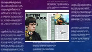
ANALYSIS OF DOUBLE 
SPREADS 
CHLOE BAKER
The main image is of the artist herself, usually from the 
front cover. People recognise her as she is a singer and 
has a new album out which is why she has a main 
interview in this magazine. The lighting of the photo is 
very bright and angelic. This makes her look like a good 
person and fits in with the context of the 
interview/question. This also goes with her reputation 
to the public as a good girl, appealing to mums for 
their children to look up to a good role model. The 
pose is also very natural as she is smiling and her make 
up is minimal but she still looks pretty. Her dress isn’t 
too revealing or anything and is the same colour as 
some of the text in the article. The hand on the face 
makes her look very fame struck and down to earth as 
she is almost shocked by the fame. This is relatable to 
the public and makes more people like her as an artist 
and buy the magazine. 
The colour scheme is blue white and 
black. The white symbolises angel like 
features, this goes with the bright 
lighting of the photos used. The blue 
symbolises calmness and this is Pixie’s 
music as she has quite calm easy going 
music. The black is used to stand out 
from the rest of the text. This is what 
makes the reader look at what is on the 
page and is a useful way of subliminally 
making the readers remember what is 
said, for example the rates out of 5. 
The other pictures used are more like a 
photo shoot. These are to fill space and 
add more to the page. They are also 
more fitting as smaller images as they 
don’t really go with the innocent nice 
look. The full eye contact is to attract 
the reader’s attention and make them 
want to read the article as they 
recognise her as a good artist. 
The layout of the main interview had the question in 
blue and the answer, from Pixie Lott, in white. This 
again makes her look good and innocent. Also 
having the main title of the article on top of the 
picture puts the word ‘perfect’ right under her face. 
This makes us judge whether she is before we even 
read the article by looking at her lit up face. 
The black speech bubble has an extract from the 
main interview. This is what we look at before 
the rest of the text as it is bigger and white on a 
black background making it stand out. 
Furthermore, the actual writing is about her 
getting mad at paparazzi which is interesting so 
people will want to read about it. 
The promotion of her new album is in the corner. This is a 
picture put on the article to let people know about her new 
release as they know people who are reading the article 
probable like her music. It has the black bubble for the text 
which stands out against her blonde hair and then the blue 
outline of the picture to separate it from the other picture for 
the interview. 
Title – Firstly the title is a question. This is what draws us in as it 
includes us. Also, using a famous artist makes us want to read 
the interview more. The word perfect is also put into full chunky 
letters to make it stand out but not as much as the artist’s name 
“Pixie” put in big blue letters. This helps us to recognise the 
artist and keeps our attention.
Title - The title is large (it takes up just under a 
third of the page) and at the top of the page 
right above the main image of the artist Jake 
Bugg. It is a play on words 'Bitten by the Bugg' 
to incorporate his name, the reader is drawn to 
what seems like a spelling mistake but through 
further reading of the article we learn the 
reason for this. 'Bitten' and 'Bugg' are also in a 
strong, bold black font compared to the soft, 
white font of 'by the' this makes the words 
stand out and draws your eye to them. There 
are a few words that are in a different colour to 
the rest of the mini paragraph. However these 
are in a softer colour of white to contrast the 
black. This makes us focus and look closer at 
what is written there and read into it. Also the 
large “J” to start off the article is big and bold 
so we can clearly see it and it stand s out. 
Main Image - The close up of his face shows how 
grungy and how he isn’t clean cut. This is to do 
with the messages his music put out. We can also 
tell by his hard expression that he isn’t into all the 
pop music in the chart he is more indie and 
alternate. This relates to the reader and they 
prefer this. His clothing is also down to earth and 
down to normal showing us that he is very close 
to his fans as he is like them. This goes with his 
hair and make up too, he is wearing no stage 
make up as he is not used to that and his hair isn’t 
perfect or styles, he has done it him self or had it 
done very naturally. His clothing also shows to us 
that he isn’t fashionable with the latest trends but 
still looks good. This is a message that is put out 
to go against trends and readers can relate to this. 
Image of artist - As it is a music magazine it is 
expected to see a shot of the artist in action 
with an instrument, it also gives the reader an 
insight into they style of music as you can often 
tell from what instrument they play and what 
they are wearing. 
The colour scheme chosen is a mild green, 
white black and red. The green is very calm 
and reflects how he isn’t a crazed singer 
who is active all the time. Its also not 
electric green so he doesn’t come across as 
really out there. The white is also very calm 
and shows how not all that is said needs to 
stand out. The black text works well with 
the green background as it stands out when 
on top of it. This also works when the 
background is white. Also, with the text 
being black when it is put in bold it really 
stands out and grabs the readers attention. 
The small tag line in the centre of the 
text is a way to let the consumer read 
ahead a little as this is what they’re 
more likely to read before the rest of 
the article as its big text surrounded by 
small text. Its normally one of the most 
exciting parts of the interview or 
something funny to grab the attention 
of the reader and make them want to 
read the rest of the article to find out 
the surrounding information. 
This small timeline of events is a good addition to 
the article. This is because it contrasts the white 
background by having a green one separated from 
the other side with the green background. Also, 
the mini subheadings for the dates are white 
writing highlighted in black meaning they are 
chunky and stand out.
The main image is covering two pages. This 
is a great way to grab the readers attention 
as they know who the people are and this is 
why they’ve bought the magazine. Also the 
clothing they're wearing is symbolic for their 
music. The leather jackets and double 
denim shows how they don’t identify with 
other fashion tastes that go with music 
styles like pop or house. They are part of the 
indie culture and this means they are 
individual and don’t follow trends. The 
stances of them has Alex Turner at the front 
as he is the main person in t he band and 
everyone knows him so he is iconic of Arctic 
Monkeys, this means more people will 
notice the band. 
The main title is in red which makes the 
reader think of danger, its also in bold so 
stands out to the target audience. It 
contrasts with the natural back ground of 
the trees which are brown and green. 
Especially when Alex at the front is 
smoking it pulls together the theme of 
dangerous music. The words “Leather 
trousers” stands out to the people who 
listen to the indie style of music as they 
would be wearing that type of style 
clothing. Also, the stance is so casual it 
connects with the reader so they feel like 
they can read it with ease. 
The quote is pulled from the main story line to entice the reader in. 
It is put in quotes to stand out and make sure people know it is 
actually what they’ve said. Also, the rest of the writing is white so 
that certain words in red stand out more than others and they 
contrast. 
The double page spread isn’t like many 
others. They have one main photo 
covering 2 pages and then only a little 
extract of the main article. This is like a 
little taster of the big article and it 
grabs the readers attention to then 
take them into the big piece. This also 
sets the tone. This is a good way to get 
people to look at the article as having a 
big picture rather than big chunks of 
writing. This also gives more space on 
the big main article for more 
interesting writing as they are a 
successful act and people want to 
know as much as they can about them. 
The layout of the page is big and 
colourful, but not bold colours it is 
colours like black and blue and the only 
colour is from the back ground. This is 
another way for the audience to relate 
to the group as they are representing 
their music through their look. Their 
new album cover is all black with a bit 
of white on it so we know they don’t 
have pop music as it isn’t big and 
bright colours. It also symbolises their 
music as they have laid back style and 
it isn’t all bouncy beats.

Double spread analysis

  • 1.
    ANALYSIS OF DOUBLE SPREADS CHLOE BAKER
  • 2.
    The main imageis of the artist herself, usually from the front cover. People recognise her as she is a singer and has a new album out which is why she has a main interview in this magazine. The lighting of the photo is very bright and angelic. This makes her look like a good person and fits in with the context of the interview/question. This also goes with her reputation to the public as a good girl, appealing to mums for their children to look up to a good role model. The pose is also very natural as she is smiling and her make up is minimal but she still looks pretty. Her dress isn’t too revealing or anything and is the same colour as some of the text in the article. The hand on the face makes her look very fame struck and down to earth as she is almost shocked by the fame. This is relatable to the public and makes more people like her as an artist and buy the magazine. The colour scheme is blue white and black. The white symbolises angel like features, this goes with the bright lighting of the photos used. The blue symbolises calmness and this is Pixie’s music as she has quite calm easy going music. The black is used to stand out from the rest of the text. This is what makes the reader look at what is on the page and is a useful way of subliminally making the readers remember what is said, for example the rates out of 5. The other pictures used are more like a photo shoot. These are to fill space and add more to the page. They are also more fitting as smaller images as they don’t really go with the innocent nice look. The full eye contact is to attract the reader’s attention and make them want to read the article as they recognise her as a good artist. The layout of the main interview had the question in blue and the answer, from Pixie Lott, in white. This again makes her look good and innocent. Also having the main title of the article on top of the picture puts the word ‘perfect’ right under her face. This makes us judge whether she is before we even read the article by looking at her lit up face. The black speech bubble has an extract from the main interview. This is what we look at before the rest of the text as it is bigger and white on a black background making it stand out. Furthermore, the actual writing is about her getting mad at paparazzi which is interesting so people will want to read about it. The promotion of her new album is in the corner. This is a picture put on the article to let people know about her new release as they know people who are reading the article probable like her music. It has the black bubble for the text which stands out against her blonde hair and then the blue outline of the picture to separate it from the other picture for the interview. Title – Firstly the title is a question. This is what draws us in as it includes us. Also, using a famous artist makes us want to read the interview more. The word perfect is also put into full chunky letters to make it stand out but not as much as the artist’s name “Pixie” put in big blue letters. This helps us to recognise the artist and keeps our attention.
  • 3.
    Title - Thetitle is large (it takes up just under a third of the page) and at the top of the page right above the main image of the artist Jake Bugg. It is a play on words 'Bitten by the Bugg' to incorporate his name, the reader is drawn to what seems like a spelling mistake but through further reading of the article we learn the reason for this. 'Bitten' and 'Bugg' are also in a strong, bold black font compared to the soft, white font of 'by the' this makes the words stand out and draws your eye to them. There are a few words that are in a different colour to the rest of the mini paragraph. However these are in a softer colour of white to contrast the black. This makes us focus and look closer at what is written there and read into it. Also the large “J” to start off the article is big and bold so we can clearly see it and it stand s out. Main Image - The close up of his face shows how grungy and how he isn’t clean cut. This is to do with the messages his music put out. We can also tell by his hard expression that he isn’t into all the pop music in the chart he is more indie and alternate. This relates to the reader and they prefer this. His clothing is also down to earth and down to normal showing us that he is very close to his fans as he is like them. This goes with his hair and make up too, he is wearing no stage make up as he is not used to that and his hair isn’t perfect or styles, he has done it him self or had it done very naturally. His clothing also shows to us that he isn’t fashionable with the latest trends but still looks good. This is a message that is put out to go against trends and readers can relate to this. Image of artist - As it is a music magazine it is expected to see a shot of the artist in action with an instrument, it also gives the reader an insight into they style of music as you can often tell from what instrument they play and what they are wearing. The colour scheme chosen is a mild green, white black and red. The green is very calm and reflects how he isn’t a crazed singer who is active all the time. Its also not electric green so he doesn’t come across as really out there. The white is also very calm and shows how not all that is said needs to stand out. The black text works well with the green background as it stands out when on top of it. This also works when the background is white. Also, with the text being black when it is put in bold it really stands out and grabs the readers attention. The small tag line in the centre of the text is a way to let the consumer read ahead a little as this is what they’re more likely to read before the rest of the article as its big text surrounded by small text. Its normally one of the most exciting parts of the interview or something funny to grab the attention of the reader and make them want to read the rest of the article to find out the surrounding information. This small timeline of events is a good addition to the article. This is because it contrasts the white background by having a green one separated from the other side with the green background. Also, the mini subheadings for the dates are white writing highlighted in black meaning they are chunky and stand out.
  • 4.
    The main imageis covering two pages. This is a great way to grab the readers attention as they know who the people are and this is why they’ve bought the magazine. Also the clothing they're wearing is symbolic for their music. The leather jackets and double denim shows how they don’t identify with other fashion tastes that go with music styles like pop or house. They are part of the indie culture and this means they are individual and don’t follow trends. The stances of them has Alex Turner at the front as he is the main person in t he band and everyone knows him so he is iconic of Arctic Monkeys, this means more people will notice the band. The main title is in red which makes the reader think of danger, its also in bold so stands out to the target audience. It contrasts with the natural back ground of the trees which are brown and green. Especially when Alex at the front is smoking it pulls together the theme of dangerous music. The words “Leather trousers” stands out to the people who listen to the indie style of music as they would be wearing that type of style clothing. Also, the stance is so casual it connects with the reader so they feel like they can read it with ease. The quote is pulled from the main story line to entice the reader in. It is put in quotes to stand out and make sure people know it is actually what they’ve said. Also, the rest of the writing is white so that certain words in red stand out more than others and they contrast. The double page spread isn’t like many others. They have one main photo covering 2 pages and then only a little extract of the main article. This is like a little taster of the big article and it grabs the readers attention to then take them into the big piece. This also sets the tone. This is a good way to get people to look at the article as having a big picture rather than big chunks of writing. This also gives more space on the big main article for more interesting writing as they are a successful act and people want to know as much as they can about them. The layout of the page is big and colourful, but not bold colours it is colours like black and blue and the only colour is from the back ground. This is another way for the audience to relate to the group as they are representing their music through their look. Their new album cover is all black with a bit of white on it so we know they don’t have pop music as it isn’t big and bright colours. It also symbolises their music as they have laid back style and it isn’t all bouncy beats.