The document discusses the ways in which the student's poster, magazine cover, and movie trailer for a horror film use and develop conventions of real media products in three areas:
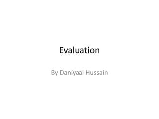
1. The poster borrows elements from real horror movie posters, such as using the color red to represent blood and only featuring the antagonist. It sticks closely to traditional horror poster conventions.
2. The magazine cover is modeled after Empire magazine and features film titles and icons as real magazines do. However, it challenges conventions by using an unedited photo without special effects.
3. The trailer borrows shot compositions and transitions from films like Friday the 13th but also develops conventions like using over-the-shoulder shots to build mystery