The font 'Vow Neue' is used for the band London Grammar's name and album titles. This font has become strongly associated with the band and they plan to continue using it. The poster features lead singer Hannah Reid in the light with the other band members shadowed in the background, potentially emphasizing Hannah's dominance and appealing to the male gaze.
Welcome to TechSoup New Member Orientation and Q&A (May 2024).pdfTechSoup
In this webinar you will learn how your organization can access TechSoup's wide variety of product discount and donation programs. From hardware to software, we'll give you a tour of the tools available to help your nonprofit with productivity, collaboration, financial management, donor tracking, security, and more.
Model Attribute Check Company Auto PropertyCeline George
In Odoo, the multi-company feature allows you to manage multiple companies within a single Odoo database instance. Each company can have its own configurations while still sharing common resources such as products, customers, and suppliers.
A Strategic Approach: GenAI in EducationPeter Windle
Artificial Intelligence (AI) technologies such as Generative AI, Image Generators and Large Language Models have had a dramatic impact on teaching, learning and assessment over the past 18 months. The most immediate threat AI posed was to Academic Integrity with Higher Education Institutes (HEIs) focusing their efforts on combating the use of GenAI in assessment. Guidelines were developed for staff and students, policies put in place too. Innovative educators have forged paths in the use of Generative AI for teaching, learning and assessments leading to pockets of transformation springing up across HEIs, often with little or no top-down guidance, support or direction.
This Gasta posits a strategic approach to integrating AI into HEIs to prepare staff, students and the curriculum for an evolving world and workplace. We will highlight the advantages of working with these technologies beyond the realm of teaching, learning and assessment by considering prompt engineering skills, industry impact, curriculum changes, and the need for staff upskilling. In contrast, not engaging strategically with Generative AI poses risks, including falling behind peers, missed opportunities and failing to ensure our graduates remain employable. The rapid evolution of AI technologies necessitates a proactive and strategic approach if we are to remain relevant.
Read| The latest issue of The Challenger is here! We are thrilled to announce that our school paper has qualified for the NATIONAL SCHOOLS PRESS CONFERENCE (NSPC) 2024. Thank you for your unwavering support and trust. Dive into the stories that made us stand out!
Palestine last event orientationfvgnh .pptxRaedMohamed3
An EFL lesson about the current events in Palestine. It is intended to be for intermediate students who wish to increase their listening skills through a short lesson in power point.
Introduction to AI for Nonprofits with Tapp NetworkTechSoup
Dive into the world of AI! Experts Jon Hill and Tareq Monaur will guide you through AI's role in enhancing nonprofit websites and basic marketing strategies, making it easy to understand and apply.
Instructions for Submissions thorugh G- Classroom.pptxJheel Barad
This presentation provides a briefing on how to upload submissions and documents in Google Classroom. It was prepared as part of an orientation for new Sainik School in-service teacher trainees. As a training officer, my goal is to ensure that you are comfortable and proficient with this essential tool for managing assignments and fostering student engagement.
2024.06.01 Introducing a competency framework for languag learning materials ...Sandy Millin
http://sandymillin.wordpress.com/iateflwebinar2024
Published classroom materials form the basis of syllabuses, drive teacher professional development, and have a potentially huge influence on learners, teachers and education systems. All teachers also create their own materials, whether a few sentences on a blackboard, a highly-structured fully-realised online course, or anything in between. Despite this, the knowledge and skills needed to create effective language learning materials are rarely part of teacher training, and are mostly learnt by trial and error.
Knowledge and skills frameworks, generally called competency frameworks, for ELT teachers, trainers and managers have existed for a few years now. However, until I created one for my MA dissertation, there wasn’t one drawing together what we need to know and do to be able to effectively produce language learning materials.
This webinar will introduce you to my framework, highlighting the key competencies I identified from my research. It will also show how anybody involved in language teaching (any language, not just English!), teacher training, managing schools or developing language learning materials can benefit from using the framework.
The Roman Empire A Historical Colossus.pdfkaushalkr1407
The Roman Empire, a vast and enduring power, stands as one of history's most remarkable civilizations, leaving an indelible imprint on the world. It emerged from the Roman Republic, transitioning into an imperial powerhouse under the leadership of Augustus Caesar in 27 BCE. This transformation marked the beginning of an era defined by unprecedented territorial expansion, architectural marvels, and profound cultural influence.
The empire's roots lie in the city of Rome, founded, according to legend, by Romulus in 753 BCE. Over centuries, Rome evolved from a small settlement to a formidable republic, characterized by a complex political system with elected officials and checks on power. However, internal strife, class conflicts, and military ambitions paved the way for the end of the Republic. Julius Caesar’s dictatorship and subsequent assassination in 44 BCE created a power vacuum, leading to a civil war. Octavian, later Augustus, emerged victorious, heralding the Roman Empire’s birth.
Under Augustus, the empire experienced the Pax Romana, a 200-year period of relative peace and stability. Augustus reformed the military, established efficient administrative systems, and initiated grand construction projects. The empire's borders expanded, encompassing territories from Britain to Egypt and from Spain to the Euphrates. Roman legions, renowned for their discipline and engineering prowess, secured and maintained these vast territories, building roads, fortifications, and cities that facilitated control and integration.
The Roman Empire’s society was hierarchical, with a rigid class system. At the top were the patricians, wealthy elites who held significant political power. Below them were the plebeians, free citizens with limited political influence, and the vast numbers of slaves who formed the backbone of the economy. The family unit was central, governed by the paterfamilias, the male head who held absolute authority.
Culturally, the Romans were eclectic, absorbing and adapting elements from the civilizations they encountered, particularly the Greeks. Roman art, literature, and philosophy reflected this synthesis, creating a rich cultural tapestry. Latin, the Roman language, became the lingua franca of the Western world, influencing numerous modern languages.
Roman architecture and engineering achievements were monumental. They perfected the arch, vault, and dome, constructing enduring structures like the Colosseum, Pantheon, and aqueducts. These engineering marvels not only showcased Roman ingenuity but also served practical purposes, from public entertainment to water supply.
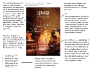
1. The font used for the band’s name and album name is called
recognised with this
The main focal point on this ‘Vow Neue’. This font has now beenthis throughout the
band, and they will continue to use
releases and on their merchandise.
poster is the main singer,
Hannah Reid. She appears to
be in the light slightly, whilst
the there band members are
shadowed and are within the
background. This could
possible link in with Hannah’s
dominance in the band, as
well as Laura Mulvey’s male
gaze theory, she is presented
in a way that some males
would like.
The actual image itself is
somewhat blurred, creating a
hazy and dream-like effect. This
style of photography is very
popular with artists within this
genre, such as James Blake in
his album covers and singles.
This poster is A3 size. I
am still deciding
whether or not I would
like this size or maybe
slightly smaller. This is
quite a typical size and
styling for bands and
artists to choose.
Although I do like this design, I
wouldn’t want to emulate this. I
would like to take on a much more
minimal approach, featuring some of
my artwork, with less typography
and detail.
The three band members have
signed the poster, making it
seem very exclusive to some of
their fans.
The colour palette used throughout
London Grammar’s merchandise is
very neutral coloured and warm
toned. Similar to The XX, they have
a consistent style throughout their
singles and poster designs. This
implies quite a gender neutral feel,
both male and females can be
associated with this band.
The text has been positioned in
the centre of the poster, which
includes the date of the release
and their website. The release
date and album information is
in a smaller font so it is less
visible to the viewers. This way
the attention isn't drawn away
from the image of the band
and the band’s name.
2. This poster has a symmetrical and geometric design.
Triangles are shown in this particular design, as well as
previous album art. Such as the album ‘The Bones Of
What You Believe’.
The focal attention is drawn to the triangles,as well as the
small flower which is positioned almost directly central of the
poster. However the whole poster is rather busy, there is a lot
happening with the prints that are used. The triangles are
filled with more geometric prints, created a sense of illusion
and not knowing where to look. The more I look, the more I
see different details.
This band is ‘CHVRCHES’,in this article the band are
promoting a gig happening in Chicago. I was just
fascinated by the presentation and artwork of the
poster, I wanted to analyse deeper into it. ‘CHVRCHES’
consistently use capital letters, and is typed in a way
where the ‘U is replaced with the ‘V’ and the ‘E’ is
replaced with a three lines that are horizontal. They
present this throughout the release of EP’s and album,
as well as featuring on their merchandise.
The band have not yet appeared
on album/EP covers or posters. I
like this style of advertising, as it
creates a sense of mystery, and
gets people thinking ‘who is this
band?’, intriguing them,
resulting in research and finding
background information on the
band. This is similar to The XX. I
want to create my poster in this
way, as well as the DigiPak as I
believe the selling point will
increase if advertising it is done
in this way.
The colour palette
is of a
monochrome, pale
pastel green and a
bold orange. All of
which look very
aesthetically
pleasing.
3. This poster is for the artist ‘Lorde’, promoting her Australian
tour for the album release ‘Pure Heroine.The style of the poster
is very similar to the layout of a fashion magazine. With the
typography at the header ‘LANEWAY FESTIVAL PROUDLY
PRESENTS IN ASSOCIATION WITH THE HABOUR AGENCY’. In
addition to this, the images behind the letters is quite a typical
style for a genre like this, and for fashion magazines. Lorde also
makes an appearance in the images, twice, which looks like a
repeated effect. The poster has a transparent white, highlighted
strip going across the entirety of it. This makes it look shiny, and
glossy, relating back to the idea of the magazine feel to it. It also
creates a sense of high end and couture, and expensive looking.
The poster includes the
record label, which is hardly
ever shown on some artists
and bands posters.
The text used for the dates
and location of the tour is
in a stylised and quite a
simple italic font. The use
of capital letters follows
the conventions of many
artists. Not only is it
clearer to read, it has
become a huge style and
trend to use, mainly for
the aesthetics.
The colour palette is very
simple, and follows the
monochrome theme. I did
have the idea of creating a
neutral style for my poster
and DigiPak, however the
idea I have gone with, with
the artwork is much more
suited for the genre of
Indie/Synth Pop.