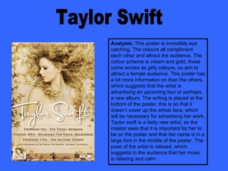
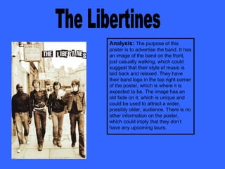
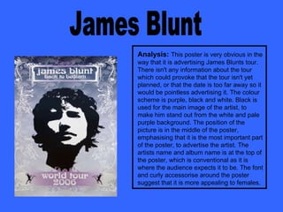
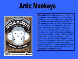
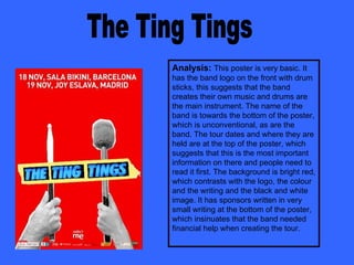
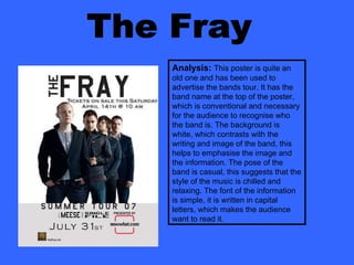
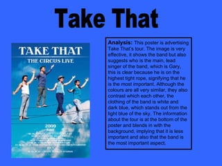
This poster analyzes 14 different concert posters, considering what visual elements make each effective at catching the audience's attention. Key aspects discussed include use of color, image size and placement, font style, and whether the information emphasizes the artist, band, or upcoming tour details. Overall trends are identified, such as typically placing the artist or band name at the top and tour information at the bottom. Differences are also noted, like unconventional element placements intended to make certain posters stand out.