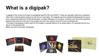
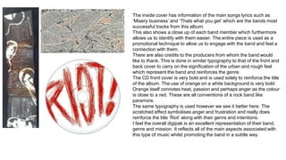
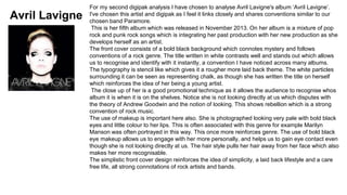
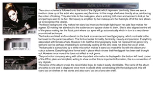
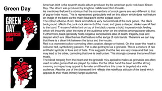
This document analyzes several digipaks from different artists, examining how they represent genre and promote the artist. It discusses how Paramore's Riot album cover uses close-ups and edgy fonts/colors to represent their genre and encourage fan connection. Avril Lavigne's self-titled album cover also uses close-ups and makeup styles to portray genre while enticing fans. Green Day's American Idiot cover symbolizes themes through its heart grenade image and font choices to strongly convey the band's tone and appeal to both male and female audiences.
GCSE, I did this presantation to go along side my work and this shown my understanding of the task and products that I had to create and do, The work which I done is completley my own work, I think this demonstrates my capabilty and understanding of the project in sections and overall.
This is my analysis of album covers within my genre to gain knowledge of how to create my digipack and poster. I also looked into the synergy and how the album represented all aspects of an artist.
Hollywood Actress - The 250 hottest galleryZsolt Nemeth
Hollywood Actress amazon album eminent worldwide media, female-singer, actresses, alhletina-woman, 250 collection.
Highest and photoreal-print exclusive testament PC collage.
Focused television virtuality crime, novel.
The sheer afterlife of the work is activism-like hollywood-actresses point com.
173 Illustrate, 250 gallery, 154 blog, 120 TV serie logo, 17 TV president logo, 183 active hyperlink.
HD AI face enhancement 384 page plus Bowker ISBN, Congress LLCL or US Copyright.
Meet Crazyjamjam - A TikTok Sensation | Blog EternalBlog Eternal
Crazyjamjam, the TikTok star everyone's talking about! Uncover her secrets to success, viral trends, and more in this exclusive feature on Blog Eternal.
Source: https://blogeternal.com/celebrity/crazyjamjam-leaks/
In the vast landscape of cinema, stories have been told, retold, and reimagined in countless ways. At the heart of this narrative evolution lies the concept of a "remake". A successful remake allows us to revisit cherished tales through a fresh lens, often reflecting a different era's perspective or harnessing the power of advanced technology. Yet, the question remains, what makes a remake successful? Today, we will delve deeper into this subject, identifying the key ingredients that contribute to the success of a remake.
From Slave to Scourge: The Existential Choice of Django Unchained. The Philos...Rodney Thomas Jr
#SSAPhilosophy #DjangoUnchained #DjangoFreeman #ExistentialPhilosophy #Freedom #Identity #Justice #Courage #Rebellion #Transformation
Welcome to SSA Philosophy, your ultimate destination for diving deep into the profound philosophies of iconic characters from video games, movies, and TV shows. In this episode, we explore the powerful journey and existential philosophy of Django Freeman from Quentin Tarantino’s masterful film, "Django Unchained," in our video titled, "From Slave to Scourge: The Existential Choice of Django Unchained. The Philosophy of Django Freeman!"
From Slave to Scourge: The Existential Choice of Django Unchained – The Philosophy of Django Freeman!
Join me as we delve into the existential philosophy of Django Freeman, uncovering the profound lessons and timeless wisdom his character offers. Through his story, we find inspiration in the power of choice, the quest for justice, and the courage to defy oppression. Django Freeman’s philosophy is a testament to the human spirit’s unyielding drive for freedom and justice.
Don’t forget to like, comment, and subscribe to SSA Philosophy for more in-depth explorations of the philosophies behind your favorite characters. Hit the notification bell to stay updated on our latest videos. Let’s discover the principles that shape these icons and the profound lessons they offer.
Django Freeman’s story is one of the most compelling narratives of transformation and empowerment in cinema. A former slave turned relentless bounty hunter, Django’s journey is not just a physical liberation but an existential quest for identity, justice, and retribution. This video delves into the core philosophical elements that define Django’s character and the profound choices he makes throughout his journey.
Link to video: https://youtu.be/GszqrXk38qk
As a film director, I have always been awestruck by the magic of animation. Animation, a medium once considered solely for the amusement of children, has undergone a significant transformation over the years. Its evolution from a rudimentary form of entertainment to a sophisticated form of storytelling has stirred my creativity and expanded my vision, offering limitless possibilities in the realm of cinematic storytelling.
Are the X-Men Marvel or DC An In-Depth Exploration.pdfXtreame HDTV
The world of comic books is vast and filled with iconic characters, gripping storylines, and legendary rivalries. Among the most famous groups of superheroes are the X-Men. Created in the early 1960s, the X-Men have become a cultural phenomenon, featuring in comics, animated series, and blockbuster movies. A common question among newcomers to the comic book world is: Are the X-Men Marvel or DC? This article delves into the history, creators, and significant moments of the X-Men to provide a comprehensive answer.
Skeem Saam in June 2024 available on ForumIsaac More
Monday, June 3, 2024 - Episode 241: Sergeant Rathebe nabs a top scammer in Turfloop. Meikie is furious at her uncle's reaction to the truth about Ntswaki.
Tuesday, June 4, 2024 - Episode 242: Babeile uncovers the truth behind Rathebe’s latest actions. Leeto's announcement shocks his employees, and Ntswaki’s ordeal haunts her family.
Wednesday, June 5, 2024 - Episode 243: Rathebe blocks Babeile from investigating further. Melita warns Eunice to stay clear of Mr. Kgomo.
Thursday, June 6, 2024 - Episode 244: Tbose surrenders to the police while an intruder meddles in his affairs. Rathebe's secret mission faces a setback.
Friday, June 7, 2024 - Episode 245: Rathebe’s antics reach Kganyago. Tbose dodges a bullet, but a nightmare looms. Mr. Kgomo accuses Melita of witchcraft.
Monday, June 10, 2024 - Episode 246: Ntswaki struggles on her first day back at school. Babeile is stunned by Rathebe’s romance with Bullet Mabuza.
Tuesday, June 11, 2024 - Episode 247: An unexpected turn halts Rathebe’s investigation. The press discovers Mr. Kgomo’s affair with a young employee.
Wednesday, June 12, 2024 - Episode 248: Rathebe chases a criminal, resorting to gunfire. Turf High is rife with tension and transfer threats.
Thursday, June 13, 2024 - Episode 249: Rathebe traps Kganyago. John warns Toby to stop harassing Ntswaki.
Friday, June 14, 2024 - Episode 250: Babeile is cleared to investigate Rathebe. Melita gains Mr. Kgomo’s trust, and Jacobeth devises a financial solution.
Monday, June 17, 2024 - Episode 251: Rathebe feels the pressure as Babeile closes in. Mr. Kgomo and Eunice clash. Jacobeth risks her safety in pursuit of Kganyago.
Tuesday, June 18, 2024 - Episode 252: Bullet Mabuza retaliates against Jacobeth. Pitsi inadvertently reveals his parents’ plans. Nkosi is shocked by Khwezi’s decision on LJ’s future.
Wednesday, June 19, 2024 - Episode 253: Jacobeth is ensnared in deceit. Evelyn is stressed over Toby’s case, and Letetswe reveals shocking academic results.
Thursday, June 20, 2024 - Episode 254: Elizabeth learns Jacobeth is in Mpumalanga. Kganyago's past is exposed, and Lehasa discovers his son is in KZN.
Friday, June 21, 2024 - Episode 255: Elizabeth confirms Jacobeth’s dubious activities in Mpumalanga. Rathebe lies about her relationship with Bullet, and Jacobeth faces theft accusations.
Monday, June 24, 2024 - Episode 256: Rathebe spies on Kganyago. Lehasa plans to retrieve his son from KZN, fearing what awaits.
Tuesday, June 25, 2024 - Episode 257: MaNtuli fears for Kwaito’s safety in Mpumalanga. Mr. Kgomo and Melita reconcile.
Wednesday, June 26, 2024 - Episode 258: Kganyago makes a bold escape. Elizabeth receives a shocking message from Kwaito. Mrs. Khoza defends her husband against scam accusations.
Thursday, June 27, 2024 - Episode 259: Babeile's skillful arrest changes the game. Tbose and Kwaito face a hostage crisis.
Friday, June 28, 2024 - Episode 260: Two women face the reality of being scammed. Turf is rocked by breaking
From the Editor's Desk: 115th Father's day Celebration - When we see Father's day in Hindu context, Nanda Baba is the most vivid figure which comes to the mind. Nanda Baba who was the foster father of Lord Krishna is known to provide love, care and affection to Lord Krishna and Balarama along with his wife Yashoda; Letter’s to the Editor: Mother's Day - Mother is a precious life for their children. Mother is life breath for her children. Mother's lap is the world happiness whose debt can never be paid.
Scandal! Teasers June 2024 on etv Forum.co.zaIsaac More
Monday, 3 June 2024
Episode 47
A friend is compelled to expose a manipulative scheme to prevent another from making a grave mistake. In a frantic bid to save Jojo, Phakamile agrees to a meeting that unbeknownst to her, will seal her fate.
Tuesday, 4 June 2024
Episode 48
A mother, with her son's best interests at heart, finds him unready to heed her advice. Motshabi finds herself in an unmanageable situation, sinking fast like in quicksand.
Wednesday, 5 June 2024
Episode 49
A woman fabricates a diabolical lie to cover up an indiscretion. Overwhelmed by guilt, she makes a spontaneous confession that could be devastating to another heart.
Thursday, 6 June 2024
Episode 50
Linda unwittingly discloses damning information. Nhlamulo and Vuvu try to guide their friend towards the right decision.
Friday, 7 June 2024
Episode 51
Jojo's life continues to spiral out of control. Dintle weaves a web of lies to conceal that she is not as successful as everyone believes.
Monday, 10 June 2024
Episode 52
A heated confrontation between lovers leads to a devastating admission of guilt. Dintle's desperation takes a new turn, leaving her with dwindling options.
Tuesday, 11 June 2024
Episode 53
Unable to resort to violence, Taps issues a verbal threat, leaving Mdala unsettled. A sister must explain her life choices to regain her brother's trust.
Wednesday, 12 June 2024
Episode 54
Winnie makes a very troubling discovery. Taps follows through on his threat, leaving a woman reeling. Layla, oblivious to the truth, offers an incentive.
Thursday, 13 June 2024
Episode 55
A nosy relative arrives just in time to thwart a man's fatal decision. Dintle manipulates Khanyi to tug at Mo's heartstrings and get what she wants.
Friday, 14 June 2024
Episode 56
Tlhogi is shocked by Mdala's reaction following the revelation of their indiscretion. Jojo is in disbelief when the punishment for his crime is revealed.
Monday, 17 June 2024
Episode 57
A woman reprimands another to stay in her lane, leading to a damning revelation. A man decides to leave his broken life behind.
Tuesday, 18 June 2024
Episode 58
Nhlamulo learns that due to his actions, his worst fears have come true. Caiphus' extravagant promises to suppliers get him into trouble with Ndu.
Wednesday, 19 June 2024
Episode 59
A woman manages to kill two birds with one stone. Business doom looms over Chillax. A sobering incident makes a woman realize how far she's fallen.
Thursday, 20 June 2024
Episode 60
Taps' offer to help Nhlamulo comes with hidden motives. Caiphus' new ideas for Chillax have MaHilda excited. A blast from the past recognizes Dintle, not for her newfound fame.
Friday, 21 June 2024
Episode 61
Taps is hungry for revenge and finds a rope to hang Mdala with. Chillax's new job opportunity elicits mixed reactions from the public. Roommates' initial meeting starts off on the wrong foot.
Monday, 24 June 2024
Episode 62
Taps seizes new information and recruits someone on the inside. Mary's new job
Panchayat Season 3 - Official Trailer.pdfSuleman Rana
The dearest series "Panchayat" is set to make a victorious return with its third season, and the fervor is discernible. The authority trailer, delivered on May 28, guarantees one more enamoring venture through the country heartland of India.
Jitendra Kumar keeps on sparkling as Abhishek Tripathi, the city-reared engineer who ends up functioning as the secretary of the Panchayat office in the curious town of Phulera. His nuanced depiction of a young fellow exploring the difficulties of country life while endeavoring to adjust to his new environmental factors has earned far and wide recognition.
Neena Gupta and Raghubir Yadav return as Manju Devi and Brij Bhushan Dubey, separately. Their dynamic science and immaculate acting rejuvenate the hardships of town administration. Gupta's depiction of the town Pradhan with an ever-evolving outlook, matched with Yadav's carefully prepared exhibition, adds profundity and credibility to the story.
New Difficulties and Experiences
The trailer indicates new difficulties anticipating the characters, as Abhishek keeps on wrestling with his part in the town and his yearnings for a superior future. The series has reliably offset humor with social editorial, and Season 3 looks ready to dig much more profound into the intricacies of rustic organization and self-awareness.
Watchers can hope to see a greater amount of the enchanting and particular residents who have become fan top picks. Their connections and the one of a kind cut of-life situations give a reviving and interesting portrayal of provincial India, featuring the two its appeal and its difficulties.
A Mix of Humor and Heart
One of the signs of "Panchayat" is its capacity to mix humor with sincere narrating. The trailer features minutes that guarantee to convey giggles, as well as scenes that pull at the heartstrings. This equilibrium has been a critical calculate the show's prosperity, resounding with crowds across different socioeconomics.
Creation Greatness
The creation quality remaining parts first rate, with the beautiful setting of Phulera town filling in as a scenery that upgrades the narrating. The meticulousness in portraying provincial life, joined with sharp composition and solid exhibitions, guarantees that "Panchayat" keeps on hanging out in the packed web series scene.
Expectation and Delivery
As the delivery date draws near, expectation for "Panchayat" Season 3 is at a record-breaking high. The authority trailer has previously created critical buzz, with fans enthusiastically anticipating the continuation of Abhishek Tripathi's excursion and the new undertakings that lie ahead in Phulera.
All in all, the authority trailer for "Panchayat" Season 3 recommends that watchers are in for another drawing in and engaging ride. Yet again with its charming characters, convincing story, and ideal mix of humor and show, the new season is set to enamor crowds. Write in your schedules and prepare to get back to the endearing universe of "Panchayat."
Maximizing Your Streaming Experience with XCIPTV- Tips for 2024.pdfXtreame HDTV
In today’s digital age, streaming services have become an integral part of our entertainment lives. Among the myriad of options available, XCIPTV stands out as a premier choice for those seeking seamless, high-quality streaming. This comprehensive guide will delve into the features, benefits, and user experience of XCIPTV, illustrating why it is a top contender in the IPTV industry.
Tom Selleck Net Worth: A Comprehensive Analysisgreendigital
Over several decades, Tom Selleck, a name synonymous with charisma. From his iconic role as Thomas Magnum in the television series "Magnum, P.I." to his enduring presence in "Blue Bloods," Selleck has captivated audiences with his versatility and charm. As a result, "Tom Selleck net worth" has become a topic of great interest among fans. and financial enthusiasts alike. This article delves deep into Tom Selleck's wealth, exploring his career, assets, endorsements. and business ventures that contribute to his impressive economic standing.
Follow us on: Pinterest
Early Life and Career Beginnings
The Foundation of Tom Selleck's Wealth
Born on January 29, 1945, in Detroit, Michigan, Tom Selleck grew up in Sherman Oaks, California. His journey towards building a large net worth began with humble origins. , Selleck pursued a business administration degree at the University of Southern California (USC) on a basketball scholarship. But, his interest shifted towards acting. leading him to study at the Hills Playhouse under Milton Katselas.
Minor roles in television and films marked Selleck's early career. He appeared in commercials and took on small parts in T.V. series such as "The Dating Game" and "Lancer." These initial steps, although modest. laid the groundwork for his future success and the growth of Tom Selleck net worth. Breakthrough with "Magnum, P.I."
The Role that Defined Tom Selleck's Career
Tom Selleck's breakthrough came with the role of Thomas Magnum in the CBS television series "Magnum, P.I." (1980-1988). This role made him a household name and boosted his net worth. The series' popularity resulted in Selleck earning large salaries. leading to financial stability and increased recognition in Hollywood.
"Magnum P.I." garnered high ratings and critical acclaim during its run. Selleck's portrayal of the charming and resourceful private investigator resonated with audiences. making him one of the most beloved television actors of the 1980s. The success of "Magnum P.I." played a pivotal role in shaping Tom Selleck net worth, establishing him as a major star.
Film Career and Diversification
Expanding Tom Selleck's Financial Portfolio
While "Magnum, P.I." was a cornerstone of Selleck's career, he did not limit himself to television. He ventured into films, further enhancing Tom Selleck net worth. His filmography includes notable movies such as "Three Men and a Baby" (1987). which became the highest-grossing film of the year, and its sequel, "Three Men and a Little Lady" (1990). These box office successes contributed to his wealth.
Selleck's versatility allowed him to transition between genres. from comedies like "Mr. Baseball" (1992) to westerns such as "Quigley Down Under" (1990). This diversification showcased his acting range. and provided many income streams, reinforcing Tom Selleck net worth.
Television Resurgence with "Blue Bloods"
Sustaining Wealth through Consistent Success
In 2010, Tom Selleck began starring as Frank Reagan i
2. What is a digipak?
A digipak is the name for the type of packaging used for CD’s and DVD’s. These are typically made from cardboard
often with a internal plastic section to hold one or more disks. The digipak was first created by Meadwestvaco and is
now a registered trademark of AGI-Shorewood, an Atlas Holdings LLC company. However over time these gatefold
designs have become more and more popular and are now used by more and more manufacturers.
This style of packaging is often used for CD singles or special editions of an artists album, for example the live tour
album or the greatest hits.
Below are some examples of Digipaks.
3. How do digipaks benefit the artist?
The artists predominate genre will often be represented on the front of the case, which allows us to identify with their
style of music. They often embody a theme and a message about the artist also, emphasising the artists brand image.
Fans may also be able to relate to this which in turn will encourage popularity for this artist. The digipak is often used to
exemplify the creative approach to the genre and pose a link often between the lyrics and visuals to reinforce the
intentions of the artist.
Digipaks often convey Andrew Goodwin's theory. Often on the front of digipaks there is a close up of the artist which
allows us to recognise their music instantly. The notion of looking is also incorporated which can encourage a personal
feeling between the artist themselves and the fan. An artist can only be in one place at once, a digipak allows them to
engage with their fans as much as possible and provide them with ‘a kit’ to feel closer to them.
Digipaks obviously benefit the promotional aspects of the music industry through helping the record label bring
awareness to the artist. This encourages consumers e.g. fans to buy and listen to the artist, a digipak is just a single
entry point into their world. The record label will often produce posters and other merchandise to increase the entry
points fans have to their artist. Furthermore it could be said that a digipak suggests loyalty between a fan and the artist.
4. Paramore Riot Analysis
The album Riot was released in 2007 and was their first real breakthrough with their single ‘Misery
Business’. Paramores aim was to express their genre uniquely and they band did not want to be
seen as a typical rock band. They wanted to find a way for their fans to relate to their music and
express themselves through the music that they created.
On the front cover the central image of the band is the main focus point. Here each member of the
band, in particular the main singer Hayley Williams are looking directly at the audience to encourage
us to engage with them. This is the notion of looking and makes the band stand out and catch our
eye when on the shelves. It can often mean that fans relate more with the band as it creates a
personal feel as you feel they are just looking at you. In addition to this the image is taken through a
high angle shot which makes the band look up as if they are addressing us to a higher power,
making us feel special and this gives a friendly impression. The use of bold black on a white back
ground makes us able to see the band clearer, yet the shading of the colours hides some of their
attributes connoting mystery and makes us want to look further at perhaps posters and other leaflets
that are within the digipak.
These colours are conventional of the genre and the use of orange for the title is a bold contrast and
suggests to us that this is an important feature. The whole image of the band and the title ‘Riot’
suggest chaos, in particular the typography used reinforces this as it is a rough sketch which gives
the band an edgy feel opposed to a script style font that would connote formality. Once more
reinforcing the genre just as Andrew Goodwin suggests.
The title suggests that we should be laid back and let go of ourselves, to an extent. Which recreates
the bands mission to allow fans to relate to their music and express themselves as many paramore
fans are often between the age of 16-25.
5. Furthermore, the entire front cover is full of words written in a sketched typography
connoting a rough and urban environment just as many of their music videos do. This
shows their genre and allows the audience to identify with this quickly.
At the bottom right is some orange coloured text, standing out from the rest of the piece
we automatically recognise that this is important information similar to a strap line on a
magazine. This information is about the band and their promotion company and is used to
catch your eye and make you recognise them.
The repitition of the title ‘Riot’ surrounds the band numerous times and this is a
promotional technique to allow us to easily remember the bands name. This is a simple
and effective background not only for promotional purposes but it reinforces genre giving
that urban feel and also the black allows the orange to stand out more. The typography is
signifying anger and frustration which is something conventional of a rock band, this gives
the notion of rebelling something closely associated with the title ‘Riot’.
The back cover is very similar in terms of house styles and conventions. The title names
are in bright orange to contrast with the black background, making them appear as
important information and stand out from the rest, a technique also used on the front
cover. The large image on the back makes us easily able to recognise the band and once
more the close up is used as a promotional technique so that we can relate to them. We
also see the notion of looking here also, so that no matter which way we look at the album
we feel a link to them. The shot is also at eye level which means that are addressing the
audience directly which gives a friendly approach. This image however contrasts with the
one on the front which connotes chaos and anger.
I have noticed how the production credits are in a simple plain text to signify their
importance.
6. The inside cover has information of the main songs lyrics such as
‘Misery business’ and ‘Thats what you get’ which are the bands most
successful tracks from this album.
This also shows a close up of each band member which furthermore
allows us to identify with them easier. The entire piece is used as a
promotional technique to allow us to engage with the band and feel a
connection with them.
There are also credits to the producers from whom the band would
like to thank. This is done in similar typography to that of the front and
back cover to carry on the signification of the urban and rough feel
which represent the band and reinforces the genre.
The CD front cover is very bold and is used solely to reinforce the title
of the album. The use of orange on a white background is very bold.
Orange itself connotes heat, passion and perhaps anger as the colour
is close to a red. These are all conventions of a rock band like
paramore.
The same typography is used however we see it better here. The
scratched effect symbolises anger and frustration and really does
reinforce the title ‘Riot’ along with their genre and intentions.
I feel the overall digipak is an excellent representation of their band,
genre and mission. It reflects all of the main aspects associated with
this type of music whilst promoting the band in a subtle way.
7. Avril Lavigne
For my second digipak analysis I have chosen to analyse Avril Lavigne's album ‘Avril Lavigne’.
I've chosen this artist and digipak as I feel it links closely and shares conventions similar to our
chosen band Paramore.
This is her fifth album which was released in November 2013. On her album is a mixture of pop
rock and punk rock songs which is integrating her past production with her new production as she
develops herself as an artist.
The front cover consists of a bold black background which connotes mystery and follows
conventions of a rock genre. The title written in white contrasts well and stands out which allows
us to recognise and identify with it instantly, a convention I have noticed across many albums.
The typography is stencil like which gives it a rougher more laid back theme. The white particles
surrounding it can be seen as representing chalk, as though she has written the title on herself
which reinforces the idea of her being a young artist.
The close up of her is a good promotional technique as it allows the audience to recognise whos
album it is when it is on the shelves. Notice she is not looking directly at us which disputes with
the theory of Andrew Goodwin and the notion of looking. This shows rebellion which is a strong
convention of rock music.
The use of makeup is important here also. She is photographed looking very pale with bold black
eyes and little colour to her lips. This is often associated with this genre for example Marilyn
Manson was often portrayed in this way. This once more reinforces genre. The use of bold black
eye makeup allows us to engage with her more personally, and helps us to gain eye contact even
though she is not looking directly at us. The hair style pulls her hair away from her face which also
makes her more recognisable.
The simplistic front cover design reinforces the idea of simplicity, a laid back lifestyle and a care
free life, all strong connotations of rock artists and bands.
8. The colour scheme is followed onto the back of the digipak which represent continuity. Here we see a
medium close up of the artist who appears very feminine. In this image she looks directly at us, reinforcing
the notion of looking. This also links to the male gaze, she is enticing both men and women to look at her
and perhaps want to be her. Her beauty is amplified by her makeup and her hairstyle off of the face allows
us to recognise this clearer.
The black background only makes her stand out more as the bright lighting on her pale face makes her
appear 3D making her stand out to the audience and appear closer to them. She is also aligned centre left
of the piece making her the focal point where our eyes will go automatically which in turn is a very clever
promotional technique.
The tracks are listed and numbered on the back in a narrow and neat typography, which contrasts to the
font used on the paramore album. The font connotes formality, femininity, beauty and precision. Everything
associated with female artists. However I do feel that this typography does not represent her genre very
well and can be perhaps misleading to somebody looking at this who does not know her as an artist.
The barcode is surrounded by a white mist which makes it stand out more this fits with the album and
colour scheme. Everything looks formal and in place which shows that the digipak has been well thought
out. However once more this does not reflect a rock genre.
The production company along with other important information is displayed in the bottom left hand corner
of the CD in plain and simplistic writing to show us that this is important information, this is a convention of
any digipak.
The spine of the album shows the record label logo, to make it easily identifiable. The name of the album
and artist is one and is displayed once more in a bold white constrasting with the background, this will
stand out on shelves in the stores and also stand out on a fans own shelf.
9. Inside the digipak is the CD which uses brighter colours to attract the attention
of the audience. The deep blue symbolizes depth, stability and confidence. This
also provides a contrast to the colour scheme of black and white. The extreme
close up of Avril printed on the disk shows her eyes in greater detail. The notion
of looking and the strong gaze provides a link between the artist and the
audience and encourages us to engage with the artist.
The booklet features a medium close up of Avril following the colour scheme
used throughout the rest of the digipak. Once more she looks deeply into our
eyes to capture our gaze. The netted sleeves of her top reveal her arms but not
to a great extent, this creates a sense of mystery and can be linked to the male
gaze where she invites us to view her and all her femininity.
Written in plain simplistic writing at the side of the booklet is the company logo
and the artists web address, used as an entry point for us to enter into her
world, this is also a promotional technique.
The interior of the booklet features a range of images from a photoshoot that
reveal more to us about her as an artist. These images reflect her beauty and
allow us to see her as more than just a singer. These are used to encourage us
to take an interest in her and perhaps for females to idolize her. The use of red
connotes danger something conventional of her music and something which
reinforces the genre.
The writing in the lyric book gives credit to everybody who has helped her to
produce her music and each individual song and is written in clear simple
typography so that we can understand this well.
10. Green Day
American idiot is the seventh studio album produced by the american punk rock band Green
Day. The album was produced by longtime collaborator Rob Cavallo.
As mentioned before it is obvious that the conventions of a rock genre are very different to that
of pop or indie music. This is represented particularly well on this album which does not feature
an image of the band as the main focal point on the digipak cover.
The colour scheme of red, black and white is very conventional of the rock genre. The black
background reflects the punk rock element of the music and gives a deeper, darker overall feel
to the band. The use of white font on top of the black creates a bold, impressionistic feeling
which will instantly catch the eyes of the audience when on the shelves amongst other albums.
Furthermore, black generally holds negative connotations also of death, tragedy, loss and
despair which are often themes that feature in the songs of rock bands. Therefore we can say
that there is a clear link between the lyrics and the visuals.
Red is a prominent colour connoting often passion, danger or hatred. On this cover the heart is
coloured red, symbolizing passion. Yet is also portrayed as a grenade. This is a mixture of two
antithetic symbols of love and of hate. This suggests that the two are very close and that one
may lead to the other, connoting that love is destructive. This strongly conveys the tone of their
music.
The blood dripping from the heart and the grenade may appeal to males as grenades are often
used in video games that are played by males. On the other hand the heart and the strong
meaning conveyed may appeal to females and therefore this cover is targeted at a wide
audience. Also the use of the distressed font reflects the rebellious attitude of the band which
appeals to their male primary target audience.
11. The colour scheme is followed through onto the back of the album, where the
important information such as the tracklist is shown in a contrasting colour to
make it stand out more to the audience. This could also show connotations of
rebellion as typically text is black on a white background, this shows they are
going against the norm which is very conventional of a rock band. This may
also show that they are exciting, young and free and dont play by the rules.
The use of a magnifying glass could symbolize that they are looking for
something or that they are lost, this could be reflected in the lyrics in their
songs once more reinforcing the link between the lyrics and the visuals. A
magnifying glass could also connote crime as they can be used to look for
clues. This reinforces rebellion and the overall rock genre.
The colour scheme used on the disk shows continuity through the use of
colours. It is also consistent with the front cover depicting the image of the
hand with blood dripping from it.
The use of white on black for the track list highlights the important features as
done on the back of the digipak. The layout of the disk and overall covers
really does reinforce their genre and the conventional intentions that rock
bands hold. This is opposed to pop artists who mainly feature images of
themselves on their digipaks to show that their image is vital to the success of
their career.
The booklet inside the digipak shows the lyrics to each song on the album.
The typography is hand written which reflects chaos, rebellion and an urban
environment. It also holds connotations of young children. The doodles and
emphasis on particular words gives a fun overall vibe which is their intention
as a band.