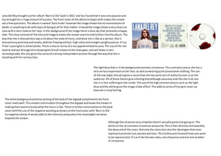
The album cover of Lana Del Rey's "Born to Die" contrasts the title with a clean-cut image of Lana that promotes a happy vibe, drawing viewers in. Her precise outfit and makeup suggest a strong, independent woman posing for a school photo while also appealing to the male gaze. The use of light blue in the background represents innocence, contrasting Lana's serious expression and provocative clothing.
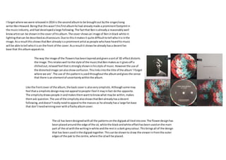
Ben Howard's album "I Forget Where We Are" features a black and white, difficult-to-identify image of Ben that shows he already has recognition, appealing to his existing fan base. The layered, distorted floral image relates to his chilled out musical style but also implies an element of uncertainty,