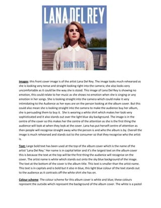
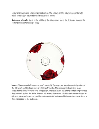
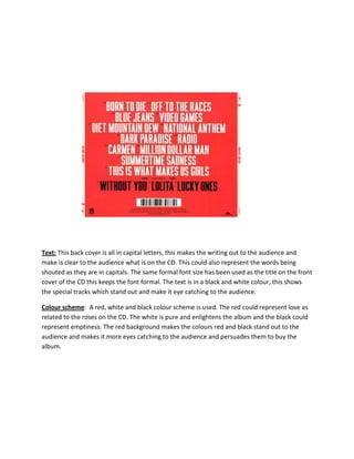
Images: this front cover image is of the artist Lana Del Rey. The image looks much rehearsed as
she is looking very tense and straight looking right into the camera; she also looks very
uncomfortable as it could be the way she is stood. This image of Lana Del Rey is showing no
emotion, this could relate to her music as she shows no emotion when she is singing or any
emotion in her songs. She is looking straight into the camera which could make it very
intimidating to the Audience as her eyes are on the person looking at the album cover. But this
could also mean she is looking straight into the camera to make the audience buy her album,
she is persuading them to buy it. She is wearing a white shirt which makes her look very
sophisticated and it also stands out over the light blue sky background. The image is in the
centre of the cover so this makes her the centre of the attention as she is the first thing the
audience will look at when they look at the cover. Lana has put herself centre of attention as
then people will recognise straight away who the person is and who the album is by. Overall the
image is much rehearsed and stands out to the consumer so that they recognise who the artist
is.
Text: Large bold text has been used at the top of the album cover which is the name of the
artist ‘Lana Del Rey.’ Her name is in capital letter and it’s the largest text on the album cover
this is because the text at the top will be the first thing the audience will recognise on the
cover. The artist name is white which stands out onto the sky blue background of the image.
The text at the bottom of the cover is the album title. This text is smaller than the artist name.
This text is in capitals and is bold but it also in blue, this light blue colour of the text stands out
to the audience as it contrasts off the white shirt she has on.
Colour scheme: The colour scheme for this album cover is white and blue; these colours
represent the outside which represent the background of the album cover. The white is a pastel
colour and blue is also a lightning mood colour. The colours on this album represent a light
mood and a happy album to make the audience happy.
Gutenberg principle: She is in the middle of the album cover she is the first main focus so the
audience look at her straight away.

Images: There are only 3 images of rose’s n this CD. The roses are placed around the edges of
the CD which could indicate they are falling off maybe. The roses can indicate love as we
associate the colour red with love and passion. The roses stand out on the white background as
they contrast against the white. There is not alot to look at and talk about with this CD cover as
it is very plane and is not eye catching to the audience so this could disadvantage the artist as it
does not appeal to the audience.
Text: This back cover is all in capital letters, this makes the writing out to the audience and
make is clear to the audience what is on the CD. This could also represent the words being
shouted as they are in capitals. The same formal font size has been used as the title on the front
cover of the CD this keeps the font formal. The text is in a black and white colour, this shows
the special tracks which stand out and make it eye catching to the audience.
Colour scheme: A red, white and black colour scheme is used. The red could represent love as
related to the roses on the CD. The white is pure and enlightens the album and the black could
represent emptiness. The red background makes the colours red and black stand out to the
audience and makes it more eyes catching to the audience and persuades them to buy the
album.

Lana

  • 1.
    Images: this frontcover image is of the artist Lana Del Rey. The image looks much rehearsed as she is looking very tense and straight looking right into the camera; she also looks very uncomfortable as it could be the way she is stood. This image of Lana Del Rey is showing no emotion, this could relate to her music as she shows no emotion when she is singing or any emotion in her songs. She is looking straight into the camera which could make it very intimidating to the Audience as her eyes are on the person looking at the album cover. But this could also mean she is looking straight into the camera to make the audience buy her album, she is persuading them to buy it. She is wearing a white shirt which makes her look very sophisticated and it also stands out over the light blue sky background. The image is in the centre of the cover so this makes her the centre of the attention as she is the first thing the audience will look at when they look at the cover. Lana has put herself centre of attention as then people will recognise straight away who the person is and who the album is by. Overall the image is much rehearsed and stands out to the consumer so that they recognise who the artist is. Text: Large bold text has been used at the top of the album cover which is the name of the artist ‘Lana Del Rey.’ Her name is in capital letter and it’s the largest text on the album cover this is because the text at the top will be the first thing the audience will recognise on the cover. The artist name is white which stands out onto the sky blue background of the image. The text at the bottom of the cover is the album title. This text is smaller than the artist name. This text is in capitals and is bold but it also in blue, this light blue colour of the text stands out to the audience as it contrasts off the white shirt she has on. Colour scheme: The colour scheme for this album cover is white and blue; these colours represent the outside which represent the background of the album cover. The white is a pastel
  • 2.
    colour and blueis also a lightning mood colour. The colours on this album represent a light mood and a happy album to make the audience happy. Gutenberg principle: She is in the middle of the album cover she is the first main focus so the audience look at her straight away. Images: There are only 3 images of rose’s n this CD. The roses are placed around the edges of the CD which could indicate they are falling off maybe. The roses can indicate love as we associate the colour red with love and passion. The roses stand out on the white background as they contrast against the white. There is not alot to look at and talk about with this CD cover as it is very plane and is not eye catching to the audience so this could disadvantage the artist as it does not appeal to the audience.
  • 3.
    Text: This backcover is all in capital letters, this makes the writing out to the audience and make is clear to the audience what is on the CD. This could also represent the words being shouted as they are in capitals. The same formal font size has been used as the title on the front cover of the CD this keeps the font formal. The text is in a black and white colour, this shows the special tracks which stand out and make it eye catching to the audience. Colour scheme: A red, white and black colour scheme is used. The red could represent love as related to the roses on the CD. The white is pure and enlightens the album and the black could represent emptiness. The red background makes the colours red and black stand out to the audience and makes it more eyes catching to the audience and persuades them to buy the album.