Download to read offline

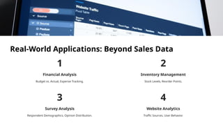


Unlock insights from your data with powerful summarization and visualization tools. Learn to create, analyze, and present data effectively using Pivot Tables and Charts. Focus: Practical examples, step-by-step instructions, and real-world applications.


