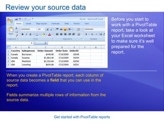
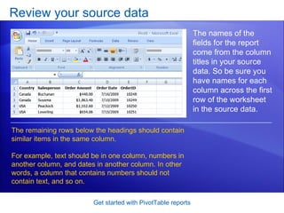
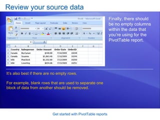
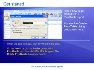
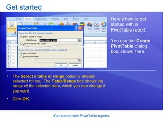
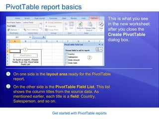
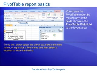
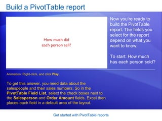
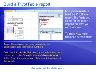
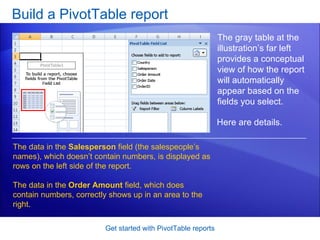
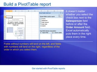
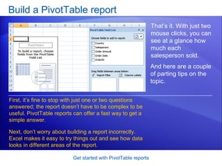
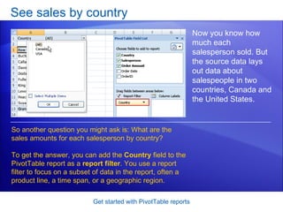
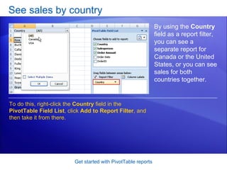
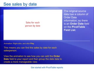
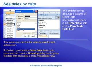
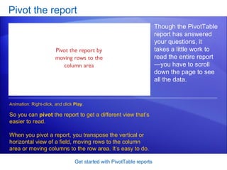
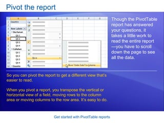
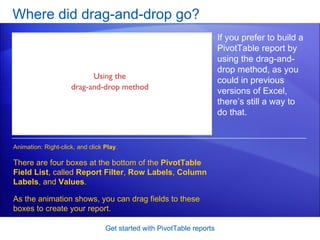
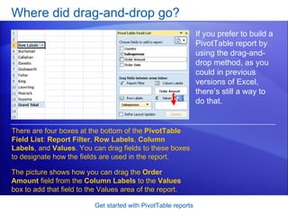
This document provides a tutorial on creating and customizing PivotTable reports in Microsoft Excel 2007. It explains how to select data fields to analyze, build the initial report layout, add filters and grouping, pivot the data orientation, and more. Screenshots demonstrate each step, such as selecting data fields, adding fields to the report layout, and using filters to focus on subsets of data. The goal is to teach users how to use PivotTable reports to efficiently analyze and summarize their data.
Pivot Tables and Beyond Data Analysis in Excel 2013 - Course Technology Compu...Cengage Learning
Pivot Tables and Beyond Data Analysis in Excel 2013 - Course Technology Computing Conference
Presenter: Patrick Carey, Cengage Learning Author
Excel is sometimes called the most popular "database" in the world, not because it's a database but because it makes data so accessible that users often turn to spreadsheets for data entry. Yet for all that, Excel's tools for data analysis and modeling remain largely untapped by the average user. In this, pivot tables may be the most powerful and least utilized tool for data exploration. In this presentation we'll examine some of the new enhancements to pivot tables introduced in Excel 2013. We'll examine how to set up relationships using the Excel Data Model to summarize information across multiple data tables. And then we'll go beyond, exploring the data modeling and data visualizing tools provided by the PowerPivot and Power View add-ins, interpreting data not just numerically but through visual imagery, charts, and interactive maps.
Our Associate Search Marketing Strategist, Jeff Malczyk, teaches us all about Excel pivot tables: how to interpret data faster, easier, and more efficiently. Complete with in-depth instructions, screenshots, video, and memes. Because you have to laugh. Download the practice worksheet: http://cl.ly/2f0t3x3M0d30
Presentation is about advance excel advance feature PIVOT Table and contains steps to insert pivot table and some useful features of pivot table in case of large amount of data
The pivot tables are not created mechanically. In Microsoft excel the user should select the data first for which the pivot table should be created. The pivot table option is available on the insert tab. The user has the option of inserting the pivot table either in the existing sheet or creating the pivot table in the new sheet. Copy the link given below and paste it in new browser window to get more information on Pivot Table:- http://www.transtutors.com/homework-help/statistics/pivot-table.aspx
This courseware is focused on understanding how PivotTables and PivotCharts work. We'll be working with sample data during the data journalism session in Kumasi to clearly understand how to work with large data sets and summarize them.
ACTG Tableau intro labDownload the TableauLab file and look ov.docxnettletondevon
ACTG Tableau intro lab
Download the TableauLab file and look over the fields. These are the fields from the FoodiesNW file you’ll use for your individual dashboard project. I created this file by selecting all fields in all the files in Access, so there are duplicates. I also added some calculations fields to the file:
Ext Gross is the extension of price X quantity; Ext Net is the extension of price X quantity, net of discount
Open Tableau and connect to Excel data. Select the TableauLab file and drag the file to the location that says Drag Files Here. Select Extract in the upper right so that Tableau will make a copy of your data. Click on the tab at the bottom that says Sheet1 to begin your first visualization.
How much is your total sales for the past 3 years?
Move the ExtNet field to the center of the sheet (similar to the values area in a pivot table). Then move it to the Rows and Columns shelves to see what happens. Then click on the first icon in the show me area – it looks like a worksheet. That icon turns your graph back into a tabular format and moves the ExtNet field over to the Marks section and lables it as text.
SHEET 1: In which time period did you sell most?
Move the Order Date field to the Rows shelf and then to the Columns shelf. Click on various graph types on the right hand side to see what happens, and then return to a tabular format.
**To create a vertical bar chart, you may need to use the Swap Rows and Columns icon in the toolbar – it has a curved arrow.
**You can sort the fields in a graph from high to low, low to high, and back to the starting position, by clicking on the icon right next to the Ext Net label on your graph
In which quarter did you sell most? Month?
Click on the drop down menu on the Order Date field in the Columns shelf and select Quarter and then Month. View this data in charts and tabular format. Change it to a line graph.
** To zoom in and out on a part of the graph, double-click, or hold Shift and double-click. Or, click the table Icon, and then
Now move a second copy of the Order Date field to the Columns shelf, so that you have years first, and then quarters or months. Return to a bar graph. Does this change your perspective on yearly sales?
** Now filter out dates so that your range ends at the end of the last quarter, on 3/31/18 by moving a copy of the Order Date field to the Filters area and selecting Range of dates.
Double click on Sheet 1 and change its name to Sales by Quarter. Notice that the title above the graph changes too.
SHEET 2: Which product categories and products have you sold most of?
Click on the symbol next to the Sheet 1 tab to add another sheet. Move the Ext Net field to the Label icon in the Marks section. Then move Category Name to the Rows Shelf. Which is the most popular category?
How has that changed over the quarters? Filter the Order Dates so they end at 3/31/18. Move Order Date to the Columns shelf and select Quarter. Select the .
For sales data analysis, by creating data breakdowns and filters (example by region, product, salesperson, etc). Objective of Easy Pivot is to provide alternative, easier to understand Pivot Table.
Bing Ads' Eric Couch dives in to beginning and advanced Excel tips and tricks for PPC marketers- including data analysis tips, Excel formulas, and incredibly handy plugins.
Do you know the difference between calculated columns and measures in Power BI?
In this article, you’ll learn what calculated columns and measures are, how they work, and when to use them.
You’ll also get some tips and best practices for choosing between them.
https://www.selectdistinct.co.uk/2023/11/21/calculated-columns-and-measures-in-power-bi/
#powerBI #measures #calculatedcolumns
bis 155 week 1 ilab data analysis with spreadsheets with lab,bis 155 week 1 quiz data analysis with spreadsheets with lab,bis 155 week 1 to week 5 all quiz,bis 155 week 1 to week 7 all discussions,devry bis 155 week 1,bis 155 week 1,devry bis 155,bis 155,devry bis 155 week 1 tutorial,devry bis 155 week 1 assignment,devry bis 155 week 1 help
How to make a sales pipeline sales funnel excel chartSteveEqualsTrue
Tutorial to make a sales Funnel chart or sales pipeline chart in excel for your executive dashboard template. Includes links for a free excel dashboard template file and video demonstration.
Link to Coffee Shop-- httpextmedia.kaplan.edubusinessMediaAB.docxSHIVA101531
Link to Coffee Shop-- http://extmedia.kaplan.edu/business/Media/AB299/Tims_Coffee_Shop/index.html
Go to The Coffee Shop’s and look in the back office. Inside the file drawer labeled “Business” is the Coffee Shop’s Income Statement for the year for 2011. This is the most recent record the coffee shop has. This year, several large businesses are moving in around his coffee shop and he expects business to increase. You need to create a pro forma profit and loss (income) statement for this year, and you need to help him. In this assignment, discuss whether each area in the pro forma income statement will increase, decrease or stay the same due to large businesses moving into the neighboring buildings into his area and explain your rationale why that line item will increase, decrease or stay the same.
Remember, the coffee shop serves coffee to many people who work in the area, so he would certainly expect a major increase in his business volume.
This assignment is not looking for dollar figures, but primarily your justification on why the line items will change and what direction they will change, if any. You may make assumptions based on the increased sales volume and how it will affect income and expenses, if and when you do make these assumptions, please describe them and their effects on each line item.
These are the line items:
Income earned:
Expenses include:
Salaries
Rent
Depreciation
Supplies
Lease (on your refrigerator)
Tax
Interest (on loans currently held)
Insurance
Checklist:
If and when you made assumptions, based on the increased sales volume and how it will affect income and expenses, please describe them and their effects on each line item.
Given what you have assumed and projected, will the total expenses increase or decrease? Why?
Given what you have assumed and projected, will the net profit increase or decrease? Why?
Directions
Respond to the line items above and the Questions provided in a minimum of 2 pages double-spaced in a Word document, written in APA.
Cover PageComplete and copy the following to Word for your cover page. Be sure that the document is stapled properly. Do not use a plastic cover or folder.In the Footer of the Word documents, add the Now() function to show what day and time the documents were printed.Submit the Excel file to CANVAS as: lastname_firstname.xls. Hand-in the Word document immediately prior to Exam 1.Although students are encouraged to ask questions for clarification, this exercise is intended to be well within the capability of students at the 3000 level and studentsshould be able to complete the project with minimal assistance. Instructions are included on each worksheet but feel free to request clarification.ACG 3401 Accounting Information SystemsExcel AssignmentSubmitted By:Name Last: First:<-- Only use this for cover page.Spring 2015By submitting this document, I affirm that the work is the product of my own effo ...
Similar to Excel 2007 Get Started With Pivot Table Reports (20)
How to Make a Field invisible in Odoo 17Celine George
It is possible to hide or invisible some fields in odoo. Commonly using “invisible” attribute in the field definition to invisible the fields. This slide will show how to make a field invisible in odoo 17.
Model Attribute Check Company Auto PropertyCeline George
In Odoo, the multi-company feature allows you to manage multiple companies within a single Odoo database instance. Each company can have its own configurations while still sharing common resources such as products, customers, and suppliers.
Unit 8 - Information and Communication Technology (Paper I).pdfThiyagu K
This slides describes the basic concepts of ICT, basics of Email, Emerging Technology and Digital Initiatives in Education. This presentations aligns with the UGC Paper I syllabus.
Macroeconomics- Movie Location
This will be used as part of your Personal Professional Portfolio once graded.
Objective:
Prepare a presentation or a paper using research, basic comparative analysis, data organization and application of economic information. You will make an informed assessment of an economic climate outside of the United States to accomplish an entertainment industry objective.
Read| The latest issue of The Challenger is here! We are thrilled to announce that our school paper has qualified for the NATIONAL SCHOOLS PRESS CONFERENCE (NSPC) 2024. Thank you for your unwavering support and trust. Dive into the stories that made us stand out!
Honest Reviews of Tim Han LMA Course Program.pptxtimhan337
Personal development courses are widely available today, with each one promising life-changing outcomes. Tim Han’s Life Mastery Achievers (LMA) Course has drawn a lot of interest. In addition to offering my frank assessment of Success Insider’s LMA Course, this piece examines the course’s effects via a variety of Tim Han LMA course reviews and Success Insider comments.
2024.06.01 Introducing a competency framework for languag learning materials ...Sandy Millin
http://sandymillin.wordpress.com/iateflwebinar2024
Published classroom materials form the basis of syllabuses, drive teacher professional development, and have a potentially huge influence on learners, teachers and education systems. All teachers also create their own materials, whether a few sentences on a blackboard, a highly-structured fully-realised online course, or anything in between. Despite this, the knowledge and skills needed to create effective language learning materials are rarely part of teacher training, and are mostly learnt by trial and error.
Knowledge and skills frameworks, generally called competency frameworks, for ELT teachers, trainers and managers have existed for a few years now. However, until I created one for my MA dissertation, there wasn’t one drawing together what we need to know and do to be able to effectively produce language learning materials.
This webinar will introduce you to my framework, highlighting the key competencies I identified from my research. It will also show how anybody involved in language teaching (any language, not just English!), teacher training, managing schools or developing language learning materials can benefit from using the framework.
1. Microsoft ® Office Excel ® 2007 Training Get started with PivotTable ® reports Jim Taliaferro Community Mental Health Center
2.
3. Overview: Make sense out of data Get started with PivotTable reports Your worksheet has lots of data, but do you know what those numbers mean? Does the data answer your questions? PivotTable reports offer a fast and powerful way to analyze numerical data, look at the same data in different ways, and answer questions about it. In this short course you’ll learn how PivotTable reports work and find out how to create one in Excel 2007.
6. Make your data work for you Get started with PivotTable reports Imagine an Excel worksheet of sales figures. It lays out thousands of rows of data about salespeople in two countries along with how much they sold on individual days. It’s a lot of data to deal with—listed in row after row and divided into multiple columns. How can you get information out of the worksheet and make sense out of all of the data? Use PivotTable reports. They turn the data into small, concise reports that tell you exactly what you need to know.
7. Review your source data Get started with PivotTable reports Before you start to work with a PivotTable report, take a look at your Excel worksheet to make sure it’s well prepared for the report. When you create a PivotTable report, each column of source data becomes a field that you can use in the report. Fields summarize multiple rows of information from the source data.
8. Review your source data Get started with PivotTable reports The names of the fields for the report come from the column titles in your source data. So be sure you have names for each column across the first row of the worksheet in the source data. The remaining rows below the headings should contain similar items in the same column. For example, text should be in one column, numbers in another column, and dates in another column. In other words, a column that contains numbers should not contain text, and so on.
9. Review your source data Get started with PivotTable reports Finally, there should be no empty columns within the data that you’re using for the PivotTable report. It’s also best if there are no empty rows. For example, blank rows that are used to separate one block of data from another should be removed.
10.
11.
12. PivotTable report basics Get started with PivotTable reports This is what you see in the new worksheet after you close the Create PivotTable dialog box. On one side is the layout area ready for the PivotTable report. On the other side is the PivotTable Field List . This list shows the column titles from the source data. As mentioned earlier, each title is a field : Country, Salesperson, and so on.
13. PivotTable report basics Get started with PivotTable reports You create the PivotTable report by moving any of the fields shown in the PivotTable Field List to the layout area. To do this, either select the check box next to the field name, or right-click a field name and then select a location to move the field to.
14. Build a PivotTable report Get started with PivotTable reports Now you’re ready to build the PivotTable report. The fields you select for the report depend on what you want to know. To start: How much has each person sold? To get this answer, you need data about the salespeople and their sales numbers. So in the PivotTable Field List , select the check boxes next to the Salesperson and Order Amount fields. Excel then places each field in a default area of the layout. Animation: Right-click, and click Play .
15. Build a PivotTable report Get started with PivotTable reports Now you’re ready to build the PivotTable report. The fields you select for the report depend on what you want to know. To start: How much has each person sold? To get the answer, you need data about the salespeople and their sales numbers. So in the PivotTable Field List , you’ll select the check boxes next to the Salesperson and Order Amount fields. Excel then places each field in a default area of the layout.
16. Build a PivotTable report Get started with PivotTable reports The gray table at the illustration’s far left provides a conceptual view of how the report will automatically appear based on the fields you select. The data in the Salesperson field (the salespeople’s names), which doesn’t contain numbers, is displayed as rows on the left side of the report. The data in the Order Amount field, which does contain numbers, correctly shows up in an area to the right. Here are details.
17. Build a PivotTable report Get started with PivotTable reports It doesn’t matter whether you select the check box next to the Salesperson field before or after the Order Amount field. Excel automatically puts them in the right place every time. Fields without numbers will land on the left, and fields with numbers will land on the right, regardless of the order in which you select them.
18. Build a PivotTable report Get started with PivotTable reports That’s it. With just two mouse clicks, you can see at a glance how much each salesperson sold. First, it’s fine to stop with just one or two questions answered; the report doesn’t have to be complex to be useful. PivotTable reports can offer a fast way to get a simple answer. Next, don’t worry about building a report incorrectly. Excel makes it easy to try things out and see how data looks in different areas of the report. And here are a couple of parting tips on the topic.
19. See sales by country Get started with PivotTable reports Now you know how much each salesperson sold. But the source data lays out data about salespeople in two countries, Canada and the United States. So another question you might ask is: What are the sales amounts for each salesperson by country? To get the answer, you can add the Country field to the PivotTable report as a report filter . You use a report filter to focus on a subset of data in the report, often a product line, a time span, or a geographic region.
20. See sales by country Get started with PivotTable reports By using the Country field as a report filter, you can see a separate report for Canada or the United States, or you can see sales for both countries together. The animation shows how to add the Country field as a report filter. Right-click the Country field in the PivotTable Field List , click Add to Report Filter , and take it from there. Animation: Right-click, and click Play .
21. See sales by country Get started with PivotTable reports By using the Country field as a report filter, you can see a separate report for Canada or the United States, or you can see sales for both countries together. To do this, right-click the Country field in the PivotTable Field List , click Add to Report Filter , and then take it from there.
22. See sales by date Get started with PivotTable reports The original source data has a column of Order Date information, so there is an Order Date field on the PivotTable Field List . This means you can find the sales by date for each salesperson. View the animation to see how you can add the Order Date field to your report and then group the date data to create a more manageable view. Animation: Right-click, and click Play .
23. See sales by date Get started with PivotTable reports The original source data has a column of Order Date information, so there is an Order Date field on the PivotTable Field List . This means you can find the sales by date for each salesperson. To find out, you’ll add the Order Date field to your report and then use the Grouping dialog box to group the date data and create a more manageable view.
24. Pivot the report Get started with PivotTable reports Though the PivotTable report has answered your questions, it takes a little work to read the entire report—you have to scroll down the page to see all the data. So you can pivot the report to get a different view that’s easier to read. When you pivot a report, you transpose the vertical or horizontal view of a field, moving rows to the column area or moving columns to the row area. It’s easy to do. Animation: Right-click, and click Play .
25. Pivot the report Get started with PivotTable reports Though the PivotTable report has answered your questions, it takes a little work to read the entire report—you have to scroll down the page to see all the data. So you can pivot the report to get a different view that’s easier to read. When you pivot a report, you transpose the vertical or horizontal view of a field, moving rows to the column area or moving columns to the row area. It’s easy to do.
26. Where did drag-and-drop go? Get started with PivotTable reports If you prefer to build a PivotTable report by using the drag-and-drop method, as you could in previous versions of Excel, there’s still a way to do that. There are four boxes at the bottom of the PivotTable Field List , called Report Filter , Row Labels , Column Labels , and Values . As the animation shows, you can drag fields to these boxes to create your report. Animation: Right-click, and click Play .
27. Where did drag-and-drop go? Get started with PivotTable reports If you prefer to build a PivotTable report by using the drag-and-drop method, as you could in previous versions of Excel, there’s still a way to do that. There are four boxes at the bottom of the PivotTable Field List : Report Filter , Row Labels , Column Labels , and Values . You can drag fields to these boxes to designate how the fields are used in the report. The picture shows how you can drag the Order Amount field from the Column Labels to the Values box to add that field to the Values area of the report.
28.
29.
30.
31.
32.
33.
34.
Editor's Notes
[ Notes to trainer: For detailed help in customizing this template, see the very last slide. Also, look for additional lesson text in the notes pane of some slides. Adobe Flash animations : This template contains Flash animations. These will play in PowerPoint 2000 and later. However: If you want to save this template in PowerPoint 2007, save it in the earlier PowerPoint file format: PowerPoint 97-2003 Presentation (*.ppt) or PowerPoint 97-2003 Template (*.pot) (you’ll see the file types in the Save As dialog box, next to Save as type) . Warning: If you save it in a PowerPoint 2007 file format, such as PowerPoint Presentation (*.pptx) or PowerPoint Template (*.potx) , the animations won’t be retained in the saved file. Also : Because this presentation contains Flash animations, saving the template may cause a warning message to appear regarding personal information. Unless you add information to the properties of the Flash file itself, this warning does not apply to this presentation. Click OK on the message.]