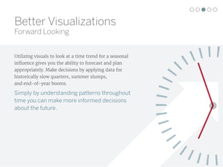
This document discusses 5 limitations of spreadsheets for data analysis and visualization and provides alternatives:
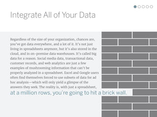
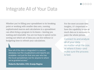
1. Spreadsheets can't handle large, diverse datasets from multiple sources like databases and data warehouses. Integrating and analyzing all relevant data is important for accurate insights.
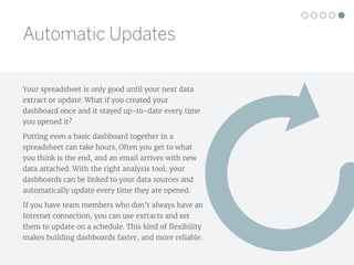
2. Complex calculations and macros can slow down spreadsheets, wasting time. Connecting to live data sources allows fast analysis of large datasets.
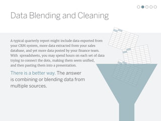
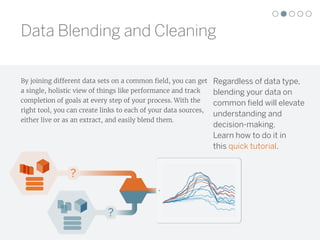
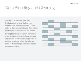
3. Blending and cleaning data from different sources is difficult in spreadsheets. Joining datasets on common fields provides a unified view.
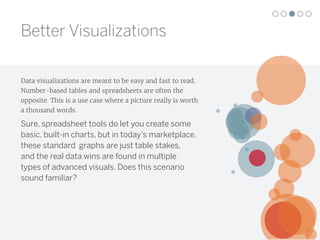
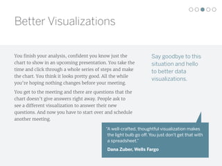
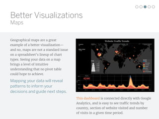
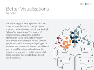
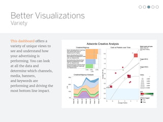
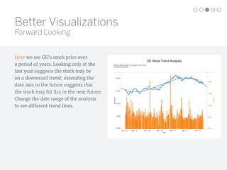
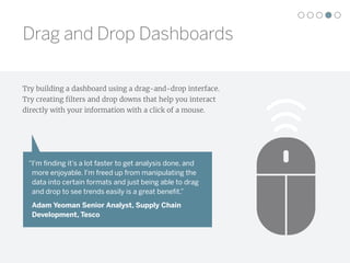
4. Spreadsheets offer limited basic charts but advanced visualizations like maps and dashboards provide faster, more intuitive understanding.
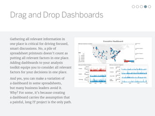
5. Interactive dashboards with up


![[Webinar Deck] Google Data Studio for Mastering the Art of Data Visualizations](https://cdn.slidesharecdn.com/ss_thumbnails/webinardeckgoogledatastudioformasteringtheartofdatavisualizations-170830111718-thumbnail.jpg?width=640&height=640&fit=bounds)


