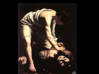
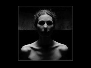
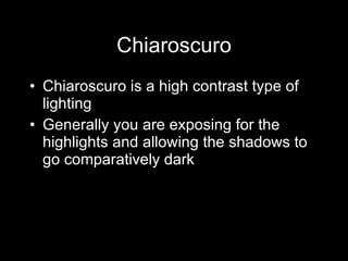
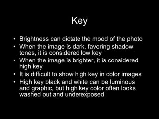
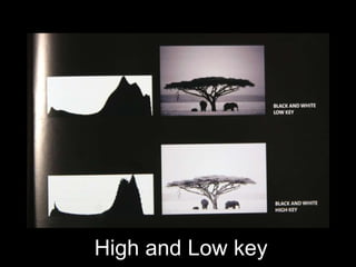
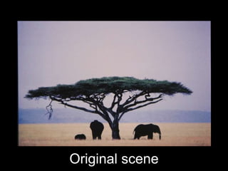
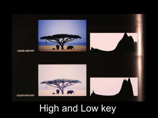
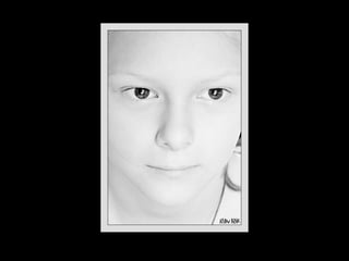
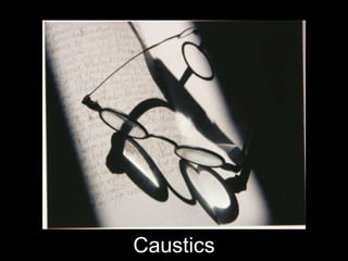
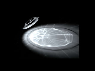
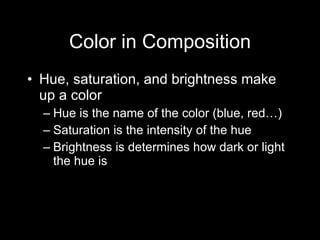
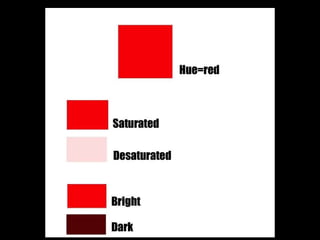
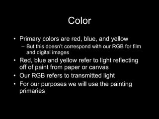
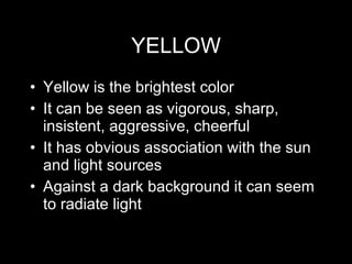
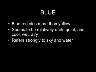
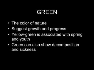
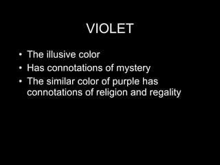
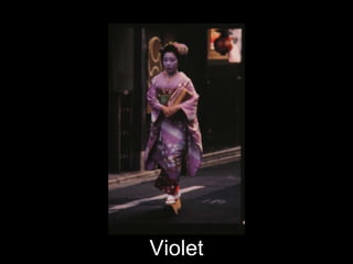
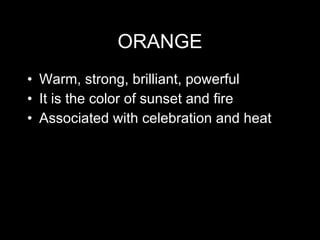
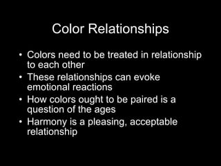
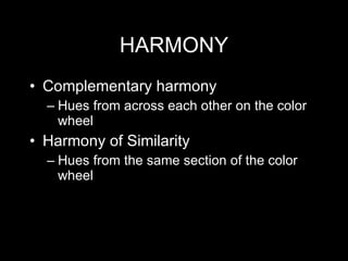
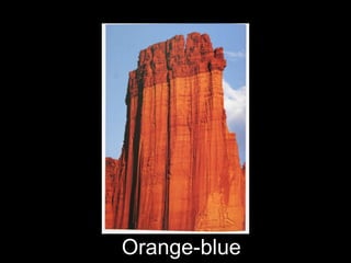
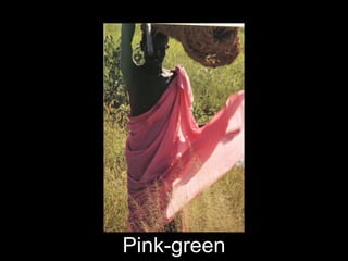
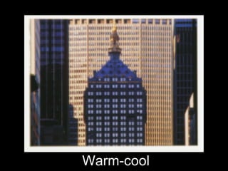
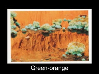
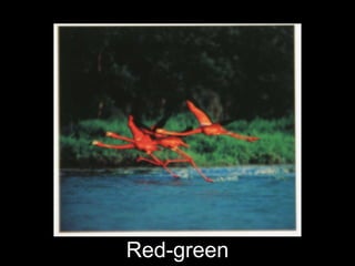
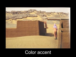
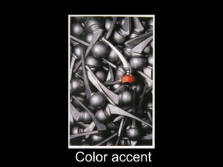
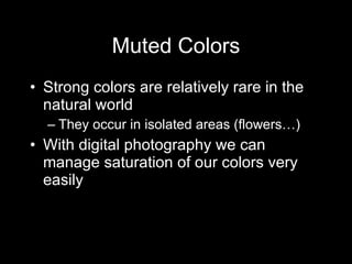
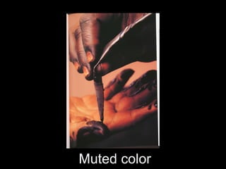
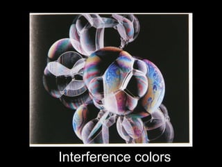
Composing with light and color
Chiaroscuro Chiaroscuro-attributed to the Italian painter Caravaggio Literally means light/dark Refers to the dramatic modeling of subjects in painting by shafts of light illuminating dark scenes It controls the sense of modeling in an image and so it controls the 3d quality of the work
 
 
Chiaroscuro Chiaroscuro is a high contrast type of lighting Generally you are exposing for the highlights and allowing the shadows to go comparatively dark
Key Brightness can dictate the mood of the photo When the image is dark, favoring shadow tones, it is considered low key When the image is brighter, it is considered high key It is difficult to show high key in color images High key black and white can be luminous and graphic, but high key color often looks washed out and underexposed
Original
High and Low key
Original scene
High and Low key


Ambiguity
Caustics
 
 
Reinforcing pattern
Color in Composition Hue, saturation, and brightness make up a color Hue is the name of the color (blue, red…) Saturation is the intensity of the hue Brightness is determines how dark or light the hue is
 
Color Primary colors are red, blue, and yellow But this doesn ’t correspond with our RGB for film and digital images Red, blue and yellow refer to light reflecting off of paint from paper or canvas Our RGB refers to transmitted light For our purposes we will use the painting primaries
 
Primary Colors
RED Red is considered the strongest color It tends to advance toward the viewer  It can be seen as vital, earthy, hot, passion, aggression, danger
Red
YELLOW Yellow is the brightest color It can be seen as vigorous, sharp, insistent, aggressive, cheerful It has obvious association with the sun and light sources Against a dark background it can seem to radiate light
 
BLUE Blue recedes more than yellow Seems to be relatively dark, quiet, and cool, wet, airy Refers strongly to sky and water
 
Secondary Colors
GREEN The color of nature Suggest growth and progress Yellow-green is associated with spring and youth Green can also show decomposition and sickness
 
 
VIOLET The illusive color Has connotations of mystery The similar color of purple has connotations of religion and regality
Violet
 
ORANGE Warm, strong, brilliant, powerful It is the color of sunset and fire Associated with celebration and heat
 
 
Color Relationships Colors need to be treated in relationship to each other These relationships can evoke emotional reactions How colors ought to be paired is a question of the ages Harmony is a pleasing, acceptable relationship
HARMONY Complementary harmony  Hues from across each other on the color wheel Harmony of Similarity Hues from the same section of the color wheel
Orange-blue
Pink-green
Warm-cool
Green-orange
Red-green
Color accent
Color accent
Muted Colors Strong colors are relatively rare in the natural world They occur in isolated areas (flowers…) With digital photography we can manage saturation of our colors very easily
Orientalist palette
Muted color
Mossy greens
Metallics
Interference colors
Texture and form

Photo Design-Light and Color-Chapter 4

  • 1.
  • 2.
    Chiaroscuro Chiaroscuro-attributed tothe Italian painter Caravaggio Literally means light/dark Refers to the dramatic modeling of subjects in painting by shafts of light illuminating dark scenes It controls the sense of modeling in an image and so it controls the 3d quality of the work
  • 3.
  • 4.
  • 5.
    Chiaroscuro Chiaroscuro isa high contrast type of lighting Generally you are exposing for the highlights and allowing the shadows to go comparatively dark
  • 6.
    Key Brightness candictate the mood of the photo When the image is dark, favoring shadow tones, it is considered low key When the image is brighter, it is considered high key It is difficult to show high key in color images High key black and white can be luminous and graphic, but high key color often looks washed out and underexposed
  • 7.
  • 8.
  • 9.
  • 10.
  • 11.
  • 12.
  • 13.
  • 14.
  • 15.
  • 16.
  • 17.
  • 18.
  • 19.
    Color in CompositionHue, saturation, and brightness make up a color Hue is the name of the color (blue, red…) Saturation is the intensity of the hue Brightness is determines how dark or light the hue is
  • 20.
  • 21.
    Color Primary colorsare red, blue, and yellow But this doesn ’t correspond with our RGB for film and digital images Red, blue and yellow refer to light reflecting off of paint from paper or canvas Our RGB refers to transmitted light For our purposes we will use the painting primaries
  • 22.
  • 23.
  • 24.
    RED Red isconsidered the strongest color It tends to advance toward the viewer It can be seen as vital, earthy, hot, passion, aggression, danger
  • 25.
  • 26.
    YELLOW Yellow isthe brightest color It can be seen as vigorous, sharp, insistent, aggressive, cheerful It has obvious association with the sun and light sources Against a dark background it can seem to radiate light
  • 27.
  • 28.
    BLUE Blue recedesmore than yellow Seems to be relatively dark, quiet, and cool, wet, airy Refers strongly to sky and water
  • 29.
  • 30.
  • 31.
    GREEN The colorof nature Suggest growth and progress Yellow-green is associated with spring and youth Green can also show decomposition and sickness
  • 32.
  • 33.
  • 34.
    VIOLET The illusivecolor Has connotations of mystery The similar color of purple has connotations of religion and regality
  • 35.
  • 36.
  • 37.
    ORANGE Warm, strong,brilliant, powerful It is the color of sunset and fire Associated with celebration and heat
  • 38.
  • 39.
  • 40.
    Color Relationships Colorsneed to be treated in relationship to each other These relationships can evoke emotional reactions How colors ought to be paired is a question of the ages Harmony is a pleasing, acceptable relationship
  • 41.
    HARMONY Complementary harmony Hues from across each other on the color wheel Harmony of Similarity Hues from the same section of the color wheel
  • 42.
  • 43.
  • 44.
  • 45.
  • 46.
  • 47.
  • 48.
  • 49.
    Muted Colors Strongcolors are relatively rare in the natural world They occur in isolated areas (flowers…) With digital photography we can manage saturation of our colors very easily
  • 50.
  • 51.
  • 52.
  • 53.
  • 54.
  • 55.