Elements of color
•Download as PPT, PDF•
1 like•396 views

About color and psychology in visual messaging

Recommended
More Related Content
What's hot
What's hot (20)
Similar to Elements of color
Similar to Elements of color (20)
More from Kaitlin Hanger, Ph.D.
More from Kaitlin Hanger, Ph.D. (20)
Recently uploaded
Recently uploaded (20)
Elements of color
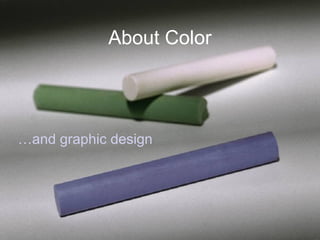
- 1. About Color …and graphic design
- 2. Color Impacts Mood & Meaning • Red: Action, aggression/ assertiveness/danger • Yellow: Demands attention; high readability • Green: Symbol of health & prosperity • Blue: Tranquility, stability • Black: Sophistication • Orange: Evokes “edibility” • Purple: Risk-taking
- 3. American Color Associations Color General Appearance Mental Associations Direct Associations Objective Associations Subjective Impressions Red brilliant, intense,opaque,dry Hot, fire, heat, blood danger, Christmas, 4th of July, Valentine's Day, Mother's Day, flag passionate, exciting active intensity, rage, fierceness Orange bright, luminous, glowing Warm, metallic, autumnal Halloween, Thanksgiving jovial, lively, energetic, forceful hilarity, exuberance, satiety Yellow sunny, incandescent, radiant sunlight caution cheerful, inspiring, vital, celestial high spirit, health Green clear, moist cool, nature, water clear, St. Patrick's Day quieting, refreshing, peaceful ghastliness, disease, terror, guilt Blue transparent, wet cold, sky, water, ice service, flag subduing, melancholy, contemplative, sober gloom, fearfulness, furtiveness Purple deep, soft, atmospheric cool, mist, darkness, shadow mourning, Easter dignified, pompous, mournful, mystic loneliness, desperation White spatial - light cool, snow cleanliness, Mother's Day, flag pure, clean, frank, youthful brightness of spirit, normality Black spatial - dark neutral, night, emptiness mourning funeral, ominous, deadly, depressing negation of spirit, death
- 6. WHITE
- 18. Blue Period. Corporate advertisers love blue. USA Today says, ”The ad business is feeling blue— literally.” Blue is the USA's favorite color The use of blue gets consumers to open up to the message. Blue suggests upscale elegance. Blue also represents technology and the future. Blue Period.
- 34. Basic Elements of “Color Theory” Hue Saturation Tints/Tones/Shades Warmth vs. Coolness Color Adjacency (Analogous Colors) Complementary Colors Monochromatic design
- 35. Saturation • Hue = basic color, typically one of the rainbow (red, blue, green, yellow, orange, violet) • Saturation refers to the brightness or dullness of a hue • At its highest level of intensity, a hue is said to be purely saturated. • Mixed with black, white, or especially gray, the fully saturated hue becomes dull in various degrees. The neutral colors dull the intensity or saturation because they dilute the hue. A color mixed with gray is called a tone
- 36. Definitions • A hue mixed with black is a shade. • A hue mixed with white is a tint. • A saturated color will dominate (attract attention) when placed alongside duller tones. • A saturated hue has the advantage of being noticed first when surrounded by hues of lower saturation.
- 37. Color • Additive color system Adding light, using the 3 primaries green, red, and blue. Primaries are also called the additive primaries because, when added together in the natural world, they create white light.
- 39. Color • When working with light in screen- based media, the three primaries are red, green, and blue (RGB).
- 40. Color • The subtractive color model is built on the subtraction of light (typically printed with black onto a reflective surface). The subtractive primary colors in pigment are yellow, red, and blue. In printing, yellow, magenta, and cyan are the colors of the process inks used for process color reproduction. A fourth color, black, is added to increase contrast. Pigment: a natural color or hue mixed for application on paper or other material (eg.paint, ink, dye)
- 41. Color • Designers should have a basic awareness of color print production, ink mixtures, and screen “safe” colors—and their problems. • Basic color knowledge should include awareness of the printing primaries of CMYK, the process of layering dots of ink to produce color, and the Pantone™ color system of ink selection. • The Pantone color system is a standardized color matching set of inks used in printing processes. • Designers should be aware that colors on the web can be unstable; therefore a palette of 256 “web-safe” colors was standardized. Pantone Matching System: Swatch
- 42. Value • Value refers to the level of luminosity— lightness or darkness—of a color, such as light blue or dark red. • To adjust the value of a hue, two neutral colors are employed: pure black and white. • Black is the darkest value and white is the lightest. • Value contrast is most useful for purposes of differentiating shapes. The value contrast most clearly differentiates the figure from the ground. • Hue contrasts alone have less impact and therefore may not be as effective for differentiating between the figure and ground images or between elements of a single composition
- 45. The Color Wheel Presents a logically arranged sequence of pure hues. A range of colors generated by mixing three beams of light. The 3 beams combined produce white light and are called primary colors (red, green, and blue). Isaac Newton developed the first color wheel in 1666. Since then artists have studied numerous variations of this concept.
- 54. Complements vibrate such as red text on a blue background,
- 56. Color theory | Check it out • http://www.worqx.com/color/combinations.htm
- 57. Color Harmony How color behaves in relation to other colors is a complex area of color theory. Helps create unity in design.
- 60. Harmony Tips • Colors harmonize best if they are similar in value--all tones, all shades, or all tints. • Complementary colors blend best with the use of intervals (graduated shades/tones/tints forming a progression toward the opposite color. • You can use semi- transparencies and layering to better harmonize awkward color combos.
- 61. Color Schemes
- 69. Color Schemes: Check it out • ADOBE color themes: ADOBE Kuler • https://color.adobe.com/create/color-wheel/