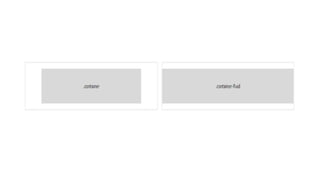
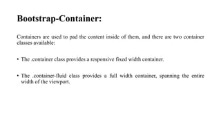
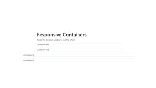
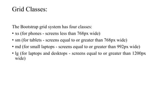
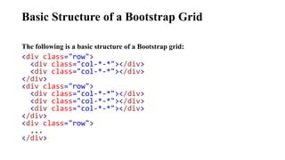
Bootstrap is a free front-end framework designed to streamline web development with pre-designed HTML and CSS components, enabling responsive designs adaptable to various devices. It offers user-friendly features such as a mobile-first approach, browser compatibility, and easy installation through downloading or CDN. The framework includes responsive classes for containers and a grid system, as well as various form layouts for efficient user input management.


![Bootstrap [part 1]](https://cdn.slidesharecdn.com/ss_thumbnails/bootstrappart-11-170208154053-thumbnail.jpg?width=640&height=640&fit=bounds)