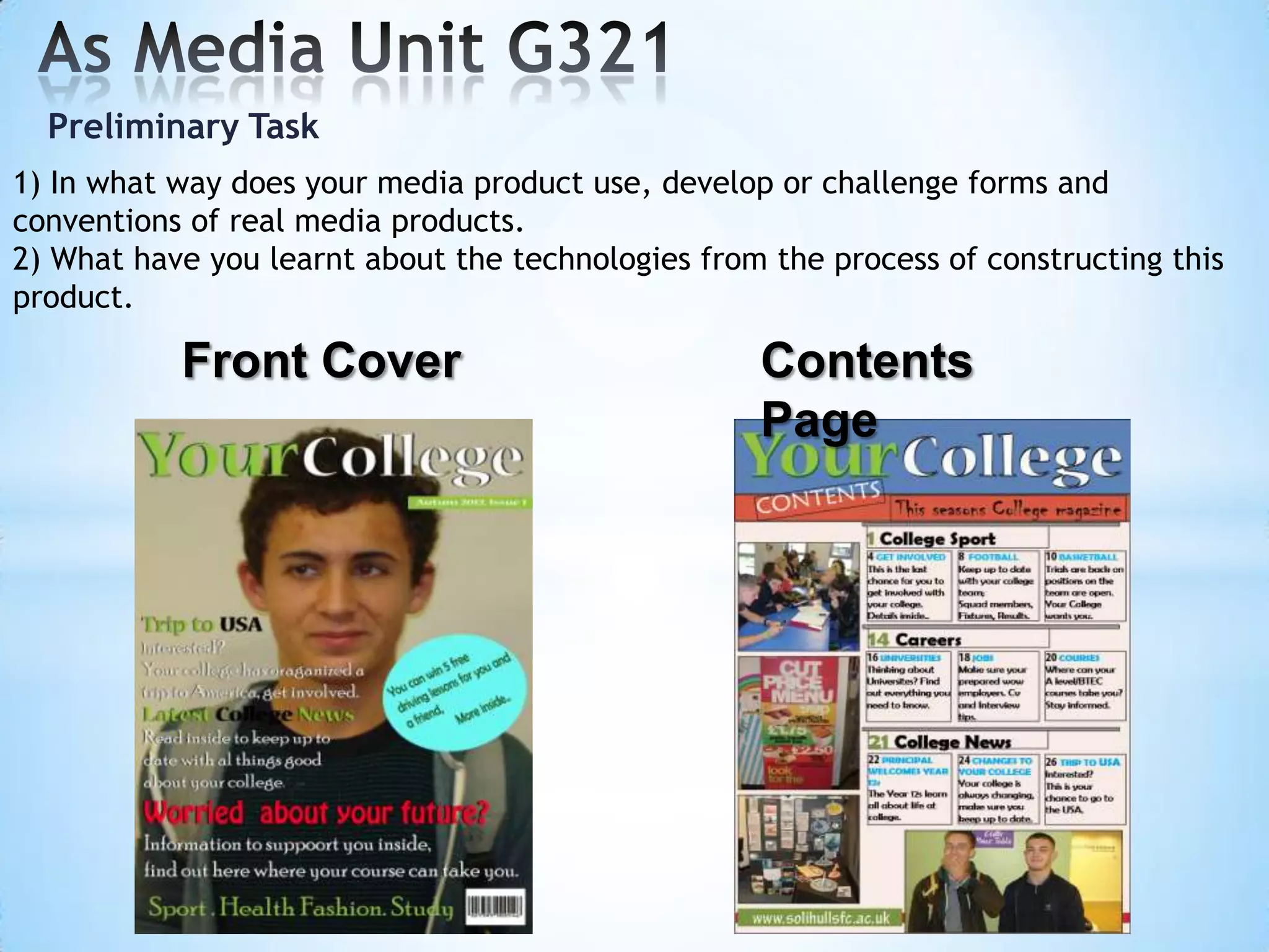
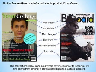
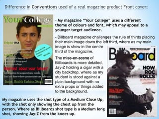
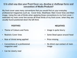
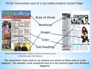
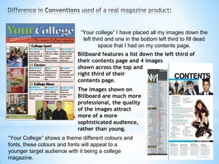
Preliminary Task
1) In what way does your media product use, develop or challenge forms and
conventions of real media products.
2) What have you learnt about the technologies from the process of constructing this
product.

           Front Cover                             Contents
                                                   Page
Similar Conventions used of a real media product Front Cover:


                                    Masthead

                                    Issue/date

                                   Main Image

                                    Coverline

                                 Main Coverline

                                     Barcode


     The conventions I have used on my front cover are similar to those you will
        find on the front cover of a professional magazine such as Billboard.
- My magazine “Your College” uses a different
                           theme of colours and font, which may appeal to a
                           younger target audience.
                           - Billboard magazine challenges the rule of thirds placing
                           their main image down the left third, where as my main
                           image is show in the centre
                           third of the magazine.
                           The mise-en-scene of
                           Billboards is more detailed,
                           Jay-Z holding a cigar with a
                           city backdrop, where as my
                           student is stood against a
                           plain background with no
                           extra props or things added
                           to the background.

My magazine uses the shot type of a Medium Close Up,
with the shot only showing the chest up from the
person. Where as Billboards shot type is a Medium long
shot, showing Jay-Z from the knees up.
My front cover uses many conventions that you would find on your everyday
professional magazines such as; Cover lines, Masthead, Main Cover lines and Main
image. Using the rule of thirds when applying those conventions to my front cover. I
extended my main cover line across all three thirds of my front cover, when they are
usually found positioned down the left third.


          POSITIVES                                          NEGATIVES

• Theme of Colours and Fonts                     • Image is quite blurry

• Realistic Cover lines                          • Some Dead space around head

• Rule of thirds being applied                   • Price missing

• Conventions of a professional                  • No direct eye contact of main
  magazine used                                    image

• Can be clearly read
The conventions I have used on my contents are similar to those used on a real
magazine. The example I have compared mine to is the contents page from Billboard
                                   Magazine.
“Your college” I have placed all my images down the
                              left third and one in the bottom left third to fill dead
                                      space that I had on my contents page.
                           Billboard features a list down the left third of
                           their contents page and 4 images
                           shown across the top and
                           right third of their
                           contents page.
                           The images shown on
                           Billboard are much more
                           professional, the quality
                           of the images attract
                           more of a more
                           sophisticated audience,
                           rather than young.
“Your College” shows a theme different colours and
fonts, these colours and fonts will appeal to a
younger target audience with it being a college
magazine.
InDesign
InDesign was used a way of designing my contents
page, I learnt how to successfully think of design and
then create it through this software, which made the
task of designing a contents page much easier.

 Photoshop
 Photoshop shop was used as a way of designing my
 front cover, I learnt how to locate and use fonts,
 effects and get to grips with a feature called layers .
 Learning these skills allowed me to produce my Front
 cover as part of my preliminary task.

 Blogger
 The website we are uploading our preliminary task. We
 have to add labels and selected appropriate fonts.

Evaluation preliminary task draft

  • 1.
    Preliminary Task 1) Inwhat way does your media product use, develop or challenge forms and conventions of real media products. 2) What have you learnt about the technologies from the process of constructing this product. Front Cover Contents Page
  • 2.
    Similar Conventions usedof a real media product Front Cover: Masthead Issue/date Main Image Coverline Main Coverline Barcode The conventions I have used on my front cover are similar to those you will find on the front cover of a professional magazine such as Billboard.
  • 3.
    - My magazine“Your College” uses a different theme of colours and font, which may appeal to a younger target audience. - Billboard magazine challenges the rule of thirds placing their main image down the left third, where as my main image is show in the centre third of the magazine. The mise-en-scene of Billboards is more detailed, Jay-Z holding a cigar with a city backdrop, where as my student is stood against a plain background with no extra props or things added to the background. My magazine uses the shot type of a Medium Close Up, with the shot only showing the chest up from the person. Where as Billboards shot type is a Medium long shot, showing Jay-Z from the knees up.
  • 4.
    My front coveruses many conventions that you would find on your everyday professional magazines such as; Cover lines, Masthead, Main Cover lines and Main image. Using the rule of thirds when applying those conventions to my front cover. I extended my main cover line across all three thirds of my front cover, when they are usually found positioned down the left third. POSITIVES NEGATIVES • Theme of Colours and Fonts • Image is quite blurry • Realistic Cover lines • Some Dead space around head • Rule of thirds being applied • Price missing • Conventions of a professional • No direct eye contact of main magazine used image • Can be clearly read
  • 5.
    The conventions Ihave used on my contents are similar to those used on a real magazine. The example I have compared mine to is the contents page from Billboard Magazine.
  • 6.
    “Your college” Ihave placed all my images down the left third and one in the bottom left third to fill dead space that I had on my contents page. Billboard features a list down the left third of their contents page and 4 images shown across the top and right third of their contents page. The images shown on Billboard are much more professional, the quality of the images attract more of a more sophisticated audience, rather than young. “Your College” shows a theme different colours and fonts, these colours and fonts will appeal to a younger target audience with it being a college magazine.
  • 8.
    InDesign InDesign was useda way of designing my contents page, I learnt how to successfully think of design and then create it through this software, which made the task of designing a contents page much easier. Photoshop Photoshop shop was used as a way of designing my front cover, I learnt how to locate and use fonts, effects and get to grips with a feature called layers . Learning these skills allowed me to produce my Front cover as part of my preliminary task. Blogger The website we are uploading our preliminary task. We have to add labels and selected appropriate fonts.