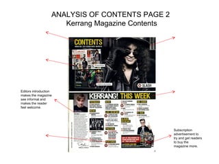
Analysis of 3 music magazine contents pages you must
analyse the Nme contents and then choose any other 2
                 contents you like   )
Analysis of magazine Contents pages
    Contents 1.NME Sept 2009
        Dizzee Rascal Edition
NME MASTHEAD SAME
                                    Contents page NME (SEPT 2009) ANALYSIS                              BANNER AT TOP
 COLOUR CODE AS FRONT
                                                                                                        Banner says ‘contents’ to show
 Creates a house style for the
                                                                                                        what the page is about
 magazine by using the same
 three colours. Red, white and                                                                            DATE
 black and creates a familiarity.
                                                                                                          Shows how recent the magazine
                                                                                                          is. Fits in with the colour scheme
   MAIN IMAGE IS                                                                                          so it stands out.
   Not as big as the image                                                                            SUB HEADING BLOCKED
   on the front cover but is                                                                          OUT INTO BLACK SUB
   still easily noticeable. It                                                                        SECTIONS
   is also anchored by text
   to show what it is about.                                                                          Makes the important sub
                                                                                                      sections stand out and draw
                                                                                                      the attention of the target
 BANDS ARE LISTED IN
                                                                                                      audience.
 RED WITH PAGE
 NUMBERS IN BLACK                                                                              BRIEF HEADING +SUMMARY OF
                                                                                               CONTENT WITH PAGE NUMBER IN
 This is so the bands and
                                                                                               RED
 the page numbers
 contrast so it is easy to                                                                     Brief information that is enough to
 see what information is                                                                       inform the reader of what is on the
 on what page.                                                                                 page but not so much that it wastes
                                                                                               their time.
IMAGE IS EDITED SO IT                                                                                  PREVIOUS/FUTURE
LOOKS LIKE A                                                                                           EDITIONS OF NME ARE
PHOTOGRAPH. THIS IS                                                                                    SHOWN WITH DETAILS
APPROPRIATE                                                                                            OF WEBSITE/PHONE
BECAUSE…                                                                                               NUMBER ETC
It makes the reader feel                                                                               This is to encourage
as if they are also on tour                                                                            people to subscribe to the
with the bands and it                                                                                  magazine so that they
makes the magazine                                                                                     can make more money. It
more informal and                    Editor’s introduction to contents of magazine                     gives all the necessary
friendly.                                                                                              information so they give
                                     Gives an informal introduction to make the reader feel welcome    you almost no excuse to
                                     and relaxed and make the magazine seem informal                   not subscribe
ANALYSIS OF LAYOUT/DESIGN FEATURES OF
            CONTENTS PAGE
                         MASTHEAD AND WORD CONTENTS –
                         BOLD AT TOP WITH DATE/ISSUE
                         NUMBER


                                             Main articles are
                                             displayed on the left so
                                             they are easily
                                             noticeable.


                    Text placed here to
                    anchor the image
                    which says what the
                    image is about. It is
                    clearly an important
                    feature as it is large
                    and in a frame to
                    highlight it to the      Positioned in the
                    readers.                 bottom right corner so
                                             that it doesn’t get in
                                             the way but it catches
                                             the reader’s eye. Also
                                             some words in yellow
                                             which contrasts to the
                                             white red and black
                                             style previously used.
ANALYSIS OF CONTENTS PAGE 2
                      Kerrang Magazine Contents


Editors introduction
makes the magazine
see informal and
makes the reader
feel welcome.


                                                  Subscription
                                                  advertisement to
                                                  try and get readers
                                                  to buy the
                                                  magazine more.
ANALYSIS OF LAYOUT
 CONTENTS PAGE 2
ANALYSIS OF CONTENTS PAGE 3
 (Title/date of magazine analysed
Analysis of layout contents page 3

Analysing nme contents page

  • 1.
    Analysis of 3music magazine contents pages you must analyse the Nme contents and then choose any other 2 contents you like )
  • 2.
    Analysis of magazineContents pages Contents 1.NME Sept 2009 Dizzee Rascal Edition
  • 3.
    NME MASTHEAD SAME Contents page NME (SEPT 2009) ANALYSIS BANNER AT TOP COLOUR CODE AS FRONT Banner says ‘contents’ to show Creates a house style for the what the page is about magazine by using the same three colours. Red, white and DATE black and creates a familiarity. Shows how recent the magazine is. Fits in with the colour scheme MAIN IMAGE IS so it stands out. Not as big as the image SUB HEADING BLOCKED on the front cover but is OUT INTO BLACK SUB still easily noticeable. It SECTIONS is also anchored by text to show what it is about. Makes the important sub sections stand out and draw the attention of the target BANDS ARE LISTED IN audience. RED WITH PAGE NUMBERS IN BLACK BRIEF HEADING +SUMMARY OF CONTENT WITH PAGE NUMBER IN This is so the bands and RED the page numbers contrast so it is easy to Brief information that is enough to see what information is inform the reader of what is on the on what page. page but not so much that it wastes their time. IMAGE IS EDITED SO IT PREVIOUS/FUTURE LOOKS LIKE A EDITIONS OF NME ARE PHOTOGRAPH. THIS IS SHOWN WITH DETAILS APPROPRIATE OF WEBSITE/PHONE BECAUSE… NUMBER ETC It makes the reader feel This is to encourage as if they are also on tour people to subscribe to the with the bands and it magazine so that they makes the magazine can make more money. It more informal and Editor’s introduction to contents of magazine gives all the necessary friendly. information so they give Gives an informal introduction to make the reader feel welcome you almost no excuse to and relaxed and make the magazine seem informal not subscribe
  • 4.
    ANALYSIS OF LAYOUT/DESIGNFEATURES OF CONTENTS PAGE MASTHEAD AND WORD CONTENTS – BOLD AT TOP WITH DATE/ISSUE NUMBER Main articles are displayed on the left so they are easily noticeable. Text placed here to anchor the image which says what the image is about. It is clearly an important feature as it is large and in a frame to highlight it to the Positioned in the readers. bottom right corner so that it doesn’t get in the way but it catches the reader’s eye. Also some words in yellow which contrasts to the white red and black style previously used.
  • 5.
    ANALYSIS OF CONTENTSPAGE 2 Kerrang Magazine Contents Editors introduction makes the magazine see informal and makes the reader feel welcome. Subscription advertisement to try and get readers to buy the magazine more.
  • 6.
    ANALYSIS OF LAYOUT CONTENTS PAGE 2
  • 7.
    ANALYSIS OF CONTENTSPAGE 3 (Title/date of magazine analysed
  • 8.
    Analysis of layoutcontents page 3