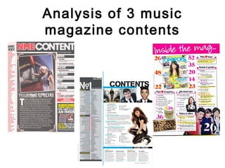
The document analyzes the contents pages of 3 music magazines:
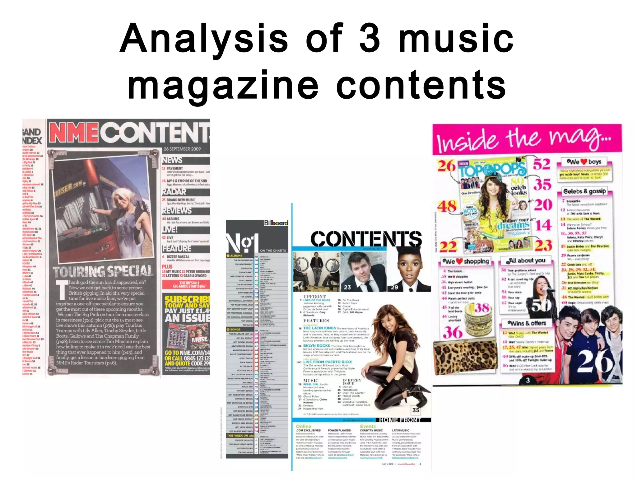
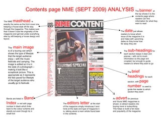
1) NME Sept 2009 edition focused on Dizzee Rascal keeps the magazine's house style and uses images relevant to the target audience's lifestyle.
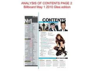
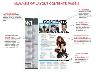
2) Billboard May 2010 Glee edition includes a music chart and advertises other magazine sections.
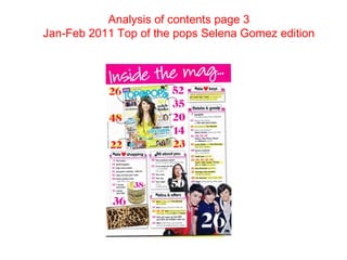
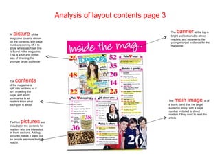
3) Top of the Pops Jan-Feb 2011 Selena Gomez edition uses bright colors and images of popular bands to attract younger readers and directs them to articles.
3. Contents page NME (SEPT 2009) ANALYSIS The banner at
the top shows it is the
contents page where
readers can find
The NME masthead is information for what they
exactly the same as the front cover one, want to read
keeping a house style all the way
date
through the magazine. This makes sure
that it doesn’t lose the originality of the The just allows
magazine and get lost under everything readers to know which
else by still keeping a house design and issue of the magazine it is
layout. and helps with upcoming
dates so they know how
far away they are
The main image
is of a touring van which The sub-headings for
shows the type of lifestyle each section keeps it clear and
that the target audience precise – with not to mush
enjoy – with the music information so the page isnt
festivals and camping. The crowded, but enough to guide
image is edited so it is in readers to where they want to go
the style of a photograph –
making it look like a
scrapbook picture. This is The brief
appropriate as it represents
the fast paced fun lifestyle headings for each
section, with page
of the target audience who
usually go to festivals
number is used to
guide the reader to which
section they want
Bands are listed in Band An advert for previous
Index in red with page editors letter
and future NME magazines is
The at the start shown, to attract readers into
number in black which links of the magazine simply introduces it and buying more or subscribing.
back to the colour scheme and hints at the style and type of magazine it This helps to build a fan base
stands out even though its in is, talking about a main article found later and popularity of the magazine
small font in the contents.
5. ANALYSIS OF LAYOUT CONTENTS PAGE 2
The banner at
the top shows it is the
masthead contents page where
The is still readers can find
included on the contents although information for what they
its smaller, so that the house style want to read
and magazine isn't lost on the inner
pages
The date just allows
readers to know which
issue of the magazine it is
and helps with upcoming
dates so they know how
far away they are
The contents page has a The contents is divided into
chart list for the top sub-headings and
music at the time, which is sections to allow readers to find
relevant for the music what they are looking for and not
magazine as target audience overcrowd the page
would be interested in this
and on the contents page it
is easy and quick to find
A separate section at the
bottom
advertises other
types of the magazine to
attract more publicity
online etc.
7. Analysis of layout contents page 3
A picture of the
The banner at the top is
bright and colourful to attract
magazine cover is shown readers, and represents the
on the contents, with page younger target audience for the
numbers coming off it to magazine
show where each sell line
is found in the magazine.
This is a fun and stylish
way of directing the
younger target audience
The contents
of the magazine is
split into sections so it
isn't crowding the
page, with short
summaries to let
readers know what The main image is of
each part is about a iconic band that the target
audience enjoy, with a page
number included to direct
readers if they want to read the
article
Fashion pictures are
included in the contents for
readers who are interested
in them sections. Adding
pictures makes it stand out
so people are more likely to
read it