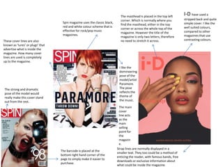
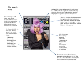
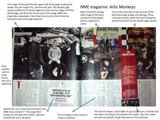
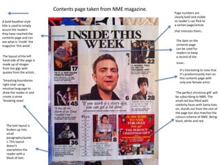
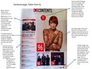
Spin magazine uses a classic black, red and white color scheme for its covers. The masthead is placed in the top left corner as usual. Lady Gaga's brightly colored hair contrasts with the grey backdrop on her issue's cover. NME magazine features a vintage-style black and white image of Arctic Monkeys filling half the page, with text on the other half. Q magazine's contents page shows images and quotes from live gigs on the left side in a rock and roll color scheme of black, red and white.
The document summarizes the author's research on existing magazine formats and conventions. It discusses several magazines the author analyzed such as Empire, Entertainment Weekly, and Total Film. Key conventions identified include placement of the masthead, use of color schemes, layout of cover stories, and inclusion of film titles and quotes. The author explains how they incorporated these same conventions into their own magazine cover design to make it look professional.
This document analyzes the contents pages of three music magazines: NME, Kerrang!, and another unspecified magazine.
The summary of the NME contents page notes the consistent color scheme used throughout the magazine. It describes the main image promoting an artist's tour and how the section headings and band listings draw attention in red and black.
The Kerrang! contents page stands out with an unusual central masthead placement. Its rebellious font and layout reflect the magazine's rock genre. Images on the page similarly feature rock styles.
Details like dates, brief summaries, and subscription information are included to help readers navigate and engage with the magazines. Consistent branding and clear presentation of content are important across all three
Analysis of existing pop music magazinesPancakes31312
This document provides an analysis of the layouts and designs of various pop music magazine covers. It examines the color schemes, images, text placement and overall layouts of magazines featuring artists like Adele, Lady Gaga, and Beyonce. Key aspects discussed include the use of bold colors to make text and images stand out, centering important information, and balancing empty and filled space to guide the reader's eyes to focal points.
The document analyzes and compares the contents pages of two music magazines - Kerrang! and Q Magazine. Both magazines use their mastheads, continuous color schemes, and teasers to attract readers. However, Kerrang!'s contents page has a more cluttered layout while Q's is neatly structured. Kerrang! also uses a informal sans serif font compared to Q's more formal serif font. The main images on both pages reflect the magazines' genres by featuring popular bands, though Kerrang!'s image has a punk/rock style and Q's portrays its more sophisticated audience.
The document analyzes the contents page of the music magazine Vibe. It summarizes that the layout uses simple colors like black, grey, and white to create a sophisticated look representing the magazine's music genre. Key elements like the masthead and cover lines stand out in white against the dark background to easily guide readers to content. Images of a scantily-clad model portray stereotypical attitudes appealing to both women and men in the target demographic.
The document provides a summary of a student's media magazine project. The student created a hip hop magazine called "The Beat" targeting a younger audience interested in rap and hip hop music. The summary describes the magazine's design conventions including the masthead, cover image, feature articles, and layout. It also discusses how the magazine represents its target audience and the technologies used in its construction. The student learned about magazine design, photography, and software like Photoshop and InDesign through completing the project.
The document provides details about the front covers of several magazines. It includes descriptions of the logos, cover lines, images and color schemes used on the covers of magazines about music (NME, Q), hip hop, DJs, and urban culture. The document also summarizes contents pages showing the layouts and photos representing upcoming articles. Key articles and images featured include the Rolling Stones, Muse, Nicki Minaj, Alisha Keys, and Annie Mac. Advertisements and other elements like barcodes and publication dates are also described.
The magazine uses a pink color scheme and images of boy bands to appeal to its young, female target audience. There is no single dominant image on the cover, focusing more on cover lines. Inside, article pages use pink banners and mastheads for branding and easy-to-read fonts with short sentences and many images. Advertisements blend in with the page layout and color scheme rather than standing out.
The document analyzes the layout and design elements of professional magazine covers. It discusses positioning of elements like the title, cover lines, images, barcode, and color schemes. Consistently across magazine covers, the title is positioned in the top left, cover lines frame the main image, and the barcode is in the bottom right containing publication details. Elements are purposefully designed to draw readers in through intriguing ambiguity while still following design conventions.
My front cover magazine design uses some conventions of music magazines like NME but also challenges some conventions:
1) My masthead follows conventions by being big, bold, and in the top left corner like NME, but does not use eyebrows above the masthead which is typical for NME.
2) I use more cover lines than typical magazines like NME to make up for the lack of eyebrows.
3) My main cover line is larger and centered like conventions, drawing attention to the most important information.
The document provides an analysis of the front pages of two music magazines - NME and Mojo.
[1] It examines the layout conventions used on both magazines' mastheads, headlines, images, pull quotes, and other design elements. [2] Key details like the magazines' target audiences, genres of music covered, and fonts and colors used are discussed. [3] The analysis provides a breakdown of how different elements on the pages are designed to catch readers' eyes and convey important information in a clear manner.
NME magazine uses a simple yet bold masthead in red at the top of the magazine to catch readers' eyes. The main image on the front cover takes up the whole page to be the focal point, and frequently features exclusives for a unique selling point. Inside, the largest text is used for headlines to stand out, while smaller text and box outs provide additional details on stories and features.
This magazine analysis document provides details on the layout and design conventions of several magazines.
The NME magazine cover follows conventions like having celebrity images and eye-catching text and fonts. Details are given on the layout of contents pages, including use of colors, images and fonts to draw readers in.
The magazine for young girls uses pink colors and designs inspired by a girl's bedroom to appeal to its target audience. Article formats include photos, games, and drop caps to make the content fun and accessible.
Magazine reviews feature star ratings and illustrations to complement music and DVD coverage. Conventions like headlines, credits and column designs are described.
This double page spread features an article about Lady Gaga. The large headline "The Lady Is A Champ" draws the reader's attention. The full page image of Lady Gaga in seductive clothing dominates the left page and overlaps the article text on the right page. The article is written in an informal, chatty tone and discusses Lady Gaga's unique fashion choices. The layout emphasizes the image over the text to attract readers' eyes to Lady Gaga as the focal point of the spread.
The document summarizes the design elements of magazine covers, including:
- Colour schemes typically use red, black and white to make text and images stand out against backgrounds.
- Mastheads and titles are large and bold to identify the magazine despite other elements obscuring them.
- Main images draw attention to featured artists or stories while fitting composition rules.
- Cover lines, banners, and subtitles are layered, colored, and sized to highlight key stories and content inside.
The double page spread features a striking close-up image of two models, giving an intimate feeling. The translucent black and white image and mysterious headline "the secret is out" intrigue readers. The article profiles artist Darrin Huss and his diverse career in dance and music production. Columns of text and graphics spaced across the page keep the layout engaging without overcrowding.
The document summarizes the key elements of three music magazine covers.
1) The first magazine cover features a close-up photo of a female artist with supporting text in varying fonts and sizes to add depth. White space is maximized without looking cluttered.
2) The second magazine uses a sans-serif masthead and black/white color scheme with yellow accents. It features mid-shots of three people in casual clothing to challenge conventions.
3) The third magazine has a large masthead incorporating the Union Jack. It uses primary colors and features four male models with a laid-back style to represent their alternative audience.
The magazine cover analyzes Dizzee Rascal's NME cover from September 2009. The colorful cover features Dizzee Rascal looking excitedly at the camera against a busy background. The use of bold colors and capitalized text is intended to draw attention. The target audience is identified as 16-25 year olds interested in indie/rock music based on the informal language and affordable price of £2.40.
The contents page of Q Magazine from July 2012 is also analyzed. The contents are categorized to aid navigation and the logo is included for brand recognition. Alternative artists like The Rolling Stones and current bands like Rizzle Kicks indicate a target audience of about 20-40 year olds who can afford
This document analyzes various design elements of the cover and table of contents page of an issue of NME magazine. The masthead uses a recognizable color scheme and compliments other elements on the cover. The central image features artist Damon Albarn to appeal to readers interested in both Blur and Gorillaz. Taglines are in bold capital letters to make topics seem urgent. The table of contents uses basic font but highlights section headings to draw the eye. Color is limited but used strategically to emphasize certain elements.
Q Magazine targets a 25+ audience of both males and females. It is published by Bauer Media Group, a large media company founded in 1875. The magazine focuses on various music genres to appeal to all music lovers. While it has a mass audience due to its popularity, it also has a niche focus on music fans.
The double page spread features an interview with artist Cher Lloyd. On the right page is a long shot photo of Cher Lloyd using the rule of thirds with her face as the focal point. She is shown taking photos with her hand on her mouth in a "shock" position, suggesting a rebellious side. The article is set out in question and answer blocks for easy reading by a younger audience. The pink and black title and headings match the magazine's house style. The main heading tells readers to read the interview "Now!" as they will be amazed by what they didn't already know about the artist.
Magazine research-Contents page and Double Page SpreadHarriet Thompson
The document provides details about the layout, images, colors, and text used on magazine contents pages and spreads from NME and Top of the Pops magazines. Key points include:
1) The NME contents page uses a grid-like layout with columns of text and center images/text. Bold black, red, and white colors are used throughout.
2) The Top of the Pops contents page features boxes of text at angles over the page with images dotted around. Bright pink, purple, and white colors target a young female audience.
3) Magazine spreads use large central images and pull quotes to draw readers in with bold visuals and intriguing text. Layouts and designs aim to clearly
Analysing contents pages prep for blog pptasmediae12
This document analyzes the contents pages of three music magazines. It finds that consistent color schemes, prominent images, and clear subheadings help guide the reader's eye and make key information easy to find. Anchoring brief summaries with related images also aids comprehension. Well-organized columns and sections structure the information in a readable format. The analyzed magazines effectively showcase content through visual design that supports usability and browsing.
The document summarizes what the student learned from constructing a music magazine as a class project. They learned how to use software like Photoshop, InDesign, and video tutorials to design the magazine layout. They also gained an understanding of how to represent and attract the target audience through careful manipulation of images, colors, language, and conventions. The student felt they progressed in skills from the preliminary task to the full magazine product, including broader knowledge of the research and production process for magazines.
The document discusses two teen suicide cases. The first is about a teenager who suffered severe depression after a breakup and considered suicide but ultimately decided to get help. The second case discusses a teenage girl who endured an abusive relationship, a miscarriage, and the suicide of her best friend. She struggled with her mental health but was able to remove herself from toxic influences and rebuild her support system. The document ends by discussing the suicide of another close friend, Emily, and the struggles the author had accepting and processing her death.
E-business involves conducting business transactions over the Internet. It allows companies to reach global customers, personalize products, and reduce costs. The main forms of e-business are B2B transactions between businesses and B2C transactions involving online retail. Challenges of e-business include privacy concerns, Internet fraud, poor website design leading to abandoned shopping carts, and channel conflicts with business partners. Companies use the Internet for communications through email, online communities, blogs, and web-based promotions. E-business has a global scope and future growth will depend on global strategies.
The document discusses how an indie magazine portrays the indie social group through images and text. It represents the indie culture by depicting trends in fashion, music, and lifestyle that they enjoy, such as wearing floral clothing, accessories, listening to artists like Lana Del Rey, attending music festivals, and discovering new bands. The images use techniques like costumes, makeup, props, and camera angles to reflect the culture's aesthetics and sense of uniqueness. The text also aims to appeal to indie interests through the magazine's design, featured artists, and content about music festivals.
The student used various technologies to create a music magazine for an evaluation task. They relied heavily on their Macbook Pro for research and work on the magazine using Photoshop. They also used their iPhone to access their blog and give feedback. Animoto was used to create a pitch and Blogger was used to post work online and see peers' work. A Panasonic TZ20 camera was used to take approximately 100-150 photos for the magazine at different angles and settings. SlideShare displayed analyses of existing magazines on the student's blog.
The document provides a calendar of upcoming events at Fort Drum for March 2012, including Family Readiness Group meetings, Army Family Team Building classes, a USO documentary showing, various conferences and festivals celebrating St. Patrick's Day, tax preparation assistance, and child care center closures. It also includes flyers advertising $1 movie days at the post exchange theater and New York's Maple Weekend festival in March. Common acronyms and contact information for various Fort Drum agencies are defined at the bottom.
The contents page of NME magazine uses a consistent color scheme of red, black, and white throughout. Band names and page numbers are listed in the left column in red and black. The masthead matches the front cover. The main image shows a woman near a tour bus to advertise a piece on touring. An introductory letter from the editor makes readers feel included. Information in the bottom right encourages subscribing for future issues.
This magazine cover features analysis discusses key elements of magazine design. In 3 sentences:
The cover summarizes that magazine covers typically include prominent mastheads, cover lines advertising main features, colorful schemes and images to attract readers, and additional text and graphics highlighting articles, artists, and advertisements. Common elements like barcodes and issue details are kept small and out of the way. Overall magazine covers aim to entice readers through eye-catching designs that preview exciting content and artists.
The contents page summarizes the key articles, features, and sections found in the magazine issue. Headings are in bold colors that match the magazine's style. Images advertise major stories and are placed with page numbers for easy navigation. Contact information at the bottom allows readers to subscribe or access additional online content.
The document summarizes the layout and design elements of magazine covers and pages. Key points include:
- Magazine covers feature recognizable mastheads, prominent cover images of popular celebrities or bands, and attention-grabbing cover lines.
- Inside pages use a consistent layout with section headings, article teasers, and photos to break up dense textual content.
- Design elements like different fonts, colors, and placement are used to draw the eye to important information and advertisements.
- Consistent branding through visual style and logos helps establish the magazine's identity and attract returning readers.
The document provides details on the layout and design of magazine covers and pages. Key points include:
- Magazine covers feature recognizable mastheads, cover lines that stand out, and photos of popular celebrities/artists to draw in readers.
- Inside pages use mastheads, bold headings, and color blocking to identify sections and make content easy to navigate.
- Articles are broken up with photos and captions while maintaining a clean, readable layout.
- Interviews are formatted with questions in one color and answers in another to clearly separate elements.
The magazine cover features the band Green Day in black clothing against a white background. The masthead "KERRANG" is in bold white font at the top to grab attention, as is the band name below in the same color scheme. This contrasts with the dark clothing of the band members and establishes the magazine's focus on rock music. Promotional images on the side advertise downloadable posters while information at the bottom like the barcode and artist listings provide less important details. The central image draws readers in by having the lead singer stare at the camera, using lighting to create a strong mood.
The magazine uses consistent branding elements like a red, white, and black color scheme throughout to maintain its house style and make the NME easily recognizable. Photos are used prominently on the cover and in articles to appeal to the target audience of younger music fans. Captions, pull quotes, and informal language help hook readers and provide a quick sense of the content in a way that matches the magazine's casual tone.
The NME targets young adult males interested in rock and hip-hop music. It has been published since 1952 and shifted its focus from music journalism to associated more with punk rock in the 1970s. Currently, the magazine aims to keep readers informed of new music through ads and articles, with a typical reader being a 23-year old male. Circulation is approximately 23,924 issues.
The NME targets young adult males interested in rock and hip-hop music. It has been published since 1952 and shifted its focus from music journalism to associated with genres like punk rock and hip-hop. The magazine aims to keep its audience informed of new music through ads and articles on up-and-coming artists. The typical reader is male around 23 years old, making up two-thirds of subscribers.
Analysis of professional magazine coversJessikahBaard
This magazine cover features a mid-shot image of a band overlaying the title. The masthead is in bold red at the top left with the positioning statement below the title. The main cover line is larger than the others in two different fonts to draw attention. The barcode at the bottom right displays the price, issue date, and web address in a small font.
The document analyzes the design elements and conventions used on the cover of a magazine. Key elements include:
1) The masthead is large and bold to grab attention, positioned in the top third as is typical.
2) The main cover line and image dominate the page, with the line positioned above to maintain prominence over the image.
3) Additional lines like the date, skyline, and buzz words are used to inform readers of content and attract potential buyers.
The document discusses the layout and design elements of magazine covers. Key elements include the logo, masthead, skyline, cover lines, barcode, price, and main image. The logo and masthead identify the magazine brand for readers. Cover lines are used to promote stories inside and attract audiences. Imagery and text are tailored to the target genre and audience. Pricing and barcode information is placed strategically to not interfere with the overall design.
The document summarizes the key design elements of a magazine cover and contents page. The masthead is prominently displayed on both pages to identify the publication. On the cover, the lead story is highlighted in a brighter color to attract readers. Other articles and advertisements are placed strategically throughout the left third to entice readers. Important information like the date and barcode are placed unobtrusively. The contents page neatly organizes articles by page number and uses colors, images, and text formatting consistently to guide readers through the issue.
This document summarizes key elements of the layout and design of Q Music Magazine. The masthead in the top left corner features the simple one-letter name "Q" to make it recognizable. Cover lines are used to draw readers in with headlines written in a consistent font. The contents page lists section headings in bright red with images of artists featured. A double page spread on Lady Gaga features a large black and white image of her posing confidently while an article about her runs in three columns for easy reading.
The layout and design of the magazine cover aims to attract readers through bold headlines and images. Notable features include a shattered masterhead suggesting a rock magazine, prominent placement of the lead singer to generate interest, and use of gold and white to convey luxury. Taglines about music celebrities aim to intrigue readers into learning more. Overall, the cover is designed to quickly inform readers of the main stories and attract potential buyers through visual elements and provocative text.
This document provides an analysis of the cover and contents page design of an NME magazine. Key points include:
- The cover features pop artist Rihanna, which is unusual for a rock magazine. Her direct gaze and lack of smile contrasts with typical pop magazine covers.
- The masthead, banner, and Rihanna quote are designed to stand out with pink text and grab readers' attention. The overall color scheme and single focus on Rihanna differentiate it from busy pop magazine covers.
- The contents page uses a simple grid layout with the magazine name in red and white standing out. A center image relates to the lead article while section titles in black boxes maintain a clean, easy-to
The document describes the layout and design conventions used in a music magazine. It utilizes bold fonts, bright colors, large images and headlines to attract readers' attention and guide them through content. Key details like the band name and release date are highlighted for easy viewing. Interviews and reviews are presented across multiple pages in a consistent visual style that flows between articles. The overall design aims to engage readers by making important information immediately noticeable and easy to navigate.
The double page spread features a large main image of singer Usher smoking a cigar which suggests a relaxed attitude reflective of the genre of music covered in Vibe magazine. The interview questions are bolded for clarity. While the image page lacks a color scheme, keeping the text page simple with just black text implies the content is interesting without additional design elements.
The document provides an analysis of the cover and layout of NME Magazine. It summarizes that the masthead is prominently displayed in red, white, and black at the top of the magazine cover and contents pages. The main cover story is an interview with singer Jamie T about drugs, violence and pulling his UK tour, which would attract his fans. Throughout the magazine, consistent colors, informal language, previews of stories, and section headings make content easy for readers to find.
The magazine cover uses various design elements effectively to attract readers. The masthead is short, bold and contrasts with the background. Buzzwords and the main cover line featuring Sherlock Holmes are also bold to catch the eye. The skyline and main image of Robert Downey Jr. relate to the cover story and use compositional rules. Overall the layout follows conventions but with a polished, professional style and color scheme.
Orpah Winfrey Dwayne Johnson: Titans of Influence and Inspirationgreendigital
Introduction
In the realm of entertainment, few names resonate as Orpah Winfrey Dwayne Johnson. Both figures have carved unique paths in the industry. achieving unparalleled success and becoming iconic symbols of perseverance, resilience, and inspiration. This article delves into the lives, careers. and enduring legacies of Orpah Winfrey Dwayne Johnson. exploring how their journeys intersect and what we can learn from their remarkable stories.
Follow us on: Pinterest
Early Life and Backgrounds
Orpah Winfrey: From Humble Beginnings to Media Mogul
Orpah Winfrey, often known as Oprah due to a misspelling on her birth certificate. was born on January 29, 1954, in Kosciusko, Mississippi. Raised in poverty by her grandmother, Winfrey's early life was marked by hardship and adversity. Despite these challenges. she demonstrated a keen intellect and an early talent for public speaking.
Winfrey's journey to success began with a scholarship to Tennessee State University. where she studied communication. Her first job in media was as a co-anchor for the local evening news in Nashville. This role paved the way for her eventual transition to talk show hosting. where she found her true calling.
Dwayne Johnson: From Wrestling Royalty to Hollywood Superstar
Dwayne Johnson, also known by his ring name "The Rock," was born on May 2, 1972, in Hayward, California. He comes from a family of professional wrestlers, with both his father, Rocky Johnson. and his grandfather, Peter Maivia, being notable figures in the wrestling world. Johnson's early life was spent moving between New Zealand and the United States. experiencing a variety of cultural influences.
Before entering the world of professional wrestling. Johnson had aspirations of becoming a professional football player. He played college football at the University of Miami. where he was part of a national championship team. But, injuries curtailed his football career, leading him to follow in his family's footsteps and enter the wrestling ring.
Career Milestones
Orpah Winfrey: The Queen of All Media
Winfrey's career breakthrough came in 1986 when she launched "The Oprah Winfrey Show." The show became a cultural phenomenon. drawing millions of viewers daily and earning many awards. Winfrey's empathetic and candid interviewing style resonated with audiences. helping her tackle diverse and often challenging topics.
Beyond her talk show, Winfrey expanded her empire to include the creation of Harpo Productions. a multimedia production company. She also launched "O, The Oprah Magazine" and OWN: Oprah Winfrey Network, further solidifying her status as a media mogul.
Dwayne Johnson: From The Ring to The Big Screen
Dwayne Johnson's wrestling career took off in the late 1990s. when he became one of the most charismatic and popular figures in WWE. His larger-than-life persona and catchphrases endeared him to fans. making him a household name. But, Johnson had ambitions beyond the wrestling ring.
In the early 20
At Digidev, we are working to be the leader in interactive streaming platforms of choice by smart device users worldwide.
Our goal is to become the ultimate distribution service of entertainment content. The Digidev application will offer the next generation television highway for users to discover and engage in a variety of content. While also providing a fresh and
innovative approach towards advertainment with vast revenue opportunities. Designed and developed by Joe Q. Bretz
Barbie Movie Review - The Astras.pdffffftheastras43
Barbie Movie Review has gotten brilliant surveys for its fun and creative story. Coordinated by Greta Gerwig, it stars Margot Robbie as Barbie and Ryan Gosling as Insight. Critics adore its perky humor, dynamic visuals, and intelligent take on the notorious doll's world. It's lauded for being engaging for both kids and grown-ups. The Astras profoundly prescribes observing the Barbie Review for a delightful and colorful cinematic involvement.https://theastras.com/hca-member-gradebooks/hca-gradebook-barbie/
The Future of Independent Filmmaking Trends and Job OpportunitiesLetsFAME
The landscape of independent filmmaking is evolving at an unprecedented pace. Technological advancements, changing consumer preferences, and new distribution models are reshaping the industry, creating new opportunities and challenges for filmmakers and film industry jobs. This article explores the future of independent filmmaking, highlighting key trends and emerging job opportunities.
Christian Louboutin: Innovating with Red Solesget joys
Christian Louboutin is celebrated for his innovative approach to footwear design, marked by his trademark red soles. This in-depth look at his life and career explores the origins of his creativity, the milestones in his journey, and the impact of his work on the fashion industry. Learn how Louboutin's bold vision and dedication to excellence have made his brand synonymous with luxury and style.
The Evolution of the Leonardo DiCaprio Haircut: A Journey Through Style and C...greendigital
Leonardo DiCaprio, a name synonymous with Hollywood stardom and acting excellence. has captivated audiences for decades with his talent and charisma. But, the Leonardo DiCaprio haircut is one aspect of his public persona that has garnered attention. From his early days as a teenage heartthrob to his current status as a seasoned actor and environmental activist. DiCaprio's hairstyles have evolved. reflecting both his personal growth and the changing trends in fashion. This article delves into the many phases of the Leonardo DiCaprio haircut. exploring its significance and impact on pop culture.
Leonardo DiCaprio House: A Journey Through His Extravagant Real Estate Portfoliogreendigital
Introduction
Leonardo DiCaprio, A name synonymous with Hollywood excellence. is not only known for his stellar acting career but also for his impressive real estate investments. The "Leonardo DiCaprio house" is a topic that piques the interest of many. as the Oscar-winning actor has amassed a diverse portfolio of luxurious properties. DiCaprio's homes reflect his varied tastes and commitment to sustainability. from retreats to historic mansions. This article will delve into the fascinating world of Leonardo DiCaprio's real estate. Exploring the details of his most notable residences. and the unique aspects that make them stand out.
Follow us on: Pinterest
Leonardo DiCaprio House: Malibu Beachfront Retreat
A Prime Location
His Malibu beachfront house is one of the most famous properties in Leonardo DiCaprio's real estate portfolio. Situated in the exclusive Carbon Beach. also known as "Billionaire's Beach," this property boasts stunning ocean views and private beach access. The "Leonardo DiCaprio house" in Malibu is a testament to the actor's love for the sea and his penchant for luxurious living.
Architectural Highlights
The Malibu house features a modern design with clean lines, large windows. and open spaces blending indoor and outdoor living. The expansive deck and patio areas provide ample space for entertaining guests or enjoying a quiet sunset. The house has state-of-the-art amenities. including a gourmet kitchen, a home theatre, and many guest suites.
Sustainable Features
Leonardo DiCaprio is a well-known environmental activist. whose Malibu house reflects his commitment to sustainability. The property incorporates solar panels, energy-efficient appliances, and sustainable building materials. The landscaping around the house is also designed to be water-efficient. featuring drought-resistant plants and intelligent irrigation systems.
Leonardo DiCaprio House: Hollywood Hills Hideaway
Privacy and Seclusion
Another remarkable property in Leonardo DiCaprio's collection is his Hollywood Hills house. This secluded retreat offers privacy and tranquility. making it an ideal escape from the hustle and bustle of Los Angeles. The "Leonardo DiCaprio house" in Hollywood Hills nestled among lush greenery. and offers panoramic views of the city and surrounding landscapes.
Design and Amenities
The Hollywood Hills house is a mid-century modern gem characterized by its sleek design and floor-to-ceiling windows. The open-concept living space is perfect for entertaining. while the cozy bedrooms provide a comfortable retreat. The property also features a swimming pool, and outdoor dining area. and a spacious deck that overlooks the cityscape.
Environmental Initiatives
The Hollywood Hills house incorporates several green features that are in line with DiCaprio's environmental values. The home has solar panels, energy-efficient lighting, and a rainwater harvesting system. Additionally, the landscaping designed to support local wildlife and promote
The Unbelievable Tale of Dwayne Johnson Kidnapping: A Riveting Sagagreendigital
Introduction
The notion of Dwayne Johnson kidnapping seems straight out of a Hollywood thriller. Dwayne "The Rock" Johnson, known for his larger-than-life persona, immense popularity. and action-packed filmography, is the last person anyone would envision being a victim of kidnapping. Yet, the bizarre and riveting tale of such an incident, filled with twists and turns. has captured the imagination of many. In this article, we delve into the intricate details of this astonishing event. exploring every aspect, from the dramatic rescue operation to the aftermath and the lessons learned.
Follow us on: Pinterest
The Origins of the Dwayne Johnson Kidnapping Saga
Dwayne Johnson: A Brief Background
Before discussing the specifics of the kidnapping. it is crucial to understand who Dwayne Johnson is and why his kidnapping would be so significant. Born May 2, 1972, Dwayne Douglas Johnson is an American actor, producer, businessman. and former professional wrestler. Known by his ring name, "The Rock," he gained fame in the World Wrestling Federation (WWF, now WWE) before transitioning to a successful career in Hollywood.
Johnson's filmography includes blockbuster hits such as "The Fast and the Furious" series, "Jumanji," "Moana," and "San Andreas." His charismatic personality, impressive physique. and action-star status have made him a beloved figure worldwide. Thus, the news of his kidnapping would send shockwaves across the globe.
Setting the Scene: The Day of the Kidnapping
The incident of Dwayne Johnson's kidnapping began on an ordinary day. Johnson was filming his latest high-octane action film set to break box office records. The location was a remote yet scenic area. chosen for its rugged terrain and breathtaking vistas. perfect for the film's climactic scenes.
But, beneath the veneer of normalcy, a sinister plot was unfolding. Unbeknownst to Johnson and his team, a group of criminals had planned his abduction. hoping to leverage his celebrity status for a hefty ransom. The stage was set for an event that would soon dominate worldwide headlines and social media feeds.
The Abduction: Unfolding the Dwayne Johnson Kidnapping
The Moment of Capture
On the day of the kidnapping, everything seemed to be proceeding as usual on set. Johnson and his co-stars and crew were engrossed in shooting a particularly demanding scene. As the day wore on, the production team took a short break. providing the kidnappers with the perfect opportunity to strike.
The abduction was executed with military precision. A group of masked men, armed and organized, infiltrated the set. They created chaos, taking advantage of the confusion to isolate Johnson. Johnson was outnumbered and caught off guard despite his formidable strength and fighting skills. The kidnappers overpowered him, bundled him into a waiting vehicle. and sped away, leaving everyone on set in a state of shock and disbelief.
The Immediate Aftermath
The immediate aftermath of the Dwayne Johnson kidnappin
2. The masthead is placed in the top left
I-D have used a
corner. Which is normally where you stripped back and quite
Spin magazine uses the classic black, simple cover. I like the
find the masthead, either in the top
red and white colour scheme that is well suited colours,
corner or across the whole top of the
effective for rock/pop music compared to other
magazine. However the title of the
magazines. magazines that use
magazine is only two letters, therefore
These cover lines are also no need to stretch it across. contrasting colours.
known as ‘lures’ or plugs’ that
advertise what is inside the
magazine. How many cover
lines are used is completely
up to the magazine.
I like the
domineering
pose of the
model/artist
Paramore.
The strong and dramatic The pose
pose of the model would reflects the
really make this cover stand theme of
out from the rest. the music.
The main
cover
line acts
as the
main
selling
point for
the
magazin
e.
Strap lines are normally displayed in a
The barcode is placed at the
smaller text. They too could be a method of
bottom right hand corner of the
enticing the reader, with famous bands, free
page to simply make it easier to
downloads or exclusive information about
purchase.
what could be inside the magazine.
3. ‘The song is
mine’ The brightness of Lady gaga’s hair on the cover of this
issue matches with the bright colours in the lettering.
The stylists have also used a slightly darker lip colour
to highlight her suggestive open mouth expression.
The main image is Lady
Gaga. Takes up the There is a simplicity about the masthead
majority of the cover and (being black and not as bold as some
her brightly coloured hair other magazines). However the bright
contrasts with the grey colours inside the letters give it a slight
backdrop but suits the edge. The colours also contrast from the
colours in the masthead. black and white scheme.
The plus symbol links the
cover lines. This plus
symbol is not used in
every magazine, it’s a
One of the cover
choice.
lines is giving us
The barcode is exclusive
placed on the information
bottom left hand ‘how she writes
corner of the her pop hits’.
magazine for the This
reason that it is exclusiveness
easier to purchase. entices the
reader and fans
of Lady Gaga.
Consciously exposing her chest area,
playing up to the male gaze and the idea
that she is dressed in a dark blazer that has
been tweaked to her individual style.
4. The masthead is stretched across both The two tone colour pallet highlights
pages. I like how the orange fades out to important information e.g names
white to break down the title and links to and bands that are going to be
the ‘best of both world’ by having two features in the text below.
different colours.
Alex Turner
facing away
Minimalisti could have
c DSP with been a
a short conscious
introductio decision to
n and the show a
article. The slight
text isn’t conflict
between
really
the two.
broken
The
down. placement
on the page
also shows
The them at
smudged two
hand print different
on the wall ends. Again
gives a this could
ghostly show a
divide
theme . between
them or
simply to
add to the
The black and white image gives ides of two
the double page spread a vintage Buy lines: introducing the worlds.
look and is a nice background for photographer and writer of the
the white text. article.
5. The image of the band fills the upper half of the page drawing the
reader into the image first, and then the text. This double page NME magazine: Artic Monkeys
spread is different to those magazines that use the image to fill the
Black and white vintage Fans of the band like to see pictures of the
whole page and drop the text on top of the image. NME was
style image of the band band backstage at gigs and signings. Show
originally a newspaper. Here they have stuck to that theme by
contrasts to the playful more personality rather than just having the
having the text and image separate.
photo’s opposite in professional shot for the double page spread.
colour.
Drop
capitals
used to
show
where
the text is
beginning
Quote from one of the band members that
NME have claimed 5*. This larger font This banner shows a short Q&A of casual questions. It breaks the
stands out and gives the reader a glimpse Text arranged in four columns text down and doesn’t overwhelm the reader. Also the reader
of what the text is all about. using a small font. can pick out specific things they want to find out/read.
6. DSP Analysis: Taken from Q magazine. (Friendly fires)
By having this page without any writing on it Minimalistic page with
could be used for multiple reasons, one being a hardly any text. Could The photo seems to be the main focus point of this double page
poster for fans. It also shortend’s the amount of continue on to the next spread and the image almost speaks for itself.
reading and doesn’t overwhelm the reader. page. Play’s up to the idea of ‘friendly fire’ and criminals.
Making the magazine more interesting to look at.
The upside-down suspect boards and
masks add a humour to the text/image . The lead uses drop capitals to show where Cover line introduces the artist and text.
the text is beginning. Grabs the readers attention and draws them
Gives the band a Quirky look . in to a specific text/band.
7. Contents page taken from NME magazine.
Page numbers are
clearly bold and visible
A bold headline style so reader’s can flick to
title is used to simply a certain page/article
assure the readers
they have reached the
that interests them .
contents page and can
see what is ‘inside’ the The date on the
magazine ‘this week’. contents page
can be used for
readers to keep
The layout of the left a record of the
hand side of the page is
made up of images issue .
from live gigs with
It’s interesting to note that
quotes from the artists .
it’s predominantly men on
this contents page with
‘Smashing boundaries
only one female artist.
right now’ using
emotive language to
draw the reader in and ‘The perfect christmas gift’ will
create a sense be subscribing to NME. The
‘breaking news’ small red box filled with
celebrity faces with Santa hats
on, stands out from the rest of
the page but also matches the
colours scheme of NME. Being
black, white and red.
The text layout is
broken up into
small
paragraphs/quote
s. This layout
doesn’t
overwhelm the
reader with a
block of text.
8. Stamp symbol showing
the issue number. This
Contents page: Taken from Q. issue is number 306
showing readers it has
been in business for a
long time and well
Black, red and
recognized. Regular
white colour
readers can also refer
scheme, iconic to
back to the magazine
.
NME and Q It’s a by the issue number.
bold statement rock
and roll style,
however this style
is common with
many other music
magazines,
therefore it might The large image of the main
not stand out. feature in the issue of the
magazine attracts the fans of
‘The best thing I’ve the artist. The red of her hair
heard all year’ this fits in nicely with the colour
emotive language scheme.
draws the reader in
and they want to find
out more and read
on.
Smaller images are
Features listed to
used to break up the
the left side of the
text and also show
page, easy to find
who is featuring in
and readers can pick
the magazine. You’ll
out specific pages
find Q’s logo in the
they’re interested
corner of every
in. Simplistic layout
page. This is a
yet effective.
The contents of conscious decision
a magazine is and adds to Q’s
normally found colour scheme and
3 or three pages style.
in, after
advertisements.
9. The top strap line tells readers that
the magazine is also available in Mojo is using green tones
The ‘mojo’ masthead other countries. in this issue’s contents.
is relatively simple The light and dark greens
and bold. Mojo has are fairly neutral and set
used stylish circular the tone of the magazine.
leters, possibly to
resemble the shape
of a CD.
A high angled shot is used to
The page number’s are also create the contents image.
green. Fitting with the colour This makes the subject look
scheme the magazine have small and unimportant.
chosen. Mojo’s page number’s However his domineering
do not stand out as much as Q’s facial stare straight into the
and almost fade into the camera insinuates a danger.
background.
Cover lines are bold and
black to make sure the
bands in the magazine
can be recognised and
the reader can flick The layout is
through to their minimalistic
favourite. A smaller text with the text
is used underneath to commonly
explain a little about why down the left
the band are in the hand side of
magazine and what the the contents
article will be about. page fitted
The red suit contrasts to the green
tones and stands out. The around the
model/artist would be lost if he image on the
was to wear neutral colours, left.
therefor the red works well and
again is suggestive of romance or
danger.