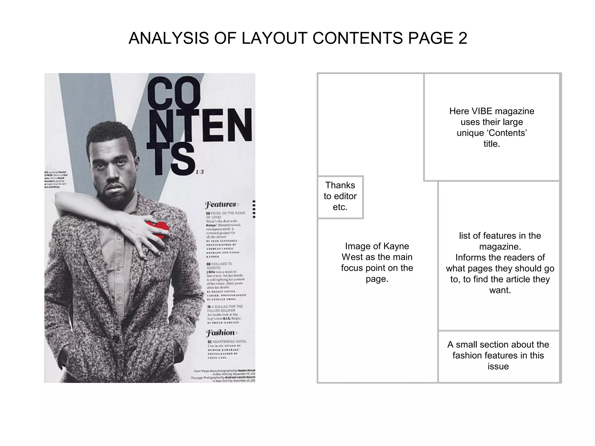
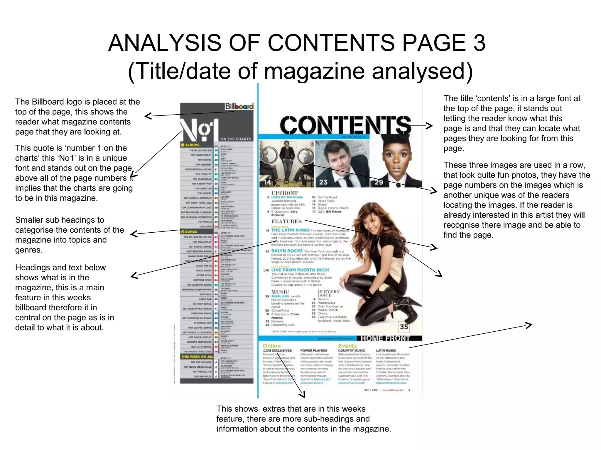
Analysis of 3 music magazine contents pages you must
analyse the Nme contents and then choose any other 2
                 contents you like   )
Analysis of magazine Contents pages
                       Contents 1.NME Sept 2009
                                                    Uses the title ‘contents page’

    Uses the same logo
                           Dizzee Rascal Edition    to let the readers know that it
                                                    is a contents page.
    as seen on the front
    cover, this looks
    professional as the
    same colours and
    themes are used on
    both.                                         Use of the same colour
                                                  scheme as the front
                                                  cover to keep it looking
  Page numbers so                                 professional, following
  that the readers                                the same house style
  know which pages
  everything is on.

  Use of an image, relates
  to the music magazine                                Use of 3 columns
  and the text beneath it


         The index numbers are                       Advertisement to
         roughly chronological to                    interest readers in the
         make it easier to read.                     next issue being
                                                     cheaper to increase
                                                     sales

Music box background
relates to the magazine
topic
ANALYSIS OF LAYOUT/DESIGN FEATURES OF
            CONTENTS PAGE
                                                       Masthead and words at the top in bold, date
                                                                     and issue.


                                                          Image in second            more important, front
                                                          column relates to            cover articles in a
                                                                                     larger contents down


                   Bands listed with page references
                                                            image below.
                                                                                            the side.

                                                                                     Headings what will be
                                                                                       in the magazine

                                                             This piece of text
                                                       informs the reader about
                                                        the ‘touring special’ and
                                                           throughout refers to
                                                       certain topics whilst then
                                                             quoting the page
                                                       number. This is a unique
                                                          and more interesting
                                                          way of informing the        Bright colors used
                                                          reader of the articles       around this page
                                                         and what pages there         number to make it
                                                                    on.                   stand out.

                                                                                    Advertisements of the
                                                                                    next issue, discount so
                                                                                    more sales are made.
ANALYSIS OF CONTENTS PAGE 2
                            (Title/date of magazine analysed)        Uses the word
                                                                     contents page so that
 Same colour scheme                                                  the readers knows that
 used as front cover.                                                this is where the page
                                                                     numbers can be found.
        First page on the                                            Unique way of
        contents page has                                            displaying the word
        the main features                                            contents.
        that were displayed
                                                                     This image of the red
        on the front cover
                                                                     heart stands out on
        so that they are
                                                                     the more dull
        seen first by the
                                                                     background colours
        readers.
                                                                     as his new single is
      There are 3 contents                                           called ‘welcome to
      pages so that all of the                                       heart break’, relating
      page numbers can be fit                                        to the woman
      on.                                                            grabbing onto his
                                                                     heart from behind.

                                                                Page numbers so that the
 Image of Kayne                                                 reader can find the
 relates to his feature.                                        feature they want on the
 He is a hip hop/ rap                                           right page
 artist, he looks quite                                                 Sub titles to show
 cool, laid back and                                                    the difference
 aggressive in this                                                     between the
 image which fits his                                                   ‘features’ and the
 role as an artist.                                                     ‘fashion’.

Image isn't central leaving room for
page numbers and info around it.
ANALYSIS OF LAYOUT CONTENTS PAGE 2


                                            Here VIBE magazine
                                              uses their large
                                             unique ‘Contents’
                                                    title.


                    Thanks
                   to editor
                      etc.


                                               list of features in the
                        Image of Kayne                magazine.
                       West as the main       Informs the readers of
                       focus point on the   what pages they should go
                             page.           to, to find the article they
                                                         want.


                                            A small section about the
                                             fashion features in this
                                                      issue
ANALYSIS OF CONTENTS PAGE 3
                           (Title/date of magazine analysed)
The Billboard logo is placed at the                                                     The title ‘contents’ is in a large font at
top of the page, this shows the                                                         the top of the page, it stands out
reader what magazine contents                                                           letting the reader know what this
page that they are looking at.                                                          page is and that they can locate what
                                                                                        pages they are looking for from this
This quote is ‘number 1 on the                                                          page.
charts’ this ‘No1’ is in a unique
font and stands out on the page                                                         These three images are used in a row,
above all of the page numbers it                                                        that look quite fun photos, they have the
implies that the charts are going                                                       page numbers on the images which is
to be in this magazine.                                                                 another unique was of the readers
                                                                                        locating the images. If the reader is
                                                                                        already interested in this artist they will
Smaller sub headings to
                                                                                        recognise there image and be able to
categorise the contents of the
                                                                                        find the page.
magazine into topics and
genres.

Headings and text below
shows what is in the
magazine, this is a main
feature in this weeks
billboard therefore it in
central on the page as is in
detail to what it is about.


                                      This shows extras that are in this weeks
                                      feature, there are more sub-headings and
                                      information about the contents in the magazine.
Analysis of layout contents page 3

Analysing contents pages prep for blog ppt

  • 1.
    Analysis of 3music magazine contents pages you must analyse the Nme contents and then choose any other 2 contents you like )
  • 2.
    Analysis of magazineContents pages Contents 1.NME Sept 2009 Uses the title ‘contents page’ Uses the same logo Dizzee Rascal Edition to let the readers know that it is a contents page. as seen on the front cover, this looks professional as the same colours and themes are used on both. Use of the same colour scheme as the front cover to keep it looking Page numbers so professional, following that the readers the same house style know which pages everything is on. Use of an image, relates to the music magazine Use of 3 columns and the text beneath it The index numbers are Advertisement to roughly chronological to interest readers in the make it easier to read. next issue being cheaper to increase sales Music box background relates to the magazine topic
  • 3.
    ANALYSIS OF LAYOUT/DESIGNFEATURES OF CONTENTS PAGE Masthead and words at the top in bold, date and issue. Image in second more important, front column relates to cover articles in a larger contents down Bands listed with page references image below. the side. Headings what will be in the magazine This piece of text informs the reader about the ‘touring special’ and throughout refers to certain topics whilst then quoting the page number. This is a unique and more interesting way of informing the Bright colors used reader of the articles around this page and what pages there number to make it on. stand out. Advertisements of the next issue, discount so more sales are made.
  • 4.
    ANALYSIS OF CONTENTSPAGE 2 (Title/date of magazine analysed) Uses the word contents page so that Same colour scheme the readers knows that used as front cover. this is where the page numbers can be found. First page on the Unique way of contents page has displaying the word the main features contents. that were displayed This image of the red on the front cover heart stands out on so that they are the more dull seen first by the background colours readers. as his new single is There are 3 contents called ‘welcome to pages so that all of the heart break’, relating page numbers can be fit to the woman on. grabbing onto his heart from behind. Page numbers so that the Image of Kayne reader can find the relates to his feature. feature they want on the He is a hip hop/ rap right page artist, he looks quite Sub titles to show cool, laid back and the difference aggressive in this between the image which fits his ‘features’ and the role as an artist. ‘fashion’. Image isn't central leaving room for page numbers and info around it.
  • 5.
    ANALYSIS OF LAYOUTCONTENTS PAGE 2 Here VIBE magazine uses their large unique ‘Contents’ title. Thanks to editor etc. list of features in the Image of Kayne magazine. West as the main Informs the readers of focus point on the what pages they should go page. to, to find the article they want. A small section about the fashion features in this issue
  • 6.
    ANALYSIS OF CONTENTSPAGE 3 (Title/date of magazine analysed) The Billboard logo is placed at the The title ‘contents’ is in a large font at top of the page, this shows the the top of the page, it stands out reader what magazine contents letting the reader know what this page that they are looking at. page is and that they can locate what pages they are looking for from this This quote is ‘number 1 on the page. charts’ this ‘No1’ is in a unique font and stands out on the page These three images are used in a row, above all of the page numbers it that look quite fun photos, they have the implies that the charts are going page numbers on the images which is to be in this magazine. another unique was of the readers locating the images. If the reader is already interested in this artist they will Smaller sub headings to recognise there image and be able to categorise the contents of the find the page. magazine into topics and genres. Headings and text below shows what is in the magazine, this is a main feature in this weeks billboard therefore it in central on the page as is in detail to what it is about. This shows extras that are in this weeks feature, there are more sub-headings and information about the contents in the magazine.
  • 7.
    Analysis of layoutcontents page 3