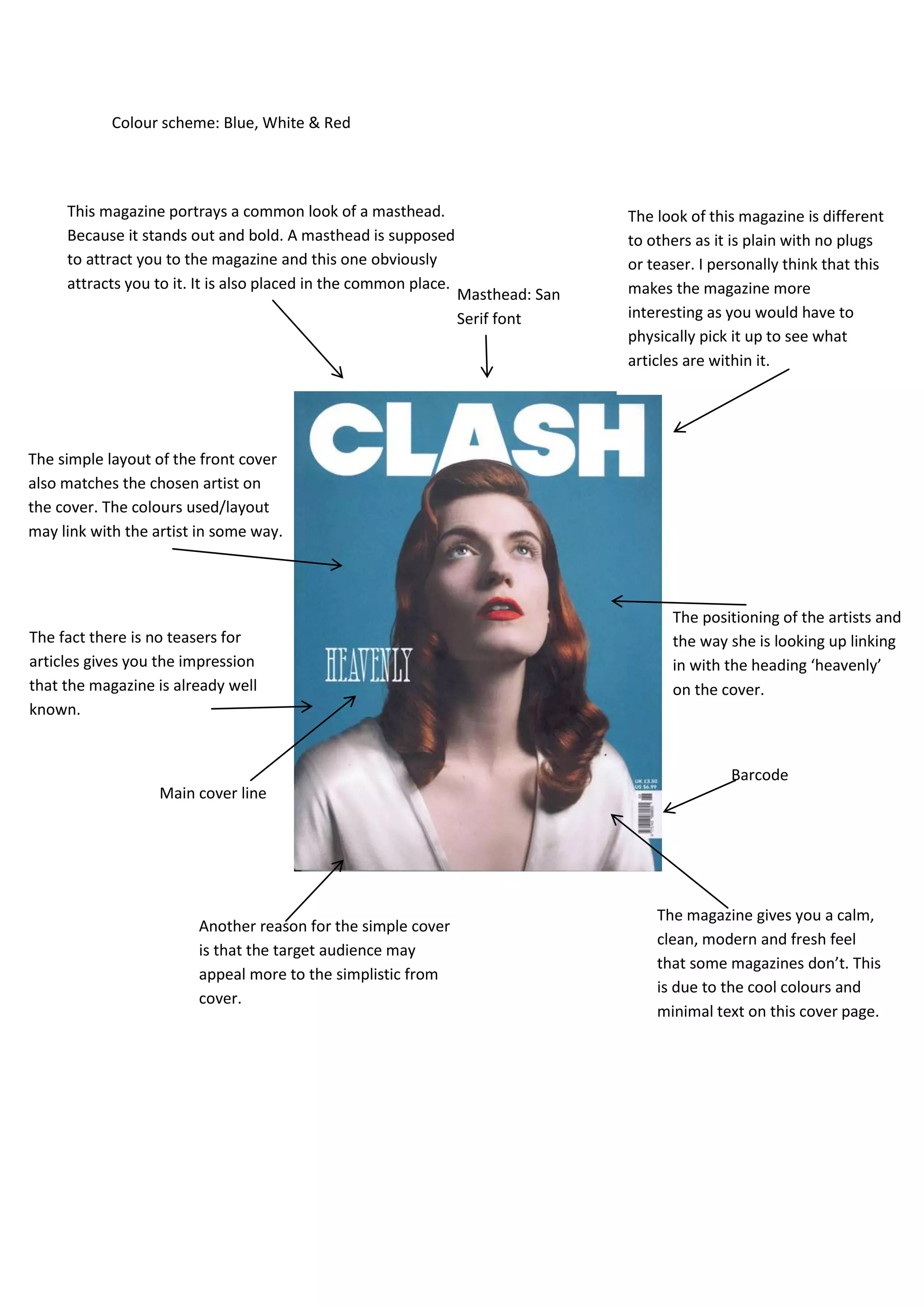
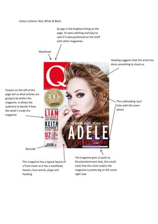
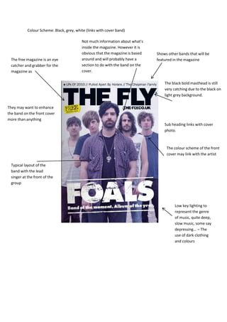
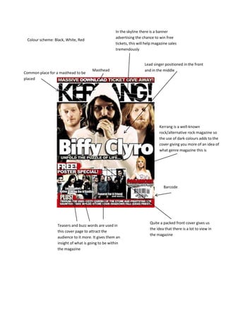
1. Colour scheme: Blue, White & Red
This magazine portrays a common look of a masthead. The look of this magazine is different
Because it stands out and bold. A masthead is supposed to others as it is plain with no plugs
to attract you to the magazine and this one obviously or teaser. I personally think that this
attracts you to it. It is also placed in the common place. makes the magazine more
Masthead: San
Serif font interesting as you would have to
physically pick it up to see what
articles are within it.
The simple layout of the front cover
also matches the chosen artist on
the cover. The colours used/layout
may link with the artist in some way.
The positioning of the artists and
The fact there is no teasers for the way she is looking up linking
articles gives you the impression in with the heading ‘heavenly’
that the magazine is already well on the cover.
known.
Barcode
Main cover line
The magazine gives you a calm,
Another reason for the simple cover
clean, modern and fresh feel
is that the target audience may
that some magazines don’t. This
appeal more to the simplistic from
is due to the cool colours and
cover.
minimal text on this cover page.
2. Colour scheme: Red, White & Black
Q Logo is the brightest thing on the
page. Its eyes catching and easy to
spot if it was positioned on the shelf
with other magazines
Masthead
Heading suggests that this artist has
done something to shock us
Teasers on the left of the
page tell us what articles are
going to be within the
magazine. It allows the The subheading ‘pun’
audience to decide if they links with the cover
like what’s inside the photo
magazine
Barcode
The magazine give us quite as
This magazine has a typical layout of fiery/predominant look, this could
a front cover as it has a masthead, state that this artist and/or the
teasers, buss words, plugs and magazine is pretty big on the scene
heading right now
3. Colour Scheme: Black, grey, white (links with cover band)
Not much information about what’s
inside the magazine. However it is
obvious that the magazine is based Shows other bands that will be
The free magazine is an eye around and will probably have a featured in the magazine
catcher and grabber for the section to do with the band on the
magazine as cover.
The black bold masthead is still
very catching due to the black on
light grey background.
They may want to enhance
the band on the front cover
more than anything
Sub heading links with cover
photo.
The colour scheme of the front
cover may link with the artist
Typical layout of the
band with the lead
singer at the front of the
group
Low key lighting to
represent the genre
of music, quite deep,
slow music, some say
depressing... – The
use of dark clothing
and colours
4. In the skyline there is a banner
advertising the chance to win free
Colour scheme: Black, White, Red
tickets, this will help magazine sales
tremendously
Lead singer positioned in the front
Masthead and in the middle
Common place for a masthead to be
placed
Kerrang is a well-known
rock/alternative rock magazine so
the use of dark colours adds to the
cover giving you more of an idea of
what genre magazine this is
Barcode
Quite a packed front cover gives us
Teasers and buzz words are used in
the idea that there is a lot to view in
this cover page to attract the
the magazine
audience to it more. It gives them an
insight of what is going to be within
the magazine
5. The magazine gives you quite a
fierce look; this connects with the
front cover as Simon Cowell is quite
a strong/powerful person in the
music industry
Skyline attracting people to the
magazine with the special edition
Light background to make
him stand out on the
meathead page
Linking the magazine
with Christmas, ‘the
Grinch speaks’ –
Simon Cowell known
for being quite a mean
person
Barcode