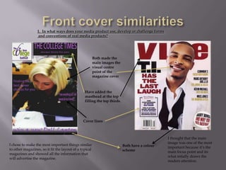
The document discusses the cover design of a college magazine, comparing it to real magazine covers. It notes several key conventions used: a prominent masthead at the top, distinct cover lines highlighting the magazine's contents, and a main central image to draw the reader's attention. The cover lines and main image are used to advertise what is inside the magazine. Additional features like competitions and ads for other companies were also included to promote sales.