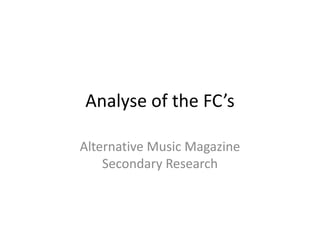
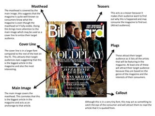
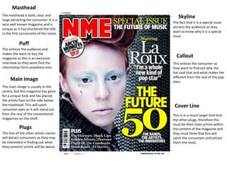
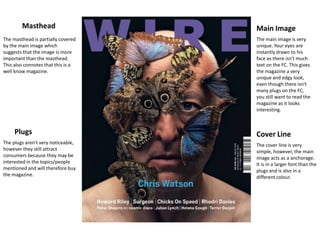
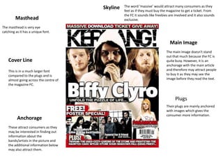
The document analyzes the front covers (FCs) of alternative music magazines. It finds that most magazines use large, eye-catching images as the main visual element. Text is kept to a minimum but key elements like the masthead, cover lines, and artist plugs are used to attract readers. Overall, the analysis shows that alternative magazines stand out by having unique, distinctive designs that emphasize striking imagery over heavy text. This guides the conclusion that an effective front cover should have a one-of-a-kind image and limited explanatory text.